


3D UI/UX Design Guide 2025: How to Build Immersive, Intuitive, and Interactive Experiences
Sharing
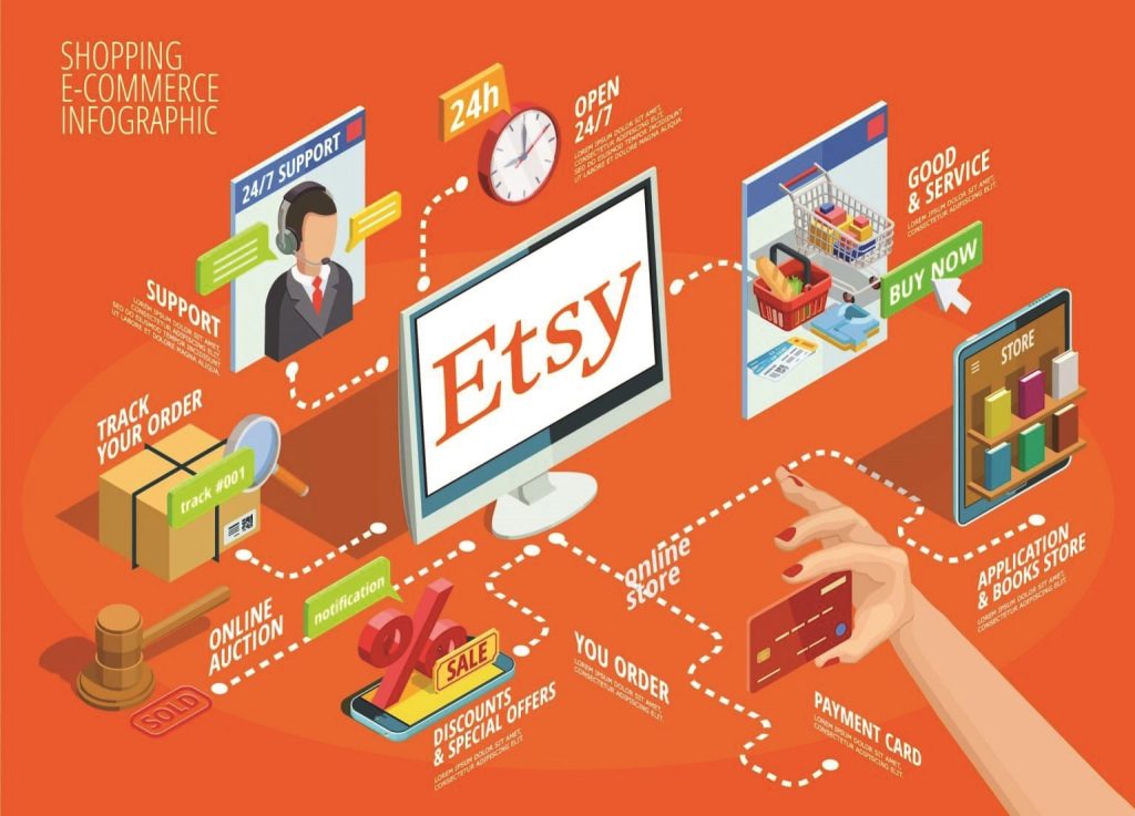
Etsy stands out as a global online marketplace specializing in handmade goods, vintage items, and craft supplies. This platform connects millions of buyers seeking unique items with creative entrepreneurs and small businesses worldwide. Etsy’s distinctiveness lies in its focus on a niche market segment, fostering a community-driven buying and selling experience that sharply contrasts with mass-market e-commerce giants.
The purpose of this case study is to provide an in-depth analysis of Etsy.com’s User Interface (UI) and User Experience (UX). The report will examine the platform’s design choices, information architecture, key user flows, and accessibility considerations. This analysis will offer insights into how Etsy effectively serves its diverse user base – encompassing both buyers looking for specific, often personalized, items and sellers managing their creative businesses. The ultimate goal is to extract lessons and best practices applicable to designers, product managers, and anyone interested in building intuitive and engaging digital platforms.
It’s crucial to recognize that Etsy faces a unique design challenge and opportunity by simultaneously serving two distinct user groups: buyers and sellers. Documentation indicates that Etsy provides a dedicated “Sell on Etsy” page along with detailed guides on how to create listings. This suggests a conscious effort to segment and optimize the experience for each user cohort. This means Etsy’s UI and UX must balance ease of product discovery for buyers with powerful tools and comprehensive support for sellers. This dual focus is both a significant design constraint and a unique competitive advantage, fostering a vibrant and sustainable ecosystem.
2. Etsy Overview: A Hub for Handmade and Vintage Goods
Etsy positions itself as “the global marketplace for unique and creative goods”. The platform is where “real people connect over special items” forming a “vibrant community”. Products offered range from “handmade pieces to vintage treasures” as well as “craft supplies, digital items, and more”. This broad yet curated product catalog appeals to users seeking uniqueness and a desire to support small businesses. The platform actively supports “creative entrepreneurs” by providing “powerful tools and services, along with expert support and education”. This reinforces Etsy’s role not just as a retail space but as a community enabler and business growth facilitator.
Etsy’s clear focus on “handmade goods, vintage items, and craft supplies” , differentiating it from general e-commerce platforms, is a fundamental UX decision. This niche focus allows Etsy to develop specialized design patterns and features that might not be present on broader platforms. For instance, the emphasis on product “personalization” capabilities is a direct consequence of this focus. By narrowing its scope, Etsy can deepen the user experience for its target audience, offering tailored functionalities like personalization options and seller stories. This strengthens the platform’s unique value proposition, leading to a more relevant and engaging experience for their core users.
3. Information Architecture: The Blueprint of Discovery
Etsy’s information architecture is designed to facilitate discovery and navigation, catering to both buyers and sellers.
3.1. Analysis of Key Navigation Elements
Etsy’s footer provides a comprehensive overview of the site’s structure, organized into logical sections: “Shop,” “Sell,” “About,” and “Help”. This clear categorization helps users quickly locate relevant information, regardless of their primary intent (buying, selling, learning about Etsy, or seeking support).
- The “Shop” section includes links like “Gift cards,” “Etsy Registry,” “Sitemap,” and “Etsy blog” , serving diverse buyer needs and discovery paths.
- The “Sell” section directly supports the seller audience with links to “Sell on Etsy,” “Teams,” “Forums,” and “Affiliates & Creators”. This indicates a strong support and community infrastructure.
- The “About” and “Help” sections provide essential company information and support resources, including “Policies,” “Investors,” “Careers,” “Press,” “Impact,” “Help Center,” and “Privacy settings”.
- Social media links (Instagram, Facebook, Pinterest, YouTube) and an option to download the app are also prominently placed in the footer , extending Etsy’s reach beyond the website.
- Regional settings (“US United States | English (US) | $ (USD)”) and a list of various other countries (Australia, Canada, Germany, etc.) are also available , highlighting Etsy’s global presence and localized experience.
3.2. Discussion of How Content is Organized for Discoverability
Category pages, such as “Jewelry,” demonstrate a layered approach to information organization. Users are presented with prominent visual links to major subcategories (Necklaces, Rings, Earrings, Bracelets, Jewelry Sets, Watches) followed by a “Show more” option for more specific segments (Cremation & Memorial Jewelry, Brooches, Pins & Clips, Body Jewelry, etc.). This visual and hierarchical organization aids progressive disclosure and exploration.
Notably, the presence of shops selling “Information Architecture (IA) Heuristics” directly on Etsy suggests that IA principles are highly valued within the Etsy community, potentially reflecting Etsy’s own internal design philosophy. These products emphasize findability, accessibility, clarity, and usefulness , which are core tenets of IA.
The combination of broad footer categories and detailed, visually supported subcategories on product pages indicates a deliberate layered information architecture. This allows users to either quickly access known sections or progressively drill down into specific niches. The “Show more” functionality is a classic progressive disclosure pattern, preventing information overload while ensuring comprehensive options are available. This layered approach enhances discoverability for both casual browsers and highly specific seekers. It acknowledges the vastness of Etsy’s inventory while providing clear pathways, reducing cognitive load and improving user satisfaction by allowing them to control the depth of their exploration.
The explicit listing of multiple regional settings and country-specific links in the footer underscores the importance of localization. This is not merely a translation feature; it implies a deeper information architecture consideration for currency, shipping rules, legal policies, and even cultural nuances in product categorization. For a global marketplace, a well-structured information architecture must support seamless localization. This ensures that users worldwide can access relevant content, pricing, and policies, fostering trust and usability across diverse geographical markets. This suggests a sophisticated information architecture on the backend supporting this global UI presentation.
Table 1: Etsy.com Footer Navigation Structure
| Main Section | Key Links/Elements | Purpose/User Goal |
| Shop | Gift cards, Etsy Registry, Sitemap, Etsy blog | Buyer utilities, discovery pathways |
| Sell | Sell on Etsy, Teams, Forums, Affiliates & Creators | Seller support, community building |
| About | Etsy, Inc., Policies, Investors, Careers, Press, Impact | Company transparency, corporate information |
| Help | Help Center, Privacy settings | Customer support, privacy management |
| Social Media | Instagram, Facebook, Pinterest, Youtube | Community engagement, extended reach |
| Regional Settings | US United States \ | English (US) \ |
| Copyright/Legal | © 2025 Etsy, Inc., Terms of Use, Privacy, Interest-based ads, Local Shops | Legal compliance, user legal information |
4. User Interface (UI) Elements: Visual Cues and Interactive Design
Etsy’s user interface is crafted to guide users effectively and present information clearly, especially in critical flows like listing creation and personalization.
4.1. Analysis of Key UI Components
- Prominent Calls to Action (CTAs): On the “Sell on Etsy” page, CTAs like “Get started” and “Open your Etsy Shop” are highly visible and repeated. These buttons are strategically placed at the top, middle, and bottom of the page, guiding potential sellers through the conversion funnel. This repetition ensures the primary goal of the page remains clear.
- Listing Structure: When creating a listing, sellers are guided through various sections: “Title,” “Photos and video,” “Digital files” (if applicable), “Description,” “Personalization,” “Price & Inventory,” “Core Details,” “Category,” “Attributes,” “Tags,” and “Materials”. This structured input ensures comprehensive product information is collected, which then informs the UI seen by buyers.
- Personalization Options: Etsy’s UI explicitly supports personalization. For buyers, the process is outlined as: “Open the listing page,” “Choose the options you’d like,” fill in the “Add your personalization” text box, then “Buy it now” or “Add to cart”. For sellers, the UI provides options to “Add Personalization,” define instructions, set character limits, and make it optional/mandatory. This highlights a core feature of the Etsy marketplace.
- Listing Page Highlights and FAQs: A specific product listing (e.g., a “Minimalist Personalized Necklace”) features “Highlights” (Materials, Sustainable features, Gemstone, Closure, Chain style, Adjustable length, Style, Personalizable, Recycled, Dimensions, Made to Order, Gift wrapping) and a detailed “FAQs” section (Gift wrapping and packaging, “Ship by” date and “Delivery” date, Care instructions, Sizing details, Custom and personalized orders, Business days, Wholesale availability). This rich information display proactively addresses common buyer questions.
4.2. Discussion of How Visual Elements Support User Interaction and Information Presentation
While specific visual design elements like color scheme and typography cannot be fully analyzed from the provided documents (documents indicate inaccessibility for visual analysis), the structure of information presentation implies a clean, functional UI.
The emphasis on “high-quality photos” and “video” for listings suggests that visual content is a primary driver of engagement and conversion on Etsy. The UI is designed to showcase these visuals effectively. The clear segmentation of information into distinct sections (e.g., “Highlights,” “FAQs,” “Description”) on product pages indicates good use of visual hierarchy and information chunking, making complex information more digestible.
The repeated mention and detailed steps for the “personalization” feature from both buyer and seller perspectives indicate this is a central, not secondary, feature. UI elements specifically designed to handle personalization (text boxes, optional dropdowns) are critical. Etsy’s UI isn’t just about displaying products; it’s about facilitating the creation of unique, customized items. This requires a flexible and robust UI that can handle diverse inputs and communicate complex options clearly, directly supporting Etsy’s core value proposition of unique, handmade goods. The UI acts as a bridge between a buyer’s desire for personalization and a seller’s ability to deliver.
The detailed “Highlights” and “FAQs” sections on product pages provide extensive information upfront, covering materials, sizing, shipping, and care instructions. This goes beyond basic product descriptions. By proactively addressing potential buyer questions and concerns through a well-structured UI, Etsy builds trust and reduces friction in the purchasing process. This minimizes the need for direct seller contact for common queries, streamlining the user journey and potentially increasing conversion rates by instilling confidence in the purchase. It reflects an understanding of common user anxieties when shopping online, especially for unique or handmade items.

5. User Experience (UX) Flows: The Journey from Browse to Buy (and Sell)
Analyzing user experience flows on Etsy reveals a highly optimized design that facilitates product discovery, purchasing, and the seller onboarding process for its users.
5.1. Search and Filtering
- Search Bar: Users can “use the search bar at the top of Etsy.com to look for items or shops”. This is the primary access point for discovery.
- Descriptive Terms: Guidance suggests entering “descriptive terms” like “rustic blue coffee mug” or “custom charm necklace” , indicating the search engine relies on natural language and specific keywords.
- Filtering Options: After a search, results can be filtered by “arrival time, Free Shipping, or Price”. The “All Filters” option (or filter icon on the app) provides a “full list of ways you can narrow results”. On category pages like “Jewelry,” users can sort by “Relevancy (default), Lowest Price, Highest Price, Top Customer Reviews, Most Recent”. A “Refine your search” panel with “Cancel,” “Back,” and “Apply” buttons indicates a robust filtering mechanism.
- Shop Location Filtering: Users can search for items from local sellers by filtering by country, city, town, state, or a custom field , supporting local commerce.
- Search Relevancy: Search results are “ordered by how relevant the items are to what you search for” , with an option to change the sort order. Etsy’s search algorithm prioritizes listings with “high-quality photos,” “return policy,” and for US sellers, “domestic shipping prices lower than $6” , indicating a focus on buyer satisfaction and conversion.
- SEO Integration: Etsy provides sellers with extensive SEO guidance, emphasizing “item title,” “description,” “images and video,” and “shop policies”. The platform advises placing “the most important keywords first” in titles and avoiding “keyword stuffing”. “Alt text” for images is highlighted for both visually impaired users and SEO.
5.2. Product Discovery and Listing Details
- Product Page Layout: While direct visual layout descriptions are inaccessible (documents indicate inaccessibility), the content provided for a sample product details “Highlights” (materials, personalization, sustainability), a narrative description, and “FAQs.” This suggests a layout designed to provide comprehensive information.
- Images and Video: Listings can include “Up to 10 photos and 1 video that’s 5-15 seconds in length”. High-quality images are “extremely important in Google search” and can “entice a user to click”.
- Add-to-Cart Functionality: The personalization flow concludes with “Click ‘Buy it now’ or ‘Add to cart’ and proceed to checkout” , implying a standard e-commerce cart process, though the cart page itself is inaccessible for detailed analysis (documents indicate inaccessibility).
5.3. Seller Onboarding Process
- Value Proposition: The “How to sell on Etsy” page clearly articulates benefits: “Millions of shoppers can’t wait to see what you have in store”. It highlights “Great Value” (low listing fees, transaction fees only on sale), “Powerful Tools” (Etsy Seller App, discounted shipping, custom website), and “Support and Education” (Etsy support, Seller Handbook, community forums).
- Clear CTAs: “Get started” and “Open your Etsy shop” are prominent and repeated throughout the page.
- Fee Transparency: A detailed breakdown of fees ($0.20 listing fee, 6.5% transaction fee, 3% + $0.25 payment processing fee, 15% Offsite Ads fee), with links to learn more, is provided. This transparency builds trust.
- Seller Stories: Testimonials from successful sellers (Nicole Lewis, Alva Mac Gowan, Shaina Adams, Micha González) are used to inspire and demonstrate success.
- Frequently Asked Questions (FAQ) Section: Addresses common questions about fees, shop creation, getting paid, and what can be sold, each with a “Learn more” link.
- What Can You Sell?: Clearly states Etsy is for “handmade goods, vintage items (20 years or older), and craft supplies” , managing expectations and ensuring marketplace integrity.
Given Etsy’s vast and diverse inventory , effective search and filtering capabilities are paramount. The detailed filtering options and the emphasis on descriptive keywords coupled with search engine optimization (SEO) for sellers indicate Etsy’s heavy investment in making products discoverable. The prioritization of listings with lower shipping prices demonstrates a direct UX optimization based on user behavior data. For a marketplace, search and filtering are not just features; they are the backbone of the user experience. Etsy’s focus on granular filtering, local search, and SEO guidance for sellers shows an understanding that effective discovery directly impacts user satisfaction and conversion rates. The continuous refinement of search algorithms (like factoring in shipping costs ) suggests a data-driven approach to UX improvement.
The “Sell on Etsy” page is meticulously structured to inform and persuade. The detailed presentation of fees, security assurances, and comprehensive support information (Seller Handbook, forums, direct contact) directly addresses potential seller anxieties. The use of seller testimonials leverages social proof. A successful two-sided marketplace must not only attract buyers but also empower sellers. Etsy’s UX in the seller onboarding process demonstrates a deep understanding of the seller’s journey, focusing on transparency and support to mitigate perceived risk and friction. This proactive communication builds trust, which is crucial for attracting and retaining the unique talent that populates Etsy’s inventory.
The emphasis on “high-quality photos and video” and the detailed personalization process on product pages are not just features but key drivers of engagement. For unique, handmade items, visuals are often the primary medium for conveying craftsmanship and appeal. Personalization transforms a generic product into a unique, desired item. Etsy’s UX strategy for product pages leverages visual storytelling and user agency (through personalization) to create a compelling and distinctive shopping experience. This is critical for a platform where products are often one-of-a-kind or customizable, allowing users to feel a deeper connection to their potential purchase.
Table 2: Etsy User Experience Flow: Search and Product Discovery
| Step in Flow | User Action/Goal | Corresponding UI/UX Elements | UX Impact/Benefit |
| Initial Search | Find a specific item | Search bar, Category links | Efficient discovery, intuitive entry point |
| Apply Filters | Narrow down options | “All Filters” button, Sort by dropdown, refine search panel | Reduced cognitive load, more precise search |
| Review Results | Evaluate product relevance | Product images, titles, prices, reviews, shipping info | Quick assessment, efficient comparison |
| View Product Page | Learn more about an item | Product images, Highlights section, description, personalization options, FAQ section | Informed decision-making, enhanced trust |
6. Accessibility and Inclusivity: Designing for a Diverse Audience
While the documents do not provide a comprehensive, direct audit of Etsy’s own accessibility features, there are strong indirect indicators of its importance.
Etsy hosts a marketplace for various “Accessibility Aids” and “Assistive Technology” items. These include WCAG 2.2 compliance checklists , assistive devices (e.g., Arthritis Aid, Braille Stamp, Tab Buddy Classic, Adaptive Switch Button) , and educational resources like “History of Assistive Technologies Timeline”. The existence of this marketplace on Etsy suggests a community aware of and demanding accessibility.
The mention of “WCAG 2.2 Accessible UX/UI Checklist Audit” and references to “Section 508, European Accessibility Act, and Canada Standards” indicate an awareness of global accessibility principles within the design community that Etsy serves and potentially adheres to internally.
Etsy specifically advises sellers to “add descriptive alt text, or alternative text, for each image” because “Alt text helps describe images for people with visual impairment, and it’s also important for SEO”. This is a direct feature implemented by Etsy to improve accessibility for visually impaired users.
Etsy’s hosting of a marketplace for accessibility tools and resources suggests that accessibility is not merely a regulatory concern but a recognized value proposition within its ecosystem. The clear guidance to sellers on using alt text directly demonstrates Etsy’s commitment to implementing accessibility features at a platform level, even if not fully detailed in the documents. Etsy’s UI and UX likely incorporate accessibility considerations beyond mere compliance, driven by both internal design principles and the needs of its diverse user base, including sellers and buyers with disabilities. This commitment fosters a more inclusive marketplace, potentially expanding its user base and enhancing its brand reputation. This indicates a mature understanding of universal design principles.
7. Key Strengths in Etsy’s UI/UX
- Clear Information Architecture: The well-structured footer and hierarchical category pages enable efficient navigation and content discovery.
- Effective Search and Filtering: Robust search functionality combined with detailed filtering options allows users to quickly narrow down vast product selections, addressing a key challenge of a large marketplace.
- Seller-Centric Onboarding Process: The “Sell on Etsy” page provides a transparent, supportive, and motivating experience for new sellers, clearly articulating value, tools, and support.
- Emphasis on Personalization: The UI and UX seamlessly integrate personalization options for unique products, a core differentiating factor for Etsy.
- Rich Product Information Display: Detailed product pages with “Highlights” and “FAQs” proactively address buyer questions, building trust and reducing friction.
- Commitment to Visuals: The platform’s encouragement and support for high-quality images and videos are crucial for showcasing unique handmade and vintage items.
- Global Localization: Support for multiple regions, languages, and currencies demonstrates a strong commitment to its global user base.
- Accessibility Awareness: Explicit mention of alt text and the presence of accessibility-related products in the marketplace suggest an underlying understanding and capability to implement accessibility best practices.
8. Opportunities for Improvement
- Visual Consistency and Design System Transparency: While Etsy likely uses an internal design system, the documents do not provide direct evidence of its public consistency (documents refer to products on Etsy related to design systems, not Etsy’s own). The research documents refer to “design system” in the context of products being sold on Etsy. This implies a marketplace for such tools, and by extension, Etsy itself could benefit from a robust internal design system to ensure consistency and scalability. However, the documents do not describe Etsy’s own design system or its visual consistency. Without direct insight into Etsy’s design system, it’s difficult to assess its impact on overall UI consistency. Opportunities might exist to further refine visual predictability across diverse pages and features, especially with the platform’s continuous evolution and the varied nature of seller shops. A publicly documented design system (like Google’s Material Design or IBM’s Carbon Design System) could also serve as an educational resource for Etsy’s creative seller community.
- Enhanced Feedback Mechanisms: While support channels are mentioned , explicit feedback mechanisms within user flows (e.g., during search, checkout, or listing creation) could be explored to gather more granular user insights for continuous improvement. The documents mention “support staff reachable by email or phone” and a “Help Center” for sellers, and “Contact Etsy Support” generally. While these are support channels, they are reactive. Proactive, in-context feedback mechanisms (e.g., “Was this helpful?” prompts, micro-surveys on specific flows, or clear error reporting within the UI) are not explicitly detailed. Implementing more integrated and diverse feedback mechanisms could allow Etsy to capture real-time user sentiment and pain points directly within specific interactions. This would enable a more agile and user-centered approach to continuous UX improvement, shifting from reactive support to proactive design refinement.
- Detailed Cart and Checkout Flow Analysis: The provided documents explicitly state that information regarding cart and checkout pages is “unavailable” (documents indicate inaccessibility). This is a critical part of the e-commerce user experience. The inability to analyze the cart and checkout flows leaves a significant gap in the UX assessment. These are high-friction, high-impact areas where even minor usability issues can lead to significant cart abandonment rates. Without direct data, this is a missed opportunity to identify potential abandonment factors or areas for streamlining the purchase process. Future analysis, if data becomes available, should prioritize these flows, as they directly impact conversion rates and overall buyer satisfaction. This highlights a limitation of the current research documentation.
9. Recommendations for Viartisan’s Audience
To craft successful digital experiences, designers and product managers can draw valuable lessons from Etsy:
- Embrace Niche-Specific Design: Etsy’s success demonstrates that tailoring UI and UX to a specific audience and product type (handmade, vintage, personalized) can create a deeply engaging and differentiated experience. Designers should identify core user needs and product characteristics to inform unique design solutions.
- Prioritize Information Architecture: Invest in robust and intuitive information architecture that supports both broad exploration and detailed searching. Layered navigation, clear categorization, and powerful filtering capabilities are essential for discoverability in content-rich platforms.
- Transparency Builds Trust: For platforms involving transactions or complex processes (like selling), transparent communication about fees, policies, and support mechanisms (as seen in Etsy’s seller onboarding) is crucial for building user trust and reducing friction.
- Leverage Visuals and Personalization: For products where aesthetics and customizability are key, design the UI to maximize visual impact and provide clear, intuitive pathways for personalization. High-quality media and flexible customization options enhance user engagement and perceived value.
- Integrate Accessibility from the Outset: Beyond compliance, treat accessibility as a core design principle. Features like alt text for images are fundamental for inclusivity and also contribute to SEO. Designers should actively seek and apply WCAG standards and other accessibility best practices.
- Continuously Optimize Search and Discovery: For marketplaces, search is paramount. Regularly analyze search behavior, refine algorithms (e.g., incorporating shipping costs ), and provide tools for content creators (sellers) to optimize their listings (SEO guidance ).
- Proactive Information Disclosure: Anticipate user questions and provide answers directly within the UI (e.g., product highlights, FAQs). This reduces cognitive load, builds confidence, and streamlines the user journey.
10. Conclusion: The Art of Digital Experience Evolution
Etsy’s UI and UX stand as a prime example of successful strategy for a niche e-commerce platform, effectively balancing the needs of its dual audience of buyers and sellers. Its strengths lie in its well-structured information architecture, robust search and filtering capabilities, supportive seller onboarding experience, and strong emphasis on personalization and visual content. The platform’s implicit commitment to accessibility and its data-driven approach to optimizing key user flows further solidify its leading position in its domain.
Etsy continues to evolve, demonstrating that a user-centered approach, combined with a deep understanding of its unique community and products, is key to sustained success in the competitive digital landscape. This case study offers valuable lessons for designers and product strategists aiming to create intuitive, engaging, and inclusive digital experiences tailored to their target audiences. It underscores that effective UI/UX is not merely about aesthetics, but about deeply understanding user needs and building a digital environment that empowers them.
Follow Viartisan to read more case studies in UI/ UX, Branding, and more!


