


3D UI/UX Design Guide 2025: How to Build Immersive, Intuitive, and Interactive Experiences
Sharing
This report presents a concise, high-level overview of the strategic imperative for Shopee to develop a robust English version of its website. The initiative extends beyond a simple linguistic translation, representing a fundamental step towards either expanding into new English-speaking markets or significantly enhancing service for existing English-speaking users within Shopee’s current operational regions. The analysis highlights critical observations derived from Shopee’s current UI/UX landscape and a comprehensive benchmarking exercise against leading e-commerce platforms, Apple and Etsy.
Key findings underscore that success for Shopee’s English platform hinges on a comprehensive localization strategy that transcends mere translation, focusing instead on deep cultural relevance and an optimized user journey. The report outlines prioritized actions for UI/UX enhancements, content adaptation, and technical improvements, emphasizing the potential for expanded market penetration and enhanced user loyalty that a well-executed English website can unlock. The core message conveyed is the strategic necessity of a truly localized English website to foster global competitiveness and user retention, providing an actionable roadmap for Shopee’s future growth.
1. Introduction: The Strategic Imperative of an English Shopee Website
The request for an English version of the Shopee website signifies a pivotal strategic move for the e-commerce giant. This is not merely a technical translation task but a fundamental step towards either expanding into new English-speaking markets or significantly enhancing service for existing English-speaking users within Shopee’s current operational regions. Shopee currently operates predominantly in Southeast Asia and Taiwan, with recent expansions into Latin American markets including Brazil, Mexico, Colombia, and Chile. Its established business model is a marketplace that efficiently connects buyers and sellers, renowned for its convenience, affordability, and a user-friendly UI/UX design specifically tailored for the Southeast Asian market.
A critical consideration for this initiative is precisely defining the core purpose behind the request for an English platform. The broad nature of the original request necessitates a clear distinction: Is the primary objective new market entry, specifically targeting English-speaking countries or large English-speaking diasporas, or is it to improve service for existing English-speaking users and sellers within current markets? This distinction is paramount because it dictates every subsequent decision. For example, the choice of a specific English dialect (e.g., American English versus British English), the necessary cultural adaptations, the relevance of product offerings, the integration of specific payment gateways, the design of logistical solutions, and the focus of marketing efforts will all be profoundly shaped by this initial strategic clarity. A precise understanding of the target English-speaking demographic—whether affluent Western consumers or tech-savvy Asian millennials—will fundamentally influence the content strategy, UI/UX design priorities, and the overall localization approach.
The overarching goal of this report is to provide a comprehensive, data-driven strategic blueprint for the development and implementation of a highly effective English version of the Shopee website. This will be achieved through a multi-faceted approach: first, by analyzing Shopee’s existing UI/UX strengths and identifying specific areas ripe for improvement; second, by benchmarking against leading global e-commerce platforms such as Apple and Etsy to derive best practices in information architecture, visual design, user journeys, accessibility, and feedback mechanisms; and third, by translating these comparative observations into actionable recommendations specifically tailored for Shopee’s English website, focusing on genuine localization beyond mere linguistic translation. Ultimately, this report aims to ensure that the English website not only facilitates seamless transactions but also deeply resonates with and effectively serves its target English-speaking audience, thereby supporting Shopee’s broader market expansion and user engagement objectives.
2. Shopee’s Current E-commerce Landscape: A Foundational Analysis
2.1 Business Model, Core Markets, and Target Audience
Shopee operates predominantly on a marketplace business model, effectively connecting a vast network of buyers and sellers. The platform’s revenue streams are diversified, stemming from transaction-based fees, advertising services, and various value-added services. This robust model facilitates both Consumer-to-Consumer (C2C) and Business-to-Consumer (B2C) transactions, demonstrating significant flexibility in its commercial offerings.
Geographically, Shopee’s stronghold remains Southeast Asia, maintaining a significant presence in countries such as Indonesia, Malaysia, Thailand, Vietnam, the Philippines, and Singapore. It also holds a strong foothold in Taiwan. In recent years, Shopee has strategically expanded its geographical reach into Latin American markets, including Brazil, Mexico, Colombia, and Chile. As of 2023, Shopee is recognized as the largest e-commerce platform in Southeast Asia by Gross Merchandise Volume (GMV).
Shopee caters to a broad and diverse user base. This includes a wide array of consumers, from “bargain hunters” and “tech-savvy users” to “young adults,” “e-commerce enthusiasts,” “fashion-conscious customers,” and those interested in “gadgets,” “health and beauty,” “home and living,” “parents and families,” “gamers,” and “outdoor enthusiasts”. On the seller side, Shopee empowers “small and medium-sized enterprises (SMEs),” “online merchants,” and “brand owners”. Notably, Shopee’s marketing strategy has historically focused on mobile users, leveraging the rapid growth of smartphone penetration in regions like Indonesia. The platform has also identified women as a primary target demographic due to their higher engagement in e-commerce activities.
A significant observation regarding Shopee’s current success is that its UI/UX design was “specifically crafted to align with the cultural and social characteristics of the Southeast Asian market”. While this deep cultural integration has undoubtedly been a significant competitive advantage in its existing markets, it presents a considerable challenge when translating the experience for a global English-speaking audience. A direct, literal translation of content and the retention of culturally specific UI patterns may not resonate, or worse, could alienate users from different cultural backgrounds. This means that a successful English website for Shopee necessitates a strategic shift from simple translation to comprehensive transcreation and cultural adaptation. This involves re-evaluating not just the language, but also visual metaphors, content tone, humor, product presentation, and even underlying assumptions about user behavior and mental models. The goal is to create an experience that feels native and intuitive to the target English-speaking demographic, rather than merely a translated version of a Southeast Asian platform.
2.2 Existing UI/UX Strengths and Identified Usability Challenges
Shopee’s current platform demonstrates several commendable UI/UX strengths, alongside identifiable areas for improvement that should be addressed for its English website.
Strengths:
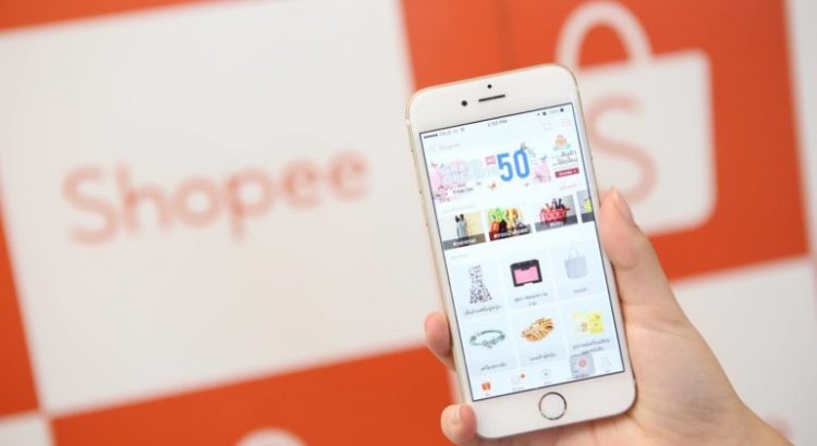
- User-Friendly Interface & Navigation: Users generally express satisfaction with Shopee’s usability, citing “obvious navigation throughout the website” and the provision of “an effective internal search engine”. The mobile application, in particular, is praised for its “clear and direct structure,” effective use of “white space,” and “organized grid-based product listing,” all contributing to an intuitive experience.
- Clear Calls to Action (CTAs): The platform features “clear links/buttons to ‘Add to Cart’ or ‘Buy now'”. Shopee’s consistent use of its brand colors ensures that CTAs are prominent and eye-catching, effectively guiding user actions.
- Efficient Purchasing Process: The checkout flow is described as an “easy-to-order process,” supported by “alternative methods for the payment” and an “accessible shopping cart from all the pages of the website”. The inclusion of “pre-checked boxes within the cart” further streamlines the checkout, reducing friction.
- Transparent Information Presentation: Shopee excels in providing clear information regarding “delivery dates,” “order charges (i.e., taxes, shipping costs),” and comprehensive “shipping, return or exchange policy and other shopping rules”.
- Security & Registration: The registration process is “short and simple,” requiring “only essential information.” The website also clearly states the “availability of privacy policy” and is perceived as “secure” with visible security logos during checkout. This category received the highest user satisfaction score in one study.
- Design Aesthetics: The platform is noted for its “consistent interface,” “attractive design,” and “appropriate use of font type, font color, and background color”.
- Engagement Features: Shopee actively integrates features like “Shopee Live” for real-time buyer-seller interaction and “gamification elements” to enhance user engagement and retention. Personalized recommendations are also a key feature.
Challenges/Areas for Improvement:
- Information Hierarchy on Product Pages: Despite good use of white space, product pages can suffer from “many unutilized spaces and a less defined information hierarchy,” making it “a bit of a hassle to discern which information is essential when everything is arranged and appears almost similar to each other”. This suggests a potential for cognitive overload despite the presence of information.
- Pricing and Discount Visibility: The sizing of “price and discounts to small, even with Shopee’s brand color, doesn’t instantly grasp users’ attention”. This is a critical element for conversion.
- Error Message Clarity: There is a noted “lack of displaying clear error messages if an error is occurred while interacting with the website”. Specific examples of common errors include invalid category IDs, image dimension/size issues, product name/description length constraints, and variant limits.
- Checkout Progress Indicators: The absence of “an obvious progress indicator at the top of the checkout pages” can lead to user uncertainty and potential abandonment.
- Delivery Options: A “lack of providing alternative methods for the delivery of the order” was identified as a usability problem.
- Product Information Detail (Presentation): While one source claims product pages are “thorough” , another notes a “lack of presenting detailed information about the product”. This apparent contradiction highlights a critical point: the information might exist, but its presentation or organization is suboptimal, making it difficult for users to find or process.
- Foreign Currency Support: The platform currently “lacks supporting foreign currency” , which is a significant barrier for international users.
- Review Quality and Authenticity: A major concern is the prevalence of unhelpful customer reviews (e.g., “Fast delivery! Not yet try,” “looks good yet to try”) driven by incentives like coins, rather than genuine product feedback. Furthermore, issues with counterfeit products and difficulty leaving negative reviews are reported, undermining the credibility of the review system.
The observation that Shopee’s product pages are described as “thorough” but simultaneously suffer from a “less defined information hierarchy” and “unutilized spaces” indicates a common e-commerce UI/UX challenge: providing ample information without overwhelming the user. When all information is presented with similar visual weight, it increases cognitive load, making it difficult for users to quickly identify key details like price, variations, or critical features. This suggests that for the English website, a significant redesign of product detail pages is crucial. This involves not just translating existing content but fundamentally re-architecting its presentation to ensure clear visual hierarchy, scannability, and the strategic application of progressive disclosure. Prioritizing essential information, such as high-quality images, prominent pricing, and clear call-to-actions, and using visual cues (e.g., bolding, larger fonts, distinct sections, accordions) to guide the user’s eye will be paramount to improving user comprehension and reducing friction.
Furthermore, the research highlights that many Shopee reviews are unhelpful, often focusing on delivery speed rather than product quality, largely due to user incentives (coins) for any review. Compounding this, there are reports of counterfeit products and difficulties in leaving negative reviews. Trustworthy reviews are a cornerstone of successful online marketplaces. If users perceive reviews as unreliable or manipulated, or if they encounter issues with product authenticity, it fundamentally erodes buyer trust. This is particularly damaging for a new English-speaking audience who may not have established loyalty to the Shopee brand. The consequence of unhelpful or manipulated reviews and unaddressed counterfeit issues is a diminished buyer trust and an increased perceived risk, which ultimately leads to reduced conversion rates, lower customer retention, and a negative brand perception for the English website. Therefore, Shopee must urgently implement mechanisms to encourage more substantive, authentic reviews, perhaps by refining incentive structures to reward detailed feedback rather than just submission. Moreover, a transparent and efficient system for reporting and addressing counterfeit products is vital. Building and maintaining trust through genuine product feedback and quality assurance will be crucial for the long-term success and growth of the English platform.
The following table summarizes Shopee’s current UI/UX strengths and areas for improvement, providing a foundational assessment for subsequent recommendations.
Table 1: Shopee’s Current UI/UX Assessment: Strengths and Areas for Improvement
| UI/UX Category | Strengths | Areas for Improvement |
| Navigation & Search | Obvious navigation throughout; effective internal search engine. Clear, direct structure in mobile app, good use of white space. | Poor navigation design (past issue), links not visible (past issue). |
| Product Display & Information | Organized grid-based product listing. Prominent advertising for new products/offers. Thorough product pages. | Less defined information hierarchy on product pages, making essential info hard to discern. Pricing/discounts too small, not instantly attention-grabbing. Lack of presenting detailed product information (presentation issue). |
| Purchasing Process (Checkout) | Clear “Add to Cart” / “Buy now” buttons. Alternative payment methods provided. Accessible shopping cart from all pages. Easy-to-order process. Pre-checked boxes in cart streamline checkout. | Lack of obvious progress indicator at top of checkout pages. Lack of alternative delivery methods. |
| Security & Registration | Short, simple registration with essential info. Availability of privacy policy. Secure website with visible security logos. | None explicitly identified as weaknesses in provided data. |
| Design Aesthetics | Consistent interface, attractive design, appropriate use of font type, color, background color. | Bright orange brand color can be excessive on certain elements, potentially feeling crowded. |
| Feedback Mechanisms & Support | Visible contact info, visible FAQ section. Supports foreign language. Live chat and social sharing features. | Lack of displaying clear error messages. Unhelpful customer reviews (focus on delivery, not product). Issues with counterfeit products and difficulty leaving negative reviews. Lack of supporting foreign currency. Manual categorization of support tickets is inefficient. |

3. Benchmarking for Excellence: Lessons from Leading E-commerce Platforms (Apple & Etsy)
To inform the strategic development of Shopee’s English website, a comprehensive benchmarking analysis against leading e-commerce platforms, Apple and Etsy, provides valuable insights into best practices in UI/UX design.
3.1 Information Architecture and Navigation Best Practices
Apple’s design philosophy is rooted in “simplicity as the ultimate sophistication”. Their iOS Settings application serves as a prime example of a highly effective, complex hierarchical information architecture (IA) that remains logical and user-friendly. This is achieved through meticulous categorization, strategic progressive disclosure, and consistent design patterns, which collectively prevent user overwhelm even when navigating hundreds of settings. Apple also integrates robust search functionality to provide direct access within deep hierarchies, catering to both novice and power users.
Etsy’s navigation is characterized by a clear subcategory organization and comprehensive filtering options. The platform prioritizes product categories and implements a search bar with advanced filters, including predictive text suggestions, to help users quickly narrow down results. Etsy also strategically utilizes footer navigation for important links, preventing clutter in main menus.
From these benchmarks, several key principles for information architecture and navigation emerge:
- Clarity: Interfaces should be easy to understand at a glance, with a clear visual hierarchy guiding the user’s attention.
- Consistency: A consistent look, feel, and behavior across devices and within the application fosters familiarity and reduces cognitive load.
- Progressive Disclosure: Presenting simple interfaces by default, with clear and intuitive paths to reveal advanced functionality or detailed information, is crucial for managing complexity.
- Scalability: The chosen IA should efficiently handle vast numbers of content items or products, supporting both casual browsing and directed searching.
- Mobile Responsiveness: Navigation must adapt seamlessly to various screen sizes, incorporating touch-friendly buttons and widely recognized mobile patterns like hamburger menus or tab bars.
A significant observation is that Shopee’s current product pages are noted for being “thorough” but suffering from a “less defined information hierarchy”. This creates a paradox where information is present but difficult to digest. Apple and information architecture experts consistently advocate for progressive disclosure as a solution to manage information density. By initially presenting only essential details and allowing users to expand for more, cognitive load is reduced, and the user experience becomes more efficient. The implementation of progressive disclosure on Shopee’s product pages would reduce visual clutter and cognitive load, making key information more prominent. This would improve user comprehension, reduce decision fatigue, and enhance overall satisfaction, potentially leading to higher conversion rates. Therefore, Shopee should re-architect its English product detail pages to prioritize core purchasing information (high-quality images, clear pricing, primary call-to-action buttons) prominently. Secondary information, such as detailed specifications, comprehensive reviews, shipping nuances, and seller policies, should be organized into expandable sections, tabs, or modal overlays. This approach aligns with best practices for complex e-commerce platforms and directly addresses Shopee’s identified usability challenge.
3.2 Visual Design Principles: Aesthetics, Clarity, and Consistency
Apple’s visual design is synonymous with minimalism, clean layouts, and a strong product-centric focus. They leverage a custom-designed typeface, San Francisco, to ensure optimal legibility and a clear visual flow across all products and platforms. Their approach includes consistent color schemes, ample white space, and high-quality imagery and videos that showcase products from every angle. Subtle animations and visual effects are employed to create a sense of depth and continuity, enhancing the user experience without being distracting. Accessibility is a core consideration, with emphasis on high contrast and dynamic color adaptation to ensure readability for all users.
While less explicitly detailed in the provided information regarding its overall design system, Etsy’s aesthetic generally supports its marketplace of unique, handmade goods. Its UI/UX is recognized for being effective, allowing product imagery to take center stage.
Key visual design principles derived from these benchmarks include:
- Aesthetic Integrity: The visual appearance of the interface should seamlessly support and enhance its functionality, creating a cohesive and intuitive experience.
- Minimalism & White Space: Eliminating unnecessary distractions and strategically using white space directs user attention to core content, contributing to a professional and high-end feel. Shopee already demonstrates good use of white space in some areas.
- Typography: Prioritizing legible and well-proportioned typography, with ample white space between lines and minimal use of different typefaces, is crucial for readability and maintaining a clear information hierarchy.
- Color & Contrast: Consistent color palettes, high contrast ratios for text and interactive elements, and the strategic use of color to convey meaning or indicate actions (e.g., blue for primary actions, red for destructive actions) are vital for clarity and accessibility.
- Imagery: High-quality, high-resolution images are essential for showcasing products effectively and should always be displayed at their intended aspect ratio to avoid distortion.
A notable observation is that Shopee’s current UI prominently features a “bright and glaring orange” brand color, which “immediately draws attention” but can also feel “excessive on certain elements”. In contrast, Apple employs minimalist color palettes, allowing content to shine, and uses color strategically to highlight actions rather than as a dominant background element. The current aggressive application of orange might be perceived as visually overwhelming or less sophisticated by some English-speaking audiences accustomed to more subdued e-commerce aesthetics. For the English website, Shopee should refine its application of the brand orange. While its vibrancy is effective for drawing attention to critical Calls to Action (CTAs) , its overuse can lead to visual clutter and diminish the perceived premium quality of the platform. A more strategic, minimalist approach would involve reserving the vibrant orange primarily for key interactive elements (buttons, links, progress indicators, alerts) and utilizing more neutral, ample white space for backgrounds and less critical content. This refined color strategy would improve visual clarity, enhance perceived sophistication, and align better with global e-commerce design trends, without losing brand identity.
3.3 Optimizing User Journeys: From Discovery to Purchase and Support
Optimizing the user journey from initial product discovery to purchase and post-purchase support is paramount for any successful e-commerce platform.
Discovery (Search & Browse): Apple supports both casual browsing and highly directed searching, leveraging personalization to increase user engagement and employing a clear visual hierarchy to help users understand content relationships. Etsy excels with robust subcategory organization and comprehensive filtering options, enabling users to efficiently narrow down product selections. Shopee’s current platform already possesses an “effective internal search engine” and “obvious navigation” , providing a strong foundation for enhancement.
Purchase Flow: Apple offers a streamlined checkout experience with diverse payment options, including Apple Card Monthly Installments, various carrier deals, and Apple Pay. They also provide flexible delivery choices and personalized setup sessions post-purchase. However, identified challenges include initial pricing visibility during browsing and the potential complexity of detailed carrier deal terms. Etsy’s product listings clearly display key highlights, materials, and personalization options, with straightforward “Add to cart” steps. Shopee’s current platform features an “easy-to-order process” with “clear links/buttons to ‘Add to Cart’ or ‘Buy now'” and provides “alternative methods for the payment”. The “pre-checked boxes within the cart” help streamline the checkout process. Nevertheless, critical gaps include the absence of an “obvious progress indicator at the top of the checkout pages” and a perceived “lack of presenting detailed information about the product” , which, as previously discussed, might be a presentation issue rather than an information absence.
Support: Apple provides extensive support resources, including dedicated support sections, quick links for common issues, multiple contact channels (phone, chat, email, dedicated support app), and comprehensive self-service resources (FAQs, support videos, community forums). Shopee’s current platform offers “visible contact information” and a “visible Frequently Asked Questions (FAQ) section”. However, it faces challenges with increasing customer service queries and issues with manually categorizing and potentially mis-tagging support tickets.
A significant observation is that while Shopee’s checkout process is noted as “easy-to-order,” it critically lacks an “obvious progress indicator”. In contrast, Apple’s payment sheet clearly outlines billing, shipping, payment method, and order totals within its flow. The absence of a visual progress indicator in multi-step processes like checkout can lead to user anxiety, uncertainty about remaining steps, and ultimately, higher cart abandonment rates. Users need to feel in control and understand their position within a process. The lack of a clear progress indicator increases cognitive load, user anxiety, and a perceived lack of control during the checkout process, leading to higher cart abandonment rates and reduced task success. Therefore, Shopee must prioritize implementing a clear, multi-step progress indicator in its English website’s checkout flow. This visual cue provides predictability, reduces user uncertainty, and reinforces the feeling of control, aligning with core UX principles. This improvement is crucial for optimizing conversion rates, especially for new users who may be less familiar with Shopee’s existing flow.
3.4 Ensuring Comprehensive Accessibility
Apple demonstrates a profound commitment to accessibility, embedding “innovation that’s accessible by design” into its core philosophy. Their products and platforms feature built-in accessibility tools for various needs, including vision (VoiceOver, Eye Tracking), hearing (AirPods Pro with Hearing Health, Music Haptics), speech (Personal Voice), mobility (Assistive Access, sufficiently sized controls, keyboard navigation, alternative input methods), and cognitive features. Apple’s Human Interface Guidelines (HIG) serve as a foundational guide for developing user-friendly and highly accessible applications, emphasizing interfaces that are intuitive, perceivable, and adaptable.
While Etsy’s platform hosts numerous products related to accessibility (e.g., adaptive switch buttons, assistive tools) , the provided information does not offer specific details on Etsy’s own website accessibility features or its adherence to accessibility standards.
The Web Content Accessibility Guidelines (WCAG) are international standards established by the World Wide Web Consortium (W3C), providing a comprehensive framework for making web content accessible to individuals with diverse disabilities (auditory, visual, physical, cognitive, speech, language, learning, neurological). Key guiding principles include Perceivable, Operable, Understandable, and Robust (POUR) content. Conformance levels (A, AA, AAA) provide benchmarks for implementation.
Shopee generally receives positive feedback on usability and is noted for supporting foreign languages and having visible contact information. However, a past study highlighted usability problems related to accessibility, such as content being available only in English (which contradicts later findings of foreign language support, suggesting a past issue or specific study limitation), poor navigation design, and links not being visible.
A significant observation is that Apple sets a high industry standard for accessibility, integrating it as a core design principle. International standards like WCAG provide clear, actionable guidelines. While Shopee’s general usability is praised, specific, comprehensive accessibility features are not prominently highlighted as strengths beyond foreign language support. Expanding to a global English-speaking audience means encountering diverse user needs and navigating varied legal requirements (e.g., ADA in the US, European Accessibility Act). Neglecting accessibility not only excludes a significant user segment but also poses legal and reputational risks. Therefore, Shopee should proactively conduct a thorough accessibility audit of its English website against WCAG 2.1 or 2.2 Level AA standards. This includes ensuring proper alternative text for images , sufficient color contrast for text and interactive elements , full keyboard navigation support, and adaptable layouts that respond to user preferences. Investing in comprehensive accessibility is not merely about compliance; it is a strategic move to expand the addressable market, enhance brand reputation, and demonstrate inclusivity, fostering greater loyalty among a broader user base.
3.5 Effective Feedback Mechanisms
Apple places a strong emphasis on providing immediate and clear feedback to users. This includes visual cues (e.g., highlighting buttons, progress indicators), auditory notifications, and haptic feedback (vibrations) to confirm interactions and system status. They also facilitate user feedback through ratings and reviews via API, prompting users at opportune moments to encourage constructive input. Etsy allows users to leave reviews for products , contributing to social proof and buyer decision-making.
Shopee’s current platform is noted for a “lack of displaying clear error messages” , which can be frustrating for users. Furthermore, its review system faces significant challenges, with many reviews being unhelpful or focusing on non-product aspects (e.g., delivery speed), and difficulties reported in leaving negative reviews, potentially due to incentive structures. Shopee does provide visible contact information and an FAQ section for support and integrates in-app messaging for direct buyer-seller communication.
A significant observation is that a major usability problem identified for Shopee is the “lack of displaying clear error messages”. While specific types of errors are known (e.g., image size, product name length, variant limits) , the generic or missing feedback frustrates users. Apple, in contrast, emphasizes providing clear messages for error handling and guiding users through complex interactions. Vague or absent error messages increase cognitive load, force users to guess, and can lead to abandonment. Therefore, the English website must prioritize implementing clear, concise, and actionable error messages across all user interactions. These messages should explicitly state what went wrong (e.g., “Image too small”) and how the user can rectify it (e.g., “Please upload an image at least 500×500 pixels”). This direct and helpful feedback empowers users, reduces frustration, and improves the overall user experience by fostering a sense of control and predictability.
The following table summarizes the UI/UX best practices derived from the benchmarking analysis against Apple and Etsy, highlighting their relevance for Shopee’s English website.
Table 2: E-commerce UI/UX Best Practices: Insights from Apple and Etsy
| UI/UX Category | Best Practice | Apple Example/Approach | Etsy Example/Approach | Relevance to Shopee |
| Information Architecture | Clarity & Simplicity | Minimalist elegance, intuitive interactions, clear visual hierarchy (iOS Settings app). | Clear subcategory organization, comprehensive filtering, strategic footer navigation. | Crucial for adapting Shopee’s culturally-aligned IA to diverse English mental models, reducing cognitive load. |
| Information Architecture | Progressive Disclosure | Present simple interfaces by default, clear paths to advanced functionality (HyperCard example, iOS Settings). | (Not explicitly detailed, but implied by effective filtering for specific product listings). | Essential for managing information density on Shopee’s product pages, making key details prominent without overwhelming users. |
| Visual Design | Aesthetic Integrity & Minimalism | Seamless merging of form and function, neutral backgrounds, ample white space, product-centric focus. | Effective UI/UX allows product imagery to take center stage. | Guides refinement of Shopee’s brand color application to achieve sophistication and visual balance for a global audience. |
| Visual Design | Typography & Contrast | San Francisco typeface for legibility, high contrast, dynamic color adaptation. | (Not explicitly detailed, but generally supports product focus). | Improves readability and accessibility across the English website, ensuring information hierarchy is clear and consistent. |
| User Journey (Purchase) | Checkout Transparency & Guidance | Clear payment sheet outlining billing, shipping, payment, order totals. Flexible delivery options. | Straightforward add-to-cart steps, clear personalization options. | Addresses Shopee’s lack of progress indicators and limited delivery options, enhancing user confidence and reducing abandonment. |
| Accessibility | Comprehensive Design for All | Built-in features for vision, hearing, speech, mobility, cognitive needs; intuitive, perceivable, adaptable interfaces (HIG). | Hosts products related to accessibility. WCAG standards provide framework. | Critical for expanding Shopee’s reach, ensuring inclusivity, and complying with international standards, building brand reputation. |
| Feedback Mechanisms | Clear Error Messages | Provides messages/prompts for error handling, guiding users. | (Not explicitly detailed, but expected for e-commerce). | Directly addresses Shopee’s identified weakness in error message clarity, empowering users to resolve issues and reducing frustration. |
| Feedback Mechanisms | User-Generated Content Credibility | API for ratings/reviews, prompts at opportune moments, responses to reviews. | Allows users to leave reviews for social proof. | Essential for rebuilding trust in Shopee’s review system, encouraging authentic feedback, and addressing counterfeit concerns. |
4. Designing for a Global English Audience: Key Considerations for Shopee
Developing an English version of the Shopee website for a global audience necessitates a deep understanding of key design considerations that extend beyond simple translation.
4.1 Adapting Information Architecture for Diverse Mental Models
A significant challenge lies in the fact that Shopee’s existing information architecture (IA) and content categorization are deeply rooted in and tailored for Southeast Asian user behaviors and cultural contexts. English-speaking audiences, particularly those from Western markets or different Asian regions, may possess fundamentally different mental models regarding how e-commerce content should be organized, categorized, and searched. For instance, product classification, search term expectations, and the perceived hierarchy of information can vary significantly across cultures. Simply translating existing labels will likely lead to confusion and suboptimal user experiences.
The observation that Shopee’s UI/UX is explicitly designed for the “cultural and social characteristics of the Southeast Asian market” carries a profound implication. If the existing information architecture (e.g., category names, navigation structures, product grouping logic) is merely translated into English without considering the distinct mental models and cultural shopping habits of the new English-speaking target audience, it will create significant cognitive friction. For example, a product category that is intuitive in one culture might be obscure or miscategorized in another, even if the words are correctly translated. This is not a linguistic error but a structural one. This oversight can act as a significant barrier to market entry or user adoption. If users struggle to find products or navigate the site due to an unfamiliar underlying information structure, they are likely to abandon the platform, regardless of product availability or competitive pricing. This directly impacts conversion rates, user retention, and ultimately, Shopee’s ability to gain market share in new English-speaking territories or effectively serve existing English-speaking segments. The cost extends beyond translation fees to lost revenue and market opportunity.
To address this, the following recommendations are crucial:
- Targeted User Research: Conduct in-depth qualitative user research (e.g., card sorting exercises, tree testing, contextual inquiries, user interviews) with representative samples from the target English-speaking demographics. The goal is to explicitly uncover their mental models for product categorization, preferred search terminology, and intuitive navigation paths.
- Refined Categories & Filters: Based on the observations from user research, refine and potentially re-structure product categories and filtering options to align with English-speaking user expectations. Ensure that all labels for categories, subcategories, and filters are clear, concise, and culturally appropriate.
- Search Optimization for English Queries: Leverage advanced analytics on English search queries and user behavior to optimize keywords, improve search result relevancy, and enhance predictive text suggestions for English-language searches. This will ensure users can find products efficiently even if their terminology differs from Shopee’s existing internal classifications.
- Strategic Progressive Disclosure: Implement progressive disclosure more rigorously across the website, particularly on product pages, to effectively manage information density. This ensures that users are not overwhelmed by information but can access details as needed.
4.2 Content Strategy and Localization Beyond Direct Translation
Effective localization for a global English audience demands more than a literal word-for-word translation. It requires adapting content to cultural nuances, idiomatic expressions, local preferences, and even legal requirements, ensuring the message resonates authentically and persuasively.
The current issues with unhelpful reviews and reports of counterfeit products on Shopee directly undermine user trust. For a new English-speaking market, where brand familiarity might be lower, establishing trust is paramount. High-quality, transparent, and authentic content – including detailed product information, clear policies, and genuine user reviews – is a critical trust-building mechanism in e-commerce. If users perceive content as generic, misleading, or reviews as unreliable, it significantly increases perceived risk. The consequence of suboptimal review quality and a lack of transparency regarding product authenticity and policies is an erosion of user trust and an increased perceived risk, which ultimately leads to reduced conversion rates, higher customer churn, and negative word-of-mouth for the English platform. Therefore, Shopee must make a strategic investment in the quality and authenticity of its content for the English platform. This encompasses not only the linguistic accuracy and cultural relevance of text but also the richness of product imagery , the detail of product specifications , the clarity of seller information, and a robust system for ensuring the credibility of user-generated content (reviews). Building this foundation of trust is essential for long-term user acquisition and retention in competitive English-speaking markets.
Key recommendations for content strategy and localization include:
- Transcreation Mandate: Implement a policy for “transcreation” rather than direct translation for all critical user-facing content, including marketing copy, product descriptions, promotional banners, and user interface text. Transcreation ensures that the message’s intent, tone, and emotional impact are culturally appropriate and compelling for the target English audience, rather than just linguistically accurate.
- Defined Tone of Voice: Develop a clear and consistent brand tone of voice specifically for the English website. This tone should align with Shopee’s overall brand identity (e.g., accessible, dynamic, reliable) but be adapted to resonate with the cultural expectations of the target English-speaking market (e.g., more formal, more casual, more direct, or more empathetic).
- Enhanced Review Management: Address the identified issues with review quality and authenticity. Develop and implement strategies to encourage more substantive, helpful, and trustworthy reviews from English-speaking users. This might involve refining gamification mechanics to reward quality feedback over mere submission, implementing clearer guidelines for reviews, and providing robust, transparent reporting mechanisms for unhelpful or fake reviews.
- Clear and Actionable Error Messages: As previously highlighted, ensure all error messages are meticulously crafted to be clear, concise, actionable, and user-friendly in English. They should guide the user on how to resolve the issue, rather than simply stating that an error occurred.
- Policy Clarity and Compliance: Ensure all legal disclaimers, shipping policies, return/exchange policies, and privacy policies are not only translated accurately but are also clearly articulated, easily understandable, and legally compliant within the specific English-speaking regions being targeted. This builds trust and reduces potential disputes.
4.3 Enhancing User Control and Predictability
Users expect a high degree of control over their online experience and predictable responses from the system. Any perceived lack of control or unexpected behavior can lead to frustration and abandonment.
The explicit mention of “lack of supporting foreign currency” as a usability problem for Shopee is a critical observation for an international English website. For global e-commerce, price transparency and the ability to transact in one’s local currency are fundamental user expectations. Hidden costs, unclear exchange rates, or being forced to calculate conversions manually significantly increase friction and erode trust. This directly impacts a user’s sense of control over their purchase decision. The absence of multi-currency support and transparent pricing increases cognitive load, user frustration, and a perceived lack of control during the purchasing process, leading to higher cart abandonment rates, reduced conversion, and diminished user trust. Therefore, Shopee must prioritize the implementation of comprehensive multi-currency display and payment options for its English website. This includes showing prices in the user’s detected or selected local currency, clearly itemizing all charges (including taxes and shipping, as already a strength ), and providing seamless payment gateways that support international transactions. This will significantly enhance user control, build trust, and reduce friction in the purchasing journey, directly contributing to higher conversion rates.
Recommendations for enhancing user control and predictability include:
- Prominent Progress Indicators: Implement highly visible and intuitive progress indicators for all multi-step processes, such as account registration, checkout, and order tracking. This provides users with a clear understanding of where they are in a process and what steps remain, reducing anxiety and improving task completion rates.
- Undo Functionality & Confirmation: Integrate easy-to-use “undo” actions for reversible operations (e.g., removing an item from the cart) and provide clear confirmation prompts for actions with significant consequences (e.g., placing an order, deleting account data). This empowers users and prevents accidental errors.
- Customization Options: Explore and implement personalization options that allow users to tailor their experience. This could include adjustable text sizes, contrast settings, and potentially even layout preferences to cater to diverse user needs and accessibility preferences.
- Consistent and Immediate Feedback: Ensure that all user interactions trigger immediate and clear feedback (visual, textual, and potentially haptic where applicable) to confirm that the system has registered their input and is processing it. This builds confidence and reduces uncertainty.
- Robust Multi-Currency Support: Address the identified usability problem of lacking foreign currency support. Implement robust multi-currency display and payment processing options, allowing users to view prices and complete transactions in their preferred local currency. If direct local currency transactions are not feasible, provide clear, real-time currency conversion tools and transparently display all associated costs (e.g., exchange rates, international transaction fees) upfront.
5. Actionable Recommendations for Shopee’s Website
Based on the foundational analysis of Shopee’s current UI/UX and the benchmarking against industry leaders, the following actionable recommendations are prioritized to guide the development of Shopee’s English website.
5.1 Prioritized UI/UX Improvements
High Priority:
- Product Page Redesign for Clarity & Conversion: Re-architect product detail pages to implement progressive disclosure. This involves prominently displaying high-quality product images, large and clear pricing (including discounts), and a highly visible “Add to Cart” or “Buy Now” Call to Action. Detailed specifications, comprehensive reviews, shipping information, and seller policies should be organized into expandable sections, tabs, or accordions to prevent visual clutter and manage information density.
- Enhanced Error Messaging: Implement a robust system for clear, actionable, and user-friendly error messages across the entire website. Messages should explicitly explain what went wrong (e.g., “Invalid image dimensions”) and how to resolve it (e.g., “Please upload an image between 500x500px and 2MB”). This improves user control and reduces frustration.
- Checkout Progress Indicator: Integrate a prominent, multi-step progress indicator at the top of all checkout pages. This visual cue provides predictability, reduces user anxiety, and helps guide users through the purchase funnel, directly impacting conversion rates.
- Comprehensive Accessibility Audit & Remediation (WCAG AA): Conduct a thorough audit against WCAG 2.1 or 2.2 Level AA standards. Prioritize implementing necessary changes to ensure the English website is perceivable, operable, understandable, and robust for users with visual, auditory, mobility, and cognitive impairments. This includes proper alt text for all images , sufficient color contrast , full keyboard navigation, and adaptable layouts.
Medium Priority:
- Refined Brand Color Usage: Strategically refine the application of Shopee’s vibrant orange brand color. While effective for CTAs, its overuse can lead to visual fatigue. Reserve its vibrancy primarily for key interactive elements and calls to action, utilizing more neutral backgrounds and ample white space for overall visual balance and a more sophisticated aesthetic.
- Improved Review System & Authenticity: Implement new mechanisms to encourage more substantive and authentic reviews from English-speaking users (e.g., post-delivery prompts for specific product attributes, gamification that rewards detailed feedback). Enhance reporting tools for unhelpful or fake reviews, and establish clearer processes for addressing counterfeit product concerns.
- Alternative Delivery Options: Address the noted usability gap by exploring and clearly presenting diverse delivery methods beyond current offerings. This could include expedited shipping, local pickup options, or different carrier choices relevant to the target English-speaking markets.
Low Priority (Ongoing Iteration):
- A/B Testing UI Variations: Continuously A/B test different UI elements, layouts, and content presentations with English-speaking user segments to iteratively optimize conversion rates, engagement, and overall user satisfaction.
- Personalization Enhancements: Further leverage user data and artificial intelligence to offer more tailored product recommendations, personalized promotions, and customized shopping experiences for English-speaking users.
5.2 Content and Language Adaptation Guidelines
- Transcreation Mandate: Implement a strict policy that all marketing, product, and user-facing content undergoes a “transcreation” process, not just literal translation. This ensures cultural relevance, emotional resonance, and idiomatic accuracy for the target English-speaking audience, preventing awkward phrasing or misinterpretations.
- Localized Terminology & Style Guide: Develop a comprehensive English style guide and glossary of e-commerce and product-specific terminology. This guide should specify the preferred English variant (e.g., American English, British English, or a standardized “international English” based on target markets) and ensure consistent, culturally appropriate language across the entire platform.
- Clear and Compliant Policies: Ensure all legal disclaimers, shipping information, return/exchange policies, and privacy policies are not only accurately translated but are also written in clear, unambiguous English and comply with the specific legal and consumer protection regulations of the targeted English-speaking regions. This builds trust and mitigates legal risks.
5.3 Technical and Performance Enhancements
- Robust Multi-Currency Support: Prioritize the implementation of comprehensive multi-currency display and payment processing capabilities. Users should be able to view prices and complete transactions in their preferred local currency, with transparent display of all charges.
- Performance Optimization: Ensure the English website maintains quick loading times and smooth transitions across various devices and network conditions, aligning with Shopee’s mobile-first ethos. This involves optimizing image sizes , streamlining code, and leveraging content delivery networks (CDNs).
- Scalable Infrastructure: Continue to utilize and optimize scalable backend database solutions (such as TiDB, which Shopee already employs) to effectively handle the anticipated increase in user traffic and data volume from the English platform.
- Enhanced Feedback Loop for Technical Issues: Establish a clear and accessible mechanism for English-speaking users to report technical issues (e.g., through a dedicated in-app feedback widget or a clear “Contact Support” option). Ensure that Shopee provides timely and transparent feedback on issue resolution, similar to Apple’s best practices.
5.4 Strategic Implementation Roadmap
A phased approach is recommended for the strategic implementation of Shopee’s English website:
Phase 1: Discovery & Strategic Alignment (Months 1-2)
- Define Target Audience: Precisely identify the primary English-speaking demographics (countries/regions) for initial launch and their specific cultural, behavioral, and linguistic expectations.
- Deep User Research: Conduct comprehensive qualitative and quantitative user research (e.g., card sorting, tree testing, usability studies, surveys) with representatives from the defined target audience to inform IA and UI/UX design.
- Localization Strategy Development: Create a detailed localization plan, including content transcreation guidelines, tone of voice, and legal compliance requirements for target regions.
- KPI Definition: Establish clear Key Performance Indicators (KPIs) for the English website’s success (e.g., conversion rate, average order value, user engagement metrics, retention rates, accessibility compliance scores).
Phase 2: Design, Development & Testing (Months 3-6)
- UI/UX Design & Prototyping: Develop detailed wireframes, mockups, and interactive prototypes for key user flows (homepage, product pages, search results, checkout), incorporating prioritized UI/UX improvements.
- Content Transcreation & Integration: Begin the transcreation process for all critical website content, ensuring cultural relevance and linguistic accuracy. Integrate translated content into the platform.
- Technical Implementation: Develop the English website, focusing on implementing multi-currency support, performance optimizations, and backend integrations.
- Rigorous Testing: Conduct extensive usability testing, A/B testing, and accessibility audits (WCAG AA) with real English-speaking users to identify and rectify issues before launch.
Phase 3: Launch, Monitoring & Iteration (Ongoing)
- Phased Launch: Implement a soft launch in selected English-speaking markets to gather initial feedback and performance data.
- Continuous Monitoring: Establish robust analytics dashboards to continuously monitor performance metrics, user behavior, and conversion funnels.
- Feedback Loop: Maintain active channels for user feedback (e.g., surveys, in-app feedback, social media monitoring) and integrate observations into iterative improvements.
- Marketing & Partnerships: Launch targeted marketing campaigns and explore influencer partnerships tailored to the English-speaking audience to drive user acquisition and engagement.
The following table provides a prioritized summary of these recommendations, linking each action to its justification and supporting benchmarks.
Table 3: Prioritized Recommendations for Shopee’s English Website
| Recommendation Area | Specific Action | Priority Level | Justification/Impact | Benchmark Reference |
| Product Page Experience | Re-architect product detail pages with progressive disclosure, prominent visuals, pricing, CTA. | High | Reduces cognitive load, improves clarity, enhances conversion by prioritizing essential info. | Apple’s product-centric focus & progressive disclosure. |
| Error Handling | Implement clear, actionable, user-friendly error messages across all interactions. | High | Empowers users, reduces frustration, improves UX by guiding issue resolution. | Apple’s emphasis on clear feedback and error handling. |
| Checkout Transparency | Integrate a prominent, multi-step progress indicator on all checkout pages. | High | Provides predictability, reduces user anxiety, improves task completion and conversion rates. | Apple’s transparent payment sheet. |
| Accessibility | Conduct comprehensive WCAG 2.1/2.2 Level AA audit and remediate identified issues. | High | Expands addressable market, enhances brand reputation, ensures inclusivity, and meets legal requirements. | Apple’s commitment to “accessible by design”. |
| Brand Visuals | Strategically refine the application of Shopee’s vibrant orange brand color. | Medium | Improves visual clarity, enhances perceived sophistication, aligns with global aesthetics without losing brand identity. | Apple’s minimalist color palettes and strategic color use. |
| Review System | Implement mechanisms for encouraging substantive, authentic reviews and robust reporting for unhelpful/fake content. | Medium | Builds trust, improves product credibility, and enhances buyer confidence, crucial for new markets. | Apple’s approach to ratings and reviews. |
| Payment Transparency | Prioritize comprehensive multi-currency display and payment processing with transparent cost breakdown. | High | Enhances user control, builds trust, and reduces friction in the purchasing journey, directly contributing to higher conversion rates. | Apple’s clear payment options and terms. |
| Content Authenticity | Strategic investment in quality and authenticity of English platform content (imagery, specs, seller info, review credibility). | Medium | Establishes critical trust for new markets, reduces perceived risk, and supports long-term user acquisition and retention. | Apple’s focus on high-quality imagery and clear product information. |
| Information Architecture | Conduct user research to adapt categories, filters, and search optimization for English mental models. | High | Reduces cognitive friction, improves product discoverability, and aligns with user expectations in new markets. | Apple’s hierarchical IA and search functionality. |
6. Conclusion: Paving the Way for Expanded Market Penetration
The development of a meticulously localized English version of the Shopee website is not merely an operational task but an overarching strategic imperative. The analysis presented in this report underscores that Shopee’s ambition for expanded market penetration and sustained growth hinges on its ability to transcend simple translation and embrace a human-centered design approach for its global audience.
The proposed UI/UX improvements, comprehensive content adaptation, and technical enhancements will collectively transform the English website from a basic linguistic offering into a truly engaging and trustworthy platform. By addressing critical areas such as information hierarchy, error message clarity, checkout transparency, and comprehensive accessibility, Shopee can significantly enhance the user experience, fostering deeper customer loyalty among its new and existing English-speaking user base. Furthermore, a strategic investment in content authenticity and transparent pricing will build the foundational trust essential for success in competitive international markets. This strategic investment will serve as a critical catalyst for Shopee’s expanded market penetration and sustained revenue growth in English-speaking territories. Ultimately, this initiative positions the English website not just as a project, but as a fundamental pillar of Shopee’s ambition to become a truly global e-commerce leader, fostering stronger connections with a diverse international user base.
To read more about UI UX, join Viartisan today!


