


3D UI/UX Design Guide 2025: How to Build Immersive, Intuitive, and Interactive Experiences
Sharing
Online education is no longer just a digital alternative—it’s the core of modern learning. With global learners expecting flexible, interactive, and personalized experiences, strong eLearning UI/UX design is more essential than ever.
In this detailed guide, Viartisan breaks down the principles, patterns, and trends shaping the next generation of online learning platforms. Whether you’re designing a corporate LMS, language app, or MOOC, this guide will help you create experiences that educate and inspire.
Why UI/UX Matters in eLearning
Effective UI/UX design directly impacts:
- Learner engagement and motivation
- Course completion rates
- Knowledge retention and behavior change
A cluttered interface, confusing navigation, or inaccessible design can frustrate users—especially those with limited tech proficiency. In contrast, well-designed learning environments enhance focus, lower cognitive load, and support different learning styles.
By focusing on learner-centric UX, platforms can:
- Increase time spent on learning activities
- Reduce bounce rates and course abandonment
- Foster long-term habit formation through ease-of-use
See research: Nielsen Norman Group – UX in eLearning
Key Principles of eLearning UI/UX Design
1. Clarity First
Good eLearning design removes ambiguity. Every screen should have a clear purpose and direct the learner toward a specific outcome.
- Use consistent icons and terminology throughout the interface
- Prioritize content over decoration—avoid excessive animations or distractions
- Structure layouts using visual hierarchy: bold headers, grouped cards, clear action buttons
- Make navigation intuitive: persistent menus, breadcrumb trails, and progress indicators reduce confusion
Clarity fosters confidence. When learners always know what to do next, they stay focused and motivated.
2. Chunked Learning
Cognitive overload is the enemy of learning. Instead of delivering long videos or dense text, chunk content into small, focused segments.
- Design lessons as 5–10 minute learning units
- Use visual breaks such as section dividers, tabs, or slide decks
- Integrate micro-assessments like flashcards, drag-and-drop, and true/false challenges
Chunking encourages retention and repetition. It’s easier to revisit bite-sized modules than restart an entire lesson.
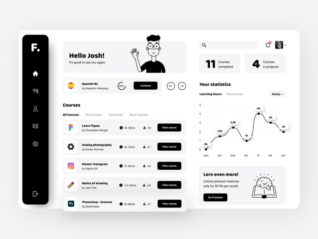
3. Progress Feedback
Learners thrive on knowing how far they’ve come—and how much remains. Visual feedback drives persistence.
- Progress bars should be visible at all times during a course
- Display percentage complete and time remaining
- Use badges, ranks, and certificates as extrinsic motivators
- Offer recap modules for learners to reflect on completed topics
Don’t just show progress—let learners feel their momentum.
4. Accessibility & Inclusion
Accessible design makes learning equitable and expands your reach.
- Ensure WCAG 2.1 compliance for screen readers, color contrast, and font legibility
- Use closed captions, subtitles, and audio descriptions in all media
- Offer flexible pacing and formats: text + audio + video combinations
- Avoid color-dependent interactions (e.g., “click the red button”)
Standards: W3C Accessibility for eLearning
Inclusive UX is not just legal—it’s ethical. Designing for everyone improves usability for all.
Designing for Motivation & Retention
Visual Design
Create a brand-aligned, calming aesthetic to reduce learner fatigue:
- Soft, neutral backgrounds with strong foreground contrast
- Use accent colors for CTAs, alerts, or interactive elements
- Leverage whitespace to prevent visual overload
Interactive Elements
Design learning as an active process:
- Embed quizzes and questions within lessons
- Use branching scenarios to simulate real-life decisions
- Include reward animations for completed modules
Gamification can be highly effective—but it must align with learning goals, not distract from them.
Social Learning UX
Learning in isolation reduces persistence. Add community-driven features:
- Live chatrooms or group discussions tied to each course module
- Peer assessment tools for collaborative learning
- Leaderboards based on course mastery, not just speed
Social presence improves accountability and gives learners a sense of belonging.
Mobile UX for eLearning
Learning on the go is now standard. Your platform must feel native on mobile.
- Responsive design should adjust content layout based on device orientation
- Large tap targets for buttons and quizzes
- Offline access to downloaded lessons with sync-on-reconnect
- Native device integrations: camera for AR learning, notifications for reminders
Example: Duolingo keeps mobile learners engaged with streaks, push notifications, and fun illustrations—all structured within microlearning UX patterns.
Common UX Mistakes in eLearning Platforms
Avoid these costly mistakes:
- Overcomplicated navigation trees or dashboards
- Lack of clear onboarding for new users or first-time courses
- Inconsistent page layouts between modules
- Ignoring mobile users with clunky or unreadable interfaces
A successful UX audit should evaluate:
- Completion rates per module
- User dwell time and scroll behavior
- Accessibility violations and learner drop-off points
External Reference: Baymard Institute – UX Guidelines for Education
Future Trends in eLearning UI/UX (2025+)
1. AI-Personalized Learning
Platforms now use behavioral data to:
- Adjust lesson difficulty dynamically
- Recommend modules based on past performance
- Alert instructors when learners disengage
2. Conversational Interfaces
- AI tutors provide instant answers, summaries, or translations
- Chatbot onboarding supports non-technical users
3. Immersive Learning Environments
- Use VR/AR for hands-on training (e.g., surgical simulation, industrial repair)
- Spatial UI design becomes more relevant for wearable learning apps
4. Emotion-Aware UX
- Systems detect learner frustration through camera/mic inputs (optional & privacy-compliant)
- Interface adapts tone, pace, or visual feedback accordingly
Read more: UI/UX Design Trends 2025
Final Thoughts
As digital learning continues to grow, the difference between an average platform and a great one lies in its user experience. A learner-centered design doesn’t just deliver content—it creates momentum, focus, and joy in learning.
At Viartisan, we help education platforms thrive by designing intuitive, inclusive, and motivating learning experiences that drive real outcomes.
📩 Let’s build your next eLearning product with purpose and precision.


