


3D UI/UX Design Guide 2025: How to Build Immersive, Intuitive, and Interactive Experiences
Sharing
Jakob Nielsen proposed 10 general principles for interaction design, called “heuristics” because they serve as guiding rules rather than specific usability standards.
Special Thanks:
- Kelley Gordon for designing the images and posters in this article.
- Kate Moran and Feifei Liu for updating the names, descriptions, and examples of these principles.
Table of Contents
- Visibility of System Status
- Match Between System and the Real World
- User Control and Freedom
- Consistency and Standards
- Error Prevention
- Recognition Rather Than Recall
- Flexibility and Efficiency of Use
- Aesthetic and Minimalist Design
- Help Users Recognize, Diagnose, and Recover from Errors
- Help and Documentation
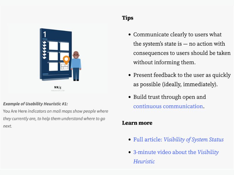
1: Visibility of System Status
The design should always keep users informed about the current state of the system by providing timely feedback.
Example: A “You Are Here” sign on a shopping mall map helps users determine their location and plan their next steps.
Design Tips:
- Clearly communicate system status; do not perform critical actions without notifying the user.
- Provide immediate feedback when changes occur in the system.
- Build trust by maintaining continuous and transparent communication.
Learn more: Visibility of System Status
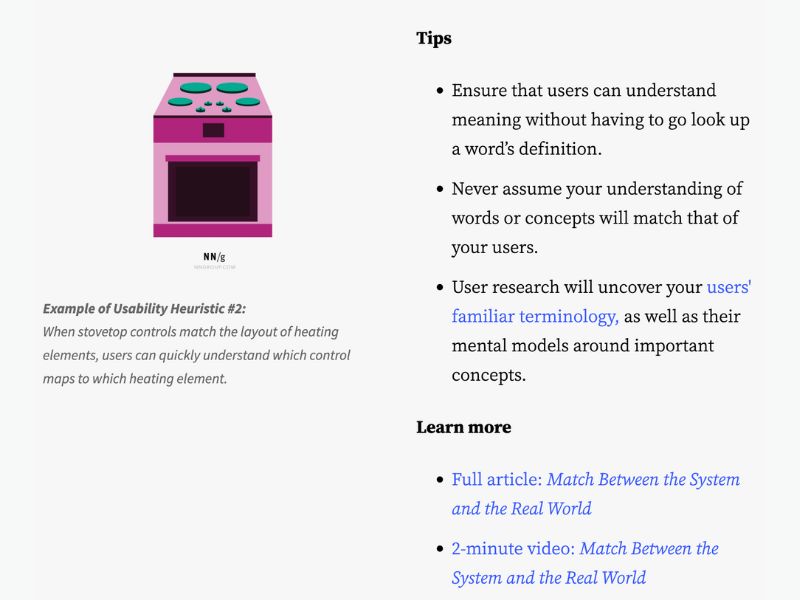
2: Match Between System and the Real World
The design should use language, symbols, and concepts familiar to users, rather than internal system terminology.
Example: A stovetop with a control panel layout that corresponds to the burner positions makes it easier for users to identify which control operates which burner.
Design Tips:
- Use words and symbols that are easy for users to understand.
- Avoid confusing industry jargon.
- Conduct user research to understand how they interpret and interact with the product.
Learn more: Match Between System and the Real World
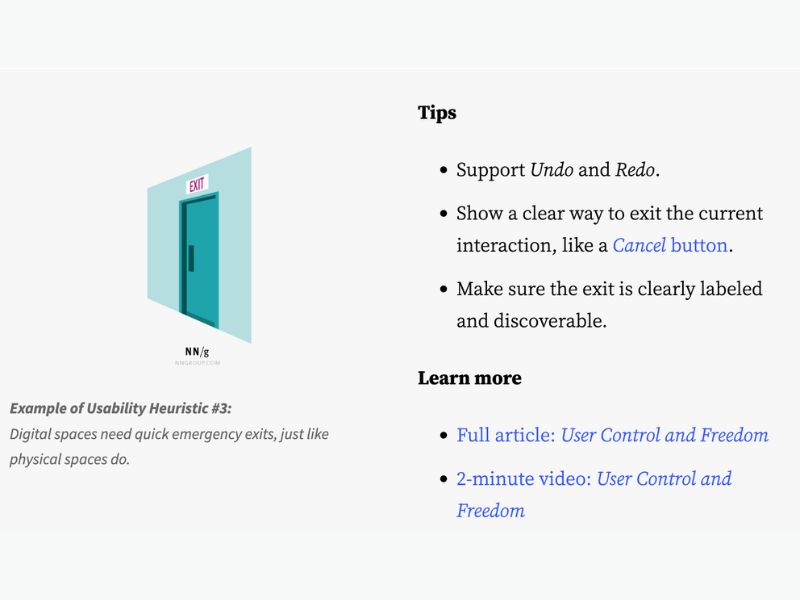
3: User Control and Freedom
Users should have options to undo actions or exit processes when they make mistakes or change their minds.
Example: An emergency exit sign with bright lighting helps users quickly find a way out in case of an emergency.
Design Tips:
- Support Undo and Redo functions.
- Provide a Cancel button to allow users to exit processes.
- Ensure exit options are visible and easily accessible.
Learn more: User Control and Freedom
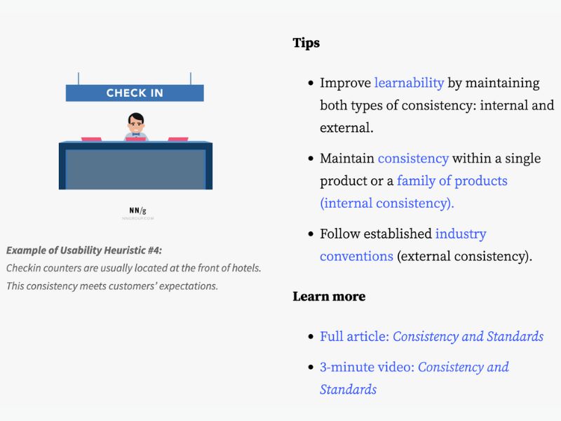
4: Consistency and Standards
Users should not have to guess the meaning of words, actions, or symbols. Follow platform and industry standards.
Example: Hotel reception desks are usually located near the entrance, making it easy for guests to recognize the check-in area.
Design Tips:
- Maintain internal consistency within the product or ecosystem.
- Follow industry standards to ensure familiarity for users.
Learn more: Consistency and Standards
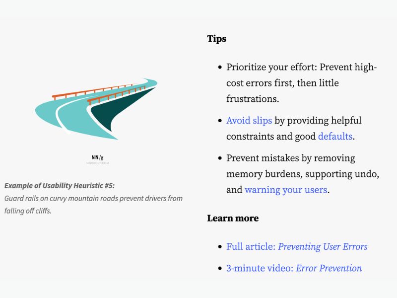
5: Error Prevention
Instead of just displaying error messages, design the system to prevent errors from occurring in the first place.
Example: Guardrails on mountain roads help prevent vehicles from veering off cliffs when drivers lose control.
Design Tips:
- Prioritize preventing severe errors first.
- Provide warnings before performing actions that could lead to errors.
- Support Undo functionality to minimize negative consequences.
Learn more: Error Prevention
6: Recognition Rather Than Recall
The interface should display necessary options and information so users don’t have to rely on memory.
Example: It’s easier to answer the question “Is Lisbon the capital of Portugal?” than to recall the capital of Portugal from memory.
Design Tips:
- Display essential information directly in the interface.
- Avoid requiring users to remember complex steps.
Learn more: Recognition Rather Than Recall

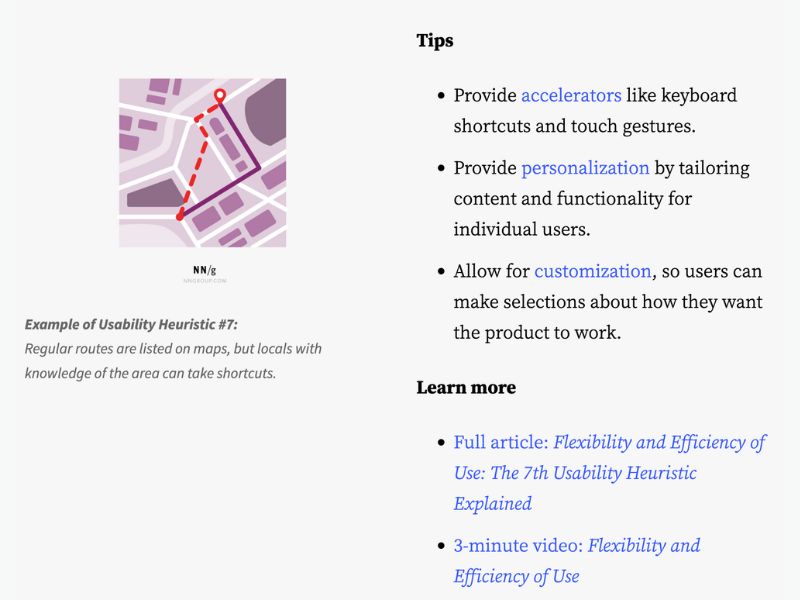
7: Flexibility and Efficiency of Use
The design should support both novice and experienced users by offering shortcuts and customization options.
Example: Locals often know shortcuts that allow them to travel faster than using the main roads.
Design Tips:
- Enable keyboard shortcuts and gesture controls to speed up interactions.
- Provide personalization options so users can customize the interface according to their needs.
Learn more: Flexibility and Efficiency of Use
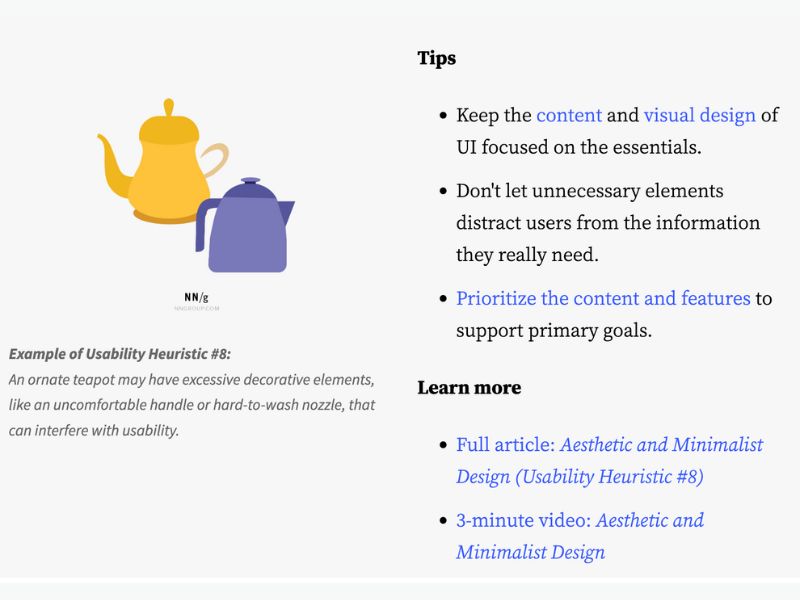
8: Aesthetic and Minimalist Design
Eliminate unnecessary elements to make the interface clear and easy to use.
Example: A teapot with an overly complex design may be difficult to use or clean.
Design Tips:
- Focus on the most important content and functions.
- Avoid distracting users with unnecessary elements.
Learn more: Aesthetic and Minimalist Design
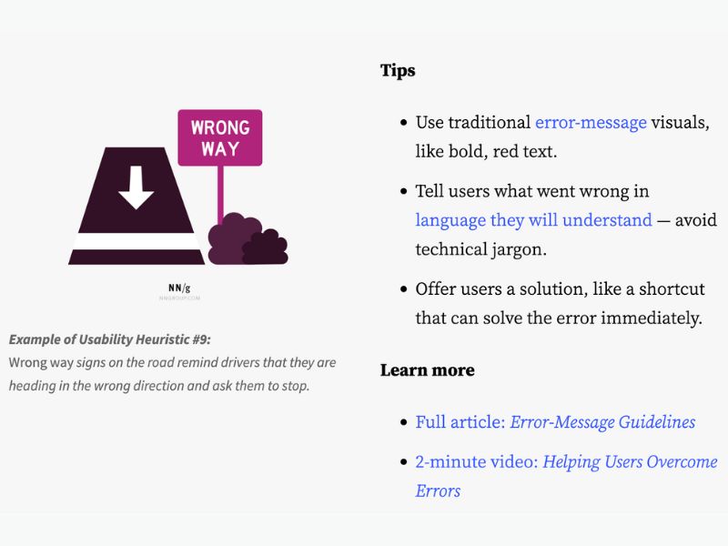
9: Help Users Recognize, Diagnose, and Recover from Errors
Error messages should be clear, easy to understand, and guide users on how to fix the issue.
Example: A “Wrong Way” sign helps drivers recognize they are going in the wrong direction and need to stop.
Design Tips:
- Use colors and icons that are easy to recognize.
- Explain errors in simple language without technical jargon.
Learn more: Helping Users Recover from Errors
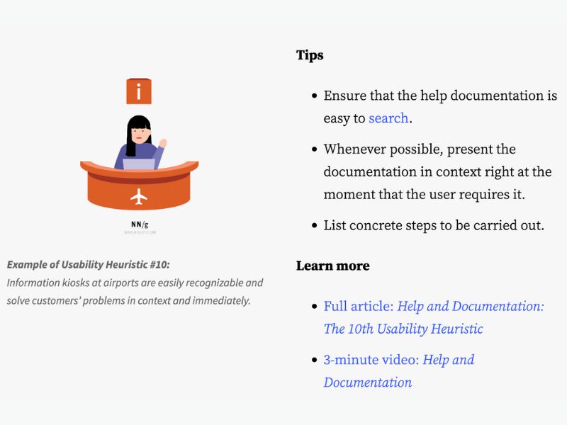
10: Help and Documentation
Even the best-designed systems require clear, accessible, and easy-to-understand help resources.
Example: Airport information kiosks allow passengers to quickly find necessary information.
Design Tips:
- Place help documentation within the relevant context.
- Keep instructions concise and break down steps clearly.
Learn more: Help and Documentation
This article has been edited from NNGroup in the Articles section by author Jakob Nielsen.


