Jakob Nielsen’s 10 Heuristic Principles for Interaction Design

Jakob Nielsen proposed 10 general principles for interaction design, called “heuristics” because they serve as guiding rules rather than specific usability standards.

Special Thanks:

  • Kelley Gordon for designing the images and posters in this article.
  • Kate Moran and Feifei Liu for updating the names, descriptions, and examples of these principles.

Table of Contents

  1. Visibility of System Status
  2. Match Between System and the Real World
  3. User Control and Freedom
  4. Consistency and Standards
  5. Error Prevention
  6. Recognition Rather Than Recall
  7. Flexibility and Efficiency of Use
  8. Aesthetic and Minimalist Design
  9. Help Users Recognize, Diagnose, and Recover from Errors
  10. Help and Documentation

1: Visibility of System Status

The design should always keep users informed about the current state of the system by providing timely feedback.

Example: A “You Are Here” sign on a shopping mall map helps users determine their location and plan their next steps.

Design Tips:

  • Clearly communicate system status; do not perform critical actions without notifying the user.
  • Provide immediate feedback when changes occur in the system.
  • Build trust by maintaining continuous and transparent communication.

Learn more: Visibility of System Status

10 Usability Heuristics for User Interface Design
Example of Usability Heuristic #1

2: Match Between System and the Real World

The design should use language, symbols, and concepts familiar to users, rather than internal system terminology.

Example: A stovetop with a control panel layout that corresponds to the burner positions makes it easier for users to identify which control operates which burner.

Design Tips:

  • Use words and symbols that are easy for users to understand.
  • Avoid confusing industry jargon.
  • Conduct user research to understand how they interpret and interact with the product.

Learn more: Match Between System and the Real World

10 Usability Heuristics for User Interface Design
Example of Usability Heuristic #2

3: User Control and Freedom

Users should have options to undo actions or exit processes when they make mistakes or change their minds.

Example: An emergency exit sign with bright lighting helps users quickly find a way out in case of an emergency.

Design Tips:

  • Support Undo and Redo functions.
  • Provide a Cancel button to allow users to exit processes.
  • Ensure exit options are visible and easily accessible.

Learn more: User Control and Freedom

10 Usability Heuristics for User Interface Design
Example of Usability Heuristic #3

4: Consistency and Standards

Users should not have to guess the meaning of words, actions, or symbols. Follow platform and industry standards.

Example: Hotel reception desks are usually located near the entrance, making it easy for guests to recognize the check-in area.

Design Tips:

  • Maintain internal consistency within the product or ecosystem.
  • Follow industry standards to ensure familiarity for users.

Learn more: Consistency and Standards

10 Usability Heuristics for User Interface Design
Example of Usability Heuristic #4

5: Error Prevention

Instead of just displaying error messages, design the system to prevent errors from occurring in the first place.

Example: Guardrails on mountain roads help prevent vehicles from veering off cliffs when drivers lose control.

Design Tips:

  • Prioritize preventing severe errors first.
  • Provide warnings before performing actions that could lead to errors.
  • Support Undo functionality to minimize negative consequences.

Learn more: Error Prevention

10 Usability Heuristics for User Interface Design
Example of Usability Heuristic #5

6: Recognition Rather Than Recall

The interface should display necessary options and information so users don’t have to rely on memory.

Example: It’s easier to answer the question “Is Lisbon the capital of Portugal?” than to recall the capital of Portugal from memory.

Design Tips:

  • Display essential information directly in the interface.
  • Avoid requiring users to remember complex steps.

Learn more: Recognition Rather Than Recall

10 Usability Heuristics for User Interface Design
Example of Usability Heuristic #6

7: Flexibility and Efficiency of Use

The design should support both novice and experienced users by offering shortcuts and customization options.

Example: Locals often know shortcuts that allow them to travel faster than using the main roads.

Design Tips:

  • Enable keyboard shortcuts and gesture controls to speed up interactions.
  • Provide personalization options so users can customize the interface according to their needs.

Learn more: Flexibility and Efficiency of Use

10 Usability Heuristics for User Interface Design
Example of Usability Heuristic #7

8: Aesthetic and Minimalist Design

Eliminate unnecessary elements to make the interface clear and easy to use.

Example: A teapot with an overly complex design may be difficult to use or clean.

Design Tips:

  • Focus on the most important content and functions.
  • Avoid distracting users with unnecessary elements.

Learn more: Aesthetic and Minimalist Design

10 Usability Heuristics for User Interface Design
Example of Usability Heuristic #8

9: Help Users Recognize, Diagnose, and Recover from Errors

Error messages should be clear, easy to understand, and guide users on how to fix the issue.

Example: A “Wrong Way” sign helps drivers recognize they are going in the wrong direction and need to stop.

Design Tips:

  • Use colors and icons that are easy to recognize.
  • Explain errors in simple language without technical jargon.

Learn more: Helping Users Recover from Errors

10 Usability Heuristics for User Interface Design
Example of Usability Heuristic #9

10: Help and Documentation

Even the best-designed systems require clear, accessible, and easy-to-understand help resources.

Example: Airport information kiosks allow passengers to quickly find necessary information.

Design Tips:

  • Place help documentation within the relevant context.
  • Keep instructions concise and break down steps clearly.

Learn more: Help and Documentation

10 Usability Heuristics for User Interface Design
Example of Usability Heuristic #10

This article has been edited from NNGroup in the Articles section by author Jakob Nielsen.

How to Build Confidence in Your UX Work

Vitaly Friedman begins by emphasizing that when embarking on any UX project, there is often little confidence in achieving successful outcomes—especially among teams that have experienced empty promises and poor execution in the past. He asserts that good UX has a significant impact on business success, but to build confidence in future UX projects, it is essential to identify major bottlenecks and uncover potential shortcomings that may affect the stakeholders involved.

UX Does Not Cause Disruptions; It Solves Problems

Friedman explains that bottlenecks are often the most disruptive elements within any organization. Every team, unit, or department may have a bottleneck, which is often well known among employees but rarely reaches senior management due to their detachment from daily operations. These bottlenecks could be a single senior developer in the team, outdated legacy tools, or a confusing workflow riddled with frequent errors. Such obstacles often lead to long wait times, project delays, and inefficient workarounds.

Before undertaking any UX work, Friedman advises identifying the factors slowing down the organization and proving that UX is not a disruption but rather a solution to internal inefficiencies. Once value has been demonstrated—no matter how small—stakeholders will quickly become interested in seeing more of what UX can offer.

Work Is Never Just “Work”

Friedman highlights that meetings, reviews, testing, presentations, deployments, support, updates, and bug fixes—all of these unplanned tasks—can interfere with planned work. Uncovering the root causes of these unplanned tasks and identifying critical bottlenecks that slow down progress is not only the first step in improving existing workflows but also a strong foundation for demonstrating UX’s value.

The Theory of Constraints

Friedman references Dr. Eliyahu M. Goldratt’s Theory of Constraints, which states that any improvements made outside of a bottleneck are merely illusions. Improvements made after a bottleneck are futile because they will always be waiting for work to come through the constraint, while improvements made before the bottleneck only result in more work accumulating at the bottleneck itself.

Avoid Operating at 100% Capacity

The goal is to maximize workflow efficiency by optimizing the bottleneck while allowing non-bottleneck areas to have idle time to enhance overall system performance. Friedman stresses that efforts to maximize resource utilization—i.e., running all departments at 100% capacity—can be counterproductive. As Goldratt notes, “An hour lost at the bottleneck is an hour lost for the entire system. An hour saved at a non-bottleneck is worthless.”

Recommended Reading: The Phoenix Project

Friedman recommends The Phoenix Project by Gene Kim, Kevin Behr, and George Spafford—a remarkable novel about the challenges of delivering projects. While not specifically about design, he describes it as an excellent book for designers looking to become more strategic in their work. It provides a compelling and realistic perspective on the complexities of project delivery, albeit from a more technical standpoint.

Conclusion

Friedman concludes that people generally dislike abrupt changes and uncertainty, and UX work often disrupts their usual way of doing things, leading to resistance by default. Therefore, before introducing major changes, gaining buy-in for UX initiatives requires building trust and demonstrating the tangible benefits of UX in their daily workflows. To achieve this, UX professionals must work alongside stakeholders, listen to their pain points, and identify key bottlenecks to propose steps that enhance the existing workflow. This approach lays the foundation for earning trust and proving that UX is not a disruption but a solution to existing challenges.

This article is adapted from a LinkedIn post by Vitaly Friedman.


Poor UX Claims Young Jenny’s Life: When Interface Design Turns Deadly

A heartbreaking tale underscores the callousness and dire consequences of poor user experience (UX) design within the medical industry.

Jonathan Shariat, a UX designer, has shared the tragic story of Jenny, a young cancer patient, who died due to negligence stemming from convoluted medical software. This account serves not only as a stark reminder of UX’s critical role in “less glamorous” sectors like healthcare but also as an urgent call to action.

Tragedy Born from Tangled Code

Jenny, a brave girl who battled cancer for four years, was readmitted for chemotherapy. The medication she required was so toxic that it necessitated continuous hydration for three days before and after its administration. However, tragedy struck when three experienced nurses, struggling with a complex medical record software, overlooked this crucial hydration step.

The outcome was devastating. The following morning, Jenny succumbed to toxicity and dehydration. For two shifts, the young girl was deprived of necessary fluids, all because skilled nurses were ensnared in a software labyrinth.

Screenshot of patient management interface from the hospital

“Disastrous” Interfaces in Hospitals

Shariat shared images of medical software interfaces his wife, a nursing student, encounters daily. These interfaces are bewildering, confusing, and rife with potential for error. “I can’t imagine how much worse these interfaces were in the past,” he wrote.

Interfaces used daily in hospitals for patient care

When UX Fails, the Repercussions Extend Beyond Product Failure

In most scenarios, a UX designer’s misstep results in a failed product. But in critical sectors like healthcare and aviation, design flaws can lead to severe, even fatal, consequences.

“I feel anger and grief when I look at these interfaces,” Shariat expressed. He also referenced other distressing incidents, such as an Ebola patient mistakenly sent home and a pilot’s incorrect flight path input causing a plane crash.

Don’t Dismiss Terrible UX

Shariat urges UX designers to focus more on “less glamorous” areas like healthcare, government, and nonprofits. “Seek opportunities in places where our skills are needed. We may not design chat apps for teens, but we can save their lives.”

He also encourages people to voice concerns about interface design flaws, from government websites to medical software. “Send emails, make calls. Don’t be silent about poor UX,” he stated.

Join the Movement for Change

Jenny’s story is a wake-up call about the importance of UX in all fields, especially healthcare. It’s time to act to ensure such tragedies are prevented.

Shariat co-authored a book with Cynthia Savard Saucier titled “Tragic Design,” with a foreword by John Maeda, exploring how flawed design can harm users.

What are your thoughts on this story? Share your perspectives in the comments below.


The article is rewritten from Medium by Jonathan Shariat in Tragic Design.

MEDICAL UX: WHEN USER EXPERIENCE HURTS, EVEN KILLS

Hard Lessons Learned:

  • In the realm of healthcare, poor user experience (UX) can have devastating consequences, leading to severe medical errors and even fatalities. This often stems from technology ill-suited to user needs, causing usability issues, treatment delays, misinformation, and inaccurate procedures.
  • The healthcare industry’s sluggish adoption of new technologies results in outdated systems that are difficult to navigate and comprehend. This issue is further compounded by the high costs of specialized medical software, potentially trapping healthcare organizations with poorly designed systems for extended periods.
  • There are real-world examples of poor UX leading to tragic outcomes, such as patients being sent to the wrong operating room due to poorly designed patient ID wristbands, or a child dying because nurses couldn’t accurately interpret information from complex charting software. These incidents underscore the urgent need for UX improvement in healthcare.

What is Poor UX?

It’s when technology fails to align with user needs. The sad truth is that healthcare is a field often plagued by such poor UX.

Healthcare UX issues impact our lives more profoundly and personally than most other sectors.

Specialized medical software tends to be a niche, often conservative and slow-moving field. Generally, when a healthcare organization purchases an EHR (Electronic Health Record) system—and these systems often cost millions of dollars—if that system ships with little regard for usability, they’re stuck with the poor UX for the system’s lifespan. There’s no easy escape.

But that’s the crux of the matter. Healthcare is a field where poor usability isn’t just an inconvenience—it can lead to serious medical errors and tragic outcomes.

When was the last time you visited a hospital, and did you notice the technology they were using? It certainly varies by region, but chances are it was older and less capable than the systems you use at home.

Every year, we see remarkable technological advancements, but these often take a long time to permeate the healthcare system. They seem to be stuck.

When Poor UX Hurts

Besides being stuck with outdated technology, systems with poor UX can cause harm. This is precisely what happened to Toi Valentine, the daughter of an emergency room physician and a nurse, whose parents wanted her to follow their medical path but who ultimately defied family expectations, moving to New York City to become an interior designer.

During summers, Toi often worked at a ski resort in Oregon. One summer, Toi unfortunately had a skiing accident where she landed on her back on the edge of a ski track, leading her to the local hospital.

Poor UX feelings became apparent as Toi entered the chaotic emergency room. Toi gradually concluded that the people there didn’t know their roles or how to interact with her as a patient. She eventually ended up in the operating room for surgery instead of going to the X-ray department for basic X-rays.

Toi realized that such mistakes weren’t human errors, but design errors.

For instance, it was the poor design of the patient ID wristband that led to Toi being taken to the wrong operating room. Poor spatial design and planning also caused treatment delays as staff ran back and forth to fetch supplies.

This story led Toi to a new career as a UX designer. She realized that design isn’t just about making things look pretty but also about understanding user needs and behaviors.

It’s clear that the broken UX that failed Toi was entirely unnecessary.

When Poor UX Takes Lives

Jonathan Shariat’s wife, a nursing student, shared Jonathan’s passion for technology in healthcare. However, her teacher had a contrary opinion and shared her story.

The patient’s real name wasn’t mentioned but was named Jenny for the sake of the story.

Jenny, a young girl, had been treated for cancer for the past four years and had been discharged. Unfortunately, she relapsed and needed very strong chemotherapy.

After the medication was administered, three nurses went to the charting software, where they entered the necessary data and issued the appropriate orders.

Those nurses, each with over 10 years of experience, simply overlooked a critical piece of information. Jenny was supposed to receive intravenous hydration for 3 days. Unfortunately, the nurses struggled to understand and respond to the software interface.

Jenny died of toxicity and dehydration. She missed hydration for two shifts. Why? Because the nurses couldn’t interpret the information provided by the system.

Examples

So, what do these user interfaces look like? The first screenshot below shows a system similar to the one Jonathan’s wife uses daily. The other two interfaces are typical of those used daily by hospital staff.

Conclusion

We all encounter poor UX in our daily journeys, but when this impacts our health and well-being—as in the cases above—the issue must be taken more seriously.

It’s hard to read the two stories above without feeling emotional. I also suspect that there are many similar untold bad UX stories that we never hear.

What solutions or steps do you think need to be taken regarding this issue? Have you or someone you know been affected by poor UX? Share your story with us.

Frequently Asked Questions (FAQ) about Bad UX in Healthcare

  • What are common examples of bad UX in healthcare?
  • How does bad UX affect patient care?
  • What are the key principles of good UX design in healthcare?
  • How can healthcare providers improve their UX design?
  • What are the benefits of good UX design in healthcare?
  • What are the challenges of implementing good UX design in healthcare?
  • How does bad UX design affect healthcare professionals?
  • Can bad UX design lead to medical errors?
  • How can UX design contribute to digital health innovation?
  • What is the role of a UX designer in healthcare?

By Abder-Rahman Ali

Physician and author focused on leveraging machine/deep learning and image processing in medical image analysis.


The article is rewritten from SitePoint.

58 “Elegant Formula” Secrets for Top-Notch User Interface Design

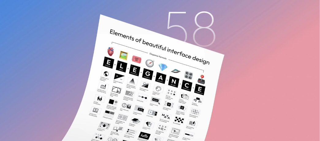
In today’s fiercely competitive digital world, the user interface (UI) is not just the “face” of an application, but a crucial bridge between businesses and customers. An eye-catching and intuitive UI can transform one-time users into loyal customers. Recognizing this, design expert Taras Bakusevych has compiled 58 golden rules, divided into 8 categories, creating an “Elegant Formula” to help designers craft impressive and effective interfaces.

58 "Elegant Formula" Secrets for Top-Notch User Interface Design

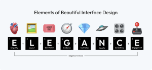
🫀 Empathy: Beauty is subjective; only by truly understanding your target audience can you create a design that resonates with them. 

🖼️ Layout: The layout is the canvas of your interface; it guides the user’s eye effortlessly, creating a seamless flow that visually connects each element.

🎟 Essentialism: Embrace simplicity; every element in your design must serve a purpose, as clutter can obscure the message and hinder the user experience. 

🧭 Guidance: Design not only pleases the eye but also guides the user, providing clear paths and cues for what to do next.

💎 Aesthetics: Aesthetics go beyond mere appearance; they encompass the feel of the design, creating an environment that emotionally resonates with users.

 🛸 Novelty: Innovative designs capture attention, but the true art lies in balancing novelty with familiarity, ensuring users feel both intrigued and comfortable. 

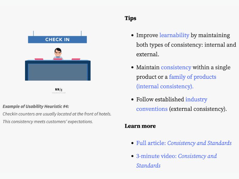
🎛 Consistency: Consistency in design breeds familiarity; it ensures users feel at ease across different parts of your interface, building trust and ease of use. 

🕹 Engagement: An engaging design is like a good conversation; it keeps users interested, responds to their actions, and encourages them to return for more.

Cultural and Social Influences Play a Key Role in Shaping Preferences and Perceptions

  • Consider Cultural and Social Influences: Account for the diverse cultural and social backgrounds of your audience to ensure your design resonates widely and respectfully.
  • Understand Industry and Usage Contexts: Tailor your design to fit specific industry standards and the real-world contexts where your interface will be used.
  • Embrace User Demographics: Embrace the diversity of user demographics, incorporating insights into age, gender, occupation, and other factors to create more relevant and effective interfaces.
  • Adapt to Audience’s Tech Savviness: Customize your interface to match the specific tech savviness of your target audience.

58 "Elegant Formula" Secrets for Top-Notch User Interface Design

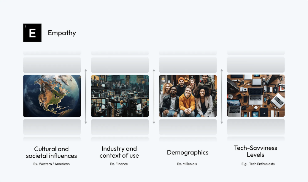
Research by the Nielsen Norman Group on various demographic groups—highlighting the unique online behaviors and expectations of younger people, the developing digital literacy and specific usage needs of older adults, and the distinct and diverse design requirements for children—emphasizes the critical importance of empathetic and user-centered design in UI development to effectively serve each group’s individual characteristics and preferences.

A Well-Planned Layout Is Not Just Arranging Elements on a Screen; It’s Creating a Visual Symphony That Guides, Pleases, and Engages Users

  • Embrace Negative Space: Use negative space wisely to create a clean, uncluttered interface, highlighting the most important elements and improving readability.
  • Employ the Golden Ratio or Rule of Thirds: Incorporate the golden ratio or rule of thirds into your design to achieve natural balance and aesthetic proportions.
  • Establish a Clear Hierarchy with Size, Color, and Spacing: Use variations in size, color, and spacing to create a visual hierarchy that guides the user’s eye to the most important information first.
  • Utilize a Grid System: Implement a grid system to provide structure and consistency to your layout, ensuring elements are arranged cohesively and harmoniously.

58 "Elegant Formula" Secrets for Top-Notch User Interface Design

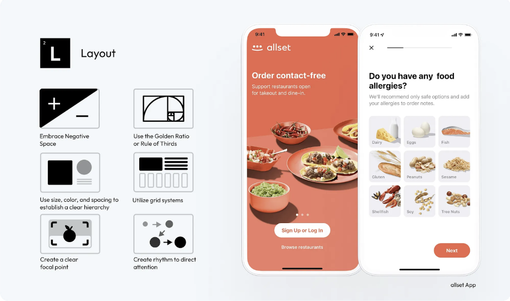
The Allset app’s welcome screen skillfully uses a Z-layout to create rhythm and direct user attention to the ‘Sign Up’ or ‘Log In’ buttons. By using a grid system and ample negative space, the design presents multiple options clearly and without overwhelming, effectively balancing information display with visual comfort. 

  • Create a Clear Focal Point: Designate a clear focal point in your layout to capture immediate attention and direct user interaction with your content.
  • Create Rhythm to Direct Attention: Use rhythmic design elements, such as repeating patterns or structured layouts, to create a visual flow that intuitively guides user attention through the interface.

Additionally, consider using F- and Z-layouts to align with natural user scanning habits. Use F-layouts in text-heavy interfaces, strategically placing important information at the top and left.

Simplicity Is the Ultimate Sophistication

It’s about eliminating unnecessary elements and focusing on what truly matters to the user.

  • Achieve Simplicity Through Purposeful Reduction: Prioritize content and functionality, eliminating anything unnecessary. Focus on core functions to create a more streamlined and user-friendly interface.
  • Organization Makes Many Things Look Like Few: Use clear categorization and element grouping. Implement drop-down menus or tabs to organize content, making the interface less cluttered and easier to navigate.
  • Don’t Make Users Think: Ensure navigation and task flows are logical and predictable. Use common UI elements and place them where users expect, reducing cognitive load.
  • Good Design Is As Little Design As Possible: Adopt a minimalist approach, using only the elements necessary for functionality. Avoid excessive use of colors, fonts, and graphics to maintain a clean and focused interface.

58 "Elegant Formula" Secrets for Top-Notch User Interface Design

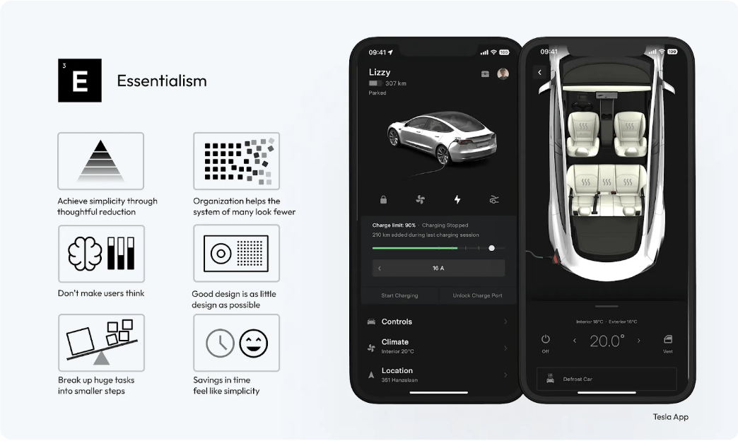
The Tesla app is clearly designed with a focus on minimalism and timeless aesthetics. This is achieved mainly through the reduction of components and labels. The interface avoids intrusive styles and instead uses a digital image of the car itself as the main visual element.

  • Break Down Large Tasks Into Smaller Steps: Design complex processes, like forms or multi-step tasks, into smaller segments. Use progress bars or breadcrumbs to visually indicate user progress and what remains.  
  • Saving Time Creates a Sense of Simplicity: Optimize loading times and streamline processes to make interactions faster. Use smart defaults, autocomplete, and predictive text to speed up user input and decision-making.

You can find more suggestions in How to Simplify Your Design.

It’s Not Just About Guiding Users From Point A to Point B; It’s About Creating a Journey That Feels Natural, Effortless, and Engaging

The art of UI design involves guiding users through digital spaces intuitively and effortlessly.

  • Create an Engaging User Onboarding Process: Start by designing an engaging onboarding process to educate users about your product from their first interaction. Effective onboarding sets the stage for the user’s entire experience with your interface.
  • Ensure Intuitive Flow: Develop your interface with a logical, step-by-step flow that feels natural and requires minimal user effort to navigate, enhancing their overall experience.
  • Provide Contextual Hints and Tips: Implement contextual support such as tooltips, pop-ups, or inline instructions that appear when users need them, assisting them in understanding and using the interface.

58 "Elegant Formula" Secrets for Top-Notch User Interface Design

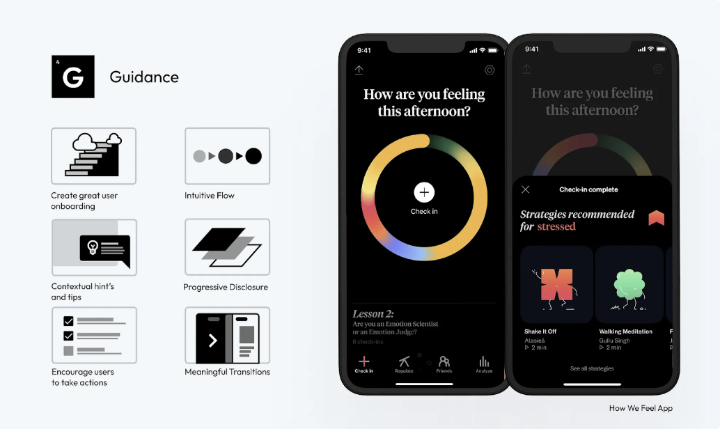
The ‘How We Feel’ app’s engaging onboarding process allows users to immediately grasp the product’s value. Useful tips and guided suggestions are tailored based on the user’s current emotion, fostering a sense of control and intuitiveness in the user experience.

  • Implement Gradual Information Disclosure: Strategically disclose information to users, showing only what is necessary at each step. This approach helps maintain a clean interface and focuses user attention on immediate tasks.
  • Design to Encourage User Action: Use clear design elements like buttons, icons, and calls to action to guide users to desired interactions, ensuring these elements are prominent and easily accessible.
  • Provide Feedback for User Actions: Create a system that provides immediate visual or audio feedback for user actions, acknowledging their interactions and guiding them to the next step in the interface.

Masterfully Applied Typography Sets You Apart, Enhancing Readability and Aesthetics

  • Establish a Typography Hierarchy: Create a clear hierarchy using different font sizes, weights, and styles to direct user attention to the most important content first.
  • Prioritize Readability: Choose fonts that are easy to read across various devices and screen sizes. Readability should be a top priority, especially for body text.
  • Reflect Brand Mood: Select fonts that align with your brand personality. Whether it’s professionalism, playfulness, or elegance, the typography should reinforce the brand’s tone.

58 "Elegant Formula" Secrets for Top-Notch User Interface Design

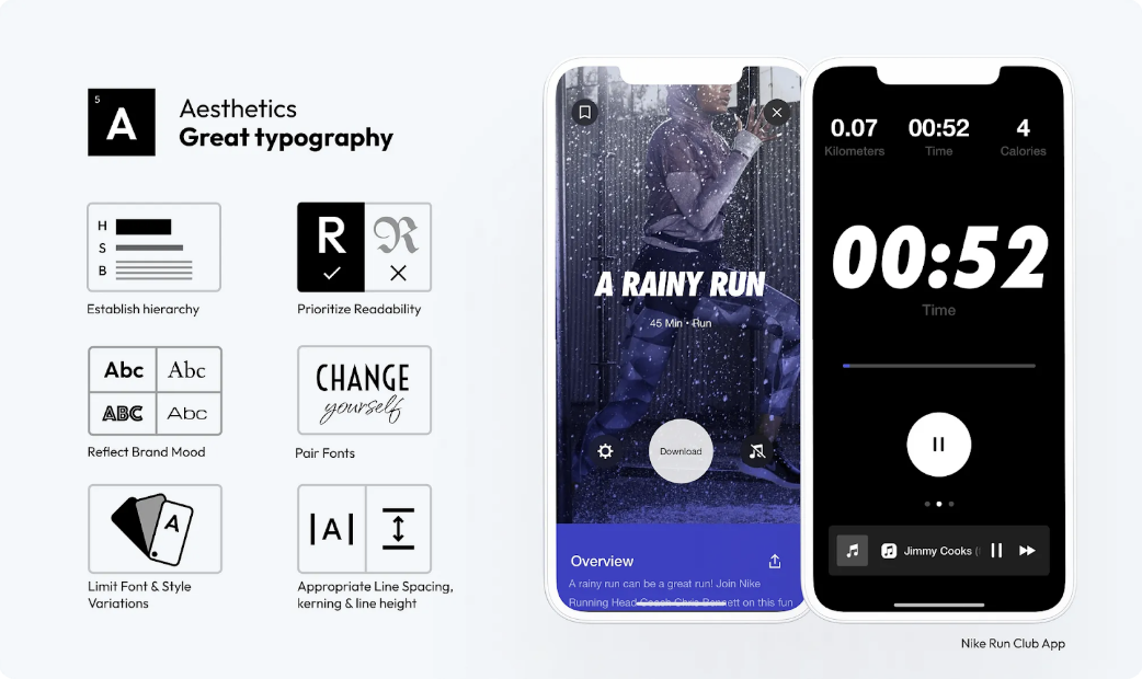
The Nike Run Club app skillfully uses bold, italic typography as its main focus, evoking a sense of movement and uniqueness without overwhelming, thanks to its sparing use combined with neutral content fonts.

  • Combine Fonts Wisely: When combining multiple fonts, ensure they complement each other.
  • Limit Font Variations and Styles: Too many font types or styles can create a cluttered and confusing interface. Use a limited set to maintain a clean and cohesive look.
  • Adjust Line Spacing, Letter Spacing, and Line Height: Appropriate spacing between letters (kerning), words, and lines improves readability and text flow. Experiment with different settings to find the most visually appealing and readable format.

The Right Color Choices Can Make a Significant Difference in How Users Perceive and Interact with a Product

  • Contrast Is Key: Ensure sufficient contrast between text and background to enhance readability and accessibility.
  • Create and Use a Consistent Color Palette: Develop a consistent color palette that reflects your brand identity and use it consistently across your interface to maintain visual cohesion. 
  • Use the 60–30–10 Rule for Color Balance: 60% dominant color, 30% secondary color, and 10% accent color, to create a visually harmonious interface.

58 "Elegant Formula" Secrets for Top-Notch User Interface Design

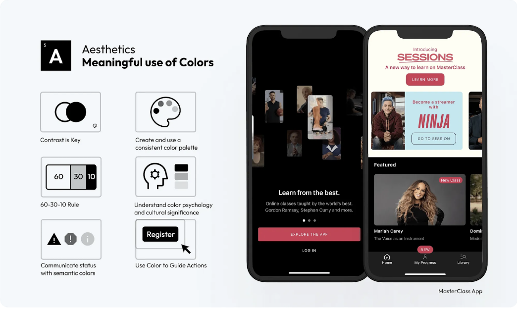
The MasterClass app is a prime example of applying the 60–30–10 rule in design, showcasing how this principle can be effectively used to enhance both aesthetics and functionality in a user interface.

  • Understand Color Psychology and Cultural Meanings: Consider how different colors evoke different emotions and meanings in various cultures. Tailoring your color choices to suit your audience can enhance user experience and avoid cultural missteps.
  • Communicate Status with Semantic Colors: Use colors to visually convey status, such as red for errors or green for success, to help users quickly understand system feedback.
  • Use Color to Guide Action: Use color strategically to highlight key actions, such as buttons or links, directing user attention to important interactions.

Effective Visual Content in UI Design Enhances User Engagement and Emotional Connection

  • Prioritize Content Over Excessive UI Styling: Focus on delivering content through visuals without overwhelming users with too much UI decoration. Let the visuals speak for themselves.
  • Purposeful Imagery and Illustrations: Use imagery and illustrations that add meaning to your content. Avoid generic stock photos; opt for custom or carefully selected visuals that reflect brand identity and message.  
  • Keep Text Short and Understandable: Supplement visuals with clear and concise text. Avoid lengthy paragraphs and opt for bullet points or short descriptions to enhance the visual message.

58 "Elegant Formula" Secrets for Top-Notch User Interface Design

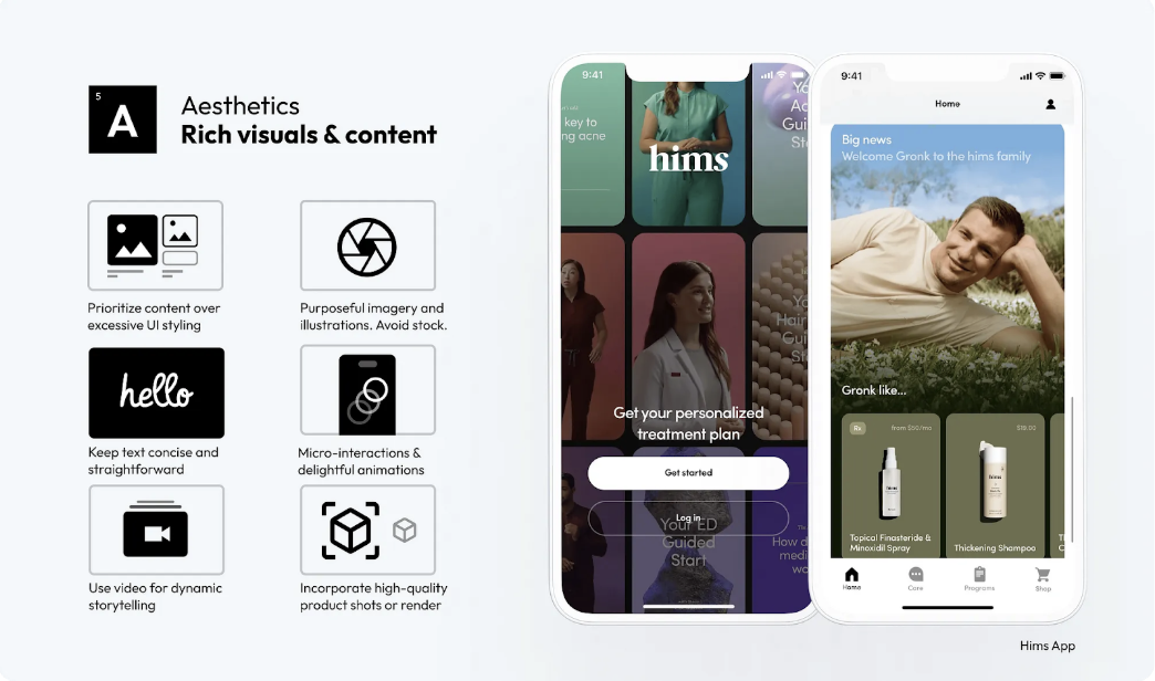
The Hims app stands out with its content-first approach, minimizing reliance on complex UI styling. It uses high-quality visuals, including carefully curated photos and short videos, that align with the app’s mood and style, contributing to a cohesive and user-friendly interface.

  • Engaging Microinteractions & Animations: Incorporate subtle animations and micro-interactions that enhance user engagement without detracting from the main content.
  • Use Video for Dynamic Storytelling: Implement video content to tell stories or explain complex concepts vividly. Video can be particularly effective in conveying messages that are difficult to express through static images.
  • Incorporate High-Quality Product Photos or Renders: For e-commerce and product-based interfaces, use high-quality product photos or 3D renders. Detailed and engaging product visuals can significantly increase user interest and sales.

Creative or Unique Interfaces Create Memorable Experiences, Leading to Higher User Satisfaction

  • Strive for Uniqueness and Differentiation: Create UI designs that stand out with original concepts and unique elements, distinguishing your product in a crowded market.
  • Leverage the Latest Technology: Stay updated on emerging technologies and consider how they can be incorporated into your design to deliver cutting-edge experiences.
  • Be Cutting-Edge, Yet Acceptable: Push the boundaries of innovation, but ensure your designs remain user-friendly and accessible to your target audience.

58 "Elegant Formula" Secrets for Top-Notch User Interface Design

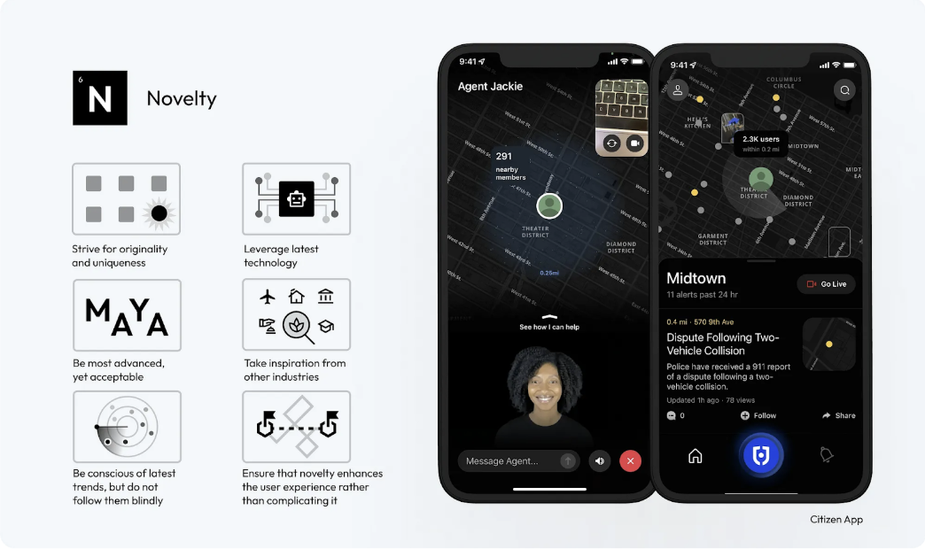
Citizen’s personal safety network empowers users to protect themselves and their communities. The integration of the personal agent concept is both innovative and user-friendly, offering a novel yet sensible enhancement to the experience.

  • Draw Inspiration From Other Industries: Look beyond UI design for inspiration, drawing creative ideas from art, architecture, nature, and more.
  • Be Aware of the Latest Trends, But Don’t Follow Them Blindly: Stay updated with current design trends, but use them judiciously to ensure your designs maintain their unique identity.
  • Ensure Novelty Enhances User Experience Rather Than Complicating It: Novelty should always serve a purpose, enhancing the overall user experience without adding unnecessary complexity.

Consistency Creates a Sense of Familiarity and Helps Build Trust and Confidence

  • Develop a Comprehensive Design System: A design system acts as a single source of truth for all design elements, ensuring uniformity across all aspects of the UI.
  • Limit Design Patterns: Using a consistent set of design patterns simplifies user interaction models, making the interface more predictable and user-friendly.
  • Ensure Predictability in Element Behavior: Interface elements should function consistently throughout the application, so users know what to expect from their interactions.

58 "Elegant Formula" Secrets for Top-Notch User Interface Design

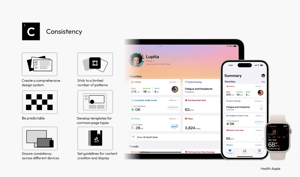
The Apple Health app is a model of consistent user experience across multiple devices. Its vast library of components and patterns ensures that new features and updates can be integrated seamlessly, maintaining ease of use and uniformity.

  • Use Standardized Templates: For common page types, standardized templates provide a consistent structure, aiding user navigation and content comprehension.
  • Maintain Consistency Across Devices: Consistent UI across different devices and platforms enhances user experience, making the interface more approachable and accessible.
  • ​​Standardize Content Guidelines: Consistent tone, style, and formatting in content presentation maintain a cohesive narrative across the interface.

Creating a More Engaging User Experience Makes It Entertaining

  • Introduce Gamification Elements: Incorporate game mechanics like points, badges, and leaderboards to motivate users and encourage interaction.
  • Personalization and Customization: Give users the ability to customize their experience. Personalization can increase the relevance of the interface to each user, enhancing engagement.
  • Use Storytelling Techniques: Embed narrative elements into the UI to create a more engaging and memorable user experience. Storytelling can guide users through the interface in a compelling way.

58 "Elegant Formula" Secrets for Top-Notch User Interface Design

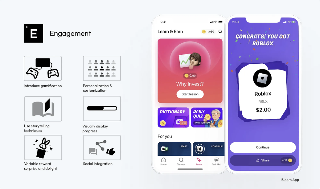
The Bloom app effectively combines gamification and educational components to keep investors engaged and make informed investment decisions. An example of this is the provision of random gift stocks, a form of variable reward, which creates a sense of excitement and surprise for users.

  • Visually Display Progress: Use visual indicators like progress bars to show users their achievements and progress. This can increase motivation and a sense of accomplishment.
  • Incorporate Variable Reward Mechanisms: Implement elements of surprise and excitement, such as unexpected rewards or bonuses, to keep users engaged and curious.
  • Integrate Social Features: Include social integration features like sharing achievements or competing with friends to foster a sense of community and encourage ongoing interaction.  

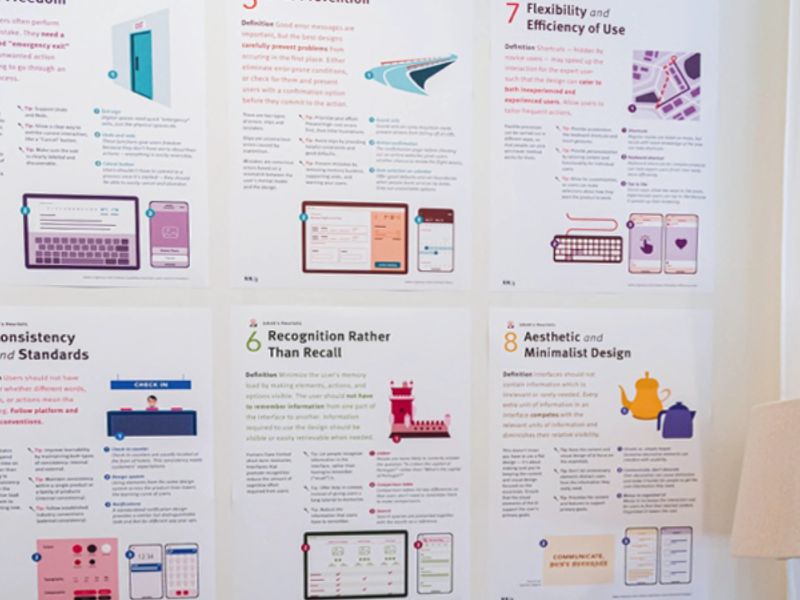
Thank you for reading! If you found these insights helpful, don’t miss my “58 Rules for Stunning and Effective User Interface Design” poster. It’s a practical checklist you can use to enhance your design skills. You can find it here. https://www.figma.com/community/file/1326467076529354215/poster-58-rules-for-stunning-and-effective-user-interface-design


The article is rewritten from Medium by Taras Bakusevych in UX Collective.