What Does a Branding Designer Do? How They Build Iconic Brands

Behind every memorable brand is a skilled branding designer. They’re the creative minds who translate vision into visuals, ensuring that what your business stands for is instantly recognizable. But what exactly does a branding designer do—and why are they essential to modern businesses?

What Is a Branding Designer?

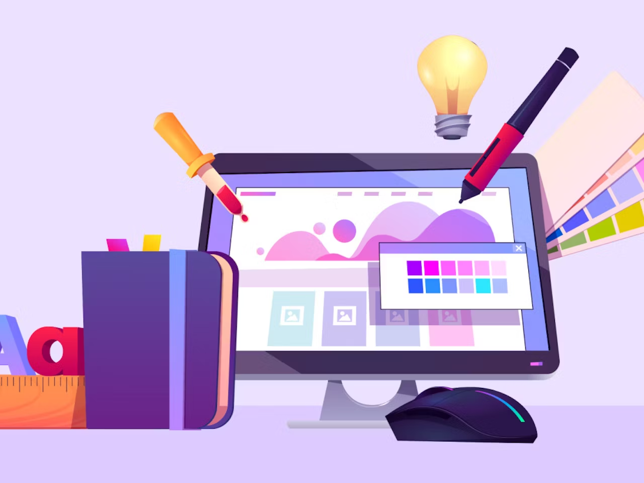
A branding designer is a creative professional who specializes in crafting a brand’s visual identity. This includes everything from the logo and color palette to typography, iconography, packaging, and design systems.

Unlike a general graphic designer, a branding designer takes a more strategic approach—aligning visuals with the brand’s purpose, values, and target audience. At Viartisan, our branding designers work hand-in-hand with strategists and developers to deliver cohesive, scalable brand experiences.

Core Responsibilities of a Branding Designer

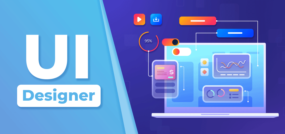
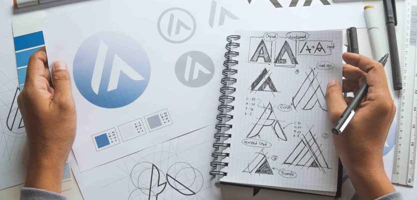
1. Logo Design and Visual Identity

One of the primary tasks of a branding designer is to create a logo that captures the brand’s essence. But it doesn’t stop there. They build a complete visual identity system, including fonts, colors, layout principles, and image style.

Check out Adobe’s guide to logo design for key principles we follow.

2. Brand Guidelines Development

A branding designer documents how the brand should be used. This brand book (or style guide) ensures consistency across platforms, teams, and campaigns.

3. Creative Strategy and Storytelling

Branding isn’t just design—it’s also about emotional connection. Designers help shape how a brand communicates its story visually. From moodboards to brand narratives, every element serves a strategic goal.

4. Packaging and Print Design

For product-based businesses, branding designers often work on labels, boxes, and merchandise—ensuring the brand experience is consistent on every shelf and unboxing video.

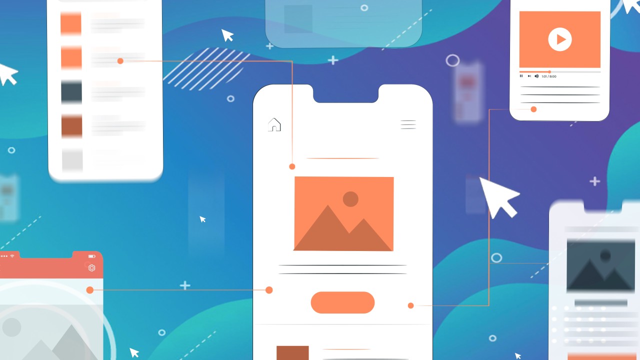
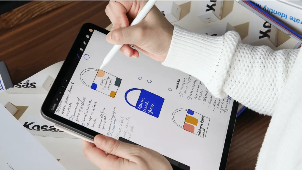
5. Digital Branding Assets

From website graphics to social media templates, email signatures, and app icons—a branding designer makes sure the brand remains cohesive across all digital touchpoints.

6. Collaboration with Developers and Marketers

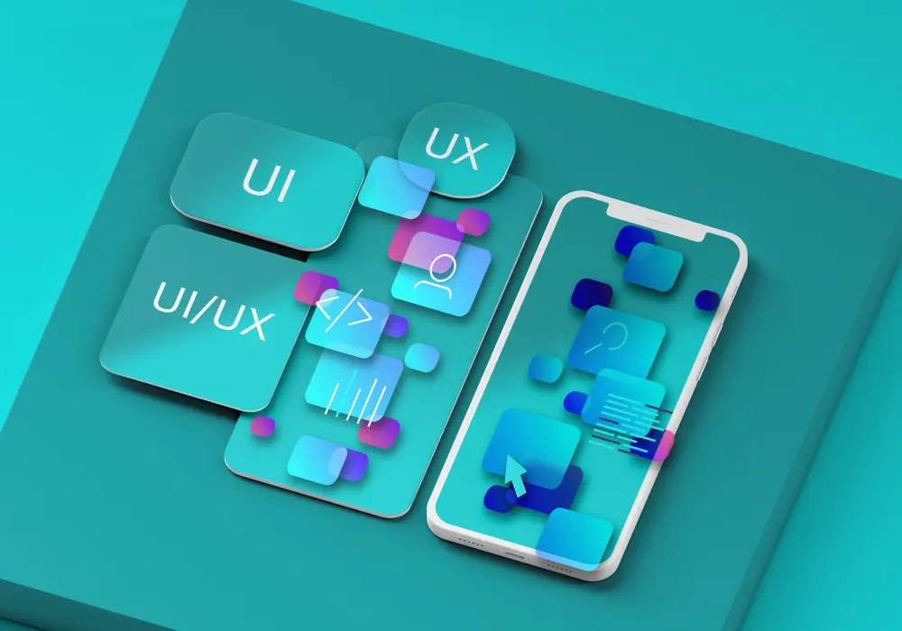
They also collaborate with web developers, marketers, and content creators to bring the brand to life. Whether it’s website UI/UX or ad creatives, everything ties back to the core brand identity.

Branding Designer
Core Responsibilities of a Branding Designer

Why Businesses Need a Branding Designer

In an era where brand perception is shaped in seconds, businesses can’t afford disjointed or forgettable branding. A branding designer helps to:

  • Ensure brand consistency
  • Improve brand recognition and trust
  • Strengthen emotional connection with audiences
  • Support differentiation in competitive markets
  • Lay the visual foundation for scalable growth

According to Hubspot, consistent brand presentation across all platforms increases revenue by up to 23%.

How Viartisan Builds Brands That Resonate

At Viartisan, our branding designers don’t just create logos. We build brand ecosystems that are strategically aligned, visually captivating, and built to scale across every customer touchpoint. We blend design thinking with business strategy to craft brands that not only look great but also perform.

Here’s a closer look at our process:

Discovery & Research

We begin with deep discovery. This phase includes stakeholder interviews, competitive analysis, customer research, and a brand audit. We explore your business objectives, vision, and positioning to uncover what makes you truly unique. Understanding your audience’s needs, preferences, and pain points is central to shaping a brand that resonates.

We also evaluate market trends, cultural cues, and category language—ensuring your brand will stand out, not blend in. This foundation ensures the creative direction is grounded in real insights and strategic intent.

Brand Strategy Alignment

Design without strategy is decoration. That’s why our designers collaborate with brand strategists to define your brand’s essence: core message, tone of voice, brand archetype, value proposition, and personality traits. We distill this into a Brand Blueprint that guides all creative decisions.

This alignment ensures consistency across your brand’s narrative, whether it’s a social media ad, a website headline, or a pitch deck. It sets the tone for how your audience should feel and think when they experience your brand.

Visual Exploration & Prototyping

Our creative team begins visual experimentation by exploring diverse directions for your logo, typography, color palette, iconography, and layout systems. We create moodboards and style tiles to align on visual tone early, followed by multiple logo concepts, brand motifs, and use-case mockups.

We prototype across real-world touchpoints—packaging, website UI, business cards, mobile apps—to stress test visual coherence and flexibility. We don’t just design a logo; we craft an adaptable identity system.

This phase is collaborative, with iterative feedback loops to ensure we’re moving toward a direction that both you and your audience will love.

Finalization & Rollout Assets

Once the creative direction is locked in, we polish every asset and build a complete brand identity system. Deliverables include:

  • Logo variations (primary, secondary, icon, monochrome)
  • Full color palette with usage guidance
  • Typography hierarchy and font files
  • Icon system and graphic patterns
  • Brand usage mockups (web, print, social)
  • Brand Style Guide (PDF + editable versions)

We also assist with implementation planning—providing rollout strategies, launch toolkits, and even training for internal teams to ensure adoption and consistency.

Key Traits of an Exceptional Branding Designer

  • Strong aesthetic sense and design skills
  • Strategic mindset beyond visuals
  • Empathy for end-users and client needs
  • Deep understanding of marketing and communication
  • Proficiency with tools like Adobe CC, Figma, Webflow, and Canva
Branding Designer
Key Traits of an Exceptional Branding Designer

Conclusion: Branding Designers Shape How the World Sees You

In today’s saturated market, a branding designer isn’t optional—they’re essential. They bring clarity, direction, and distinction to your business identity.

Whether you’re launching a new brand or refreshing an old one, Viartisan’s branding designers are here to help you craft a visual identity that commands attention, earns trust, and scales with success.

How to Create a Branding Name That Builds Trust and Stands Out

A branding name is more than just a label—it’s your business’s verbal identity. It’s what people remember, search for, talk about, and associate with the value you deliver. In a crowded market, a strong and strategic branding name can be the difference between being overlooked and becoming iconic.

What Is a Branding Name?

A branding name is the foundation of your brand identity. It’s the word or phrase that represents your values, story, and promise to your audience. Whether you’re launching a startup, rebranding, or entering new markets, choosing the right name is crucial.

At Viartisan, we approach brand naming as a mix of creativity, psychology, and strategy—making sure your name resonates, differentiates, and endures.

Need inspiration or a quick tool? Try Shopify’s Business Name Generator to explore initial ideas.

Branding Name
What Is a Branding Name?

Why Is a Branding Name So Important?

1. It Creates a Strong First Impression

Your branding name is often the first touchpoint with potential customers. A compelling name sparks curiosity and opens the door for trust and connection. Just like a logo, your name contributes to the emotional impact of your brand.

A strong name can imply credibility, personality, and purpose—essential elements in establishing brand trust. This is especially important in industries where customer loyalty and referrals drive success.

2. It Reflects Your Brand Identity

Great names say something meaningful. Think of names like “Nike,” “Google,” or “Patagonia” – each evokes a specific image or emotion. Your name should align with your mission, tone, and personality.

A well-chosen name can reflect your values and vision. For instance, “Tesla” suggests innovation and pays homage to the legendary inventor, while “Slack” communicates ease and informality in communication.

3. It Enhances Memorability and Word-of-Mouth

Names that are short, catchy, and easy to spell are more likely to be remembered and shared. This strengthens top-of-mind awareness and increases referrals organically.

According to Forbes, a memorable name plays a critical role in brand marketing and customer retention.

The easier it is to remember your name, the more likely customers will think of you when they need your product or service. And in the digital age, shareability equals visibility.

4. It Sets You Apart From Competitors

Your name should help you stand out in your industry. Avoid sounding too generic or similar to others—a distinct name gives you a competitive edge and is easier to protect legally.

Unique names support differentiation and give you more freedom in marketing. For example, brands like “Spotify” or “Zappos” broke away from descriptive names to embrace originality.

5. It Supports SEO and Online Visibility

A smartly chosen name can make your brand easier to search for online. Whether it’s a unique word or includes an SEO-friendly keyword, your name can help improve discoverability.

Incorporating keyword relevance into your brand name, especially for newer businesses, can improve your presence on Google and social platforms. Think “Booking.com” for travel or “Webflow” for web design.

6. It Scales With Your Business

Choose a name that can grow with you. Don’t limit yourself to a product, location, or trend that might fade. A timeless name allows you to expand into new markets and offerings seamlessly.

A narrow name can limit your future growth. For example, “Seattle Cupcakes” might be great locally, but what if you want to open in Tokyo or expand into cookies?

Steps Which Helps You Create a Strategic Branding Name

At Viartisan, we help businesses create names that are original, meaningful, and legally ownable. Here’s our process:

Step 1: Brand Discovery

We begin by understanding your values, target audience, vision, and competition. This strategic foundation ensures the naming process is aligned with long-term brand goals.

Step 2: Ideation and Word Exploration

We brainstorm across naming categories: descriptive, evocative, invented, and metaphorical. We also explore linguistic roots, phonetic harmony, and cross-cultural adaptability.

Step 3: Shortlisting and Filtering

Each name is evaluated based on clarity, uniqueness, relevance, and memorability. We also check for domain name availability and conduct a basic trademark screening.

Step 4: Real-World Testing

We validate name options with internal teams or select user groups to gather reactions and preferences. A/B testing and user interviews can reveal hidden perceptions.

Step 5: Final Delivery

You receive a curated shortlist, domain recommendations, legal checklists, and creative rationale. We also deliver a brand narrative that supports the chosen name’s rollout in marketing.

Branding Name
Steps Which Helps You Create a Strategic Branding Name

Common Naming Mistakes to Avoid

  • Using overly generic words (e.g., “Tech Solutions”) that fail to differentiate
  • Choosing a name that’s hard to spell or pronounce, especially in global markets
  • Neglecting trademark or domain checks, which may lead to legal disputes
  • Chasing trends rather than long-term brand relevance
  • Picking a name too narrow that could restrict business expansion later

Real-World Examples of Effective Branding Names

  • Airbnb – A blend of “Airbed” and “B&B” that redefined travel hospitality
  • Dropbox – A simple, descriptive, and metaphorical name that speaks to digital file storage
  • Zendesk – Suggests calm customer support through its soft phonetics and approachable tone
  • Asana – Inspired by yoga, it evokes calmness and focus—ideal for a project management tool

Each of these names serves as a core asset in the brand’s growth and recognition.

Conclusion: Your Name Is Your Legacy

Your branding name isn’t just a starting point—it’s your brand’s foundation. The right name tells a story, builds loyalty, and creates emotional value. Investing in a strategic naming process pays off in recognition, trust, and long-term success.

Let Viartisan help you find a name that communicates who you are and where you’re going. Whether you’re launching a new business or rebranding an old one, we’re here to guide the process with creativity, clarity, and confidence.

7 Reasons Why a Strong Brand Logo Is Critical to Your Business Success

What Is a Brand Logo?

Your brand logo is more than just a pretty image. It’s the face of your business—the visual cornerstone of your brand identity. Whether you’re launching a startup or refreshing an existing business, your logo plays a critical role in how your audience perceives you.

At Viartisan, we view logo design not only as a design task but as a strategic process to reflect a brand’s essence, mission, and unique story.

Why Is a Brand logo So Important?

A strong branding logo has far-reaching effects on how customers perceive and connect with your business. It communicates who you are, what you stand for, and why someone should care. Here are seven reasons why investing in a great logo is essential for any modern business:

1. First Impressions Matter

Your logo is often the first interaction a potential customer has with your brand. That moment happens in a split second—on your website, on social media, or even on packaging. A professional, creative, and visually appealing logo sets the tone immediately. It conveys a sense of trust, reliability, and professionalism. People form opinions quickly, and a good logo gives you an edge from the very beginning.

2. Foundation of Brand Identity

A strong logo lays the groundwork for your entire visual identity. It influences every design element associated with your brand: your color palette, typography, design style, and even your tone of voice in marketing materials. Without a clear and consistent logo, brand communications can feel disjointed and unprofessional. A cohesive brand identity, rooted in a well-thought-out logo, enhances recognition and builds familiarity over time.

3. Brand Recognition and Recall

Logos act as visual shortcuts. Think of iconic logos like Apple, Nike, or McDonald’s. These logos are simple yet powerful—instantly recognizable and easy to remember. A thoughtfully designed logo makes your brand more memorable, helping people recall your business when they need your product or service. This top-of-mind awareness is crucial in competitive markets.

4. Differentiation From Competitors

In today’s crowded marketplace, standing out is more important than ever. Your logo is one of the most effective ways to differentiate yourself from competitors. Through strategic design elements like color, typography, and symbolism, a great logo communicates your unique value proposition. It tells your story, expresses your brand personality, and answers the question: “Why should customers choose you over others?”

5. Builds Trust and Professionalism

Trust is at the heart of every business relationship. A professionally designed logo gives the impression that your company is established, credible, and dependable. In contrast, a poorly designed or outdated logo can make your business seem less reliable, even if your products or services are excellent. When people trust your visual branding, they are more likely to explore your offerings, convert into customers, and stay loyal over time.

6. Versatile for All Marketing Channels

A successful branding logo must perform well in a wide range of formats and contexts. From digital platforms like websites, mobile apps, and social media to physical materials like business cards, packaging, and signage—your logo should always look sharp and professional. A versatile logo is adaptable in color and size, scalable without losing clarity, and effective whether in black-and-white or full color.

7. Drives Brand Consistency

Consistency is key to building a recognizable and trusted brand. With a strong logo at its core, your brand can maintain a cohesive look and feel across all touchpoints. From emails and presentations to advertisements and social content, a consistent visual identity helps customers identify and trust your brand. Over time, this consistency reinforces brand loyalty and improves your long-term marketing efforts.

How to Create a Strong Brand Logo

Designing a logo isn’t just about aesthetics. Here’s how Viartisan approaches it:

Step 1: Understand the Brand

We start by exploring your brand values, mission, target audience, and market positioning.

Step 2: Sketch and Explore Concepts

Our team brainstorms multiple directions, experimenting with typography, icons, and shapes that reflect your story.

Step 3: Refine and Digitalize

We translate sketches into digital drafts using Adobe Illustrator and Figma, fine-tuning based on client feedback.

Step 4: Ensure Scalability and Versatility

We test the logo across devices and mediums to ensure it remains effective and impactful in any size.

Step 5: Deliver the Full Identity Kit

You receive the final logo in multiple formats, along with brand guidelines to ensure consistent use.

Common Logo Design Mistakes to Avoid

  • Overcomplicating the design: Simplicity improves memorability.
  • Using too many colors: Stick to 2–3 core brand colors.
  • Copying trends blindly: Trendy today can be outdated tomorrow.
  • Lack of scalability: Your logo should be readable on a billboard and a business card.
  • Neglecting brand fit: A playful logo doesn’t suit a legal consultancy.

Conclusion: Invest in a Logo That Grows With You

Your brand logo is not just a visual asset—it’s a long-term business investment. A thoughtfully designed logo can elevate your presence, earn trust, and ultimately drive growth.

At Viartisan, we specialize in crafting logos and brand identities that go beyond design—they communicate value, inspire action, and support your journey.

Read more:

Ready to create a logo that defines your brand? Contact Viartisan and let’s build something meaningful.

The Role of UI/UX Design in Building Trust and Security Perception in Online Banking

In the digital transformation of financial services, online banking applications have become a daily essential for millions of users. However, offering cutting-edge features is no longer enough. What truly determines user retention and brand loyalty lies in how intuitive, secure, and trustworthy the digital experience feels.

In this article, Viartisan explores how UI/UX design significantly shapes user trust and security perception in online banking apps—and how design teams can implement principles that both delight and protect users.

Why UI/UX Matters More Than Ever in Digital Banking

The user interface (UI) and user experience (UX) of banking apps play a decisive role in customer behavior. A clean, consistent layout paired with smooth task flows not only reduces friction but also reassures users that the app is secure and reliable. In fact, design isn’t just about visuals—it tells a story of trustworthiness.

When users interact with banking apps, they need to:

  • Feel in control: Well-structured information architecture and familiar navigation build a sense of security.
  • See signs of protection: Visual cues such as padlock icons, biometric login, or two-factor authentication help users recognize that strong security measures are in place.
  • Receive clear feedback: Confirmations after transactions or alerts for suspicious activity increase user confidence in the app’s transparency and efficiency.

From Aesthetic to Assurance: The Dual Role of UX in Security

While robust backend security is essential, what truly impacts user perception is how that security is communicated through design. According to recent studies, even the most secure platforms may be abandoned if users perceive them as unsafe.

Effective UX design in banking apps should:

  • Make secure actions (e.g. password resets, identity verification) seamless and non-intrusive.
  • Offer helpful guidance when errors occur, especially with login failures or failed transactions.
  • Educate users proactively on threats like phishing or identity theft through microcopy or support content.
  • Showcase transparency by explaining data handling policies clearly within the UI.

Real-World Examples: What Works and What Doesn’t

Effective designs:

  • Monzo’s playful yet functional UI uses color psychology and illustrated icons to establish trust and ease.
  • Dashboard views that summarize account balances and upcoming payments give users a stronger sense of financial control.
  • Biometric login integration (e.g. Face ID, fingerprint) enhances both convenience and the feeling of secure access.

Poor designs:

  • Complex onboarding with excessive steps can frustrate users and spark distrust.
  • Cluttered interfaces and inconsistent navigation make users feel lost—and worry about data mismanagement.
  • Lack of visible security cues during sensitive transactions can cause users to abandon actions.

Design Principles to Boost Trust and Security in Banking Apps

At Viartisan, we apply the following design principles to maximize trust and security perception for financial clients:

To Build Trust:

  • Consistency in layout, fonts, colors, and component behavior.
  • Clarity and simplicity in language and task flows.
  • Feedback-rich interactions, especially for key financial actions.
  • Transparency around terms, fees, and privacy policies.
  • Personalization that reflects user behavior and preferences.

To Reinforce Security:

  • Seamless integration of strong authentication methods (e.g. MFA, biometrics).
  • Use of visual security cues in sensitive areas (padlocks, HTTPS, badges).
  • Security education integrated into onboarding and help sections.
  • Friendly error messages that guide users instead of alarming them.
  • Frequent app updates with clear communication of security improvements.

Final Thoughts

UI/UX design is not merely a layer of polish in fintech products—it’s a strategic tool to build emotional confidence and behavioral trust. In an industry where a single misstep can cause user drop-off or brand damage, thoughtful digital experience design becomes a competitive edge.

As the financial landscape embraces AI and immersive technologies, design teams must continue to ask: Does this experience feel safe? Does it empower users to act confidently?

At Viartisan, we don’t just design screens—we design trust.

Web design: The digital foundation of modern brand identity

Web Design as a Brand Differentiator

In today’s hyper-digital landscape, a business’s website often serves as its first—and sometimes only—point of contact with potential clients. As such, the importance of web design transcends mere aesthetics; it is an essential pillar in building a strong, credible, and memorable brand.

Whether you are a startup aiming to stand out or a corporation seeking to refresh your digital presence, understanding the role of web design in branding is no longer optional—it’s strategic.

In this article, we’ll explore what web design truly encompasses, why it’s crucial for brand success, and how businesses can harness design trends and principles to their advantage.

What is Web Design? Key Concepts and Components

Web design refers to the process of planning, conceptualizing, and arranging content online. While often associated with the visual aspects of a site (such as layout, colors, and typography), modern web design incorporates a range of disciplines, including user experience (UX), user interface (UI), information architecture, and responsive design.

Key components of effective web design include:

  • Visual Design: Color schemes, typography, imagery, and layout that reflect the brand identity.
  • Navigation: Intuitive menus and structure that guide users smoothly through the website.
  • UX/UI Design: Creating seamless, user-centered interactions that prioritize usability and accessibility.
  • Responsive Design: Ensuring websites function optimally on various screen sizes and devices.
  • Speed and Performance: Fast-loading pages to reduce bounce rate and improve SEO rankings.

Web design is where functionality meets branding—every design decision communicates something about your company’s identity, values, and professionalism.

Why Web Design is Critical for Branding

A well-designed website serves as a digital storefront, building trust and reinforcing your brand message. Here’s why web design matters:

  • First Impressions Matter

Studies show that users form an opinion about a website in as little as 0.05 seconds. A clean, modern design instills professionalism, while a cluttered or outdated look can erode trust immediately.

  • Consistent Branding

Web design allows for consistent application of brand elements—logos, fonts, color palettes, voice—across all digital touchpoints, strengthening brand recognition.

  • User Engagement and Retention

An engaging design combined with intuitive UX encourages users to stay longer, explore more, and convert. Every element should support the user’s journey toward your desired action (purchase, sign-up, contact).

  • SEO and Visibility

Google favors well-structured, mobile-optimized, and fast-loading websites. Good web design inherently supports on-page SEO through proper heading use, clean code, image optimization, and user behavior metrics.

Design Principles for an Effective Business Website

To ensure your website aligns with your brand goals and user expectations, consider the following design principles:

  • Brand-Driven Visual Identity

Use consistent brand elements (colors, fonts, logos) throughout the site. Align visuals with the brand’s tone—whether minimalist and elegant or bold and energetic.

  • Intuitive User Navigation

Structure your site logically with clear menus, breadcrumbs, and CTAs. Anticipate user needs and reduce friction at every interaction point.

  • Responsive & Mobile-First Design

Over 60% of global website traffic comes from mobile devices. A responsive design ensures your site functions beautifully across smartphones, tablets, and desktops.

  • Content Hierarchy & Readability

Use headings, subheadings, bullet points, and short paragraphs to make content scannable. Highlight key messages through strategic placement and emphasis.

  • Speed Optimization

Compress images, use lazy loading, and minimize code to improve loading time. A fast website reduces bounce rates and improves SEO.

Emerging Web Design Trends for 2024–2025

Staying current with design trends can make your brand feel modern and innovative. Here are some noteworthy trends shaping the future of web design:

  • Minimalist & Clean Aesthetics

Less is more. Clean lines, whitespace, and simple color schemes create a premium and clutter-free user experience.

  • Dark Mode & Adaptive Themes

Offering both light and dark themes improves user comfort and reflects cutting-edge UX awareness.

  • AI Integration & Chatbots

Intelligent interfaces, from chatbots to personalized recommendations, enhance customer service and user engagement.

  • Micro-Interactions & Animations

Subtle animations (button hover effects, loading animations) guide users and create delightful, responsive feedback loops.

  • Mobile-First Animations

Mobile-optimized animations help enhance engagement without sacrificing performance on smaller devices.

  • Real-World Examples

    • Apple: Clean layout, whitespace, and strong product-centric focus.
    • Airbnb: Intuitive UX paired with vibrant imagery and subtle micro-interactions.
    • Dropbox: Minimalist design with playful illustrations and a consistent color palette.

Common Web Design Mistakes to Avoid

Even well-meaning businesses can fall into these common traps when designing their websites:

  • Focusing solely on looks without considering functionality or user flow.
  • Ignoring mobile optimization, which can alienate a large portion of visitors.
  • Inconsistent branding, leading to confusion or mistrust.
  • Overloading with animations that slow down performance or distract from key content.
  • Lack of clear CTAs, leaving users uncertain of what action to take next.

A website must blend aesthetics with strategic intent. Form should always follow function.

Web Design as a Strategic Brand Investment

In a digital-first world, your website is more than a virtual business card—it’s a dynamic tool for brand storytelling, lead generation, and market positioning. High-quality web design not only enhances user experience but also reinforces brand credibility and drives measurable results.

Whether you’re building from scratch or redesigning an outdated platform, investing in professional, user-centric web design is one of the most impactful moves a modern business can make.

Are you ready to elevate your brand through impactful web design?
Partner with Viartisan that understands branding, UX, and growth. Contact us today for a tailored consultation.

Measuring UX success: A comprehensive guide to KPIs (key performance indicators) for data-driven design

Introduction

In the ever-evolving landscape of User Experience (UX) design, achieving true success requires more than just intuitive design and adherence to best practices. While these are undoubtedly important, they must be complemented by a rigorous approach to measurement. Key Performance Indicators (KPIs) serve as the cornerstone of this approach, providing the quantifiable data necessary to evaluate design effectiveness, track progress, and drive continuous improvement. This comprehensive guide delves into the crucial role of KPIs in UX design, offering a detailed exploration of their definition, significance, selection, and application.

Understanding UX KPIs: Quantifying the intangible

At their core, KPIs are, as the Interaction Design Foundation article defines, “measurements of performance.” They are specific, measurable values that act as indicators of progress towards achieving particular objectives. In the context of UX, KPIs take on the crucial task of translating often-subjective aspects of the user experience – such as ease of use, satisfaction, or efficiency – into objective, quantifiable data. This translation allows designers to move beyond relying on gut feelings or anecdotal evidence and instead ground their decisions in concrete data.

The indispensable role of KPIs in UX design

The strategic implementation of KPIs in UX design yields a multitude of benefits, transforming the design process from an art form to a data-informed discipline:

  • Objective Evaluation: Moving Beyond Subjectivity
    • KPIs provide a framework for evaluating design effectiveness in a clear and objective manner.
    • Instead of relying on subjective opinions or personal preferences, designers can leverage data to support their assessments and justify their design choices.
    • This objectivity is crucial for fostering constructive discussions among stakeholders and ensuring that design decisions are aligned with user needs and business goals.
  • Data-Driven Decision-Making: Guiding Design Iterations
    • KPIs empower designers to make informed decisions based on concrete evidence.
    • By tracking KPIs, designers can identify what aspects of the design are performing well and which areas require improvement.
    • This data-driven approach facilitates iterative design, allowing designers to continuously refine and optimize the user experience based on user behavior and feedback.
  • Tracking Progress Over Time: Demonstrating UX Value
    • KPIs enable designers to monitor the impact of design changes and track progress towards achieving specific UX goals.
    • This longitudinal perspective is essential for demonstrating the value of UX to stakeholders and justifying investments in UX research and design.
    • By showcasing how UX improvements positively influence key metrics, designers can build credibility and secure buy-in for future UX initiatives.
  • Identifying Areas for Improvement: Focusing Design Efforts
    • KPIs serve as diagnostic tools, helping designers pinpoint specific areas within the user experience that are underperforming or causing user frustration.
    • This granular level of insight allows designers to prioritize their efforts and focus on the most impactful improvements, maximizing the efficiency of the design process.
  • Alignment with Business Objectives: Connecting UX to ROI
    • UX KPIs can be strategically aligned with broader business objectives, such as increasing conversion rates, improving customer retention, or reducing support costs.
    • This alignment demonstrates the direct contribution of UX design to the overall success of the business, strengthening the case for UX investment and recognition.
Measuring UX success
Emily Stevens, Fair Use

Strategic considerations for KPI selection

Choosing the right KPIs is a critical step in the UX measurement process. The selected KPIs will directly influence the insights gained and the actions taken. The following considerations are essential:

  • Relevance: Tailoring KPIs to Specific Goals
    • KPIs must be directly relevant to the specific UX goals of the project and the overarching objectives of the product or service.
    • For example, if the primary goal is to increase user engagement, relevant KPIs might include time spent on the site, number of interactions, or feature adoption rate.
    • Carefully consider the specific context and tailor the KPIs accordingly.
  • Measurability: Ensuring Quantifiable Data
    • KPIs must be quantifiable, meaning they can be expressed as numerical values.
    • This ensures that data can be tracked objectively and that performance can be compared over time.
    • Avoid vague or subjective metrics that cannot be reliably measured.
  • Actionability: Driving Meaningful Change
    • KPIs should provide insights that lead to actionable improvements in the design.
    • The data should highlight specific areas where changes are needed and suggest potential solutions.
    • Avoid KPIs that are merely descriptive but do not offer guidance for action.
  • Clarity: Fostering Shared Understanding
    • KPIs must be clearly defined and easily understood by all stakeholders involved in the project, including designers, developers, product managers, and business leaders.
    • This shared understanding is crucial for effective communication and collaboration.
  • Balance: Capturing a Holistic View
    • Employ a balanced set of KPIs to capture different aspects of the user experience.
    • Avoid relying on a single metric, as this can provide a narrow and potentially misleading view of performance.
    • Consider both behavioral metrics (what users do) and attitudinal metrics (what users say or feel).

Illustrative examples of UX KPIs

The specific KPIs used will vary depending on the product, industry, and project goals. However, here are some commonly used examples of UX KPIs:

  • Task Success Rate:
    • The percentage of users who successfully complete a predefined task within the interface.
    • This metric directly measures the effectiveness of the design in enabling users to achieve their objectives.
    • Example: Percentage of users who successfully complete a purchase on an e-commerce website.
Measuring UX success
Jakob Nielsen and Raluca Budiu, Fair Use
  • Time on Task:
    • The average amount of time users take to complete a specific task.
    • This metric measures the efficiency of the design and identifies potential areas of friction or complexity.
    • Example: Average time it takes users to fill out a registration form.
Measuring UX success
Aparna Subhash, Fair Use
  • Error Rate:
    • The number of errors users make while attempting to complete a task.
    • This metric highlights usability issues and areas where users are likely to encounter difficulties.
    • Example: Number of incorrect password entries during a login attempt.
Measuring UX success
Sandro Meyer, Fair Use
  • User Satisfaction (CSAT):
    • A measure of users’ subjective satisfaction with a product or service.
    • Often collected through surveys or questionnaires using rating scales.
    • Example: Average rating on a scale of 1 to 5 for overall product satisfaction.
  • Net Promoter Score (NPS):
    • A measure of customer loyalty and the likelihood of users recommending the product to others.
    • Based on a survey question asking users how likely they are to recommend the product on a scale of 0 to 10.
    • Users are categorized as Promoters, Passives, or Detractors.
  • Conversion Rate:
    • The percentage of users who complete a desired action, such as making a purchase, signing up for a newsletter, 1 or downloading a file.  
    • This metric directly reflects the effectiveness of the design in driving business goals.
    • Example: Percentage of website visitors who complete a purchase.
  • Retention Rate:
    • The percentage of users who continue to use the product or service over a specific period.
    • This metric indicates the product’s ability to retain users and build long-term engagement.
    • Example: Percentage of app users who remain active after 30 days.
  • Abandonment Rate:
    • The percentage of users who abandon a process before completion, such as leaving a shopping cart or abandoning a form.
    • This metric highlights potential usability issues or points of friction that are causing users to drop off.
    • Example: Percentage of users who abandon their shopping cart before completing the checkout process.

Tools and techniques for effective UX measurement

To accurately track and measure UX KPIs, designers can leverage a variety of tools and techniques:

  • Analytics Tools:
    • Tools like Google Analytics, Adobe Analytics, and Mixpanel provide valuable data on user behavior, such as page views, bounce rate, session duration, and user flow.
    • These tools offer quantitative insights into how users are interacting with the product and can help identify areas for improvement.
  • Usability Testing:
    • Conducting usability tests with representative users allows for direct observation and measurement of user behavior.
    • Usability testing can be used to measure task success rate, time on task, error rate, and other behavioral metrics.
  • Surveys and Questionnaires:
    • Tools like SurveyMonkey, Google Forms, and Qualtrics enable designers to gather user feedback on satisfaction, usability, and other attitudinal metrics.
    • Surveys can be used to collect both quantitative (e.g., rating scales) and qualitative (e.g., open-ended responses) data.
  • Heatmaps and Session Recordings:
    • Tools like Hotjar, Crazy Egg, and FullStory provide visual representations of user interactions and recordings of user sessions.
    • Heatmaps show where users click, scroll, and hover, while session recordings allow designers to observe individual user behavior and identify pain points.
  • A/B Testing:
    • This technique involves comparing two or more variations of a design element or page to determine which performs best in terms of a specific KPI.
    • A/B testing allows designers to make data-driven decisions about design changes and optimize the user experience.
Measuring UX success
Long Le, Fair Use

Conclusion: Embracing data-driven UX for user-centric success

In conclusion, KPIs are indispensable tools for UX professionals who strive to create user-centered and effective digital experiences. By carefully selecting, rigorously tracking, and thoughtfully analyzing KPIs, designers can gain a deeper and more nuanced understanding of their users, empower data-driven design decisions, and effectively demonstrate the tangible value of UX design to their organizations. Embracing a data-driven approach is no longer a luxury but an essential prerequisite for creating successful and sustainable digital products and services that truly resonate with users and achieve business objectives.

Visit Viartisan to read the latest and most in-depth articles on UI, UX, Branding, Develop, and Illustration!

This article has been edited from Interation Design with the title “Key Performance Indicators (KPIs)”.

How to use visual hierarchy and alignment to improve UI design

Introduction

Your brain is constantly scanning everything it sees, searching for visual cues that tell it where to focus. In UI design, this means your users are doing the same — scanning screens, looking for what’s important. By applying visual hierarchy and alignment correctly, you can help users navigate your interface more easily, quickly understand what’s important, and enjoy a more seamless user experience.

In this article, we’ll break down how to use visual hierarchy and alignment to improve your UI design, with practical examples and actionable tips.

Master Visual Hierarchy for Clear and Effective UI

What is visual hierarchy?

Visual hierarchy is the arrangement of UI elements in a way that reflects their importance. It’s how you guide your users’ eyes from the most important parts of your interface to the least important. Elements like size, color, spacing, contrast, and placement all contribute to what users notice first — and what they may ignore.

Why it matters

Without a clear hierarchy, users get lost. If everything looks the same, nothing stands out. They may feel overwhelmed, unsure where to click, and end up abandoning the experience altogether.

Pro tip: Design with intention. If you want a user to read or interact with something, make sure it visually stands out.

Real-world example

Think about websites that use large, bold headlines to grab attention, followed by subheadings and body text. That’s visual hierarchy at work. The user knows where to start and what to read next — all without having to think too hard.

Use Alignment to Support Scannability and Flow

Why alignment is essential

Alignment is one of the clearest signs that a UI has been professionally designed. Even if users don’t consciously notice good alignment, they can feel the difference. Proper alignment makes interfaces feel tidy, trustworthy, and easier to navigate.

Align text with text

Avoid aligning content based on icons, images, or decorative elements. Instead, align your text elements with each other. This helps users scan your content quickly and makes everything feel more cohesive.

Example:

In a testimonial section, align the actual quotes and names—not the quotation marks or avatars. This creates clean lines that are easier to follow visually.

Horizontal alignment

When content blocks are horizontally aligned (especially across the top), it helps users scan across sections naturally. Try to align based on x-height (the height of lowercase letters), not just the top of the tallest character. This creates a more visually consistent experience.

Also, when placing content side by side, ensure they fall along the same eye-line. Misalignment can break the user’s flow and increase cognitive load.

Tip: Don’t squish elements together to shorten the page. White space is your friend — it separates content and improves comprehension.

Combine Visual Hierarchy and Alignment for Better UI

Visual hierarchy and alignment are most powerful when used together. Making key elements stand out and aligning everything clearly allows users to scan your interface effortlessly and take action faster.

Practical comparison

Imagine two versions of the same webpage:

  • One with inconsistent alignment, equal emphasis on every element, and no visual anchors
  • One with clear headings, aligned content blocks, and strong visual flow

Which one would you rather use? The second, obviously. It’s easier to scan, easier to read, and ultimately, more effective.

Conclusion

Understanding and applying visual hierarchy and alignment is foundational to good UI design. These principles make your interface easier to scan, more enjoyable to use, and more effective at guiding user actions.

Take time to regularly review your designs. Ask yourself:

  • Where does your eye go first?
  • Are important elements standing out?
  • Is everything aligned in a way that supports easy reading?

Better yet, ask someone else to review your interface and tell you what they notice first — and what confuses them. These small insights can lead to big improvements.

Visit Viartisan to read the latest and most in-depth articles on UI, UX, Branding, Develop, and Illustration!

This article has been edited from Balsamiq Logo with the title “How to use visual hierarchy and alignment to improve UI design”.

Mobile User Experience: Limitations and Strengths

Mobile User Experience – Mobile devices have revolutionized how we live and perform daily tasks. We can not only access nearly any kind of content on mobile devices, but many modern smartphones allow us to perform actions like depositing checks, processing credit card payments, ordering food and paying for groceries, digitally signing documents, and even locking our home doors. This new technology, the smartphone, has simplified certain tasks.

Mobile-Research Project

Over the past seven years, we have conducted an ongoing, self-funded mobile-usability project involving multiple rounds of user testing on various mobile websites and applications. The project included 151 participants, primarily from the US, with additional sessions in Australia, Hong Kong, Netherlands, Romania, and the UK. Participants in all studies used their own mobile phones in our lab.

While initial studies encompassed a range of phone types (including touchscreen phones, non-touch smartphones, and feature phones), more recent research has concentrated on touch phones, reflecting current market trends. Furthermore, our latest studies focused specifically on phablets (touchscreen smartphones with screens larger than 5.3 inches). When relevant, we asked participants to show us their installed apps and then assigned tasks using either mobile apps or the web.

In addition to user testing, we employed other research methodologies such as diary studies and expert reviews. We have also evaluated numerous mobile sites and apps as part of client projects, though we cannot disclose specific findings from these studies. This confidential research informs and inspires our publishable research.

The mobile research discussed here was distinct from our research on tablet user experience. Despite some similarities (e.g., handheld touchscreens), tablets and phones have different usage patterns and interaction-design constraints, leading to distinct usability guidelines for each device category.

Mobile Limitations and Strengths

Mobile phones present both strengths and limitations. These factors influence the creation of effective mobile user experiences.

Small Screen

Despite the trend toward larger screens, the portability and convenience of mobile phones are largely due to their small size. Compared to desktop and even laptop screens, phone screens can display significantly less content. Consequently, screen size is a major constraint for mobile devices. Content that fits above the fold on a 30-inch monitor may require five screenfuls on a small 4-inch screen. This means mobile users must (1) expend greater effort to access the same amount of information and (2) rely on short-term memory to recall information not currently visible on the screen. It is therefore not surprising that mobile content is twice as difficult.

Each new design element or piece of content added to a mobile screen displaces something else (or pushes it below the fold). Careful consideration of the opportunity cost of each new element is crucial: What are the implications for users if element B is omitted to include element A? Is element A more critical than element B? Content and feature prioritization is essential. While this report offers general guidelines, the optimal approach often depends on the specific users and tasks involved.

“Chrome” refers to the user-interface elements that facilitate the use of a site or application. Users visit a site to find necessary information or complete a task, not to admire the aesthetics of buttons, navigation, menus, and other design elements. Content is always important (on both mobile and desktop), but while desktop screens offer ample space for both content and chrome, mobile designers often need to minimize chrome to maximize space for essential content.

This does not imply that chrome should be eliminated from mobile design. A usable interface requires some chrome. However, mobile screens necessitate a high content-to-chrome ratio.

Portable = Interruptible

Mobile phones are portable, easily fitting into a pocket or purse and accompanying us everywhere. Because we use phones in various contexts and situations, we are more likely to experience interruptions while using them: external events in the environment may demand our attention, forcing us to pause our activity on the small screen. Consequently, attention on mobile is often fragmented, and mobile sessions tend to be short. In fact, the average mobile session duration is 72 seconds. In comparison, our studies indicate an average desktop session of 150 seconds, more than twice as long.

Short mobile sessions necessitate designing for interruptions: saving user state and enabling users to save their progress.

Designers should preserve context and facilitate seamless context recovery and task resumption. Mobile apps or websites must consistently save state to accommodate interruptions. They should also strive for smooth transitions back to the app/website, minimizing the need for users to redo previously completed work.

Furthermore, mobile users may not always make immediate decisions and may prefer to revisit content later in contexts with greater bandwidth or on larger screens. Enabling users to save history, email information to themselves or others, or share information is important. It is also beneficial to allow users to access their data and actions across different platforms.

Designing for interruptions extends beyond saving state. It also involves prioritizing essential information and simplifying tasks and interactions. Due to fragmented attention, it is crucial to present users with what they need as quickly as possible. Overwhelming them with details and requiring them to sift through large amounts of text for relevant information is not conducive to interruption-friendly design. The core information should always precede the details. Simpler tasks are quicker to complete and easier to resume than complex ones with numerous steps and options.

Single Window

While some phone manufacturers are exploring the implementation of multiple windows on the screen, the limited screen size of mobile devices makes this approach impractical, even with today’s larger-screen phones. The vast majority of users can only view a single window (and thus a single application or website) at a time; they cannot split the screen (as on a desktop) to work with multiple apps simultaneously.

The single-window constraint dictates that designs should be self-sufficient: Mobile tasks should be easily completed within a single app or website. Users should not be required to exit an app (or website) to find necessary information that the app does not provide. It’s important to remember that pen and paper, even if available, are often impractical for on-the-go use. If users must transfer information between apps, they will likely need to copy and paste it (or, worse, rely on memory, increasing cognitive load); this makes the interaction more complex and prone to errors. Apps and websites should be self-contained and should not require external resources, whether physical or digital.

Touchscreen

Touchscreens offer both advantages and disadvantages. Gestures represent a hidden, alternative user interface (UI) that, when designed with appropriate affordances, can make interactions fluid and efficient and can conserve screen real estate. However, gestures can also suffer from low memorability and discoverability. Additionally, typing accurately on a small virtual keyboard can be challenging, and accidental touches are common.

Typing is a significant challenge: On a soft keyboard, users must constantly divide their attention between the text they are entering and the keypad area. Touch typing is impossible without haptic feedback, and keypads are small with crowded keys.

Another difference between touch input and input methods like a mouse is that the target size needed to optimize reach time and minimize errors is considerably larger for touch than for mouse interaction. Therefore, not only is the screen smaller than a laptop or desktop screen, but buttons and other interactive elements need to be larger than those on a regular monitor.

The presence of numerous target areas on a touchscreen increases the likelihood of accidental touches. These can disorient users and cause confusion about what occurred. The “undo” function, one of the original 10 usability heuristics, is even more critical on touch devices.

Variable Connectivity

Even with the prevalence of fast cellular networks and widespread Wi-Fi, coverage is not consistently available or reliable. Phone users frequently encounter connectivity issues. Each new page load can result in significant delays when the network is slow or unstable.

To ensure users can complete their tasks on your mobile site or app, it is essential to consider waiting times. Design lightweight pages that contain as much relevant information as possible to minimize the number of client-server round trips. Reduce the number of steps and, ultimately, the number of page loads.

GPS, Camera, Accelerometer, Voice, and Other Phone Features

While phones have limitations, they also offer unique features, some of which are accessible only to apps, while others are available to websites as well. The camera, microphone, and GPS are conveniently integrated and can simplify input and overcome some of the challenges of typing. Photographs can convey nuanced information that is often difficult to capture in text (e.g., describing a product). Notifications allow users to receive immediate updates about relevant events. Touch ID enables users to log in using a fingerprint, eliminating the need to type passwords. And technologies like Apple Pay and Google Wallet enable users to make payments in person or online using their phones, without entering credit card information.

If a phone has a camera, avoid requiring users to manually enter barcodes. If it has GPS, avoid asking them to enter zip codes. Leverage phone features whenever possible to minimize user effort.

New Research Report

Our extensive mobile-usability findings are compiled in our report “Mobile User Experience.” (This report has since been updated in a newer edition, incorporating subsequent events and research.) Many guidelines reflect current mobile patterns and interactions, and older guidelines have been revised with updated examples.

Visit Viartisan to read the latest and most in-depth articles on UI, UX, Branding, Develop, and Illustration!

This article has been edited from NNG with the title Mobile User Experience: Limitations and Strengths by author Raluca Budiu.

UX in 2024: Navigating the era of late-stage design

Reflections from the 9th Annual State of UX Report by the UX Collective

In its ninth edition, the State of UX 2024 report by the UX Collective delivers a sharp and honest snapshot of where the design industry stands today. Drawing from over 1,000 curated articles and insights from a global community of over 500,000 readers, the report captures the patterns, tensions, and shifts that shaped UX throughout 2023.

This year’s theme? Late-stage UX — a term inspired by late-stage capitalism — describing an industry at a crossroads: oversaturated, increasingly driven by business metrics, and shaped by rapid automation.

What Defines Late-Stage UX?

The report outlines five key characteristics shaping the current UX climate:

  1. Automation
    The rise of AI is transforming the design workflow. While it opens new creative doors, it’s also automating tasks once core to the designer’s role — particularly in entry- to mid-level positions.
  2. Saturation
    There are now more designers than available roles, especially as companies scale back hiring and redefine design team structures post-pandemic.
  3. Commoditization
    Design has become more about consistency and scalability than innovation or delight. Frameworks and design systems are prioritized over differentiated experiences.
  4. Financialization
    Design decisions are now deeply entangled with business KPIs, shareholder value, and ROI metrics. Human-centered approaches are increasingly tempered by financial constraints.
  5. Disintegration
    User trust is declining. Misinformation, dark patterns, and data exploitation have made many people skeptical, disengaged, or vulnerable in digital spaces.

The Design Community’s Response

Despite these challenges, the UX community continues to rise to the moment. The 2024 report doesn’t just critique—it celebrates the people and ideas pushing the industry forward with courage, creativity, and nuance. A few highlights:

  • Writers and Thinkers
    Contributors like Daley Wilhelm, Slava Polonski, Rosie Hoggmascall, and Pavel Samsonov offered fresh, critical perspectives throughout the year—redefining what it means to practice thoughtful, ethical design.
  • Data Storytelling
    Platforms like Pudding.cool stood out for their brilliant use of data visualization to unpack cultural and technological trends.
  • Maggie Appleton’s Visual Essays
    A fusion of anthropology, programming, and design, her work challenges how we think about generative AI and technology’s role in our lives.
  • Vivianne Castillo’s Advocacy
    A constant voice reminding us that our worth is not measured by output alone: “Breathe in: I am more than what I produce. Breathe out: My rest requires no apology.”
  • Rest of World’s Editorial Excellence
    By spotlighting underrepresented markets and voices, they remind us that good design must be globally inclusive.
  • Brad Frost’s Reflection on Atomic Design
    A bold invitation to re-examine the purpose behind our design systems: “Are we capturing human potential or just redrawing rectangles?”
  • Conversations at Config and SmashingConf
    From Halli Thorleifsson’s vulnerable storytelling to the welcoming spirit of Vitaly Friedman’s events, the conferences proved that the design community still thrives on human connection and shared growth.
  • Brazil’s Vibrant UX Scene
    Content creators across Brazil — Rafael Frota, Kakau Fonseca, Karina Tronkos and many more — continue to enrich the global conversation with original work in Portuguese, despite market pressures.

Looking Ahead

As we move deeper into 2024, the design industry faces tough questions — about its values, its direction, and its responsibility to users. The State of UX 2024 doesn’t offer simple answers, but it does offer something just as valuable: clarity, honesty, and a sense of community.

Want to deepen your knowledge of UI, UX, Branding, Develop, and Illustration? Read more helpful articles at Viartisan.

At its core, this report is a tribute to the resilience of designers worldwide—those who keep questioning, adapting, and creating with intention.
Written by: Fabricio Teixeira & Caio Braga
Illustrated by: Fabio Benê
Edited by: Emily Curtin
Narrated by: Laura Vandiver
Published by: The UX Collective (ISSN: 2766–5267)

Explore the full report here: The State of UX in 2024

The Strong Pull of What’s Already There: Why Defaults Matter

It seems web users might be more easily influenced than we think. A fascinating study by Professor Thorsten Joachims and his team at Cornell University shed light on how people interact with search engine results pages (SERPs). Their research revealed a significant tendency for users to click on the very first listing far more often than its actual relevance would suggest – highlighting the powerful influence of default options.

Initial findings, consistent with previous studies, showed that a whopping 42% of users clicked the top search result, while only 8% opted for the second one. This isn’t entirely surprising, as we know top positions generally attract the most attention.

However, the truly insightful part of the study involved a clever manipulation. The researchers secretly used a script to swap the order of the top two search results before they were displayed to users. So, the listing that was originally second now appeared first, and the original top result was moved to the second position.

Even with this swap, the results were striking. Users still clicked the new top entry 34% of the time, while the new second entry received 12% of the clicks.

The Magnetic Effect of the Top Spot

This experiment helps us understand why the top result gets so much attention. There are two main possibilities:

  1. Search engines are incredibly accurate at determining relevance and almost always place the best result first.
  2. Users click the top result simply because it’s at the top. This could be due to laziness (we naturally start from the top) or because users assume the search engine has correctly identified the best option.

The study’s findings indicate that the truth lies in a combination of both factors.

If users were always clicking the best link, then swapping the top two should have also swapped the click percentages. But this didn’t happen; the top spot still commanded the most clicks.

Conversely, if users blindly trusted the search engine and clicked the first link solely because it was first, then swapping the order shouldn’t have changed the percentages at all. This also wasn’t the case. The click-through rate of the top link decreased from 42% to 34%. This means that 8% of users shifted their clicks: 4% clicked the second result (which was originally first), and another 4% explored other options further down the page.

To further understand the accuracy of the search engine’s rankings, the researchers had human evaluators judge the relevance of the websites. Since there’s no definitive way to objectively determine the “best” website for a given query, they averaged the ratings of five individuals – likely the most reliable method for assessing information relevance.

The evaluation revealed that the original top result was judged the most relevant only 36% of the time, while the second result was deemed most relevant 24% of the time. Interestingly, the two top results were considered equally relevant 40% of the time. This shows that while the search engine was often correct, it was wrong about one-fourth of the time. (When the top two are equally relevant, the placement doesn’t really matter, so these instances were counted as “correct.”)

Considering how often the search engine’s top pick wasn’t actually the most relevant, users clicked it far too often. And when the top two were switched, too few users adjusted their behavior. The clear conclusion is that there’s a significant bias towards clicking the top link, although the quality of the link does still play a role.

For search engine marketers, the implications are clear: achieving that top spot is incredibly valuable. However, it’s equally crucial to have compelling “microcontent” – like effective page titles and summaries – that increases the likelihood of users perceiving your site as relevant. Unfortunately, controlling these snippets can be challenging on major search engines like Google, which often displays unhelpful and unclear descriptions. You have more control over this for internal search engines on your own website or intranet, assuming you can encourage content creators to write good summaries.

Defaults Extend Beyond Search

The power of defaults isn’t limited to search results. Users frequently rely on pre-selected options in various aspects of user interface design. For instance, they rarely delve into complex customization features, making it essential to optimize the default user experience, as this is what most people will stick with.

In forms and applications, pre-filling fields with the most common value can significantly improve usability. For example, on a conference registration form, if someone registers for the New York event, the country field could default to “United States.” If they register for the London event, it could default to “United Kingdom.” While users from other countries will need to change this, they would have had to specify their country anyway if the field was left blank. By using the most frequent value as the default, we save many users a small amount of effort.

Defaults offer two key usability benefits:

  • By presenting a representative value, they act as just-in-time instructions, helping users understand how to complete a field.
  • By showing a frequent value, they provide insight into the commonly expected response, as opposed to less typical ones. This knowledge can even be used for sales purposes – for example, by pre-selecting a one-year subscription option over a monthly one. However, consistently defaulting to the most expensive option can erode trust, so it’s important not to overdo it.

By guiding and informing users, well-chosen default values help reduce errors. Therefore, it’s crucial to select defaults that are genuinely helpful, rather than simply choosing the first item alphabetically or whatever happened to be at the top of an initial list.

Reference:

Thorsten Joachims, Laura Granka, Bing Pan, Helene Hembrooke, and Geri Gay, “Accurately Interpreting Clickthrough Data as Implicit Feedback,” Proceedings of the Conference on Research and Development in Information Retrieval (SIGIR), 2005. (Note: The link leads to a PDF file, which is an academic paper.)

This article has been edited from Nielsen Norman Group with the title The Power of Defaults by author Jakob Nielsen.