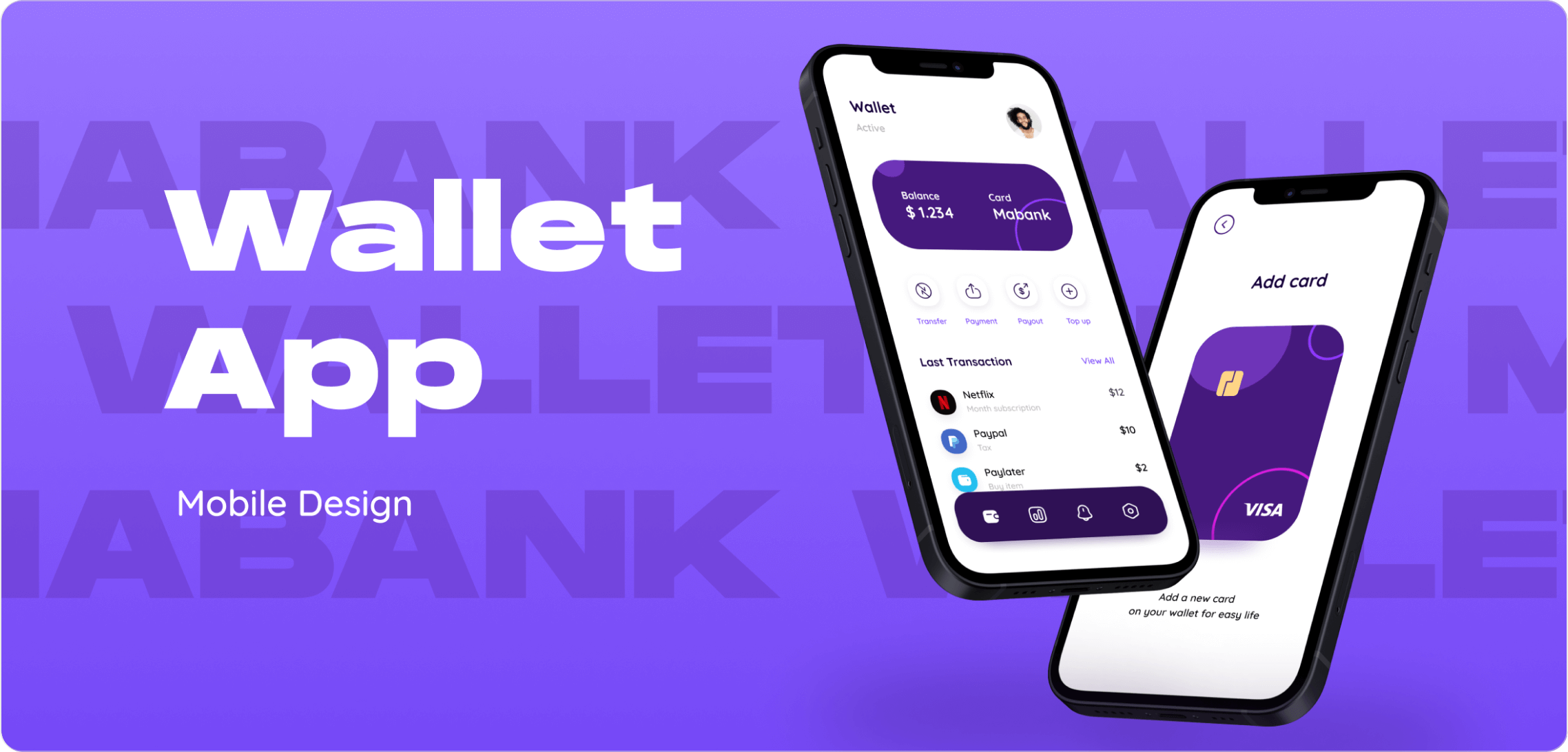
In 2025, e-wallets are more than just payment tools—they’re digital lifelines. From peer-to-peer transfers and online shopping to in-store QR payments and crypto wallets, users demand convenience, trust, and frictionless experiences.
This makes e-wallet UI/UX design a critical factor in product adoption, retention, and security. In this in-depth guide, Viartisan explores how to design e-wallet apps that are not only secure and functional but also delightful and brand-differentiated.
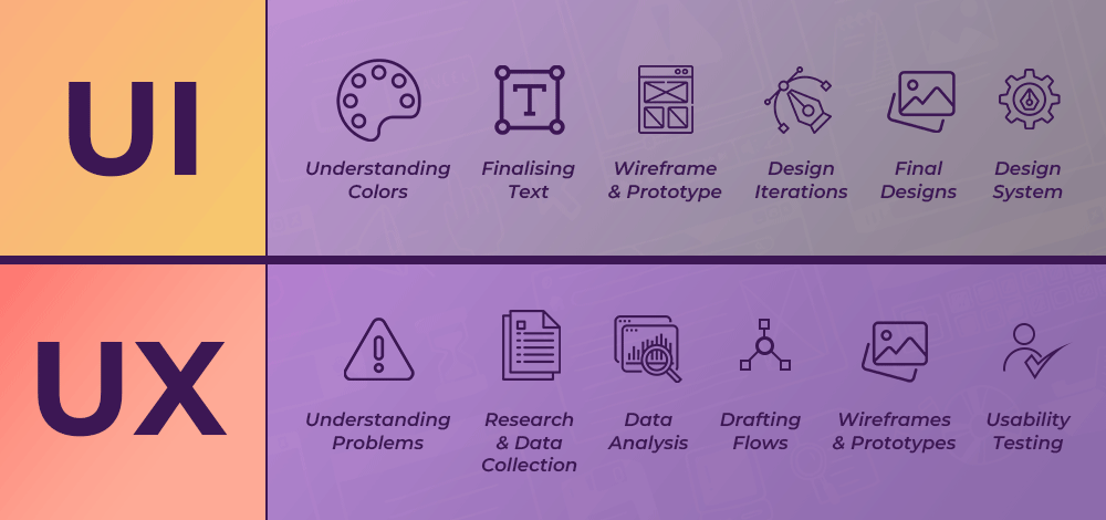
Why UI/UX Design Matters in e-Wallets
E-wallets deal with one of the most sensitive areas of user interaction—money. Unlike entertainment or retail apps, mistakes or confusion in wallet design can cost real value, reputation, and trust.
Top UX Challenges in e-Wallets
Real-time expectations: Users want instant responses and confirmations.
Security transparency: Clear UX is needed to show users their data and funds are protected.
Context-sensitive design: Users may access their wallets in public, at night, on poor networks—design must adapt.
A great e-wallet experience blends:
Fast and accessible interaction design
High-level security cues with minimal intrusion
Cross-platform consistency for mobile, web, and wearable devices
Core UX Principles for e-Wallet Design
1. Frictionless Onboarding
Onboarding can be a drop-off point in fintech apps. Your design should:
Minimize form fields using OCR or ID scan features
Integrate biometric sign-up & login for quick access
Show a progress bar during multi-step verification
Example:Onfido offers a seamless identity verification API for fintech UX flows.
2. Transparent Money Movement
Clear labeling and iconography reduce mistakes and hesitation:
Use simple verbs (Send, Receive, Add, Withdraw)
Show recipient preview, transfer limits, and estimated fees upfront
Add visual feedback after each action: animation, success banner, or vibration
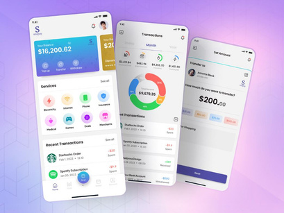
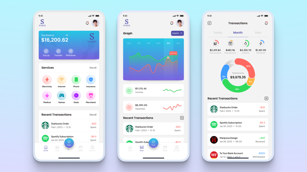
3. Personalization & Dashboard UX
Wallets should feel personal and purposeful:
Allow custom nicknames for cards or bank accounts
Show dynamic visualizations of spending, balance, trends
Integrate goals (saving for travel, paying down debt) with progress bars
Core UX Principles for e-Wallet Design
UI Design Best Practices for Digital Wallets
Effective Visual Hierarchy
Emphasize available balance, then actions (Send, Scan, Pay)
Design with card-like UI modules (e.g., for bank accounts or loyalty)
Use contrast and icons to reduce reliance on reading—especially in low-light or fast-use scenarios
Transaction UX Flows
Support drag-and-drop actions for repeat payments
Use visual recipient avatars for peer-to-peer (P2P) comfort
Offer real-time validation of card/account numbers (e.g., BIN matching)
Payment Sources & Cards Management
Let users freeze/unfreeze cards from the UI
Display virtual card CVV with biometric unlock
Group cards by color or function (primary, joint, crypto, business)
Paytm is one of the most widely used digital wallets in India, serving hundreds of millions of users. Its UI/UX success lies in delivering a multipurpose experience under a single app architecture. Whether you’re topping up your mobile phone, transferring money via UPI, purchasing gold, or paying utility bills, the flow feels unified and effortless.
Multi-service design: Users can move between wallet, bank account, and investment features without changing UI logic or context.
Localized suggestions: The app uses real-time location data to suggest nearby stores, available cashbacks, or recharge offers.
Gamification & loyalty: Cashback coupons and scratch cards are presented with playful animations, increasing engagement.
Paytm’s strength lies in combining scale with contextual simplicity.
Apple Wallet
Apple Wallet exemplifies the art of minimalist design applied to financial interaction. Rather than adding new layers, Apple strips things down to their essentials—resulting in a clean, predictable experience.
One-glance UX: Users instantly see their default card, tickets, or boarding passes without navigating tabs.
WatchOS integration: Payments on Apple Watch mirror the visual flow of iOS, with vibration and color cues for success.
Privacy-focused visuals: Apple uses subtle shading and blur effects to mask sensitive data until biometric authenticated.
Seamless backups: Wallet items are tied to the iCloud ecosystem, making cross-device continuity feel effortless.
Apple Wallet’s design is not only polished but incredibly secure—delivering confidence without clutter.
ZaloPay (Vietnam)
ZaloPay builds on the social chat foundation of Zalo—Vietnam’s leading messaging app—to create a highly intuitive and local-first wallet experience.
Fast onboarding in local language: New users complete setup in under 60 seconds, with native Vietnamese UI and SMS OTP authentication.
QR-first design: Given Vietnam’s high QR code adoption, the app prioritizes Scan & Pay with floating buttons and camera-ready state.
Chat-to-pay integration: Within Zalo Messenger, users can send/receive money directly in chats, similar to WeChat Pay.
Mini-program ecosystem: Users can pay bills, shop, or order food within ZaloPay through lightweight embedded apps.
ZaloPay’s experience demonstrates how tightly integrated UI/UX and cultural behavior can elevate usage frequency and loyalty.
Real-World Examples: Learning from Leaders
Final Thoughts
Building a successful e-wallet means balancing trust, performance, and usability. It must be lightning-fast, visually intuitive, inclusive, and 100% secure—all at once.
At Viartisan, we help fintech brands build human-centered digital wallets that users love and return to. Our designs are rooted in data, shaped by behavior, and built to scale.
📩 Talk to us about launching your next-gen wallet experienc
In today’s competitive digital marketplace, your eCommerce UI/UX design can make or break your business. Users expect speed, clarity, and seamless experiences. If they don’t find it on your site, they’ll find it on your competitor’s.
At Viartisan, we believe high-converting eCommerce design isn’t just about looking good—it’s about aligning business goals with user needs at every step of the journey. In this guide, we break down the latest best practices and strategies to create exceptional eCommerce experiences in 2025. This is not just a list of design tips—it’s a comprehensive approach to crafting seamless digital shopping experiences that foster trust, ease, and loyalty.
Why UI/UX Matters in eCommerce
Direct Impact on Revenue
A well-designed eCommerce interface not only improves usability—it drives results. According to industry research:
88% of online shoppers won’t return after a bad UX.
Every extra second of load time reduces conversions by up to 7%.
Companies investing in UX see a return of $100 for every $1 spent.
Key UX Outcomes
Improved first-time buyer conversion
Increased customer lifetime value (CLV)
Reduced cart abandonment rates
Enhanced brand loyalty and differentiation
UX is no longer a support function—it’s a strategic business asset.
Why UI/UX Matters in eCommerce
Core Principles of eCommerce UI/UX Design
1. Speed and Performance
Use CDN and lazy loading for product images
Minify code and defer non-critical JavaScript
Prioritize above-the-fold content for faster perceived load
2. Simplicity and Clarity
Remove visual clutter: only necessary information should be on each screen
Use whitespace to increase scannability
Highlight one primary action per screen (e.g., “Add to Cart” or “Checkout Now”)
3. Consistent User Interface Patterns
Place search bars and filters in intuitive locations
Maintain consistent icon styles and hover interactions
Apply a clear color system for actions (e.g., green for primary, red for delete)
Core Principles of eCommerce UI/UX Design
Homepage & Landing Page Design Best Practices
Homepage Essentials
Hero section: State your brand value clearly (e.g., “Affordable, Ethical Skincare”)
Featured categories: Highlight your bestsellers or trending collections
Social proof: Display real reviews, star ratings, or Instagram UGC
Creating seamless, trustworthy, and goal-oriented UI/UX for eCommerce is a multidisciplinary challenge—combining interface design, UX psychology, performance optimization, and business strategy.
AtViartisan, we design eCommerce experiences that drive measurable growth. Whether you’re launching a startup or scaling a DTC brand, we blend data, creativity, and user empathy to build stores that convert.
📩 Talk to our team to transform your eCommerce vision into a world-class customer experience.
UI/UX design has evolved into one of the most impactful fields in the digital age—shaping how users interact with technology and how brands deliver value. With the rapid rise of AI, responsive design, and ethical personalization, building a comprehensive UI/UX design roadmap has never been more important.
In this in-depth guide, Viartisan outlines the complete 2025 roadmap to mastering UI/UX design—from foundational knowledge and tool mastery to advanced UX systems, real-world portfolios, and career evolution.
Whether you’re transitioning from graphic design, development, or starting fresh, this roadmap will help you navigate your way into a thriving design career.
Why You Need a UI/UX Design Roadmap in 2025
The field of UI/UX design is expanding rapidly. According to recent industry reports:
UI/UX roles are among the top 10 most in-demand jobs globally.
Average salaries for UX Designers range from $80,000 to $130,000 in the U.S.
Startups, agencies, enterprises, and government sectors all rely on skilled designers.
Yet, many aspiring designers feel overwhelmed by:
The broad range of skills required
Constantly changing tools and trends
Lack of structure in self-learning paths
A strategic roadmap helps:
Prioritize what to learn first
Build portfolio-ready projects
Develop skills that align with actual job roles
Stay updated with evolving industry standards
This roadmap is not a one-size-fits-all checklist—it’s a flexible framework you can adapt depending on your background and goals.
Why You Need a UI/UX Design Roadmap in 2025
Stage 1: Build Your Foundations in UI/UX Design
Key Concepts to Master
Understanding the difference between UI and UX is crucial. UI is visual—it’s about aesthetics and interactions. UX is functional—it’s about research, flow, behavior, and user satisfaction.
Key principles include:
Visual design fundamentals: Color theory, typography, layout, spacing
UX psychology: User behavior, cognitive load, Hick’s Law, Fitts’s Law
Design patterns: Common navigation methods, input forms, onboarding screens
Frameworks
Design Thinking: Empathize, Define, Ideate, Prototype, Test
Double Diamond: A proven model for divergent and convergent thinking in design
Exercises
Redesign a simple app with wireframes and mockups
Critique 3 onboarding flows and note UX pain points
Build mood boards and style tiles for hypothetical brands
Service blueprints: End-to-end system visualization
Task models: Detailed breakdowns of user decision-making
Tools to Use
Dovetail for qualitative research synthesis
Hotjar or FullStory for user behavior analysis
Useberry or Maze for remote usability testing
Stage 4: Master Prototyping and Testing
From Sketch to Pixel-Perfect
Build flows that replicate the full user experience:
Integrate voice, gesture, and microinteractions
Design with state changes and motion logic
Include loading, error, and success scenarios
Prototype Testing
Use Figma’s Smart Animate to simulate interactions
Conduct A/B tests to compare flows
Include accessibility tests with screen readers and keyboard-only navigation
Bonus: Include annotation layers explaining intent to developers
Stage 5: Understand Product Thinking and Collaboration
UX in Business Context
UX isn’t just design—it’s strategy. Learn how UX decisions impact:
Retention and conversion rates
Time to value (TTV) and user activation
Support costs and feature adoption
Real-World Scenarios
Conduct design sprints with cross-functional teams
Translate feedback into product roadmap adjustments
Balance MVP constraints with long-term UX vision
Documentation & Handoff
Build specs using Notion, Confluence, or Figma Dev Mode
Document component behaviors, edge cases, and interaction logic
Stage 6: Build a Portfolio That Gets Hired
Your portfolio is your product—treat it with the same care:
Case Study Essentials
Each case study should show how you think, not just what you made:
Problem: What pain points existed?
Approach: What research did you conduct?
Design: What iterations did you test?
Outcome: What metrics or feedback validated your work?
Beyond Visuals
Add project retrospectives and lessons learned
Include “before and after” comparisons
Use plain English—avoid buzzwords
Career Pathways in UI/UX Design
UI/UX is not a linear path—it spans:
Entry-Level
Mid-Level
Senior-Level
Specialist
Junior UX Designer
UX/Product Designer
Lead UX Designer
UX Researcher
Visual Designer
Interaction Designer
Design Manager
Accessibility Specialist
UX Writer
UX Strategist
Director of UX
UX Engineer / Prototyper
Each path leads to different forms of impact—on users, systems, or organizations.
Career Pathways in UI/UX Design
Final Thoughts: Design Is a Journey, Not a Job Title
UI/UX design is about curiosity, empathy, iteration, and collaboration. The best designers never stop learning. They test assumptions. They advocate for users. And they deliver value—not just visuals.
AtViartisan, we design smarter by applying design systems, research insights, and cross-functional collaboration.
If you’re building your UI/UX career—or your product vision—we’re ready to help.
This report presents a concise, high-level overview of the strategic imperative for Shopee to develop a robust English version of its website. The initiative extends beyond a simple linguistic translation, representing a fundamental step towards either expanding into new English-speaking markets or significantly enhancing service for existing English-speaking users within Shopee’s current operational regions. The analysis highlights critical observations derived from Shopee’s current UI/UX landscape and a comprehensive benchmarking exercise against leading e-commerce platforms, Apple and Etsy.
Key findings underscore that success for Shopee’s English platform hinges on a comprehensive localization strategy that transcends mere translation, focusing instead on deep cultural relevance and an optimized user journey. The report outlines prioritized actions for UI/UX enhancements, content adaptation, and technical improvements, emphasizing the potential for expanded market penetration and enhanced user loyalty that a well-executed English website can unlock. The core message conveyed is the strategic necessity of a truly localized English website to foster global competitiveness and user retention, providing an actionable roadmap for Shopee’s future growth.
1. Introduction: The Strategic Imperative of an English Shopee Website
The request for an English version of the Shopee website signifies a pivotal strategic move for the e-commerce giant. This is not merely a technical translation task but a fundamental step towards either expanding into new English-speaking markets or significantly enhancing service for existing English-speaking users within Shopee’s current operational regions. Shopee currently operates predominantly in Southeast Asia and Taiwan, with recent expansions into Latin American markets including Brazil, Mexico, Colombia, and Chile. Its established business model is a marketplace that efficiently connects buyers and sellers, renowned for its convenience, affordability, and a user-friendly UI/UX design specifically tailored for the Southeast Asian market.
A critical consideration for this initiative is precisely defining the core purpose behind the request for an English platform. The broad nature of the original request necessitates a clear distinction: Is the primary objective new market entry, specifically targeting English-speaking countries or large English-speaking diasporas, or is it to improve service for existing English-speaking users and sellers within current markets? This distinction is paramount because it dictates every subsequent decision. For example, the choice of a specific English dialect (e.g., American English versus British English), the necessary cultural adaptations, the relevance of product offerings, the integration of specific payment gateways, the design of logistical solutions, and the focus of marketing efforts will all be profoundly shaped by this initial strategic clarity. A precise understanding of the target English-speaking demographic—whether affluent Western consumers or tech-savvy Asian millennials—will fundamentally influence the content strategy, UI/UX design priorities, and the overall localization approach.
The overarching goal of this report is to provide a comprehensive, data-driven strategic blueprint for the development and implementation of a highly effective English version of the Shopee website. This will be achieved through a multi-faceted approach: first, by analyzing Shopee’s existing UI/UX strengths and identifying specific areas ripe for improvement; second, by benchmarking against leading global e-commerce platforms such as Apple and Etsy to derive best practices in information architecture, visual design, user journeys, accessibility, and feedback mechanisms; and third, by translating these comparative observations into actionable recommendations specifically tailored for Shopee’s English website, focusing on genuine localization beyond mere linguistic translation. Ultimately, this report aims to ensure that the English website not only facilitates seamless transactions but also deeply resonates with and effectively serves its target English-speaking audience, thereby supporting Shopee’s broader market expansion and user engagement objectives.
The Strategic Imperative of an English Shopee Website
2. Shopee’s Current E-commerce Landscape: A Foundational Analysis
2.1 Business Model, Core Markets, and Target Audience
Shopee operates predominantly on a marketplace business model, effectively connecting a vast network of buyers and sellers. The platform’s revenue streams are diversified, stemming from transaction-based fees, advertising services, and various value-added services. This robust model facilitates both Consumer-to-Consumer (C2C) and Business-to-Consumer (B2C) transactions, demonstrating significant flexibility in its commercial offerings.
Geographically, Shopee’s stronghold remains Southeast Asia, maintaining a significant presence in countries such as Indonesia, Malaysia, Thailand, Vietnam, the Philippines, and Singapore. It also holds a strong foothold in Taiwan. In recent years, Shopee has strategically expanded its geographical reach into Latin American markets, including Brazil, Mexico, Colombia, and Chile. As of 2023, Shopee is recognized as the largest e-commerce platform in Southeast Asia by Gross Merchandise Volume (GMV).
Shopee caters to a broad and diverse user base. This includes a wide array of consumers, from “bargain hunters” and “tech-savvy users” to “young adults,” “e-commerce enthusiasts,” “fashion-conscious customers,” and those interested in “gadgets,” “health and beauty,” “home and living,” “parents and families,” “gamers,” and “outdoor enthusiasts”. On the seller side, Shopee empowers “small and medium-sized enterprises (SMEs),” “online merchants,” and “brand owners”. Notably, Shopee’s marketing strategy has historically focused on mobile users, leveraging the rapid growth of smartphone penetration in regions like Indonesia. The platform has also identified women as a primary target demographic due to their higher engagement in e-commerce activities.
A significant observation regarding Shopee’s current success is that its UI/UX design was “specifically crafted to align with the cultural and social characteristics of the Southeast Asian market”. While this deep cultural integration has undoubtedly been a significant competitive advantage in its existing markets, it presents a considerable challenge when translating the experience for a global English-speaking audience. A direct, literal translation of content and the retention of culturally specific UI patterns may not resonate, or worse, could alienate users from different cultural backgrounds. This means that a successful English website for Shopee necessitates a strategic shift from simple translation to comprehensive transcreation and cultural adaptation. This involves re-evaluating not just the language, but also visual metaphors, content tone, humor, product presentation, and even underlying assumptions about user behavior and mental models. The goal is to create an experience that feels native and intuitive to the target English-speaking demographic, rather than merely a translated version of a Southeast Asian platform.
2.2 Existing UI/UX Strengths and Identified Usability Challenges
Shopee’s current platform demonstrates several commendable UI/UX strengths, alongside identifiable areas for improvement that should be addressed for its English website.
Strengths:
User-Friendly Interface & Navigation: Users generally express satisfaction with Shopee’s usability, citing “obvious navigation throughout the website” and the provision of “an effective internal search engine”. The mobile application, in particular, is praised for its “clear and direct structure,” effective use of “white space,” and “organized grid-based product listing,” all contributing to an intuitive experience.
Clear Calls to Action (CTAs): The platform features “clear links/buttons to ‘Add to Cart’ or ‘Buy now'”. Shopee’s consistent use of its brand colors ensures that CTAs are prominent and eye-catching, effectively guiding user actions.
Efficient Purchasing Process: The checkout flow is described as an “easy-to-order process,” supported by “alternative methods for the payment” and an “accessible shopping cart from all the pages of the website”. The inclusion of “pre-checked boxes within the cart” further streamlines the checkout, reducing friction.
Transparent Information Presentation: Shopee excels in providing clear information regarding “delivery dates,” “order charges (i.e., taxes, shipping costs),” and comprehensive “shipping, return or exchange policy and other shopping rules”.
Security & Registration: The registration process is “short and simple,” requiring “only essential information.” The website also clearly states the “availability of privacy policy” and is perceived as “secure” with visible security logos during checkout. This category received the highest user satisfaction score in one study.
Design Aesthetics: The platform is noted for its “consistent interface,” “attractive design,” and “appropriate use of font type, font color, and background color”.
Engagement Features: Shopee actively integrates features like “Shopee Live” for real-time buyer-seller interaction and “gamification elements” to enhance user engagement and retention. Personalized recommendations are also a key feature.
Challenges/Areas for Improvement:
Information Hierarchy on Product Pages: Despite good use of white space, product pages can suffer from “many unutilized spaces and a less defined information hierarchy,” making it “a bit of a hassle to discern which information is essential when everything is arranged and appears almost similar to each other”. This suggests a potential for cognitive overload despite the presence of information.
Pricing and Discount Visibility: The sizing of “price and discounts to small, even with Shopee’s brand color, doesn’t instantly grasp users’ attention”. This is a critical element for conversion.
Error Message Clarity: There is a noted “lack of displaying clear error messages if an error is occurred while interacting with the website”. Specific examples of common errors include invalid category IDs, image dimension/size issues, product name/description length constraints, and variant limits.
Checkout Progress Indicators: The absence of “an obvious progress indicator at the top of the checkout pages” can lead to user uncertainty and potential abandonment.
Delivery Options: A “lack of providing alternative methods for the delivery of the order” was identified as a usability problem.
Product Information Detail (Presentation): While one source claims product pages are “thorough” , another notes a “lack of presenting detailed information about the product”. This apparent contradiction highlights a critical point: the information might exist, but its presentation or organization is suboptimal, making it difficult for users to find or process.
Foreign Currency Support: The platform currently “lacks supporting foreign currency” , which is a significant barrier for international users.
Review Quality and Authenticity: A major concern is the prevalence of unhelpful customer reviews (e.g., “Fast delivery! Not yet try,” “looks good yet to try”) driven by incentives like coins, rather than genuine product feedback. Furthermore, issues with counterfeit products and difficulty leaving negative reviews are reported, undermining the credibility of the review system.
The observation that Shopee’s product pages are described as “thorough” but simultaneously suffer from a “less defined information hierarchy” and “unutilized spaces” indicates a common e-commerce UI/UX challenge: providing ample information without overwhelming the user. When all information is presented with similar visual weight, it increases cognitive load, making it difficult for users to quickly identify key details like price, variations, or critical features. This suggests that for the English website, a significant redesign of product detail pages is crucial. This involves not just translating existing content but fundamentally re-architecting its presentation to ensure clear visual hierarchy, scannability, and the strategic application of progressive disclosure. Prioritizing essential information, such as high-quality images, prominent pricing, and clear call-to-actions, and using visual cues (e.g., bolding, larger fonts, distinct sections, accordions) to guide the user’s eye will be paramount to improving user comprehension and reducing friction.
Furthermore, the research highlights that many Shopee reviews are unhelpful, often focusing on delivery speed rather than product quality, largely due to user incentives (coins) for any review. Compounding this, there are reports of counterfeit products and difficulties in leaving negative reviews. Trustworthy reviews are a cornerstone of successful online marketplaces. If users perceive reviews as unreliable or manipulated, or if they encounter issues with product authenticity, it fundamentally erodes buyer trust. This is particularly damaging for a new English-speaking audience who may not have established loyalty to the Shopee brand. The consequence of unhelpful or manipulated reviews and unaddressed counterfeit issues is a diminished buyer trust and an increased perceived risk, which ultimately leads to reduced conversion rates, lower customer retention, and a negative brand perception for the English website. Therefore, Shopee must urgently implement mechanisms to encourage more substantive, authentic reviews, perhaps by refining incentive structures to reward detailed feedback rather than just submission. Moreover, a transparent and efficient system for reporting and addressing counterfeit products is vital. Building and maintaining trust through genuine product feedback and quality assurance will be crucial for the long-term success and growth of the English platform.
The following table summarizes Shopee’s current UI/UX strengths and areas for improvement, providing a foundational assessment for subsequent recommendations.
Table 1: Shopee’s Current UI/UX Assessment: Strengths and Areas for Improvement
UI/UX Category
Strengths
Areas for Improvement
Navigation & Search
Obvious navigation throughout; effective internal search engine. Clear, direct structure in mobile app, good use of white space.
Poor navigation design (past issue), links not visible (past issue).
Product Display & Information
Organized grid-based product listing. Prominent advertising for new products/offers. Thorough product pages.
Less defined information hierarchy on product pages, making essential info hard to discern. Pricing/discounts too small, not instantly attention-grabbing. Lack of presenting detailed product information (presentation issue).
Purchasing Process (Checkout)
Clear “Add to Cart” / “Buy now” buttons. Alternative payment methods provided. Accessible shopping cart from all pages. Easy-to-order process. Pre-checked boxes in cart streamline checkout.
Lack of obvious progress indicator at top of checkout pages. Lack of alternative delivery methods.
Security & Registration
Short, simple registration with essential info. Availability of privacy policy. Secure website with visible security logos.
None explicitly identified as weaknesses in provided data.
Design Aesthetics
Consistent interface, attractive design, appropriate use of font type, color, background color.
Bright orange brand color can be excessive on certain elements, potentially feeling crowded.
Feedback Mechanisms & Support
Visible contact info, visible FAQ section. Supports foreign language. Live chat and social sharing features.
Lack of displaying clear error messages. Unhelpful customer reviews (focus on delivery, not product). Issues with counterfeit products and difficulty leaving negative reviews. Lack of supporting foreign currency. Manual categorization of support tickets is inefficient.
Shopee’s Current E-commerce Landscape: A Foundational Analysis
3. Benchmarking for Excellence: Lessons from Leading E-commerce Platforms (Apple & Etsy)
To inform the strategic development of Shopee’s English website, a comprehensive benchmarking analysis against leading e-commerce platforms, Apple and Etsy, provides valuable insights into best practices in UI/UX design.
3.1 Information Architecture and Navigation Best Practices
Apple’s design philosophy is rooted in “simplicity as the ultimate sophistication”. Their iOS Settings application serves as a prime example of a highly effective, complex hierarchical information architecture (IA) that remains logical and user-friendly. This is achieved through meticulous categorization, strategic progressive disclosure, and consistent design patterns, which collectively prevent user overwhelm even when navigating hundreds of settings. Apple also integrates robust search functionality to provide direct access within deep hierarchies, catering to both novice and power users.
Etsy’s navigation is characterized by a clear subcategory organization and comprehensive filtering options. The platform prioritizes product categories and implements a search bar with advanced filters, including predictive text suggestions, to help users quickly narrow down results. Etsy also strategically utilizes footer navigation for important links, preventing clutter in main menus.
From these benchmarks, several key principles for information architecture and navigation emerge:
Clarity: Interfaces should be easy to understand at a glance, with a clear visual hierarchy guiding the user’s attention.
Consistency: A consistent look, feel, and behavior across devices and within the application fosters familiarity and reduces cognitive load.
Progressive Disclosure: Presenting simple interfaces by default, with clear and intuitive paths to reveal advanced functionality or detailed information, is crucial for managing complexity.
Scalability: The chosen IA should efficiently handle vast numbers of content items or products, supporting both casual browsing and directed searching.
Mobile Responsiveness: Navigation must adapt seamlessly to various screen sizes, incorporating touch-friendly buttons and widely recognized mobile patterns like hamburger menus or tab bars.
A significant observation is that Shopee’s current product pages are noted for being “thorough” but suffering from a “less defined information hierarchy”. This creates a paradox where information is present but difficult to digest. Apple and information architecture experts consistently advocate for progressive disclosure as a solution to manage information density. By initially presenting only essential details and allowing users to expand for more, cognitive load is reduced, and the user experience becomes more efficient. The implementation of progressive disclosure on Shopee’s product pages would reduce visual clutter and cognitive load, making key information more prominent. This would improve user comprehension, reduce decision fatigue, and enhance overall satisfaction, potentially leading to higher conversion rates. Therefore, Shopee should re-architect its English product detail pages to prioritize core purchasing information (high-quality images, clear pricing, primary call-to-action buttons) prominently. Secondary information, such as detailed specifications, comprehensive reviews, shipping nuances, and seller policies, should be organized into expandable sections, tabs, or modal overlays. This approach aligns with best practices for complex e-commerce platforms and directly addresses Shopee’s identified usability challenge.
3.2 Visual Design Principles: Aesthetics, Clarity, and Consistency
Apple’s visual design is synonymous with minimalism, clean layouts, and a strong product-centric focus. They leverage a custom-designed typeface, San Francisco, to ensure optimal legibility and a clear visual flow across all products and platforms. Their approach includes consistent color schemes, ample white space, and high-quality imagery and videos that showcase products from every angle. Subtle animations and visual effects are employed to create a sense of depth and continuity, enhancing the user experience without being distracting. Accessibility is a core consideration, with emphasis on high contrast and dynamic color adaptation to ensure readability for all users.
While less explicitly detailed in the provided information regarding its overall design system, Etsy’s aesthetic generally supports its marketplace of unique, handmade goods. Its UI/UX is recognized for being effective, allowing product imagery to take center stage.
Key visual design principles derived from these benchmarks include:
Aesthetic Integrity: The visual appearance of the interface should seamlessly support and enhance its functionality, creating a cohesive and intuitive experience.
Minimalism & White Space: Eliminating unnecessary distractions and strategically using white space directs user attention to core content, contributing to a professional and high-end feel. Shopee already demonstrates good use of white space in some areas.
Typography: Prioritizing legible and well-proportioned typography, with ample white space between lines and minimal use of different typefaces, is crucial for readability and maintaining a clear information hierarchy.
Color & Contrast: Consistent color palettes, high contrast ratios for text and interactive elements, and the strategic use of color to convey meaning or indicate actions (e.g., blue for primary actions, red for destructive actions) are vital for clarity and accessibility.
Imagery: High-quality, high-resolution images are essential for showcasing products effectively and should always be displayed at their intended aspect ratio to avoid distortion.
A notable observation is that Shopee’s current UI prominently features a “bright and glaring orange” brand color, which “immediately draws attention” but can also feel “excessive on certain elements”. In contrast, Apple employs minimalist color palettes, allowing content to shine, and uses color strategically to highlight actions rather than as a dominant background element. The current aggressive application of orange might be perceived as visually overwhelming or less sophisticated by some English-speaking audiences accustomed to more subdued e-commerce aesthetics. For the English website, Shopee should refine its application of the brand orange. While its vibrancy is effective for drawing attention to critical Calls to Action (CTAs) , its overuse can lead to visual clutter and diminish the perceived premium quality of the platform. A more strategic, minimalist approach would involve reserving the vibrant orange primarily for key interactive elements (buttons, links, progress indicators, alerts) and utilizing more neutral, ample white space for backgrounds and less critical content. This refined color strategy would improve visual clarity, enhance perceived sophistication, and align better with global e-commerce design trends, without losing brand identity.
3.3 Optimizing User Journeys: From Discovery to Purchase and Support
Optimizing the user journey from initial product discovery to purchase and post-purchase support is paramount for any successful e-commerce platform.
Discovery (Search & Browse): Apple supports both casual browsing and highly directed searching, leveraging personalization to increase user engagement and employing a clear visual hierarchy to help users understand content relationships. Etsy excels with robust subcategory organization and comprehensive filtering options, enabling users to efficiently narrow down product selections. Shopee’s current platform already possesses an “effective internal search engine” and “obvious navigation” , providing a strong foundation for enhancement.
Purchase Flow: Apple offers a streamlined checkout experience with diverse payment options, including Apple Card Monthly Installments, various carrier deals, and Apple Pay. They also provide flexible delivery choices and personalized setup sessions post-purchase. However, identified challenges include initial pricing visibility during browsing and the potential complexity of detailed carrier deal terms. Etsy’s product listings clearly display key highlights, materials, and personalization options, with straightforward “Add to cart” steps. Shopee’s current platform features an “easy-to-order process” with “clear links/buttons to ‘Add to Cart’ or ‘Buy now'” and provides “alternative methods for the payment”. The “pre-checked boxes within the cart” help streamline the checkout process. Nevertheless, critical gaps include the absence of an “obvious progress indicator at the top of the checkout pages” and a perceived “lack of presenting detailed information about the product” , which, as previously discussed, might be a presentation issue rather than an information absence.
Support: Apple provides extensive support resources, including dedicated support sections, quick links for common issues, multiple contact channels (phone, chat, email, dedicated support app), and comprehensive self-service resources (FAQs, support videos, community forums). Shopee’s current platform offers “visible contact information” and a “visible Frequently Asked Questions (FAQ) section”. However, it faces challenges with increasing customer service queries and issues with manually categorizing and potentially mis-tagging support tickets.
A significant observation is that while Shopee’s checkout process is noted as “easy-to-order,” it critically lacks an “obvious progress indicator”. In contrast, Apple’s payment sheet clearly outlines billing, shipping, payment method, and order totals within its flow. The absence of a visual progress indicator in multi-step processes like checkout can lead to user anxiety, uncertainty about remaining steps, and ultimately, higher cart abandonment rates. Users need to feel in control and understand their position within a process. The lack of a clear progress indicator increases cognitive load, user anxiety, and a perceived lack of control during the checkout process, leading to higher cart abandonment rates and reduced task success. Therefore, Shopee must prioritize implementing a clear, multi-step progress indicator in its English website’s checkout flow. This visual cue provides predictability, reduces user uncertainty, and reinforces the feeling of control, aligning with core UX principles. This improvement is crucial for optimizing conversion rates, especially for new users who may be less familiar with Shopee’s existing flow.
3.4 Ensuring Comprehensive Accessibility
Apple demonstrates a profound commitment to accessibility, embedding “innovation that’s accessible by design” into its core philosophy. Their products and platforms feature built-in accessibility tools for various needs, including vision (VoiceOver, Eye Tracking), hearing (AirPods Pro with Hearing Health, Music Haptics), speech (Personal Voice), mobility (Assistive Access, sufficiently sized controls, keyboard navigation, alternative input methods), and cognitive features. Apple’s Human Interface Guidelines (HIG) serve as a foundational guide for developing user-friendly and highly accessible applications, emphasizing interfaces that are intuitive, perceivable, and adaptable.
While Etsy’s platform hosts numerous products related to accessibility (e.g., adaptive switch buttons, assistive tools) , the provided information does not offer specific details on Etsy’s own website accessibility features or its adherence to accessibility standards.
The Web Content Accessibility Guidelines (WCAG) are international standards established by the World Wide Web Consortium (W3C), providing a comprehensive framework for making web content accessible to individuals with diverse disabilities (auditory, visual, physical, cognitive, speech, language, learning, neurological). Key guiding principles include Perceivable, Operable, Understandable, and Robust (POUR) content. Conformance levels (A, AA, AAA) provide benchmarks for implementation.
Shopee generally receives positive feedback on usability and is noted for supporting foreign languages and having visible contact information. However, a past study highlighted usability problems related to accessibility, such as content being available only in English (which contradicts later findings of foreign language support, suggesting a past issue or specific study limitation), poor navigation design, and links not being visible.
A significant observation is that Apple sets a high industry standard for accessibility, integrating it as a core design principle. International standards like WCAG provide clear, actionable guidelines. While Shopee’s general usability is praised, specific, comprehensive accessibility features are not prominently highlighted as strengths beyond foreign language support. Expanding to a global English-speaking audience means encountering diverse user needs and navigating varied legal requirements (e.g., ADA in the US, European Accessibility Act). Neglecting accessibility not only excludes a significant user segment but also poses legal and reputational risks. Therefore, Shopee should proactively conduct a thorough accessibility audit of its English website against WCAG 2.1 or 2.2 Level AA standards. This includes ensuring proper alternative text for images , sufficient color contrast for text and interactive elements , full keyboard navigation support, and adaptable layouts that respond to user preferences. Investing in comprehensive accessibility is not merely about compliance; it is a strategic move to expand the addressable market, enhance brand reputation, and demonstrate inclusivity, fostering greater loyalty among a broader user base.
3.5 Effective Feedback Mechanisms
Apple places a strong emphasis on providing immediate and clear feedback to users. This includes visual cues (e.g., highlighting buttons, progress indicators), auditory notifications, and haptic feedback (vibrations) to confirm interactions and system status. They also facilitate user feedback through ratings and reviews via API, prompting users at opportune moments to encourage constructive input. Etsy allows users to leave reviews for products , contributing to social proof and buyer decision-making.
Shopee’s current platform is noted for a “lack of displaying clear error messages” , which can be frustrating for users. Furthermore, its review system faces significant challenges, with many reviews being unhelpful or focusing on non-product aspects (e.g., delivery speed), and difficulties reported in leaving negative reviews, potentially due to incentive structures. Shopee does provide visible contact information and an FAQ section for support and integrates in-app messaging for direct buyer-seller communication.
A significant observation is that a major usability problem identified for Shopee is the “lack of displaying clear error messages”. While specific types of errors are known (e.g., image size, product name length, variant limits) , the generic or missing feedback frustrates users. Apple, in contrast, emphasizes providing clear messages for error handling and guiding users through complex interactions. Vague or absent error messages increase cognitive load, force users to guess, and can lead to abandonment. Therefore, the English website must prioritize implementing clear, concise, and actionable error messages across all user interactions. These messages should explicitly state what went wrong (e.g., “Image too small”) and how the user can rectify it (e.g., “Please upload an image at least 500×500 pixels”). This direct and helpful feedback empowers users, reduces frustration, and improves the overall user experience by fostering a sense of control and predictability.
The following table summarizes the UI/UX best practices derived from the benchmarking analysis against Apple and Etsy, highlighting their relevance for Shopee’s English website.
Table 2: E-commerce UI/UX Best Practices: Insights from Apple and Etsy
Addresses Shopee’s lack of progress indicators and limited delivery options, enhancing user confidence and reducing abandonment.
Accessibility
Comprehensive Design for All
Built-in features for vision, hearing, speech, mobility, cognitive needs; intuitive, perceivable, adaptable interfaces (HIG).
Hosts products related to accessibility. WCAG standards provide framework.
Critical for expanding Shopee’s reach, ensuring inclusivity, and complying with international standards, building brand reputation.
Feedback Mechanisms
Clear Error Messages
Provides messages/prompts for error handling, guiding users.
(Not explicitly detailed, but expected for e-commerce).
Directly addresses Shopee’s identified weakness in error message clarity, empowering users to resolve issues and reducing frustration.
Feedback Mechanisms
User-Generated Content Credibility
API for ratings/reviews, prompts at opportune moments, responses to reviews.
Allows users to leave reviews for social proof.
Essential for rebuilding trust in Shopee’s review system, encouraging authentic feedback, and addressing counterfeit concerns.
4. Designing for a Global English Audience: Key Considerations for Shopee
Developing an English version of the Shopee website for a global audience necessitates a deep understanding of key design considerations that extend beyond simple translation.
4.1 Adapting Information Architecture for Diverse Mental Models
A significant challenge lies in the fact that Shopee’s existing information architecture (IA) and content categorization are deeply rooted in and tailored for Southeast Asian user behaviors and cultural contexts. English-speaking audiences, particularly those from Western markets or different Asian regions, may possess fundamentally different mental models regarding how e-commerce content should be organized, categorized, and searched. For instance, product classification, search term expectations, and the perceived hierarchy of information can vary significantly across cultures. Simply translating existing labels will likely lead to confusion and suboptimal user experiences.
The observation that Shopee’s UI/UX is explicitly designed for the “cultural and social characteristics of the Southeast Asian market” carries a profound implication. If the existing information architecture (e.g., category names, navigation structures, product grouping logic) is merely translated into English without considering the distinct mental models and cultural shopping habits of the new English-speaking target audience, it will create significant cognitive friction. For example, a product category that is intuitive in one culture might be obscure or miscategorized in another, even if the words are correctly translated. This is not a linguistic error but a structural one. This oversight can act as a significant barrier to market entry or user adoption. If users struggle to find products or navigate the site due to an unfamiliar underlying information structure, they are likely to abandon the platform, regardless of product availability or competitive pricing. This directly impacts conversion rates, user retention, and ultimately, Shopee’s ability to gain market share in new English-speaking territories or effectively serve existing English-speaking segments. The cost extends beyond translation fees to lost revenue and market opportunity.
To address this, the following recommendations are crucial:
Targeted User Research: Conduct in-depth qualitative user research (e.g., card sorting exercises, tree testing, contextual inquiries, user interviews) with representative samples from the target English-speaking demographics. The goal is to explicitly uncover their mental models for product categorization, preferred search terminology, and intuitive navigation paths.
Refined Categories & Filters: Based on the observations from user research, refine and potentially re-structure product categories and filtering options to align with English-speaking user expectations. Ensure that all labels for categories, subcategories, and filters are clear, concise, and culturally appropriate.
Search Optimization for English Queries: Leverage advanced analytics on English search queries and user behavior to optimize keywords, improve search result relevancy, and enhance predictive text suggestions for English-language searches. This will ensure users can find products efficiently even if their terminology differs from Shopee’s existing internal classifications.
Strategic Progressive Disclosure: Implement progressive disclosure more rigorously across the website, particularly on product pages, to effectively manage information density. This ensures that users are not overwhelmed by information but can access details as needed.
4.2 Content Strategy and Localization Beyond Direct Translation
Effective localization for a global English audience demands more than a literal word-for-word translation. It requires adapting content to cultural nuances, idiomatic expressions, local preferences, and even legal requirements, ensuring the message resonates authentically and persuasively.
The current issues with unhelpful reviews and reports of counterfeit products on Shopee directly undermine user trust. For a new English-speaking market, where brand familiarity might be lower, establishing trust is paramount. High-quality, transparent, and authentic content – including detailed product information, clear policies, and genuine user reviews – is a critical trust-building mechanism in e-commerce. If users perceive content as generic, misleading, or reviews as unreliable, it significantly increases perceived risk. The consequence of suboptimal review quality and a lack of transparency regarding product authenticity and policies is an erosion of user trust and an increased perceived risk, which ultimately leads to reduced conversion rates, higher customer churn, and negative word-of-mouth for the English platform. Therefore, Shopee must make a strategic investment in the quality and authenticity of its content for the English platform. This encompasses not only the linguistic accuracy and cultural relevance of text but also the richness of product imagery , the detail of product specifications , the clarity of seller information, and a robust system for ensuring the credibility of user-generated content (reviews). Building this foundation of trust is essential for long-term user acquisition and retention in competitive English-speaking markets.
Key recommendations for content strategy and localization include:
Transcreation Mandate: Implement a policy for “transcreation” rather than direct translation for all critical user-facing content, including marketing copy, product descriptions, promotional banners, and user interface text. Transcreation ensures that the message’s intent, tone, and emotional impact are culturally appropriate and compelling for the target English audience, rather than just linguistically accurate.
Defined Tone of Voice: Develop a clear and consistent brand tone of voice specifically for the English website. This tone should align with Shopee’s overall brand identity (e.g., accessible, dynamic, reliable) but be adapted to resonate with the cultural expectations of the target English-speaking market (e.g., more formal, more casual, more direct, or more empathetic).
Enhanced Review Management: Address the identified issues with review quality and authenticity. Develop and implement strategies to encourage more substantive, helpful, and trustworthy reviews from English-speaking users. This might involve refining gamification mechanics to reward quality feedback over mere submission, implementing clearer guidelines for reviews, and providing robust, transparent reporting mechanisms for unhelpful or fake reviews.
Clear and Actionable Error Messages: As previously highlighted, ensure all error messages are meticulously crafted to be clear, concise, actionable, and user-friendly in English. They should guide the user on how to resolve the issue, rather than simply stating that an error occurred.
Policy Clarity and Compliance: Ensure all legal disclaimers, shipping policies, return/exchange policies, and privacy policies are not only translated accurately but are also clearly articulated, easily understandable, and legally compliant within the specific English-speaking regions being targeted. This builds trust and reduces potential disputes.
4.3 Enhancing User Control and Predictability
Users expect a high degree of control over their online experience and predictable responses from the system. Any perceived lack of control or unexpected behavior can lead to frustration and abandonment.
The explicit mention of “lack of supporting foreign currency” as a usability problem for Shopee is a critical observation for an international English website. For global e-commerce, price transparency and the ability to transact in one’s local currency are fundamental user expectations. Hidden costs, unclear exchange rates, or being forced to calculate conversions manually significantly increase friction and erode trust. This directly impacts a user’s sense of control over their purchase decision. The absence of multi-currency support and transparent pricing increases cognitive load, user frustration, and a perceived lack of control during the purchasing process, leading to higher cart abandonment rates, reduced conversion, and diminished user trust. Therefore, Shopee must prioritize the implementation of comprehensive multi-currency display and payment options for its English website. This includes showing prices in the user’s detected or selected local currency, clearly itemizing all charges (including taxes and shipping, as already a strength ), and providing seamless payment gateways that support international transactions. This will significantly enhance user control, build trust, and reduce friction in the purchasing journey, directly contributing to higher conversion rates.
Recommendations for enhancing user control and predictability include:
Prominent Progress Indicators: Implement highly visible and intuitive progress indicators for all multi-step processes, such as account registration, checkout, and order tracking. This provides users with a clear understanding of where they are in a process and what steps remain, reducing anxiety and improving task completion rates.
Undo Functionality & Confirmation: Integrate easy-to-use “undo” actions for reversible operations (e.g., removing an item from the cart) and provide clear confirmation prompts for actions with significant consequences (e.g., placing an order, deleting account data). This empowers users and prevents accidental errors.
Customization Options: Explore and implement personalization options that allow users to tailor their experience. This could include adjustable text sizes, contrast settings, and potentially even layout preferences to cater to diverse user needs and accessibility preferences.
Consistent and Immediate Feedback: Ensure that all user interactions trigger immediate and clear feedback (visual, textual, and potentially haptic where applicable) to confirm that the system has registered their input and is processing it. This builds confidence and reduces uncertainty.
Robust Multi-Currency Support: Address the identified usability problem of lacking foreign currency support. Implement robust multi-currency display and payment processing options, allowing users to view prices and complete transactions in their preferred local currency. If direct local currency transactions are not feasible, provide clear, real-time currency conversion tools and transparently display all associated costs (e.g., exchange rates, international transaction fees) upfront.
Key Considerations for Shopee
5. Actionable Recommendations for Shopee’s Website
Based on the foundational analysis of Shopee’s current UI/UX and the benchmarking against industry leaders, the following actionable recommendations are prioritized to guide the development of Shopee’s English website.
5.1 Prioritized UI/UX Improvements
High Priority:
Product Page Redesign for Clarity & Conversion: Re-architect product detail pages to implement progressive disclosure. This involves prominently displaying high-quality product images, large and clear pricing (including discounts), and a highly visible “Add to Cart” or “Buy Now” Call to Action. Detailed specifications, comprehensive reviews, shipping information, and seller policies should be organized into expandable sections, tabs, or accordions to prevent visual clutter and manage information density.
Enhanced Error Messaging: Implement a robust system for clear, actionable, and user-friendly error messages across the entire website. Messages should explicitly explain what went wrong (e.g., “Invalid image dimensions”) and how to resolve it (e.g., “Please upload an image between 500x500px and 2MB”). This improves user control and reduces frustration.
Checkout Progress Indicator: Integrate a prominent, multi-step progress indicator at the top of all checkout pages. This visual cue provides predictability, reduces user anxiety, and helps guide users through the purchase funnel, directly impacting conversion rates.
Comprehensive Accessibility Audit & Remediation (WCAG AA): Conduct a thorough audit against WCAG 2.1 or 2.2 Level AA standards. Prioritize implementing necessary changes to ensure the English website is perceivable, operable, understandable, and robust for users with visual, auditory, mobility, and cognitive impairments. This includes proper alt text for all images , sufficient color contrast , full keyboard navigation, and adaptable layouts.
Medium Priority:
Refined Brand Color Usage: Strategically refine the application of Shopee’s vibrant orange brand color. While effective for CTAs, its overuse can lead to visual fatigue. Reserve its vibrancy primarily for key interactive elements and calls to action, utilizing more neutral backgrounds and ample white space for overall visual balance and a more sophisticated aesthetic.
Improved Review System & Authenticity: Implement new mechanisms to encourage more substantive and authentic reviews from English-speaking users (e.g., post-delivery prompts for specific product attributes, gamification that rewards detailed feedback). Enhance reporting tools for unhelpful or fake reviews, and establish clearer processes for addressing counterfeit product concerns.
Alternative Delivery Options: Address the noted usability gap by exploring and clearly presenting diverse delivery methods beyond current offerings. This could include expedited shipping, local pickup options, or different carrier choices relevant to the target English-speaking markets.
Low Priority (Ongoing Iteration):
A/B Testing UI Variations: Continuously A/B test different UI elements, layouts, and content presentations with English-speaking user segments to iteratively optimize conversion rates, engagement, and overall user satisfaction.
Personalization Enhancements: Further leverage user data and artificial intelligence to offer more tailored product recommendations, personalized promotions, and customized shopping experiences for English-speaking users.
5.2 Content and Language Adaptation Guidelines
Transcreation Mandate: Implement a strict policy that all marketing, product, and user-facing content undergoes a “transcreation” process, not just literal translation. This ensures cultural relevance, emotional resonance, and idiomatic accuracy for the target English-speaking audience, preventing awkward phrasing or misinterpretations.
Localized Terminology & Style Guide: Develop a comprehensive English style guide and glossary of e-commerce and product-specific terminology. This guide should specify the preferred English variant (e.g., American English, British English, or a standardized “international English” based on target markets) and ensure consistent, culturally appropriate language across the entire platform.
Clear and Compliant Policies: Ensure all legal disclaimers, shipping information, return/exchange policies, and privacy policies are not only accurately translated but are also written in clear, unambiguous English and comply with the specific legal and consumer protection regulations of the targeted English-speaking regions. This builds trust and mitigates legal risks.
5.3 Technical and Performance Enhancements
Robust Multi-Currency Support: Prioritize the implementation of comprehensive multi-currency display and payment processing capabilities. Users should be able to view prices and complete transactions in their preferred local currency, with transparent display of all charges.
Performance Optimization: Ensure the English website maintains quick loading times and smooth transitions across various devices and network conditions, aligning with Shopee’s mobile-first ethos. This involves optimizing image sizes , streamlining code, and leveraging content delivery networks (CDNs).
Scalable Infrastructure: Continue to utilize and optimize scalable backend database solutions (such as TiDB, which Shopee already employs) to effectively handle the anticipated increase in user traffic and data volume from the English platform.
Enhanced Feedback Loop for Technical Issues: Establish a clear and accessible mechanism for English-speaking users to report technical issues (e.g., through a dedicated in-app feedback widget or a clear “Contact Support” option). Ensure that Shopee provides timely and transparent feedback on issue resolution, similar to Apple’s best practices.
5.4 Strategic Implementation Roadmap
A phased approach is recommended for the strategic implementation of Shopee’s English website:
Define Target Audience: Precisely identify the primary English-speaking demographics (countries/regions) for initial launch and their specific cultural, behavioral, and linguistic expectations.
Deep User Research: Conduct comprehensive qualitative and quantitative user research (e.g., card sorting, tree testing, usability studies, surveys) with representatives from the defined target audience to inform IA and UI/UX design.
Localization Strategy Development: Create a detailed localization plan, including content transcreation guidelines, tone of voice, and legal compliance requirements for target regions.
KPI Definition: Establish clear Key Performance Indicators (KPIs) for the English website’s success (e.g., conversion rate, average order value, user engagement metrics, retention rates, accessibility compliance scores).
Phase 2: Design, Development & Testing (Months 3-6)
UI/UX Design & Prototyping: Develop detailed wireframes, mockups, and interactive prototypes for key user flows (homepage, product pages, search results, checkout), incorporating prioritized UI/UX improvements.
Content Transcreation & Integration: Begin the transcreation process for all critical website content, ensuring cultural relevance and linguistic accuracy. Integrate translated content into the platform.
Technical Implementation: Develop the English website, focusing on implementing multi-currency support, performance optimizations, and backend integrations.
Rigorous Testing: Conduct extensive usability testing, A/B testing, and accessibility audits (WCAG AA) with real English-speaking users to identify and rectify issues before launch.
Phase 3: Launch, Monitoring & Iteration (Ongoing)
Phased Launch: Implement a soft launch in selected English-speaking markets to gather initial feedback and performance data.
Continuous Monitoring: Establish robust analytics dashboards to continuously monitor performance metrics, user behavior, and conversion funnels.
Feedback Loop: Maintain active channels for user feedback (e.g., surveys, in-app feedback, social media monitoring) and integrate observations into iterative improvements.
Marketing & Partnerships: Launch targeted marketing campaigns and explore influencer partnerships tailored to the English-speaking audience to drive user acquisition and engagement.
The following table provides a prioritized summary of these recommendations, linking each action to its justification and supporting benchmarks.
Table 3: Prioritized Recommendations for Shopee’s English Website
Strategically refine the application of Shopee’s vibrant orange brand color.
Medium
Improves visual clarity, enhances perceived sophistication, aligns with global aesthetics without losing brand identity.
Apple’s minimalist color palettes and strategic color use.
Review System
Implement mechanisms for encouraging substantive, authentic reviews and robust reporting for unhelpful/fake content.
Medium
Builds trust, improves product credibility, and enhances buyer confidence, crucial for new markets.
Apple’s approach to ratings and reviews.
Payment Transparency
Prioritize comprehensive multi-currency display and payment processing with transparent cost breakdown.
High
Enhances user control, builds trust, and reduces friction in the purchasing journey, directly contributing to higher conversion rates.
Apple’s clear payment options and terms.
Content Authenticity
Strategic investment in quality and authenticity of English platform content (imagery, specs, seller info, review credibility).
Medium
Establishes critical trust for new markets, reduces perceived risk, and supports long-term user acquisition and retention.
Apple’s focus on high-quality imagery and clear product information.
Information Architecture
Conduct user research to adapt categories, filters, and search optimization for English mental models.
High
Reduces cognitive friction, improves product discoverability, and aligns with user expectations in new markets.
Apple’s hierarchical IA and search functionality.
Actionable Recommendations for Shopee’s Website
6. Conclusion: Paving the Way for Expanded Market Penetration
The development of a meticulously localized English version of the Shopee website is not merely an operational task but an overarching strategic imperative. The analysis presented in this report underscores that Shopee’s ambition for expanded market penetration and sustained growth hinges on its ability to transcend simple translation and embrace a human-centered design approach for its global audience.
The proposed UI/UX improvements, comprehensive content adaptation, and technical enhancements will collectively transform the English website from a basic linguistic offering into a truly engaging and trustworthy platform. By addressing critical areas such as information hierarchy, error message clarity, checkout transparency, and comprehensive accessibility, Shopee can significantly enhance the user experience, fostering deeper customer loyalty among its new and existing English-speaking user base. Furthermore, a strategic investment in content authenticity and transparent pricing will build the foundational trust essential for success in competitive international markets. This strategic investment will serve as a critical catalyst for Shopee’s expanded market penetration and sustained revenue growth in English-speaking territories. Ultimately, this initiative positions the English website not just as a project, but as a fundamental pillar of Shopee’s ambition to become a truly global e-commerce leader, fostering stronger connections with a diverse international user base.
Apple’s User Interface (UI) and User Experience (UX) design have long been considered a gold standard in the technology industry. This prominence stems not just from the sleek appearance of its products but from how Apple has redefined the interaction between humans and technology.
The Interplay of Form and Function
Apple has redefined how humans interact with technology by seamlessly merging form and function. This isn’t just about the aesthetic beauty of the products but about designing in a way that makes the user experience as intuitive, efficient, and delightful as possible. This harmony creates a product that not only works well but also feels “right” to use.
This tight integration of form and function has set an industry standard. Other major tech companies, such as Google with Material Design and Microsoft with Fluent UI, have learned from and been inspired by Apple’s commitment to clarity, simplicity, and efficiency. This demonstrates Apple’s far-reaching influence, not just within its own ecosystem but in shaping global design trends.
The Importance of User-Centered Design in Apple’s Success
Apple’s design philosophy has always centered on human-centered innovation. This means every design decision aims to reduce cognitive load and ensure users can accomplish tasks with minimal effort. The goal is to create an experience where users feel empowered and effortlessly in control.
Placing the user at the center is not just a design methodology but a core business strategy. This approach has led to exceptional customer loyalty, with a Net Promoter Score of 72 and a customer retention rate of 92%. This also allows Apple to maintain premium pricing for its products. Users are willing to pay more for an optimized, reliable, and deeply satisfying experience, making UX design a strategic competitive advantage that directly impacts the company’s bottom line.
I. Core Design Philosophy: The Foundation of the Apple Experience
Apple’s design philosophy is built upon several core principles that shape every one of its products and services.
Simplicity is the Ultimate Sophistication: Clarity, Efficiency, and Aesthetic Integrity
Apple’s design philosophy revolves around simplicity, fostering user-friendliness and delivering an intuitive experience. This simplicity is evident in the elimination of unnecessary complexity, allowing users to immediately know what they can do on a screen without lengthy instructions
Clarity: Interfaces are designed to be easy to understand at a glance. Every element serves a clear purpose, and unnecessary complexity is removed so users can focus on the main task. Apple prioritizes well-proportioned typography and ample white space to enhance readability and clarity..
Efficiency: The Apple ecosystem thrives on seamless, fluid interactions. Every design decision aims to reduce cognitive load, ensuring users accomplish tasks with minimal effort. This includes touch-first interactions and haptic feedback to confirm actions.
Aesthetic Integrity: Beyond function, Apple’s design principles uphold beauty and emotional connection. An app’s appearance should support and enhance its functionality to the point that the two seem inseparable. Decorative elements are kept subtle, while primary tasks are given prominence.
The balance between “simplicity” and “efficiency” is a complex design challenge that Apple has masterfully addressed. Rather than merely removing features, Apple prioritizes ease of use and core functionality, avoiding “over-designed” products that can lead to frustration. This demonstrates a deep understanding of user psychology, where simplicity does not equate to a lack of features, but rather an optimization for accessibility and effective use.
Consistency Across the Ecosystem: Building Trust and Familiarity
Consistency is a cornerstone of Apple’s success. Regardless of the device, from iPhone to Mac, users experience a consistent look and feel, facilitating seamless navigation built on familiarity. This ensures that skills and knowledge transfer easily from one device to another.
The “squircle” (distinctive rounded square) design introduced in iOS 7 is a famous example of this attention to detail and consistency in Apple’s design language. This consistency not only improves usability but also reinforces customer loyalty by reducing “switching costs.” When users are familiar and proficient with a consistent ecosystem, moving to another platform becomes more difficult both cognitively and practically. This leads to high customer retention rates, with an estimated 85% of iPhone sales coming from existing iPhone customers upgrading to the latest model, and an overall customer retention rate of 92%. The seamless integration between Apple’s products creates a cohesive ecosystem that users find hard to leave.
Attention to Detail: From Materials to Haptic Feedback
One of Apple’s distinguishing features is its meticulous attention to detail. Every aspect of a product is carefully considered, from the physical dimensions of the device to the placement of buttons and icons.
Materials and Translucency: Materials in Apple platforms impart translucency by blurring and modifying the color values of the underlying visual content. This improves the integration of foreground and background elements, visually communicating a separation between layers and helping people retain a sense of place. Thinner, translucent materials are preferred to create a fresh feel and elevate content.
Haptic Feedback: Tiny vibrations provide tactile confirmation of interactions, making the experience feel natural and responsive. This is a crucial form of interactive feedback, complementing visual and auditory feedback.
This attention to detail, encompassing both physical and digital elements like materials and haptic feedback, creates a “premium experience” and reinforces perceptions of “quality and reliability”. This is not just about functionality but about the overall feel and impression, contributing to the “emotional connection” users have with the brand. These small details, when executed flawlessly, transform products from mere tools into cherished items, reinforcing the brand’s premium value.
Continuous Innovation: Leading the Market and Setting Trends
Apple continually pushes the boundaries of technology, from the first smartphone to the first mainstream tablet. Apple’s innovative approach is characterized by patience and focus, prioritizing getting things right over being first to market. They invest in innovation even during economic downturns, focusing on shaping the future of technology.
Apple’s innovation extends beyond creating new products to refining existing ideas into category-defining products, such as AirPods. This indicates a strategic trend: Apple focuses on optimizing existing user experiences through continuous improvement and refinement, rather than merely chasing the latest technologies. This is a form of deep innovation, where the perfection of the experience is prioritized over mere novelty.
Table 1: Apple’s Core Design Principles and Their Application in UI/UX
Principle
Brief Principle Description
Application in Apple’s UI/UX
Simplicity
Eliminating unnecessary complexity, focusing on core functionality.
Minimalist interfaces, ample white space, removal of distracting elements.
Clarity
Interfaces are easy to understand at a glance, every element has a clear purpose.
Well-proportioned typography (San Francisco font), clear iconography, intuitive hierarchy.
Efficiency
Seamless interactions, reduced cognitive load, accomplishing tasks with minimal effort.
Touch-first interactions, haptic feedback, optimized user flows (e.g., Apple Pay).
Aesthetic Integrity
Appearance supports and enhances functionality, creating emotional connection.
Minimalist color palettes, high-quality imagery, subtle animations, “squircle” design.
Consistency
Uniform look and feel across all devices and applications.
Unified design language, easy skill transfer between devices, consistent UI elements.
Deference
Interface minimizes distractions, allowing users to focus on primary content.
Subtle decorative elements, content brought to the forefront, translucent toolbars.
Depth
Uses layering, shadows, and visual effects to create a sense of hierarchy and dimensionality.
Interface layers, parallax effects, haptic feedback for interaction confirmation.
The Foundation of the Apple Experience
II. Human Interface Guidelines (HIG) and Their Application in UI/UX
Apple’s Human Interface Guidelines (HIG) are a comprehensive set of rules that help designers and developers create intuitive, seamless, and consistent interfaces across all Apple devices. Adhering to the HIG not only enhances usability but also boosts an app’s overall appeal and success.
Key HIG Principles: Clarity, Deference, and Depth
Clarity: Ensures every element in the app is easy to understand, focusing on minimalist design and straightforward navigation. This helps users quickly grasp how to use the app without confusion. This principle is demonstrated by prioritizing well-proportioned typography, ample white space, and clear, unambiguous icons.
Deference: In design, deference means the interface should minimize distractions, allowing users to focus on their tasks and enhancing overall engagement. This is often achieved through the use of subtle decorative elements and bringing content to the forefront.
Depth: Achieved through layering, shadows, and visual effects, creating a sense of hierarchy and a multi-dimensional experience that guides users naturally through the app. This helps users easily perceive interactive elements and understand information structure.
These HIG principles are not merely rigid design rules, but a framework for creating “learnable” rather than just “intuitive” interfaces. This implies that Apple designs for users to not only easily use immediately but also to develop mastery and confidence over time, reinforcing long-term loyalty and engagement with the ecosystem.
Key UI Design Elements
Typography and Readability: San Francisco and New York
Apple prioritizes well-proportioned typography and ample white space to ensure optimal readability. San Francisco (SF) is Apple’s default sans serif typeface family, specifically chosen for its clarity and legibility across digital screen. New York (NY) is a serif typeface family designed to work well alongside SF fonts, offering design flexibility.
Apple recommends using easily readable font sizes (minimum 11pt) and high contrast between font and background colors to ensure legibility in all conditions. They also encourage minimizing the number of typefaces used within an interface to maintain a clear information hierarchy and avoid visual clutter. Apple’s self-design and use of its own typefaces (San Francisco) and its detailed typography guidelines demonstrate its tight control over the visual experience. This not only ensures consistency across the entire ecosystem but also creates a unique and recognizable “brand signature,” enhancing overall aesthetics and reinforcing the brand’s premium identity.
Color and Contrast: Minimalist Palettes and Dynamic Colors
Apple employs a minimalist color palette, often neutral backgrounds, allowing content to shine and take center stage. They emphasize high contrast and dynamic color adaptation to improve accessibility and ensure good display in various contexts. Blue is used for primary actions (e.g., ‘Save’, ‘Continue’) to guide users, while red is reserved for destructive actions (e.g., ‘Delete’) to signal caution and prevent errors. The use of semantically meaningful and dynamic colors is an example of “intelligent” design that goes beyond mere aesthetics. It not only makes the interface visually appealing but also significantly improves usability and accessibility, especially in varying contexts or for users with specific visual needs.
Layout, Imagery, and Visual Consistency
Clean, minimalist layouts help eliminate distractions and keep the focus on content. The use of grids, white space, and a structured design creates a high-end, professional feel while enhancing readability and navigation. Apple’s product pages are highly focused on product imagery and features. Apple ensures high image quality by providing high-resolution versions of all image assets (@2x and @3x for Retina displays) and always displaying images at their intended aspect ratio to avoid distortion. The combination of minimalist layout, white space, and high-quality imagery creates a “luxurious and product-focused” experience. This is not just a visual style but a UX strategy to effectively guide user attention, highlight the core value of the product and brand, and minimize information overload.
Animations and Feedback: Creating a Natural and Intuitive Feel
Subtle animations create a sense of continuity and depth without overwhelming the user. They are designed to complement the experience without being distracting. Apple provides various types of interactive feedback to confirm user actions and provide status information:
Visual Feedback: Highlighting a button when pressed, showing progress indicators during loading.
Auditory Feedback: Distinctive sound notifications for specific events.
Haptic Feedback: Physical vibrations provide tactile confirmation, especially effective on mobile devices.
Verbal/Text Feedback: Clear messages or prompts help with error handling or guide users through complex interactions.
The diverse use of feedback channels (visual, auditory, haptic, textual) demonstrates a deep understanding of how humans process information and interact with technology. This not only makes the interface feel “natural and intuitive” but also enhances accessibility, catering to a wide range of users with different sensory capabilities, while building trust and confidence in app usage.
Information Architecture and Navigation
Hierarchical Structure and Progressive Disclosure
Effective information architecture (IA) is crucial for a positive user experience, helping users find information and functionality with ease. iOS’s Settings app is a prime example of a complex hierarchical information architecture, organizing hundreds of system and app settings into a logical, user-friendly structure This structure features clear parent-child relationships between categories, with settings grouped under broader categories that can have subcategories.
A key IA strategy is Progressive Disclosure, presenting simple interfaces by default with clear paths to advanced functionality. This allows both novice and expert users to use the same system effectively, avoiding overwhelming new users. For instance, on Apple’s website, product information is often kept minimal until users click ‘Learn More’ for full details. Apple’s progressive disclosure model is a sophisticated IA strategy that manages the inherent complexity of feature-rich systems. It addresses the potential drawbacks of deep hierarchical structures (hidden settings, confusion, or lengthy scrolling) by providing a simple starting point and allowing users to delve deeper as needed, optimizing for both new and experienced users without sacrificing clarity.
Search Functionality and User Flow Optimization
Search functionality is a crucial feature for direct access to information or functionality when the hierarchy is deep. Apple Pay on the web is integrated into multiple touchpoints in the purchase flow, including product detail pages, shopping cart pages, and mini shopping cart widgets. The Apple Pay button allows direct purchase from the product page without adding to the cart, reducing steps in the checkout process. The integration of Apple Pay at multiple points in the purchase journey is a prime example of optimizing user flows for “efficiency” and “direct manipulation”. This not only reduces steps and friction in the checkout process but also directly improves conversion rates and customer satisfaction by providing a fast and convenient purchase path.
Table 2: Key Apple UI/UX Elements and Their User Impact
UI/UX Element
How Apple Implements It
User Impact
Typography
Uses San Francisco and New York fonts, minimum 11pt size, high contrast, minimizes font count.
Subtle animations, creates sense of continuity and depth, not overwhelming.
Enhances natural and intuitive feel, improves overall user experience.
Haptic Feedback
Small vibrations confirm interactions, especially on mobile devices.
Increases reliability, makes interactions feel natural and responsive.
Hit Targets
Controls are at least 44pt x 44pt.
Easy and accurate finger interaction, improves usability for all users.
Hierarchical Structure
Organizes information in parent-child structure, uses progressive disclosure.
Easy navigation, manages complexity, optimizes for both new and expert users.
Human Interface Guidelines (HIG) and Apple’s Application in UI/UX
III. User Experience and Customer Loyalty
Apple’s success in UI/UX extends beyond product design to how they build and maintain relationships with users through the overall experience and a commitment to accessibility.
User-Centered Design and Feedback Mechanisms
Apple is committed to collecting user feedback for continuous experience enhancement. They gather copious amounts of data from various sources, including physical experiences (like unboxing, first device boot-up) to after-sales services like Apple Care.
Official Feedback Mechanisms:
App Store Ratings and Reviews: Users provide ratings and reviews to share their app experiences and help others decide which apps to try.
Rating Prompts: Developers can ask users to rate apps at appropriate times (e.g., after completing an action or level), up to three times in a 365-day period without leaving the app, via the SKStoreReviewController API.
Review Responses: Developers can respond to reviews to improve user experience and app rankings. Ideal responses are concise, respectful, personalized, and directly address customer feedback.
A significant advancement in handling feedback is iOS 18.4’s provision of system-powered app review summaries based on a multi-step LLM (Large Language Model). This feature allows users to quickly get a high-level overview of what others think about an app, while still having the option to dive into individual reviews for more detail. Apple’s use of AI/LLM to summarize app reviews is a cutting-edge example of how they not only collect feedback but also process and present it effectively to improve UX. This indicates a new trend: AI is not just used to create interfaces but also to optimize the feedback loop, helping both users and developers better understand product experiences, thereby driving continuous improvement based on real data.
Accessibility: Designing for All Users
Apple’s innovation is designed to be accessible to everyone. This means their products and services have built-in features to help users create, connect, and do what they love in their own way, regardless of physical or cognitive abilities. This long-standing commitment is fundamental to everything Apple does.
Key Accessibility Principles:
Intuitive: The interface uses familiar and consistent interactions that make tasks straightforward.
Perceivable: The interface doesn’t rely on any single method to convey information. Users can access and interact with content using sight, hearing, speech, or touch. Visual indicators, such as distinct shapes or icons, should be provided in addition to color to help users perceive differences in function and changes in state.
Adaptable: The interface adapts to how users want to use their device, whether by supporting system accessibility features or allowing users to personalize settings.
Notable Apple Accessibility Features:
VoiceOver: Hears exactly what’s on the screen.
AirPods Pro 2 + Hearing Health: Sets up a clinical-grade Hearing Aid feature.
Music Haptics: Experiences music with synchronized vibrations
Personal Voice: Creates a voice that sounds like the user’s own.
Eye Tracking: Controls the device with just the eyes.
Assistive Access: Customizes apps to work for the user’s own way.
Mobility and Motion Considerations:
Mobility: Ensures the interface offers a comfortable experience for users with limited dexterity or mobility. Controls should be sufficiently sized (minimum 44pt x 44pt). Additionally, alternative interactions (e.g., buttons for swipe gestures) and keyboard navigation should be provided. Actions should be simple and intuitive, minimizing the use of time-limited interface elements.
Motion: Caution is advised with fast-moving and blinking animations, as they can be distracting, cause dizziness, or even trigger epileptic episodes. Users can enable “Reduce Motion” settings to lessen automatic and repetitive animations. Other best practices include: tightening animation springs to reduce bounce effects, tracking animations directly with user gestures, avoiding animating depth changes in z-axis layers, replacing x, y, z-axis transitions with fades to avoid motion, and avoiding animating into and out of blurs.
Apple’s “accessible by design” philosophy is a core value, not just a feature. This commitment to inclusivity, supporting diverse needs, not only expands its user base but also strengthens its brand image. It demonstrates a deep understanding of human diversity, allowing Apple to reach a broader market and reinforce its reputation for quality and social responsibility.
User Experience and Customer Loyalty of Apple
Conclusion: The Future of Apple UI/UX and Lessons for the Industry
This analysis of Apple’s UI/UX reveals a comprehensive and consistent design philosophy that places the user at its core. From the principle of simplicity as the ultimate sophistication, consistency across the ecosystem, meticulous attention to detail, to continuous innovation, Apple has built a solid foundation for superior user experience.
The execution of these principles through the Human Interface Guidelines (HIG) has resulted in clear, deferential, and deep interfaces that are both learnable and easy to use. Key UI elements such as the San Francisco typeface, minimalist yet dynamic color palettes, subtle animations, and diverse feedback (visual, auditory, haptic) all contribute to an intuitive and reliable experience. The hierarchical information architecture combined with progressive disclosure and robust search functionality ensures users can navigate and find information efficiently, even within complex systems.
Apple’s commitment to collecting and processing user feedback, including the use of advanced technologies like AI/LLM for review summaries, indicates a continuous, data-driven improvement process. Furthermore, the “accessible by design” philosophy is not just a feature but a core value, enabling Apple to reach and serve all user demographics, reinforcing its loyalty and market leadership.
In the future, Apple’s UI/UX will likely continue to focus on immersive interfaces, gesture-driven interactions, AI-powered UX, and even deeper ecosystem integration. These innovations will continue to shape how humans interact with technology, opening new possibilities and maintaining Apple’s position as a benchmark in user experience design. The lessons from Apple regarding clarity, simplicity, efficiency, and attention to detail will continue to inspire and guide the entire global UI/UX industry.
Follow Viartisan to read more case studies, interesting news, …
Etsy stands out as a global online marketplace specializing in handmade goods, vintage items, and craft supplies. This platform connects millions of buyers seeking unique items with creative entrepreneurs and small businesses worldwide. Etsy’s distinctiveness lies in its focus on a niche market segment, fostering a community-driven buying and selling experience that sharply contrasts with mass-market e-commerce giants.
The purpose of this case study is to provide an in-depth analysis of Etsy.com’s User Interface (UI) and User Experience (UX). The report will examine the platform’s design choices, information architecture, key user flows, and accessibility considerations. This analysis will offer insights into how Etsy effectively serves its diverse user base – encompassing both buyers looking for specific, often personalized, items and sellers managing their creative businesses. The ultimate goal is to extract lessons and best practices applicable to designers, product managers, and anyone interested in building intuitive and engaging digital platforms.
It’s crucial to recognize that Etsy faces a unique design challenge and opportunity by simultaneously serving two distinct user groups: buyers and sellers. Documentation indicates that Etsy provides a dedicated “Sell on Etsy” page along with detailed guides on how to create listings. This suggests a conscious effort to segment and optimize the experience for each user cohort. This means Etsy’s UI and UX must balance ease of product discovery for buyers with powerful tools and comprehensive support for sellers. This dual focus is both a significant design constraint and a unique competitive advantage, fostering a vibrant and sustainable ecosystem.
2. Etsy Overview: A Hub for Handmade and Vintage Goods
Etsy positions itself as “the global marketplace for unique and creative goods”. The platform is where “real people connect over special items” forming a “vibrant community”. Products offered range from “handmade pieces to vintage treasures” as well as “craft supplies, digital items, and more”. This broad yet curated product catalog appeals to users seeking uniqueness and a desire to support small businesses. The platform actively supports “creative entrepreneurs” by providing “powerful tools and services, along with expert support and education”. This reinforces Etsy’s role not just as a retail space but as a community enabler and business growth facilitator.
Etsy’s clear focus on “handmade goods, vintage items, and craft supplies” , differentiating it from general e-commerce platforms, is a fundamental UX decision. This niche focus allows Etsy to develop specialized design patterns and features that might not be present on broader platforms. For instance, the emphasis on product “personalization” capabilities is a direct consequence of this focus. By narrowing its scope, Etsy can deepen the user experience for its target audience, offering tailored functionalities like personalization options and seller stories. This strengthens the platform’s unique value proposition, leading to a more relevant and engaging experience for their core users.
Etsy – A Hub for Handmade and Vintage Goods
3. Information Architecture: The Blueprint of Discovery
Etsy’s information architecture is designed to facilitate discovery and navigation, catering to both buyers and sellers.
3.1. Analysis of Key Navigation Elements
Etsy’s footer provides a comprehensive overview of the site’s structure, organized into logical sections: “Shop,” “Sell,” “About,” and “Help”. This clear categorization helps users quickly locate relevant information, regardless of their primary intent (buying, selling, learning about Etsy, or seeking support).
The “Shop” section includes links like “Gift cards,” “Etsy Registry,” “Sitemap,” and “Etsy blog” , serving diverse buyer needs and discovery paths.
The “Sell” section directly supports the seller audience with links to “Sell on Etsy,” “Teams,” “Forums,” and “Affiliates & Creators”. This indicates a strong support and community infrastructure.
The “About” and “Help” sections provide essential company information and support resources, including “Policies,” “Investors,” “Careers,” “Press,” “Impact,” “Help Center,” and “Privacy settings”.
Social media links (Instagram, Facebook, Pinterest, YouTube) and an option to download the app are also prominently placed in the footer , extending Etsy’s reach beyond the website.
Regional settings (“US United States | English (US) | $ (USD)”) and a list of various other countries (Australia, Canada, Germany, etc.) are also available , highlighting Etsy’s global presence and localized experience.
3.2. Discussion of How Content is Organized for Discoverability
Category pages, such as “Jewelry,” demonstrate a layered approach to information organization. Users are presented with prominent visual links to major subcategories (Necklaces, Rings, Earrings, Bracelets, Jewelry Sets, Watches) followed by a “Show more” option for more specific segments (Cremation & Memorial Jewelry, Brooches, Pins & Clips, Body Jewelry, etc.). This visual and hierarchical organization aids progressive disclosure and exploration.
Notably, the presence of shops selling “Information Architecture (IA) Heuristics” directly on Etsy suggests that IA principles are highly valued within the Etsy community, potentially reflecting Etsy’s own internal design philosophy. These products emphasize findability, accessibility, clarity, and usefulness , which are core tenets of IA.
The combination of broad footer categories and detailed, visually supported subcategories on product pages indicates a deliberate layered information architecture. This allows users to either quickly access known sections or progressively drill down into specific niches. The “Show more” functionality is a classic progressive disclosure pattern, preventing information overload while ensuring comprehensive options are available. This layered approach enhances discoverability for both casual browsers and highly specific seekers. It acknowledges the vastness of Etsy’s inventory while providing clear pathways, reducing cognitive load and improving user satisfaction by allowing them to control the depth of their exploration.
The explicit listing of multiple regional settings and country-specific links in the footer underscores the importance of localization. This is not merely a translation feature; it implies a deeper information architecture consideration for currency, shipping rules, legal policies, and even cultural nuances in product categorization. For a global marketplace, a well-structured information architecture must support seamless localization. This ensures that users worldwide can access relevant content, pricing, and policies, fostering trust and usability across diverse geographical markets. This suggests a sophisticated information architecture on the backend supporting this global UI presentation.
Table 1: Etsy.com Footer Navigation Structure
Main Section
Key Links/Elements
Purpose/User Goal
Shop
Gift cards, Etsy Registry, Sitemap, Etsy blog
Buyer utilities, discovery pathways
Sell
Sell on Etsy, Teams, Forums, Affiliates & Creators
4. User Interface (UI) Elements: Visual Cues and Interactive Design
Etsy’s user interface is crafted to guide users effectively and present information clearly, especially in critical flows like listing creation and personalization.
4.1. Analysis of Key UI Components
Prominent Calls to Action (CTAs): On the “Sell on Etsy” page, CTAs like “Get started” and “Open your Etsy Shop” are highly visible and repeated. These buttons are strategically placed at the top, middle, and bottom of the page, guiding potential sellers through the conversion funnel. This repetition ensures the primary goal of the page remains clear.
Listing Structure: When creating a listing, sellers are guided through various sections: “Title,” “Photos and video,” “Digital files” (if applicable), “Description,” “Personalization,” “Price & Inventory,” “Core Details,” “Category,” “Attributes,” “Tags,” and “Materials”. This structured input ensures comprehensive product information is collected, which then informs the UI seen by buyers.
Personalization Options: Etsy’s UI explicitly supports personalization. For buyers, the process is outlined as: “Open the listing page,” “Choose the options you’d like,” fill in the “Add your personalization” text box, then “Buy it now” or “Add to cart”. For sellers, the UI provides options to “Add Personalization,” define instructions, set character limits, and make it optional/mandatory. This highlights a core feature of the Etsy marketplace.
Listing Page Highlights and FAQs: A specific product listing (e.g., a “Minimalist Personalized Necklace”) features “Highlights” (Materials, Sustainable features, Gemstone, Closure, Chain style, Adjustable length, Style, Personalizable, Recycled, Dimensions, Made to Order, Gift wrapping) and a detailed “FAQs” section (Gift wrapping and packaging, “Ship by” date and “Delivery” date, Care instructions, Sizing details, Custom and personalized orders, Business days, Wholesale availability). This rich information display proactively addresses common buyer questions.
4.2. Discussion of How Visual Elements Support User Interaction and Information Presentation
While specific visual design elements like color scheme and typography cannot be fully analyzed from the provided documents (documents indicate inaccessibility for visual analysis), the structure of information presentation implies a clean, functional UI.
The emphasis on “high-quality photos” and “video” for listings suggests that visual content is a primary driver of engagement and conversion on Etsy. The UI is designed to showcase these visuals effectively. The clear segmentation of information into distinct sections (e.g., “Highlights,” “FAQs,” “Description”) on product pages indicates good use of visual hierarchy and information chunking, making complex information more digestible.
The repeated mention and detailed steps for the “personalization” feature from both buyer and seller perspectives indicate this is a central, not secondary, feature. UI elements specifically designed to handle personalization (text boxes, optional dropdowns) are critical. Etsy’s UI isn’t just about displaying products; it’s about facilitating the creation of unique, customized items. This requires a flexible and robust UI that can handle diverse inputs and communicate complex options clearly, directly supporting Etsy’s core value proposition of unique, handmade goods. The UI acts as a bridge between a buyer’s desire for personalization and a seller’s ability to deliver.
The detailed “Highlights” and “FAQs” sections on product pages provide extensive information upfront, covering materials, sizing, shipping, and care instructions. This goes beyond basic product descriptions. By proactively addressing potential buyer questions and concerns through a well-structured UI, Etsy builds trust and reduces friction in the purchasing process. This minimizes the need for direct seller contact for common queries, streamlining the user journey and potentially increasing conversion rates by instilling confidence in the purchase. It reflects an understanding of common user anxieties when shopping online, especially for unique or handmade items.
User Interface (UI) Elements of Esty
5. User Experience (UX) Flows: The Journey from Browse to Buy (and Sell)
Analyzing user experience flows on Etsy reveals a highly optimized design that facilitates product discovery, purchasing, and the seller onboarding process for its users.
5.1. Search and Filtering
Search Bar: Users can “use the search bar at the top of Etsy.com to look for items or shops”. This is the primary access point for discovery.
Descriptive Terms: Guidance suggests entering “descriptive terms” like “rustic blue coffee mug” or “custom charm necklace” , indicating the search engine relies on natural language and specific keywords.
Filtering Options: After a search, results can be filtered by “arrival time, Free Shipping, or Price”. The “All Filters” option (or filter icon on the app) provides a “full list of ways you can narrow results”. On category pages like “Jewelry,” users can sort by “Relevancy (default), Lowest Price, Highest Price, Top Customer Reviews, Most Recent”. A “Refine your search” panel with “Cancel,” “Back,” and “Apply” buttons indicates a robust filtering mechanism.
Shop Location Filtering: Users can search for items from local sellers by filtering by country, city, town, state, or a custom field , supporting local commerce.
Search Relevancy: Search results are “ordered by how relevant the items are to what you search for” , with an option to change the sort order. Etsy’s search algorithm prioritizes listings with “high-quality photos,” “return policy,” and for US sellers, “domestic shipping prices lower than $6” , indicating a focus on buyer satisfaction and conversion.
SEO Integration: Etsy provides sellers with extensive SEO guidance, emphasizing “item title,” “description,” “images and video,” and “shop policies”. The platform advises placing “the most important keywords first” in titles and avoiding “keyword stuffing”. “Alt text” for images is highlighted for both visually impaired users and SEO.
5.2. Product Discovery and Listing Details
Product Page Layout: While direct visual layout descriptions are inaccessible (documents indicate inaccessibility), the content provided for a sample product details “Highlights” (materials, personalization, sustainability), a narrative description, and “FAQs.” This suggests a layout designed to provide comprehensive information.
Images and Video: Listings can include “Up to 10 photos and 1 video that’s 5-15 seconds in length”. High-quality images are “extremely important in Google search” and can “entice a user to click”.
Add-to-Cart Functionality: The personalization flow concludes with “Click ‘Buy it now’ or ‘Add to cart’ and proceed to checkout” , implying a standard e-commerce cart process, though the cart page itself is inaccessible for detailed analysis (documents indicate inaccessibility).
5.3. Seller Onboarding Process
Value Proposition: The “How to sell on Etsy” page clearly articulates benefits: “Millions of shoppers can’t wait to see what you have in store”. It highlights “Great Value” (low listing fees, transaction fees only on sale), “Powerful Tools” (Etsy Seller App, discounted shipping, custom website), and “Support and Education” (Etsy support, Seller Handbook, community forums).
Clear CTAs: “Get started” and “Open your Etsy shop” are prominent and repeated throughout the page.
Fee Transparency: A detailed breakdown of fees ($0.20 listing fee, 6.5% transaction fee, 3% + $0.25 payment processing fee, 15% Offsite Ads fee), with links to learn more, is provided. This transparency builds trust.
Seller Stories: Testimonials from successful sellers (Nicole Lewis, Alva Mac Gowan, Shaina Adams, Micha González) are used to inspire and demonstrate success.
Frequently Asked Questions (FAQ) Section: Addresses common questions about fees, shop creation, getting paid, and what can be sold, each with a “Learn more” link.
What Can You Sell?: Clearly states Etsy is for “handmade goods, vintage items (20 years or older), and craft supplies” , managing expectations and ensuring marketplace integrity.
Given Etsy’s vast and diverse inventory , effective search and filtering capabilities are paramount. The detailed filtering options and the emphasis on descriptive keywords coupled with search engine optimization (SEO) for sellers indicate Etsy’s heavy investment in making products discoverable. The prioritization of listings with lower shipping prices demonstrates a direct UX optimization based on user behavior data. For a marketplace, search and filtering are not just features; they are the backbone of the user experience. Etsy’s focus on granular filtering, local search, and SEO guidance for sellers shows an understanding that effective discovery directly impacts user satisfaction and conversion rates. The continuous refinement of search algorithms (like factoring in shipping costs ) suggests a data-driven approach to UX improvement.
The “Sell on Etsy” page is meticulously structured to inform and persuade. The detailed presentation of fees, security assurances, and comprehensive support information (Seller Handbook, forums, direct contact) directly addresses potential seller anxieties. The use of seller testimonials leverages social proof. A successful two-sided marketplace must not only attract buyers but also empower sellers. Etsy’s UX in the seller onboarding process demonstrates a deep understanding of the seller’s journey, focusing on transparency and support to mitigate perceived risk and friction. This proactive communication builds trust, which is crucial for attracting and retaining the unique talent that populates Etsy’s inventory.
The emphasis on “high-quality photos and video” and the detailed personalization process on product pages are not just features but key drivers of engagement. For unique, handmade items, visuals are often the primary medium for conveying craftsmanship and appeal. Personalization transforms a generic product into a unique, desired item. Etsy’s UX strategy for product pages leverages visual storytelling and user agency (through personalization) to create a compelling and distinctive shopping experience. This is critical for a platform where products are often one-of-a-kind or customizable, allowing users to feel a deeper connection to their potential purchase.
Table 2: Etsy User Experience Flow: Search and Product Discovery
Step in Flow
User Action/Goal
Corresponding UI/UX Elements
UX Impact/Benefit
Initial Search
Find a specific item
Search bar, Category links
Efficient discovery, intuitive entry point
Apply Filters
Narrow down options
“All Filters” button, Sort by dropdown, refine search panel
Reduced cognitive load, more precise search
Review Results
Evaluate product relevance
Product images, titles, prices, reviews, shipping info
6. Accessibility and Inclusivity: Designing for a Diverse Audience
While the documents do not provide a comprehensive, direct audit of Etsy’s own accessibility features, there are strong indirect indicators of its importance.
Etsy hosts a marketplace for various “Accessibility Aids” and “Assistive Technology” items. These include WCAG 2.2 compliance checklists , assistive devices (e.g., Arthritis Aid, Braille Stamp, Tab Buddy Classic, Adaptive Switch Button) , and educational resources like “History of Assistive Technologies Timeline”. The existence of this marketplace on Etsy suggests a community aware of and demanding accessibility.
The mention of “WCAG 2.2 Accessible UX/UI Checklist Audit” and references to “Section 508, European Accessibility Act, and Canada Standards” indicate an awareness of global accessibility principles within the design community that Etsy serves and potentially adheres to internally.
Etsy specifically advises sellers to “add descriptive alt text, or alternative text, for each image” because “Alt text helps describe images for people with visual impairment, and it’s also important for SEO”. This is a direct feature implemented by Etsy to improve accessibility for visually impaired users.
Etsy’s hosting of a marketplace for accessibility tools and resources suggests that accessibility is not merely a regulatory concern but a recognized value proposition within its ecosystem. The clear guidance to sellers on using alt text directly demonstrates Etsy’s commitment to implementing accessibility features at a platform level, even if not fully detailed in the documents. Etsy’s UI and UX likely incorporate accessibility considerations beyond mere compliance, driven by both internal design principles and the needs of its diverse user base, including sellers and buyers with disabilities. This commitment fosters a more inclusive marketplace, potentially expanding its user base and enhancing its brand reputation. This indicates a mature understanding of universal design principles.
7. Key Strengths in Etsy’s UI/UX
Clear Information Architecture: The well-structured footer and hierarchical category pages enable efficient navigation and content discovery.
Effective Search and Filtering: Robust search functionality combined with detailed filtering options allows users to quickly narrow down vast product selections, addressing a key challenge of a large marketplace.
Seller-Centric Onboarding Process: The “Sell on Etsy” page provides a transparent, supportive, and motivating experience for new sellers, clearly articulating value, tools, and support.
Emphasis on Personalization: The UI and UX seamlessly integrate personalization options for unique products, a core differentiating factor for Etsy.
Rich Product Information Display: Detailed product pages with “Highlights” and “FAQs” proactively address buyer questions, building trust and reducing friction.
Commitment to Visuals: The platform’s encouragement and support for high-quality images and videos are crucial for showcasing unique handmade and vintage items.
Global Localization: Support for multiple regions, languages, and currencies demonstrates a strong commitment to its global user base.
Accessibility Awareness: Explicit mention of alt text and the presence of accessibility-related products in the marketplace suggest an underlying understanding and capability to implement accessibility best practices.
8. Opportunities for Improvement
Visual Consistency and Design System Transparency: While Etsy likely uses an internal design system, the documents do not provide direct evidence of its public consistency (documents refer to products on Etsy related to design systems, not Etsy’s own). The research documents refer to “design system” in the context of products being sold on Etsy. This implies a marketplace for such tools, and by extension, Etsy itself could benefit from a robust internal design system to ensure consistency and scalability. However, the documents do not describe Etsy’s own design system or its visual consistency. Without direct insight into Etsy’s design system, it’s difficult to assess its impact on overall UI consistency. Opportunities might exist to further refine visual predictability across diverse pages and features, especially with the platform’s continuous evolution and the varied nature of seller shops. A publicly documented design system (like Google’s Material Design or IBM’s Carbon Design System) could also serve as an educational resource for Etsy’s creative seller community.
Enhanced Feedback Mechanisms: While support channels are mentioned , explicit feedback mechanisms within user flows (e.g., during search, checkout, or listing creation) could be explored to gather more granular user insights for continuous improvement. The documents mention “support staff reachable by email or phone” and a “Help Center” for sellers, and “Contact Etsy Support” generally. While these are support channels, they are reactive. Proactive, in-context feedback mechanisms (e.g., “Was this helpful?” prompts, micro-surveys on specific flows, or clear error reporting within the UI) are not explicitly detailed. Implementing more integrated and diverse feedback mechanisms could allow Etsy to capture real-time user sentiment and pain points directly within specific interactions. This would enable a more agile and user-centered approach to continuous UX improvement, shifting from reactive support to proactive design refinement.
Detailed Cart and Checkout Flow Analysis: The provided documents explicitly state that information regarding cart and checkout pages is “unavailable” (documents indicate inaccessibility). This is a critical part of the e-commerce user experience. The inability to analyze the cart and checkout flows leaves a significant gap in the UX assessment. These are high-friction, high-impact areas where even minor usability issues can lead to significant cart abandonment rates. Without direct data, this is a missed opportunity to identify potential abandonment factors or areas for streamlining the purchase process. Future analysis, if data becomes available, should prioritize these flows, as they directly impact conversion rates and overall buyer satisfaction. This highlights a limitation of the current research documentation.
9. Recommendations for Viartisan’s Audience
To craft successful digital experiences, designers and product managers can draw valuable lessons from Etsy:
Embrace Niche-Specific Design: Etsy’s success demonstrates that tailoring UI and UX to a specific audience and product type (handmade, vintage, personalized) can create a deeply engaging and differentiated experience. Designers should identify core user needs and product characteristics to inform unique design solutions.
Prioritize Information Architecture: Invest in robust and intuitive information architecture that supports both broad exploration and detailed searching. Layered navigation, clear categorization, and powerful filtering capabilities are essential for discoverability in content-rich platforms.
Transparency Builds Trust: For platforms involving transactions or complex processes (like selling), transparent communication about fees, policies, and support mechanisms (as seen in Etsy’s seller onboarding) is crucial for building user trust and reducing friction.
Leverage Visuals and Personalization: For products where aesthetics and customizability are key, design the UI to maximize visual impact and provide clear, intuitive pathways for personalization. High-quality media and flexible customization options enhance user engagement and perceived value.
Integrate Accessibility from the Outset: Beyond compliance, treat accessibility as a core design principle. Features like alt text for images are fundamental for inclusivity and also contribute to SEO. Designers should actively seek and apply WCAG standards and other accessibility best practices.
Continuously Optimize Search and Discovery: For marketplaces, search is paramount. Regularly analyze search behavior, refine algorithms (e.g., incorporating shipping costs ), and provide tools for content creators (sellers) to optimize their listings (SEO guidance ).
Proactive Information Disclosure: Anticipate user questions and provide answers directly within the UI (e.g., product highlights, FAQs). This reduces cognitive load, builds confidence, and streamlines the user journey.
10. Conclusion: The Art of Digital Experience Evolution
Etsy’s UI and UX stand as a prime example of successful strategy for a niche e-commerce platform, effectively balancing the needs of its dual audience of buyers and sellers. Its strengths lie in its well-structured information architecture, robust search and filtering capabilities, supportive seller onboarding experience, and strong emphasis on personalization and visual content. The platform’s implicit commitment to accessibility and its data-driven approach to optimizing key user flows further solidify its leading position in its domain.
Etsy continues to evolve, demonstrating that a user-centered approach, combined with a deep understanding of its unique community and products, is key to sustained success in the competitive digital landscape. This case study offers valuable lessons for designers and product strategists aiming to create intuitive, engaging, and inclusive digital experiences tailored to their target audiences. It underscores that effective UI/UX is not merely about aesthetics, but about deeply understanding user needs and building a digital environment that empowers them.
Follow Viartisan to read more case studies in UI/ UX, Branding, and more!
Artificial intelligence is no longer a distant concept in the UI/UX design world. In 2025, UI/UX design AI is not only accelerating workflows—it’s actively reshaping how designers create, test, and personalize digital experiences.
This article explores how AI-powered tools and techniques are transforming every stage of the design process—from ideation to interaction—and how Viartisan leverages AI to deliver user-first, data-informed digital products that perform at scale.
Whether you’re building a new SaaS platform, refining a mobile app, or launching a digital brand, understanding the intersection of AI and UX is essential to stay competitive.
1. AI-Powered User Research & Insights
Traditionally, user research involved time-consuming surveys, interviews, and manual analysis. In 2025, AI tools dramatically reduce time-to-insight and increase research quality.
Key Benefits:
Real-time session recordings with automatic event tagging
Sentiment analysis of user feedback and reviews
Heatmaps and scrollmaps generated from interaction data
Automatic persona clustering based on user behavior
Example Tools: Hotjar AI, Fullstory AI Insights, UXCam, Amplitude Behavioral Cohorts
Viartisan approach: We use machine learning algorithms to spot engagement patterns, uncover drop-off points, and suggest layout improvements in dashboards and web apps.
2. Predictive UI Personalization
Static UIs are being replaced by adaptive, personalized interfaces driven by AI. Based on user preferences, past actions, and even contextual signals (like time of day or location), your UI can now:
Reorganize menus and prioritize content
Suggest features or tools before the user asks
Adapt color themes for focus, calm, or excitement
Real-World Impact:
SaaS platforms personalize dashboards for different roles (sales vs. marketing)
E-commerce stores show hyper-targeted promotions
Learning platforms tailor content to skill level
Viartisan delivers: Dynamic user flows tailored to specific user archetypes and behavioral data.
3. Intelligent Design Systems & Generative UI
AI now assists in generating design components based on input prompts or previous project patterns. These AI-enhanced design systems:
Offer smart layout suggestions
Generate new button states or input field variations
Apply consistent themes across platforms
Design Tools to Watch: Galileo AI, Uizard, Figma AI Assist, Locofy
Viartisan use case: Our design sprints now begin with AI-assisted ideation, allowing designers to explore more variations in less time.
4. AI in UX Writing & Microcopy
AI tools are taking UX writing to a new level—offering data-backed, on-brand copy at scale. With minimal human input, these tools:
Write and optimize call-to-action (CTA) buttons
Draft onboarding flows and empty states
Localize content into multiple languages
Key Features:
Consistency with brand tone
A/B test-ready variations
Reduction in content debt
Tools in use: Jasper, Copy.ai, GrammarlyGO, Writer.com
5. Automated Usability Testing
Manual usability tests are time-consuming and expensive. In 2025, AI tools offer:
Virtual user simulations with pre-defined personas
Session replays with predictive clickstream analysis
AI-generated usability ratings and accessibility scores
Why It’s a Game-Changer: Teams get feedback on prototypes in hours instead of weeks.
Platforms to explore: Maze AI, Useberry, PlaybookUX, UserTesting with AI Insights
6. AI-Enhanced Prototyping & Wireframing
Designers can now generate wireframes from plain text prompts using AI.
Example Use:
“Design a user-friendly checkout screen for an online bookstore” → Instantly creates UI blocks with hierarchy and spacing
Smart Features:
Auto-aligned grids
Color accessibility check in real time
Auto-labeled form elements
Viartisan workflow: We use AI tools in early design stages to map out multiple layouts, then iterate with strategic design thinking.
7. Conversational UX + NLP Interfaces
Voice assistants and chatbot interfaces are now conversational, empathetic, and task-efficient.
What’s Changing:
AI recognizes emotional tone and adjusts responses accordingly
In-app assistants proactively guide users to desired outcomes
Industry Use Cases:
Healthcare apps guiding symptom input
Banking apps using chatbots for transaction queries
Design Tip: NLP-powered UX needs fallback paths and visual cues to prevent user frustration.
8. Accessibility & Compliance Automation
Ensuring compliance with accessibility standards (WCAG 2.2+) is made easier with AI.
Key AI Functions:
Auto-detection of color contrast issues
Auto-fill of missing alt text using image recognition
Live previews for screen reader behavior
Scan and suggest remediations across entire design files
Why It Matters: Accessible design is now faster, more accurate, and part of every product sprint.
9. Emotion Recognition & Adaptive UX
Using computer vision, voice analysis, and cursor tracking, AI can interpret user emotions in real time.
Applications Include:
Simplifying UIs when frustration is detected
Offering guided assistance during confusion
Enhancing delight when excitement is detected
Ethical Note: Emotion-based personalization must be opt-in, transparent, and respectful of user consent.
Viartisan standards: We focus on user safety and trust when implementing any emotion-aware interface features.
10. Collaboration Between Designers & AI
The role of AI in design is not to replace creatives—it’s to augment them.
How Collaboration Works:
AI handles repetition, scaling, and iteration
Designers focus on empathy, aesthetics, narrative, and decision-making
Teams use AI as a collaborative partner, not a tool
Viartisan’s philosophy: Technology should empower creativity. We use AI to unlock better outcomes—not shortcuts.
Design Smarter with AI
The role of AI in UI/UX is only growing. From adaptive interfaces to real-time usability testing, AI is helping designers deliver faster, smarter, and more personalized experiences.
At Viartisan, we believe the future of digital product design is human-centered, data-backed, and ethically enhanced by AI. Whether you’re launching a new platform or evolving an existing one, we’re ready to co-create with you.
Explore the academic foundations of UI/UX research—from top ACM conferences to leading journals and interdisciplinary innovations driving the future of user-centered design.
Behind every intuitive app, seamless website, or meaningful digital product lies a foundation of rigorous research. In the ever-evolving field of UI/UX design, academic research provides the backbone for innovation, accessibility, and human-centered thinking. From the halls of top universities to global tech conferences, the intersection of design, psychology, and technology is producing groundbreaking work that informs the way we build modern interfaces.
In this blog, Viartisan explores the leading academic drivers shaping UI/UX today: the most prestigious conferences, influential journals, emerging trends like AI-human interaction, and how this knowledge fuels practical design systems.
The Role of Academia in UI/UX Design
UI (User Interface) and UX (User Experience) are no longer viewed as purely artistic or engineering challenges—they’re multidisciplinary endeavors that span cognitive psychology, computer science, artificial intelligence, and sociology. Academic research helps UX professionals:
Understand user behavior and cognitive load
Improve accessibility and usability
Develop inclusive, ethical, and adaptive design systems
Innovate with technologies like AI, AR/VR, and conversational agents
AtViartisan, we integrate academic insights into real-world design projects—transforming theory into elegant, user-first solutions.
Leading Conferences in UI/UX Research
1. CHI – ACM Conference on Human Factors in Computing Systems
The most prominent venue for HCI and UX research worldwide. CHI papers have shaped the way we think about:
Thematic Analysis: Finding patterns in user feedback
Literature Reviews: Synthesizing findings to guide new explorations
Regular evaluations ensure that products not only work—but resonate with real users.
What UI/UX Professionals Can Learn from Academia
Academic UI/UX research is more than theory—it offers powerful tools, frameworks, and validated methods to improve product design. As we face new challenges in personalization, ethics, accessibility, and interaction, staying informed on research trends will be key.
At Viartisan, we actively track research from CHI, UIST, UMAP, and top journals to inspire the products we design. Whether you’re building your next mobile app, redesigning a dashboard, or creating AI-enhanced systems—we’re here to bridge academic rigor with business value.
Want to work with a team that combines research-driven design with creative innovation? Contact Viartisan today.
As technology evolves, so do the expectations of digital users. In 2025, UI/UX design trends are moving beyond visual polish and diving deep into personalization, emotion, and ethical innovation. Whether you’re designing an app, SaaS product, or website, staying on top of emerging UI/UX trends can help your brand stay relevant, impactful, and user-loved.
In this guide, we break down 10 key UI/UX trends that will shape digital design in 2025—with insights on how Viartisan integrates them into real-world projects for clients across industries.
1. AI-Powered Personalized Interfaces
In 2025, AI-driven customization will go beyond content suggestions. Modern interfaces now learn from real-time behavior, usage history, and environmental context to dynamically adapt UI and flows.
Key applications:
Predictive actions based on user journeys
Personalized dashboards and navigation structures
Context-aware product recommendations
Why it matters: Users expect digital products to anticipate needs without being asked.
How Viartisan applies it: We use behavioral analytics and machine learning to redesign enterprise dashboards that adjust based on role, goals, and frequency of use—maximizing both usability and efficiency.
2. Voice and Conversational UI
With the maturity of NLP (natural language processing), voice interfaces and chat UIs are now integral to daily workflows.
Design considerations:
Natural dialogue flows
Multi-turn conversations
Tone-aware chatbot personalities
Integration with screen-based fallback UI
Trend shift: From robotic FAQs to context-rich, helpful conversation partners.
Best use cases: Healthcare apps, fintech onboarding, smart homes, and B2B SaaS support.
3. Inclusive & Accessible Design by Default
Designing for everyone is no longer optional—it’s a business necessity. Accessible design improves UX for all users, not just those with disabilities.
Emerging practices:
High contrast and motion sensitivity toggles
Semantic HTML and ARIA for screen readers
Audio alternatives for visual content
Inclusive language and representation in UI
Viartisan’s philosophy: Accessibility is baked in at the wireframe stage—not retrofitted during QA.
4. Immersive Microinteractions
Microinteractions are the smallest moments of delight that build emotional connection. In 2025, they’re more thoughtful, goal-driven, and integrated with motion design.
Effective microinteractions:
Swipe feedback in mobile apps
Hover previews on desktop UI
Animated loading states and confirmations
Pro insight: Good microinteractions should feel invisible until they’re missing.
Viartisan tools: We use Lottie, Framer Motion, and custom SVG animation libraries to craft UX that “feels alive.”
5. 3D and Spatial Interfaces
With WebGL, Three.js, and immersive tools, 3D is no longer just eye-candy—it’s functional. Especially in industries like architecture, education, and retail.
2025 applications:
Product configurators (AR previews)
Virtual classrooms with interactive 3D models
Metaverse-ready interface components
Design note: Spatial interfaces must stay intuitive and accessible—3D shouldn’t overwhelm clarity.
6. Emotional UX & Neurodesign
Emotion-driven design focuses on what users feel, not just what they do. It leverages behavioral psychology and visual hierarchy to nudge user emotion.
Tools of emotional design:
Color theory for mood
Rhythm and repetition in UI
Music or sound for emotional resonance
AI-generated mood-driven layout suggestions
Why it matters: Emotionally resonant design improves memory retention and brand loyalty.
7. Dark Mode as a Brand Experience
In 2025, dark mode isn’t just for battery saving—it’s an intentional part of brand identity.
Tips for design:
Use soft contrast tones instead of pure black
Customize illustrations and icons for each mode
Avoid reverse type pitfalls (e.g. white on saturated color)
Case study: Viartisan helped a fintech client build a dual-mode UI system with auto-adaptive theme triggers based on user time zone and light sensors.
8. Zero UI Interfaces (Gesture, Eye-Tracking, AR)
As hardware evolves, UI becomes invisible. Voice, gesture, and gaze-based interactions are defining new paradigms in UX.
Use cases:
Gesture-based navigation in smart fitness apps
Eye-tracking menus in AR/VR headsets
Smart mirror or kiosk experiences
Design challenge: Maintain usability without relying on visual cues. Haptic feedback, spatial sound, and user training play major roles.
9. Ethical & Transparent UX
Privacy, transparency, and sustainability are not just legal matters—they’re brand values.
Viartisan solution: We build modular UI systems that scale with your product—from MVP to global platform.
Designing for 2025 and Beyond
The future of UI/UX is not about trends—it’s about building meaningful, inclusive, scalable, and emotionally intelligent experiences.
AtViartisan, we don’t just follow trends—we help define them through thoughtful design, emerging tech, and user-first strategy. If you want your digital product to stand out in 2025 and beyond, we’re ready to build it with you.
A brand is more than a logo—it’s the way your business is recognized, remembered, and emotionally experienced. At the heart of that experience is your brand identity. It’s what makes your company look, sound, and feel unique in a sea of competitors. In this guide, we’ll break down exactly what brand identity means, why it matters, and how to build one that communicates your value with clarity and style.
Whether you’re a startup looking to define your brand from scratch or an established company ready to rebrand, a well-crafted brand identity is a strategic asset—not just a design.
What Is Brand Identity?
Brand identity is the collection of all visual and verbal elements that represent your brand. It’s how your business communicates its personality, values, and promises to the world.
It includes:
Logo and logo variations
Color palette
Typography
Imagery and photography style
Iconography and graphic patterns
Brand voice and tone
Layout principles and design system
Brand identity translates your brand strategy into tangible, recognizable assets that shape perception and build emotional connection.
Think of it this way: branding is the strategy, brand identity is the expression.
Why Brand Identity Matters
1. Recognition and Recall
A consistent visual identity allows audiences to instantly recognize your brand across touchpoints. When applied consistently, it creates familiarity, which is the foundation of trust.
2. Trust and Credibility
Customers are more likely to trust a brand that looks cohesive and polished. A strong identity signals professionalism, attention to detail, and reliability.
3. Differentiation
In saturated markets, your identity helps set you apart. A unique visual style helps avoid brand confusion and positions you clearly against competitors.
4. Brand Equity Growth
Brand identity contributes directly to brand equity by reinforcing positive associations, perceived value, and customer loyalty.
5. Internal Alignment
A clear brand identity gives your team guidelines to follow—ensuring consistency across departments, campaigns, and collateral.
According to Lucidpress, consistent brand presentation across all platforms can increase revenue by up to 23%.
Key Elements of a Powerful Brand Identity
1. Logo System
Your logo is the most visible part of your identity. It should:
Be adaptable across digital and print
Work in color and black & white
Scale well from a favicon to a billboard
Include variations like:
Primary logo
Secondary (horizontal/vertical)
Icon-only version
Simplified or stacked format
2. Color Palette
Colors evoke emotion and influence decisions. A strong color palette typically includes:
1–2 primary brand colors
2–4 secondary colors for flexibility
Neutral tones (grays, black, white) for balance
Use HEX (for web), RGB (for digital), and CMYK (for print) codes.
3. Typography
Your typefaces should align with your brand personality:
Serif fonts often feel traditional and formal
Sans-serif fonts are modern and clean
Display fonts can add uniqueness and flair
Define font hierarchy:
H1, H2, H3
Body text
Captions or UI labels
4. Imagery Style
Photos and illustrations should:
Reflect your audience and values
Be consistent in tone (e.g., natural light, high contrast, candid, warm)
Support storytelling (lifestyle, product-focused, emotional)
Iconography should follow clear rules:
Stroke width
Fill vs. outline
Corner radius and spacing
5. Voice and Tone
Your brand’s personality must come through in how you write:
Are you casual or professional?
Do you use emojis, contractions, or humor?
Is your tone warm, bold, inclusive, witty?
Provide examples in your guidelines to help teams stay consistent.
6. Brand Guidelines Document
This guide ensures your identity is used correctly. It should cover:
Logo usage rules
Color and font usage
Brand voice do’s and don’ts
Layout and spacing rules
Application examples (web, print, merch, social)
How to Create a Strong Brand Identity
Step 1: Define Your Brand Strategy
This includes:
Brand purpose, mission, and vision
Core values
Target audience and buyer personas
Competitive analysis
Unique selling proposition (USP)
This strategy ensures your identity is rooted in meaning—not aesthetics alone.
Step 2: Collaborate with Design Experts
Partner with branding professionals who understand both business and design. A great identity is not just “pretty”—it solves strategic problems.
Step 3: Develop a Visual Language
Translate strategy into design. This involves:
Moodboards for creative direction
Logo ideation and refinement
Color palette exploration
Typeface selection
Visual mockups across real-world assets
Step 4: Test and Refine
Gather internal and external feedback before rollout. Check for:
Accessibility
Visual balance
Consistency
Clarity of message
Step 5: Document and Apply Consistently
Create a digital brand book or style guide. Train internal teams and share with vendors and freelancers to maintain control.
Positioning: Speed, creativity, and reasonableness
Explore howViartisan helps brands build identity systems from concept to market-ready rollout.
How Viartisan Builds Brand Identity That Scales
At Viartisan, we create scalable and strategic brand identities for growing businesses.
Our Brand Identity Services Include:
Visual Identity Design: Logos, color systems, typography
Brand Voice Development: Messaging strategy and tone guides
Digital Asset Creation: Social templates, UI kits, brand icons
Comprehensive Brand Guidelines: PDF & online handbooks
UI/UX Integration: Applying identity to websites and digital products
We combine strategy with creativity to deliver identities that aren’t just beautiful—but functional and future-ready.
Build a Brand Identity That Leaves a Mark
Your brand identity is how the world sees and remembers you. It should make your business instantly recognizable, emotionally resonant, and visually consistent.
Whether you’re building from zero or refreshing for growth, your identity is the most scalable asset you own. Make it count.
LetViartisan help you craft an identity that aligns with your mission, stands out in your market, and grows with your business.