Top UI/UX Design Tools 2025: Complete Guide for Designers, Developers & Product Teams

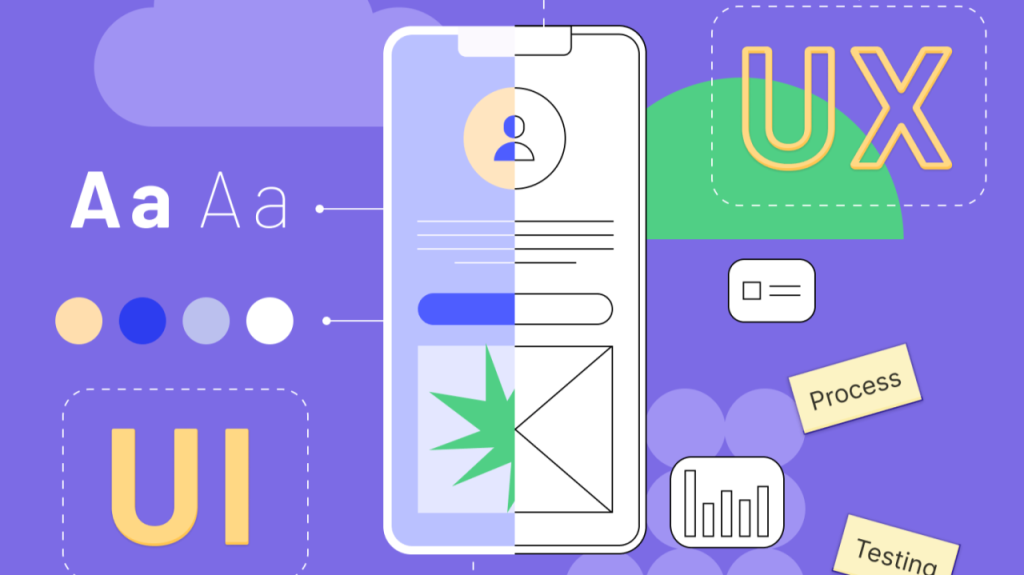
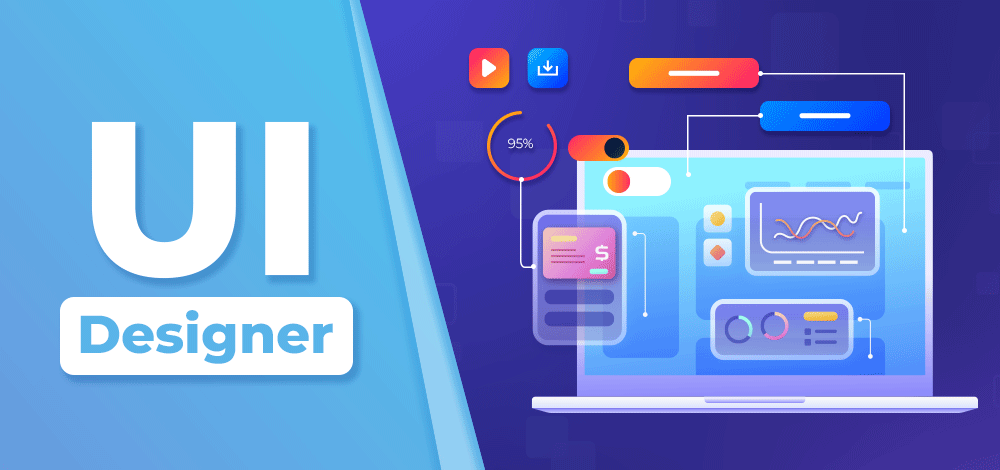
UI/UX design in 2025 demands more than static mockups—it requires dynamic, collaborative, and user-driven processes. Whether you’re designing a mobile app, website, or immersive 3D experience, the right tools can dramatically impact your speed, creativity, and user outcomes.

This comprehensive guide from Viartisan showcases the most powerful and up-to-date UI/UX design tools every product team should know. From early-stage wireframes to developer handoff and usability testing, explore which platforms can elevate your design workflow.

Why Choosing the Right UI/UX design tools Matters

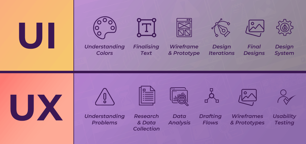
The UI/UX workflow has grown more complex—spanning ideation, user research, wireframing, prototyping, testing, and collaboration. Choosing tools that match your design process means:

  • Faster iteration & feedback loops
  • Improved team communication
  • Seamless developer handoff
  • Better user-centered outcomes

Moreover, top tools today must integrate with agile workflows, remote collaboration, and cross-functional teams. Designers need tools that bridge creativity and engineering, empowering both rapid innovation and pixel-perfect implementation.

UI/UX Design Tools
Why Choosing the Right UI/UX design tools Matters

Top Categories of UI/UX design tools (2025 Edition)

1. Wireframing & Low-Fidelity Design

These tools help visualize structure, layout, and hierarchy before design polish:

  • Balsamiq: Ideal for quick sketch-like wireframes
  • Whimsical: Combines wireframes, flowcharts, and sticky notes
  • Figma (Wireframe Kits): Fast, collaborative wireframing with real-time co-editing

Wireframes remain essential in clarifying navigation logic, page layouts, and information architecture before deeper visual design begins.

Tip: Use wireframes to align stakeholders before diving into visuals. A simple low-fi mockup can save hours of rework down the line.

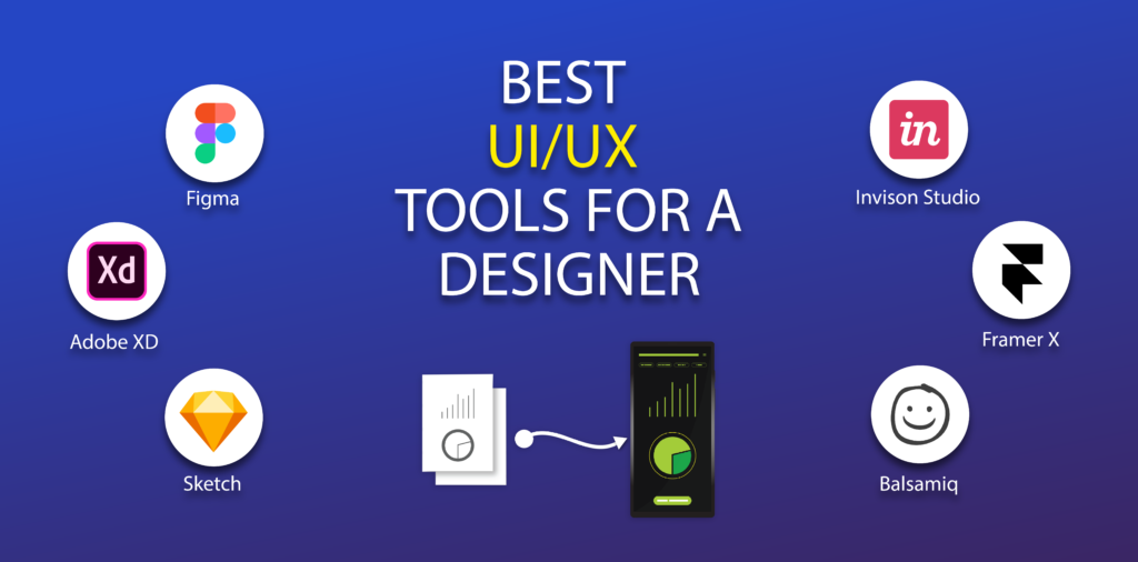
2. High-Fidelity Design & UI Components

These platforms help designers craft beautiful, responsive interfaces:

  • Figma: The industry’s #1 design platform for collaborative UI
  • Adobe XD: Smooth Adobe integration and good for animation flows
  • Sketch: Mac-only, plugin-rich environment for UI libraries
  • Penpot: Open-source alternative with growing feature parity

Figma has cemented itself as the gold standard due to cloud-first architecture, design systems, and Dev Mode. Meanwhile, Sketch remains popular in Mac-based workflows, and Penpot is gaining attention in open-source communities.

Read: Why Figma Dominates the Design Stack in 2025

3. Prototyping & Animation Tools

Prototype real interactions without code:

  • ProtoPie: Advanced interaction logic, sensor inputs
  • Framer: Component-based design, ideal for product-led growth teams
  • Principle: Timeline-based animations for mobile microinteractions

The gap between design and development shrinks when designers can build smart, animated prototypes that simulate true user flows.

Prototypes reduce dev misalignment and improve stakeholder buy-in. Pair with usability testing for even stronger results.

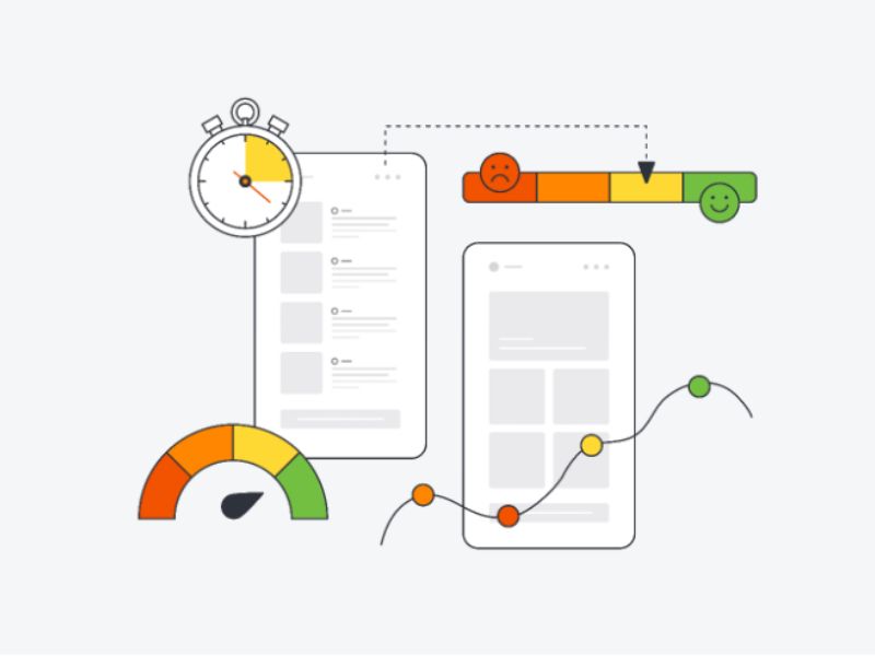
4. UX Research & User Testing Platforms

Validate assumptions, test usability, and analyze behavior:

  • Maze: Remote usability testing with direct integration from Figma
  • Useberry: Quick first-click and preference tests
  • Lookback.io: Live moderated testing + video playback
  • Hotjar / FullStory: Behavioral analytics via heatmaps and session replays

Research is no longer optional—tools like Maze and Lookback allow even small teams to gather data-driven insights pre-launch. Combine qualitative and quantitative testing for richer UX validation.

Insight: Use data from real users—not just internal reviews.

5. Design System & Handoff Tools

Ensure scalability and dev-ready designs:

  • Zeplin: Handoff-ready specs, style guides, and asset exports
  • Storybook: UI components with code and design documentation
  • Figma Dev Mode: Code-inspection and dev handoff without leaving the file
  • Zeroheight: Build design system documentation your whole team can use

With design systems at the core of modern design ops, these tools ensure cross-team consistency and scale. Storybook + Figma is a common combo for teams standardizing atomic UI systems.

UI/UX Design Tools
Top Categories of UI/UX design tools

Specialized UI/UX design tools for 2025

Accessibility Tools

Design inclusively with:

  • Stark: Built-in accessibility checks inside Figma/Sketch
  • axe DevTools: Automated WCAG compliance tests in-browser
  • Color Oracle: Simulates colorblind views to test visual hierarchy

A11y is no longer a nice-to-have—it’s a business and legal imperative. These tools help embed accessibility early in the design process.

Collaboration & Feedback Tools

Remote and hybrid teams need powerful whiteboarding:

  • FigJam: Figma’s whiteboarding tool for workshops, brainstorming
  • Miro: Industry leader in remote design sprint facilitation
  • Notion: Combine documentation, design process, and research libraries

Real-time collaboration has become a core UX discipline, not just a process add-on.

AI-Powered Design Tools

Boost ideation and automation:

  • Uizard: Turn text prompts into wireframes instantly
  • Relume: AI site map + component generator
  • Framer AI: Auto-layout and real-time UI generation from copy

Generative design is here. Smart UI tools reduce friction, speed up exploration, and help non-designers prototype confidently.

Future-facing design means embracing AI + automation for scale.

UI/UX Design Tools
Specialized UI/UX design tools

How to Choose the Right UI/UX design tools stack

There’s no one-size-fits-all. Consider:

  • Team size: Small teams may favor all-in-one tools (e.g., Figma)
  • Design fidelity: Do you need wireframes, visuals, animation—or all three?
  • Collaboration level: How async or real-time is your workflow?
  • Developer involvement: Is handoff manual or deeply integrated?
  • Project complexity: Does your app span mobile, web, or 3D environments?

Build your toolkit with modularity in mind—start lean, then layer on specialty tools.

Final Thoughts

The best UI/UX tools don’t just create beautiful designs—they enable faster thinking, clearer communication, and better product outcomes. In 2025, product success depends on cross-disciplinary collaboration, and your tools should be bridges—not bottlenecks.

Invest in tools that fit your team, your product, and your culture. And remember: tools evolve fast. Stay curious, test often, and keep your stack lean but powerful.

At Viartisan, we help startups and enterprises streamline design ops and scale intuitive user experiences. Whether you’re building a SaaS platform, mobile app, or 3D interface, we can help you choose, implement, and optimize the best UI/UX tools.

📩 Contact our team for a custom workflow or tool audit.

3D UI/UX Design Guide 2025: How to Build Immersive, Intuitive, and Interactive Experiences

In 2025, the future of user experience is no longer flat. As AR, VR, and mixed reality (XR) technologies become mainstream, 3D UI/UX design is emerging as the next evolution in digital interaction. Whether you’re building immersive educational apps, spatial commerce platforms, or next-gen games, mastering 3D UX principles is essential.

At Viartisan, we design future-facing interfaces that blend clarity, motion, and depth to create impactful virtual experiences. This guide explores key 3D UX frameworks, challenges, tools, and real-world applications to help you build interfaces that users can feel—not just see.

Why 3D UI/UX Design Matters in 2025

Traditional 2D interfaces are constrained by the flatness of screens. But immersive 3D environments introduce an entirely new spatial dimension that enables intuitive interaction using depth, motion, and perspective. With next-gen hardware like the Meta Quest 3, Apple Vision Pro, Magic Leap, and WebXR-enabled browsers, 3D design is redefining how we think about digital experiences.

Benefits of 3D UX design include:

  • Natural interaction: Users can interact with content using gestures, gaze, and body position.
  • Immersive storytelling: Brands can craft environments that emotionally engage users.
  • Contextual awareness: Interfaces adapt based on position, focus, and behavior within space.

Industries already seeing 3D UX breakthroughs:

  • Healthcare: Virtual anatomy labs and surgery simulations
  • Retail: Virtual showrooms and AR product previews
  • Education: Hands-on simulations for complex topics (e.g., architecture, astronomy)
  • Enterprise: Virtual collaboration tools with spatial whiteboards and real-time avatars

Related: Apple Vision Pro UI Guidelines

Core Principles of 3D UX Design

1. Depth and Spatial Awareness

Designing in 3D means thinking in layers—not just layout. Interface elements should:

  • Maintain appropriate parallax and distance from the user
  • Use environmental depth cues (lighting, blur, fog) for hierarchy
  • Limit Z-axis density to prevent visual fatigue or confusion

Ensure UI layers remain readable and within ergonomic reach. Keep essential UI between 1.5–2 meters in XR devices.

2. User Comfort and Ergonomics

Immersive experiences must never compromise user health or focus. Prioritize:

  • Low-latency interactions (under 20ms)
  • High refresh rates (90Hz+) to avoid motion sickness
  • Minimal head movement with gaze-aware targeting
  • Natural field-of-view UI placement—avoid floating panels that track aggressively

Best practice: Let users choose seated, standing, or dynamic modes. Personalization = comfort.

3. Interaction Models

No mouse, no screen? Welcome to multimodal input:

  • Hand tracking: Pinch to select, push to activate
  • Eye tracking: Highlighted elements upon gaze dwell
  • Voice commands: Natural language for actions (“Open dashboard,” “Close settings”)
  • Haptic feedback: Vibrations or controller pulses for confirmation

Design interactions that match the user’s intent and are discoverable, forgiving, and consistent.

Tip: Always include onboarding for first-time gestures and input discovery.

3D UI/UX Design
Core Principles of 3D UX Design

Tools and Frameworks for 3D UI/UX Design

  • Unity & Unreal Engine: Full-featured XR development environments
  • WebXR & Three.js: Bring immersive experiences to the web
  • Blender, Maya, Cinema 4D: High-fidelity 3D modeling and animation
  • Figma + Spline: Ideal for early UI mockups and transitions
  • 8thWall, ZapWorks: AR-focused visual dev tools

Tool Spotlight: Spline allows designers to prototype and animate 3D interfaces with browser-based tools—perfect for fast iteration without dev overhead.

3D UX Patterns & Layout Techniques

Anchored UI vs Floating UI

  • Anchored UI elements are fixed in a virtual room—perfect for dashboards, menus, or maps.
  • Floating UI follows the user’s head or hand—used for transient actions like tool selection or tooltips.

Mix both patterns to balance stability and adaptability.

Environmental Cues

Spatial design must guide—not overwhelm. Use:

  • Ambient audio (e.g., directional cues)
  • Lighting that highlights focus zones
  • Animations to introduce changes naturally

Object-Based Interactions

Embrace tangibility:

  • Allow users to grab, spin, or throw items using realistic physics
  • Combine animation + audio + haptics for satisfying micro-interactions
  • Give weight to objects—light should float, heavy should resist

Use prototyping tools to test these elements in real-time!

3D UI/UX Design
3D UX Patterns & Layout Techniques

Accessibility in 3D Design

3D experiences must not exclude users with disabilities.

Accessible 3D design includes:

  • Subtitles and closed captioning for audio
  • UI scaling for visual impairments
  • Toggle-able motion for users prone to VR sickness
  • Alternative inputs: large gesture zones, simplified voice navigation

Read: XR Access Accessibility Guidelines

Bonus: Offer calibration steps before entry—headset height, dominant hand, visual preference.

Real-World Examples of 3D UX

Horizon Workrooms (Meta)

  • Transforms remote meetings into spatial experiences
  • Uses positional audio, avatar body language, and whiteboard tools
  • Floating UI for quick tool access without breaking immersion

IKEA Studio (Apple + LiDAR)

  • Scans real room layout for AR-based furniture placement
  • Allows scale-accurate previews and light simulation
  • Natural gestures for rotate, resize, and reposition

Tilt Brush (Google)

  • Lets users paint in 3D space
  • Simple floating toolset that adapts to dominant hand
  • Radial UI menus with haptic confirmation

These apps prove that utility and creativity can coexist in immersive UX.

Future Trends in 3D UI/UX

  • Spatial commerce: Shoppable stores with 3D product exploration
  • 3D onboarding assistants: Interactive avatars guiding users through features
  • Emotion-aware interfaces: Adaptive lighting or UI tone based on expression or posture
  • Cross-device continuity: Seamless switching between VR headset, mobile AR, and desktop

Prediction: Microlearning + 3D gamification will dominate digital education by 2026.

3D UI/UX Design
Future Trends in 3D UI/UX

Final Thoughts

Designing in 3D isn’t just about “cool visuals”—it’s about rethinking interaction, presence, and feedback. As spatial computing becomes the norm, businesses need design partners who can navigate both dimensional storytelling and digital usability.

At Viartisan, we bring together strategy, prototyping, and immersive design to craft 3D UI/UX experiences that transform how people learn, shop, work, and play.

Build immersive interfaces with us today.


eLearning UI/UX Design Guide 2025: How to Build Effective, Engaging & Inclusive Learning Platforms

Online education is no longer just a digital alternative—it’s the core of modern learning. With global learners expecting flexible, interactive, and personalized experiences, strong eLearning UI/UX design is more essential than ever.

In this detailed guide, Viartisan breaks down the principles, patterns, and trends shaping the next generation of online learning platforms. Whether you’re designing a corporate LMS, language app, or MOOC, this guide will help you create experiences that educate and inspire.

Why UI/UX Matters in eLearning

Effective UI/UX design directly impacts:

  • Learner engagement and motivation
  • Course completion rates
  • Knowledge retention and behavior change

A cluttered interface, confusing navigation, or inaccessible design can frustrate users—especially those with limited tech proficiency. In contrast, well-designed learning environments enhance focus, lower cognitive load, and support different learning styles.

By focusing on learner-centric UX, platforms can:

  • Increase time spent on learning activities
  • Reduce bounce rates and course abandonment
  • Foster long-term habit formation through ease-of-use

See research: Nielsen Norman Group – UX in eLearning

Key Principles of eLearning UI/UX Design

1. Clarity First

Good eLearning design removes ambiguity. Every screen should have a clear purpose and direct the learner toward a specific outcome.

  • Use consistent icons and terminology throughout the interface
  • Prioritize content over decoration—avoid excessive animations or distractions
  • Structure layouts using visual hierarchy: bold headers, grouped cards, clear action buttons
  • Make navigation intuitive: persistent menus, breadcrumb trails, and progress indicators reduce confusion

Clarity fosters confidence. When learners always know what to do next, they stay focused and motivated.

2. Chunked Learning

Cognitive overload is the enemy of learning. Instead of delivering long videos or dense text, chunk content into small, focused segments.

  • Design lessons as 5–10 minute learning units
  • Use visual breaks such as section dividers, tabs, or slide decks
  • Integrate micro-assessments like flashcards, drag-and-drop, and true/false challenges

Chunking encourages retention and repetition. It’s easier to revisit bite-sized modules than restart an entire lesson.

3. Progress Feedback

Learners thrive on knowing how far they’ve come—and how much remains. Visual feedback drives persistence.

  • Progress bars should be visible at all times during a course
  • Display percentage complete and time remaining
  • Use badges, ranks, and certificates as extrinsic motivators
  • Offer recap modules for learners to reflect on completed topics

Don’t just show progress—let learners feel their momentum.

4. Accessibility & Inclusion

Accessible design makes learning equitable and expands your reach.

  • Ensure WCAG 2.1 compliance for screen readers, color contrast, and font legibility
  • Use closed captions, subtitles, and audio descriptions in all media
  • Offer flexible pacing and formats: text + audio + video combinations
  • Avoid color-dependent interactions (e.g., “click the red button”)

Standards: W3C Accessibility for eLearning

Inclusive UX is not just legal—it’s ethical. Designing for everyone improves usability for all.

eLearning UI/UX Design
Key Principles of eLearning UI/UX Design

Designing for Motivation & Retention

Visual Design

Create a brand-aligned, calming aesthetic to reduce learner fatigue:

  • Soft, neutral backgrounds with strong foreground contrast
  • Use accent colors for CTAs, alerts, or interactive elements
  • Leverage whitespace to prevent visual overload

Interactive Elements

Design learning as an active process:

  • Embed quizzes and questions within lessons
  • Use branching scenarios to simulate real-life decisions
  • Include reward animations for completed modules

Gamification can be highly effective—but it must align with learning goals, not distract from them.

Social Learning UX

Learning in isolation reduces persistence. Add community-driven features:

  • Live chatrooms or group discussions tied to each course module
  • Peer assessment tools for collaborative learning
  • Leaderboards based on course mastery, not just speed

Social presence improves accountability and gives learners a sense of belonging.

Mobile UX for eLearning

Learning on the go is now standard. Your platform must feel native on mobile.

  • Responsive design should adjust content layout based on device orientation
  • Large tap targets for buttons and quizzes
  • Offline access to downloaded lessons with sync-on-reconnect
  • Native device integrations: camera for AR learning, notifications for reminders

Example: Duolingo keeps mobile learners engaged with streaks, push notifications, and fun illustrations—all structured within microlearning UX patterns.

Common UX Mistakes in eLearning Platforms

Avoid these costly mistakes:

  • Overcomplicated navigation trees or dashboards
  • Lack of clear onboarding for new users or first-time courses
  • Inconsistent page layouts between modules
  • Ignoring mobile users with clunky or unreadable interfaces

A successful UX audit should evaluate:

  • Completion rates per module
  • User dwell time and scroll behavior
  • Accessibility violations and learner drop-off points

External Reference: Baymard Institute – UX Guidelines for Education

eLearning UI/UX Design
Common UX Mistakes in eLearning Platforms

Future Trends in eLearning UI/UX (2025+)

1. AI-Personalized Learning

Platforms now use behavioral data to:

  • Adjust lesson difficulty dynamically
  • Recommend modules based on past performance
  • Alert instructors when learners disengage

2. Conversational Interfaces

  • AI tutors provide instant answers, summaries, or translations
  • Chatbot onboarding supports non-technical users

3. Immersive Learning Environments

  • Use VR/AR for hands-on training (e.g., surgical simulation, industrial repair)
  • Spatial UI design becomes more relevant for wearable learning apps

4. Emotion-Aware UX

  • Systems detect learner frustration through camera/mic inputs (optional & privacy-compliant)
  • Interface adapts tone, pace, or visual feedback accordingly

Read more: UI/UX Design Trends 2025

eLearning UI/UX Design
Future Trends in eLearning UI/UX

Final Thoughts

As digital learning continues to grow, the difference between an average platform and a great one lies in its user experience. A learner-centered design doesn’t just deliver content—it creates momentum, focus, and joy in learning.

At Viartisan, we help education platforms thrive by designing intuitive, inclusive, and motivating learning experiences that drive real outcomes.

📩 Let’s build your next eLearning product with purpose and precision.


e-Wallet UI/UX Design Guide 2025: How to Build Secure, Intuitive & Engaging Payment Experiences

In 2025, e-wallets are more than just payment tools—they’re digital lifelines. From peer-to-peer transfers and online shopping to in-store QR payments and crypto wallets, users demand convenience, trust, and frictionless experiences.

This makes e-wallet UI/UX design a critical factor in product adoption, retention, and security. In this in-depth guide, Viartisan explores how to design e-wallet apps that are not only secure and functional but also delightful and brand-differentiated.

Why UI/UX Design Matters in e-Wallets

E-wallets deal with one of the most sensitive areas of user interaction—money. Unlike entertainment or retail apps, mistakes or confusion in wallet design can cost real value, reputation, and trust.

Top UX Challenges in e-Wallets

  • Real-time expectations: Users want instant responses and confirmations.
  • Security transparency: Clear UX is needed to show users their data and funds are protected.
  • Context-sensitive design: Users may access their wallets in public, at night, on poor networks—design must adapt.

A great e-wallet experience blends:

  • Fast and accessible interaction design
  • High-level security cues with minimal intrusion
  • Cross-platform consistency for mobile, web, and wearable devices

Core UX Principles for e-Wallet Design

1. Frictionless Onboarding

Onboarding can be a drop-off point in fintech apps. Your design should:

  • Minimize form fields using OCR or ID scan features
  • Integrate biometric sign-up & login for quick access
  • Show a progress bar during multi-step verification

Example: Onfido offers a seamless identity verification API for fintech UX flows.

2. Transparent Money Movement

Clear labeling and iconography reduce mistakes and hesitation:

  • Use simple verbs (Send, Receive, Add, Withdraw)
  • Show recipient preview, transfer limits, and estimated fees upfront
  • Add visual feedback after each action: animation, success banner, or vibration

3. Personalization & Dashboard UX

Wallets should feel personal and purposeful:

  • Allow custom nicknames for cards or bank accounts
  • Show dynamic visualizations of spending, balance, trends
  • Integrate goals (saving for travel, paying down debt) with progress bars
e-Wallet UI/UX Design
Core UX Principles for e-Wallet Design

UI Design Best Practices for Digital Wallets

Effective Visual Hierarchy

  • Emphasize available balance, then actions (Send, Scan, Pay)
  • Design with card-like UI modules (e.g., for bank accounts or loyalty)
  • Use contrast and icons to reduce reliance on reading—especially in low-light or fast-use scenarios

Transaction UX Flows

  • Support drag-and-drop actions for repeat payments
  • Use visual recipient avatars for peer-to-peer (P2P) comfort
  • Offer real-time validation of card/account numbers (e.g., BIN matching)

Payment Sources & Cards Management

  • Let users freeze/unfreeze cards from the UI
  • Display virtual card CVV with biometric unlock
  • Group cards by color or function (primary, joint, crypto, business)

Recommended Read: Frictionless Fintech UX Principles

Security-Centric UX

Security is only useful if users trust and understand it. Clarity beats complexity.

What Good Security UX Includes

  • Immediate alert for any new device login or location
  • Notification center with categorized actions (e.g., flag transaction, change PIN)
  • Explainers: a short tooltip on “Why we need your ID selfie”

Suggested Tools: Cognito or Auth0 for frictionless login with compliance

Accessibility and Multilingual UX

Inclusive Design Moves

  • Support RTL languages (Arabic, Hebrew) and locale formatting for currencies
  • Provide guided audio mode for visually impaired users
  • Use haptic alerts in tandem with error states

Explore more: W3C Accessibility Standards

Localization Done Right

  • Show currency format based on user location
  • Use local payment methods (GCash in PH, iDEAL in NL, M-Pesa in Africa)
  • Customize color symbolism—red may imply danger in the West but prosperity in China
e-Wallet UI/UX Design
Accessibility and Multilingual UX

Future-Focused UX Trends in e-Wallets

1. Smart Spending Alerts

  • Contextual nudges (“You’ve spent 25% more on food this month”)
  • Voice summary of monthly financial status

2. Crypto & DeFi Wallet UX

  • Simplify seed phrase handling: gamified backup steps, cloud-encrypted storage
  • Clarify gas fees or slippage in plain language
  • Show NFT collections in wallet visually

3. Cross-Device Wallet Continuity

  • Start a transaction on mobile, complete on smart watch
  • Tap-to-pay visual consistency across platforms

External Insight: Finextra Report on Fintech UX 2024–2025

Real-World Examples: Learning from Leaders

Paytm (India)

Paytm is one of the most widely used digital wallets in India, serving hundreds of millions of users. Its UI/UX success lies in delivering a multipurpose experience under a single app architecture. Whether you’re topping up your mobile phone, transferring money via UPI, purchasing gold, or paying utility bills, the flow feels unified and effortless.

  • Multi-service design: Users can move between wallet, bank account, and investment features without changing UI logic or context.
  • Localized suggestions: The app uses real-time location data to suggest nearby stores, available cashbacks, or recharge offers.
  • Gamification & loyalty: Cashback coupons and scratch cards are presented with playful animations, increasing engagement.
  • Security indicators: Padlocks, “verified merchant” tags, and SMS confirmations reinforce trust.

Paytm’s strength lies in combining scale with contextual simplicity.

Apple Wallet

Apple Wallet exemplifies the art of minimalist design applied to financial interaction. Rather than adding new layers, Apple strips things down to their essentials—resulting in a clean, predictable experience.

  • One-glance UX: Users instantly see their default card, tickets, or boarding passes without navigating tabs.
  • WatchOS integration: Payments on Apple Watch mirror the visual flow of iOS, with vibration and color cues for success.
  • Privacy-focused visuals: Apple uses subtle shading and blur effects to mask sensitive data until biometric authenticated.
  • Seamless backups: Wallet items are tied to the iCloud ecosystem, making cross-device continuity feel effortless.

Apple Wallet’s design is not only polished but incredibly secure—delivering confidence without clutter.

ZaloPay (Vietnam)

ZaloPay builds on the social chat foundation of Zalo—Vietnam’s leading messaging app—to create a highly intuitive and local-first wallet experience.

  • Fast onboarding in local language: New users complete setup in under 60 seconds, with native Vietnamese UI and SMS OTP authentication.
  • QR-first design: Given Vietnam’s high QR code adoption, the app prioritizes Scan & Pay with floating buttons and camera-ready state.
  • Chat-to-pay integration: Within Zalo Messenger, users can send/receive money directly in chats, similar to WeChat Pay.
  • Mini-program ecosystem: Users can pay bills, shop, or order food within ZaloPay through lightweight embedded apps.

ZaloPay’s experience demonstrates how tightly integrated UI/UX and cultural behavior can elevate usage frequency and loyalty.

e-Wallet UI/UX Design
Real-World Examples: Learning from Leaders

Final Thoughts

Building a successful e-wallet means balancing trust, performance, and usability. It must be lightning-fast, visually intuitive, inclusive, and 100% secure—all at once.

At Viartisan, we help fintech brands build human-centered digital wallets that users love and return to. Our designs are rooted in data, shaped by behavior, and built to scale.

📩 Talk to us about launching your next-gen wallet experienc

UI/UX Design Roadmap 2025: Skills, Tools, Learning Paths & Career Progression

UI/UX design has evolved into one of the most impactful fields in the digital age—shaping how users interact with technology and how brands deliver value. With the rapid rise of AI, responsive design, and ethical personalization, building a comprehensive UI/UX design roadmap has never been more important.

In this in-depth guide, Viartisan outlines the complete 2025 roadmap to mastering UI/UX design—from foundational knowledge and tool mastery to advanced UX systems, real-world portfolios, and career evolution.

Whether you’re transitioning from graphic design, development, or starting fresh, this roadmap will help you navigate your way into a thriving design career.

Why You Need a UI/UX Design Roadmap in 2025

The field of UI/UX design is expanding rapidly. According to recent industry reports:

  • UI/UX roles are among the top 10 most in-demand jobs globally.
  • Average salaries for UX Designers range from $80,000 to $130,000 in the U.S.
  • Startups, agencies, enterprises, and government sectors all rely on skilled designers.

Yet, many aspiring designers feel overwhelmed by:

  • The broad range of skills required
  • Constantly changing tools and trends
  • Lack of structure in self-learning paths

A strategic roadmap helps:

  • Prioritize what to learn first
  • Build portfolio-ready projects
  • Develop skills that align with actual job roles
  • Stay updated with evolving industry standards

This roadmap is not a one-size-fits-all checklist—it’s a flexible framework you can adapt depending on your background and goals.

UI/UX Design Roadmap
Why You Need a UI/UX Design Roadmap in 2025

Stage 1: Build Your Foundations in UI/UX Design

Key Concepts to Master

Understanding the difference between UI and UX is crucial. UI is visual—it’s about aesthetics and interactions. UX is functional—it’s about research, flow, behavior, and user satisfaction.

Key principles include:

  • Visual design fundamentals: Color theory, typography, layout, spacing
  • UX psychology: User behavior, cognitive load, Hick’s Law, Fitts’s Law
  • Design patterns: Common navigation methods, input forms, onboarding screens

Frameworks

  • Design Thinking: Empathize, Define, Ideate, Prototype, Test
  • Double Diamond: A proven model for divergent and convergent thinking in design

Exercises

  • Redesign a simple app with wireframes and mockups
  • Critique 3 onboarding flows and note UX pain points
  • Build mood boards and style tiles for hypothetical brands

Stage 2: Develop Visual Design Skills (UI-Specific)

Advanced UI Concepts

This stage moves beyond aesthetics into interaction and usability.

Key skills:

  • Typography scaling for responsive design
  • Design tokens for consistent theming
  • Accessibility-aware design: Color contrast, focus states, keyboard nav
  • Dark mode: Tone shifts, icon optimization, shadow balancing

Design Systems

Practice Projects

  • Create UI kits with button states, inputs, navbars
  • Design a responsive landing page for desktop, tablet, and mobile
  • Apply real-world brand guidelines to a fictional product

Stage 3: Learn UX Research and Interaction Design

This stage requires deep user empathy and rigorous testing.

Research Techniques

  • Contextual inquiry (field observations)
  • Diary studies for behavioral tracking
  • Usability benchmarking (SUS, NPS, task success rate)

UX Deliverables

  • Affinity maps: Group user quotes into themes
  • Service blueprints: End-to-end system visualization
  • Task models: Detailed breakdowns of user decision-making

Tools to Use

  • Dovetail for qualitative research synthesis
  • Hotjar or FullStory for user behavior analysis
  • Useberry or Maze for remote usability testing

Stage 4: Master Prototyping and Testing

From Sketch to Pixel-Perfect

Build flows that replicate the full user experience:

  • Integrate voice, gesture, and microinteractions
  • Design with state changes and motion logic
  • Include loading, error, and success scenarios

Prototype Testing

  • Use Figma’s Smart Animate to simulate interactions
  • Conduct A/B tests to compare flows
  • Include accessibility tests with screen readers and keyboard-only navigation

Bonus: Include annotation layers explaining intent to developers

Stage 5: Understand Product Thinking and Collaboration

UX in Business Context

UX isn’t just design—it’s strategy. Learn how UX decisions impact:

  • Retention and conversion rates
  • Time to value (TTV) and user activation
  • Support costs and feature adoption

Real-World Scenarios

  • Conduct design sprints with cross-functional teams
  • Translate feedback into product roadmap adjustments
  • Balance MVP constraints with long-term UX vision

Documentation & Handoff

  • Build specs using Notion, Confluence, or Figma Dev Mode
  • Document component behaviors, edge cases, and interaction logic

Stage 6: Build a Portfolio That Gets Hired

Your portfolio is your product—treat it with the same care:

Case Study Essentials

Each case study should show how you think, not just what you made:

  • Problem: What pain points existed?
  • Approach: What research did you conduct?
  • Design: What iterations did you test?
  • Outcome: What metrics or feedback validated your work?

Beyond Visuals

  • Add project retrospectives and lessons learned
  • Include “before and after” comparisons
  • Use plain English—avoid buzzwords

Career Pathways in UI/UX Design

UI/UX is not a linear path—it spans:

Entry-Level Mid-Level Senior-Level Specialist
Junior UX Designer UX/Product Designer Lead UX Designer UX Researcher
Visual Designer Interaction Designer Design Manager Accessibility Specialist
UX Writer UX Strategist Director of UX UX Engineer / Prototyper

Each path leads to different forms of impact—on users, systems, or organizations.

UI/UX Design Roadmap
Career Pathways in UI/UX Design

Final Thoughts: Design Is a Journey, Not a Job Title

UI/UX design is about curiosity, empathy, iteration, and collaboration. The best designers never stop learning. They test assumptions. They advocate for users. And they deliver value—not just visuals.

At Viartisan, we design smarter by applying design systems, research insights, and cross-functional collaboration.

If you’re building your UI/UX career—or your product vision—we’re ready to help.

Contact us to accelerate your design journey.

Transforming UI/UX Design AI in 2025

Artificial intelligence is no longer a distant concept in the UI/UX design world. In 2025, UI/UX design AI is not only accelerating workflows—it’s actively reshaping how designers create, test, and personalize digital experiences.

This article explores how AI-powered tools and techniques are transforming every stage of the design process—from ideation to interaction—and how Viartisan leverages AI to deliver user-first, data-informed digital products that perform at scale.

Whether you’re building a new SaaS platform, refining a mobile app, or launching a digital brand, understanding the intersection of AI and UX is essential to stay competitive.

1. AI-Powered User Research & Insights

Traditionally, user research involved time-consuming surveys, interviews, and manual analysis. In 2025, AI tools dramatically reduce time-to-insight and increase research quality.

Key Benefits:

  • Real-time session recordings with automatic event tagging
  • Sentiment analysis of user feedback and reviews
  • Heatmaps and scrollmaps generated from interaction data
  • Automatic persona clustering based on user behavior

Example Tools: Hotjar AI, Fullstory AI Insights, UXCam, Amplitude Behavioral Cohorts

Viartisan approach: We use machine learning algorithms to spot engagement patterns, uncover drop-off points, and suggest layout improvements in dashboards and web apps.

2. Predictive UI Personalization

Static UIs are being replaced by adaptive, personalized interfaces driven by AI. Based on user preferences, past actions, and even contextual signals (like time of day or location), your UI can now:

  • Reorganize menus and prioritize content
  • Suggest features or tools before the user asks
  • Adapt color themes for focus, calm, or excitement

Real-World Impact:

  • SaaS platforms personalize dashboards for different roles (sales vs. marketing)
  • E-commerce stores show hyper-targeted promotions
  • Learning platforms tailor content to skill level

Viartisan delivers: Dynamic user flows tailored to specific user archetypes and behavioral data.

3. Intelligent Design Systems & Generative UI

AI now assists in generating design components based on input prompts or previous project patterns. These AI-enhanced design systems:

  • Offer smart layout suggestions
  • Generate new button states or input field variations
  • Apply consistent themes across platforms

Design Tools to Watch: Galileo AI, Uizard, Figma AI Assist, Locofy

Viartisan use case: Our design sprints now begin with AI-assisted ideation, allowing designers to explore more variations in less time.

4. AI in UX Writing & Microcopy

AI tools are taking UX writing to a new level—offering data-backed, on-brand copy at scale. With minimal human input, these tools:

  • Write and optimize call-to-action (CTA) buttons
  • Draft onboarding flows and empty states
  • Localize content into multiple languages

Key Features:

  • Consistency with brand tone
  • A/B test-ready variations
  • Reduction in content debt

Tools in use: Jasper, Copy.ai, GrammarlyGO, Writer.com

5. Automated Usability Testing

Manual usability tests are time-consuming and expensive. In 2025, AI tools offer:

  • Virtual user simulations with pre-defined personas
  • Session replays with predictive clickstream analysis
  • AI-generated usability ratings and accessibility scores

Why It’s a Game-Changer: Teams get feedback on prototypes in hours instead of weeks.

Platforms to explore: Maze AI, Useberry, PlaybookUX, UserTesting with AI Insights

6. AI-Enhanced Prototyping & Wireframing

Designers can now generate wireframes from plain text prompts using AI.

Example Use:

  • “Design a user-friendly checkout screen for an online bookstore” → Instantly creates UI blocks with hierarchy and spacing

Smart Features:

  • Auto-aligned grids
  • Color accessibility check in real time
  • Auto-labeled form elements

Viartisan workflow: We use AI tools in early design stages to map out multiple layouts, then iterate with strategic design thinking.

7. Conversational UX + NLP Interfaces

Voice assistants and chatbot interfaces are now conversational, empathetic, and task-efficient.

What’s Changing:

  • AI recognizes emotional tone and adjusts responses accordingly
  • Interfaces allow multi-turn, natural conversations
  • In-app assistants proactively guide users to desired outcomes

Industry Use Cases:

  • Healthcare apps guiding symptom input
  • Banking apps using chatbots for transaction queries

Design Tip: NLP-powered UX needs fallback paths and visual cues to prevent user frustration.

8. Accessibility & Compliance Automation

Ensuring compliance with accessibility standards (WCAG 2.2+) is made easier with AI.

Key AI Functions:

  • Auto-detection of color contrast issues
  • Auto-fill of missing alt text using image recognition
  • Live previews for screen reader behavior
  • Scan and suggest remediations across entire design files

Why It Matters: Accessible design is now faster, more accurate, and part of every product sprint.

9. Emotion Recognition & Adaptive UX

Using computer vision, voice analysis, and cursor tracking, AI can interpret user emotions in real time.

Applications Include:

  • Simplifying UIs when frustration is detected
  • Offering guided assistance during confusion
  • Enhancing delight when excitement is detected

Ethical Note: Emotion-based personalization must be opt-in, transparent, and respectful of user consent.

Viartisan standards: We focus on user safety and trust when implementing any emotion-aware interface features.

10. Collaboration Between Designers & AI

The role of AI in design is not to replace creatives—it’s to augment them.

How Collaboration Works:

  • AI handles repetition, scaling, and iteration
  • Designers focus on empathy, aesthetics, narrative, and decision-making
  • Teams use AI as a collaborative partner, not a tool

Viartisan’s philosophy: Technology should empower creativity. We use AI to unlock better outcomes—not shortcuts.

Design Smarter with AI

The role of AI in UI/UX is only growing. From adaptive interfaces to real-time usability testing, AI is helping designers deliver faster, smarter, and more personalized experiences.

At Viartisan, we believe the future of digital product design is human-centered, data-backed, and ethically enhanced by AI. Whether you’re launching a new platform or evolving an existing one, we’re ready to co-create with you.

Top 10 Web Design Companies to Elevate Your Brand Online

A great website isn’t just about looks—it’s about performance, user experience, and measurable results. In today’s digital-first world, your website is your storefront, salesperson, and storyteller. Choosing the right web design companies is one of the most important decisions you’ll make for your brand. Whether you’re building a new website from scratch or redesigning to improve conversions, this curated list of top 10 web design agencies will help you make the right choice.

Each agency featured here has a proven track record, a strong design philosophy, and the ability to deliver tailored solutions that move brands forward.

1. Viartisan (Vietnam)

Best for: UI/UX design, custom development, branding and motion design

Viartisan is a leading creative agency headquartered in Vietnam, known for fusing design, technology, and strategy into cohesive digital experiences. What sets Viartisan apart is its unique blend of youthful energy, creative vision, and technical expertise. They serve global startups and established brands looking to elevate their presence through beautifully crafted websites, apps, and brand identities.

With over 390+ projects delivered and a team of 20+ experts, Viartisan prioritizes fast delivery, visual innovation, and scalable architecture.

  • Website: viartisan.com
  • Services: Web design, UI/UX, mobile development, branding, 2D/3D illustrations, interactive animation
  • Industries: Technology, eCommerce, healthcare, SaaS, education
  • Strengths: Agile team structure, creative-first process, cost-efficiency for global clients

If you want a partner that not only designs but strategizes for your growth, Viartisan is the web design company to trust.

Web Design Companies
Viartisan

2. Clay (USA)

Best for: Product UI/UX design for high-growth SaaS and tech enterprises

Based in San Francisco, Clay is a digital product design agency with a strong portfolio of work for top-tier clients including Google, Slack, and Facebook. They’re known for meticulous UX design, high-fidelity prototyping, and emotionally engaging digital products.

  • Website: clay.global
  • Services: UX research, web design, enterprise UI, product strategy, brand identity
  • Highlight: Their design sprints and user testing cycles produce high-performing interfaces that convert
Web Design Companies
Clay

3. Beyond (USA, UK)

Best for: Strategic, enterprise-level digital transformation

Beyond is a global design and technology agency helping enterprise brands innovate at scale. With offices in London, New York, and San Francisco, Beyond blends strategy, design, and engineering to help businesses build purposeful experiences.

  • Website: bynd.com
  • Services: UX strategy, digital design, engineering, analytics
  • Clients: Google, Facebook, Mailchimp, Snap
  • Why choose them: Ideal for companies seeking large-scale innovation and deep digital product expertise
Web Design Companies
Beyond

4. BKWLD (USA)

Best for: Brands looking for bold, immersive, cinematic websites

Pronounced “backwild,” BKWLD is an experience design agency that blends storytelling with digital to deliver visually powerful, emotionally resonant websites.

  • Website: bkwld.com
  • Services: Creative direction, web development, digital content, art direction
  • Notable Work: They’ve worked with the likes of Netflix, Sonos, and Adobe
  • Unique touch: They push visual boundaries while maintaining performance and UX integrity
Web Design Companies
BKWLD

5. Lounge Lizard (USA)

Best for: Full-service web design and digital marketing under one roof

Lounge Lizard is known for its data-driven web design combined with branding and digital marketing. They specialize in creating websites that not only look great but are built to convert leads and improve customer engagement.

  • Website: loungelizard.com
  • Services: Web design, SEO, branding, digital marketing, social media
  • USP: Ideal for businesses looking for a unified agency that can handle everything from website to traffic growth
Web Design Companies
Lounge Lizard

6. Ueno (Global)

Best for: Visually rich websites with a modern design language

Now acquired by Twitter, Ueno was a boutique creative agency recognized for crafting clean, user-centric websites and branding projects. Despite its acquisition, their legacy remains influential.

  • Website: ueno.co
  • Clients: Airbnb, Google, Dropbox, Uber
  • Core style: Clean layouts, strategic storytelling, and interactive flair
Web Design Companies
Ueno

7. Ramotion (USA)

Best for: SaaS companies and digital-first brands

Ramotion provides branding, web, and product design for startups and tech companies. They specialize in scalable UI/UX systems and digital brands that evolve with the business.

  • Website: ramotion.com
  • Strength: Design systems for scaling products (perfect for seed-to-series B startups)
  • Bonus: They also offer design system audits and visual identity refreshes
Web Design Companies
Ramotion

8. Isadora Agency (USA)

Best for: Complex enterprise UX/UI and digital platforms

Isadora is a digital transformation agency that specializes in reshaping enterprise workflows through custom websites and platform design.

  • Website: isadoradigitalagency.com
  • Approach: Collaborative, research-driven, highly visual
  • Who it’s for: Mid-size to large companies with internal tools, dashboards, or web apps
Web Design Companies
Isadora Agency

9. Huemor (USA)

Best for: Conversion-focused sites for mid-market businesses

Huemor helps brands create memorable web experiences that drive results. They’re known for combining storytelling, strategy, and creativity with CRO best practices.

  • Website: huemor.rocks
  • Key strengths: Site performance optimization, storytelling, brand personality
  • Popular platforms: WordPress, Shopify, HubSpot
Web Design Companies
Huemor

10. Hello Monday (Denmark)

Best for: Emotionally engaging, award-winning websites

Hello Monday is a creative studio with a global reputation for pushing digital boundaries. Their work is often interactive, playful, and inspiring—making them a go-to for brands looking to connect on a deeper level.

  • Website: hellomonday.com
  • Creative signature: Highly animated, story-driven, playful websites
  • Awards: Webby, Awwwards, FWA, and more
Web Design Companies
Hello Monday

How to Choose the Right Web Design Company for Your Needs

When selecting a web design company, consider more than their portfolio. Ask:

  • Do they understand your business goals?
  • Can they deliver strategy as well as visuals?
  • Do they offer development, not just design?
  • Is their process collaborative and transparent?

Your website is your most powerful branding and conversion tool. Choosing the right agency means partnering with a team that listens, thinks strategically, and delivers on time.

👉 If you’re looking for a creative and strategic partner with a global mindset and local dedication, Viartisan is here to build experiences that perform beautifully—visually and functionally.

Measuring UX success: A comprehensive guide to KPIs (key performance indicators) for data-driven design

Introduction

In the ever-evolving landscape of User Experience (UX) design, achieving true success requires more than just intuitive design and adherence to best practices. While these are undoubtedly important, they must be complemented by a rigorous approach to measurement. Key Performance Indicators (KPIs) serve as the cornerstone of this approach, providing the quantifiable data necessary to evaluate design effectiveness, track progress, and drive continuous improvement. This comprehensive guide delves into the crucial role of KPIs in UX design, offering a detailed exploration of their definition, significance, selection, and application.

Understanding UX KPIs: Quantifying the intangible

At their core, KPIs are, as the Interaction Design Foundation article defines, “measurements of performance.” They are specific, measurable values that act as indicators of progress towards achieving particular objectives. In the context of UX, KPIs take on the crucial task of translating often-subjective aspects of the user experience – such as ease of use, satisfaction, or efficiency – into objective, quantifiable data. This translation allows designers to move beyond relying on gut feelings or anecdotal evidence and instead ground their decisions in concrete data.

The indispensable role of KPIs in UX design

The strategic implementation of KPIs in UX design yields a multitude of benefits, transforming the design process from an art form to a data-informed discipline:

  • Objective Evaluation: Moving Beyond Subjectivity
    • KPIs provide a framework for evaluating design effectiveness in a clear and objective manner.
    • Instead of relying on subjective opinions or personal preferences, designers can leverage data to support their assessments and justify their design choices.
    • This objectivity is crucial for fostering constructive discussions among stakeholders and ensuring that design decisions are aligned with user needs and business goals.
  • Data-Driven Decision-Making: Guiding Design Iterations
    • KPIs empower designers to make informed decisions based on concrete evidence.
    • By tracking KPIs, designers can identify what aspects of the design are performing well and which areas require improvement.
    • This data-driven approach facilitates iterative design, allowing designers to continuously refine and optimize the user experience based on user behavior and feedback.
  • Tracking Progress Over Time: Demonstrating UX Value
    • KPIs enable designers to monitor the impact of design changes and track progress towards achieving specific UX goals.
    • This longitudinal perspective is essential for demonstrating the value of UX to stakeholders and justifying investments in UX research and design.
    • By showcasing how UX improvements positively influence key metrics, designers can build credibility and secure buy-in for future UX initiatives.
  • Identifying Areas for Improvement: Focusing Design Efforts
    • KPIs serve as diagnostic tools, helping designers pinpoint specific areas within the user experience that are underperforming or causing user frustration.
    • This granular level of insight allows designers to prioritize their efforts and focus on the most impactful improvements, maximizing the efficiency of the design process.
  • Alignment with Business Objectives: Connecting UX to ROI
    • UX KPIs can be strategically aligned with broader business objectives, such as increasing conversion rates, improving customer retention, or reducing support costs.
    • This alignment demonstrates the direct contribution of UX design to the overall success of the business, strengthening the case for UX investment and recognition.
Measuring UX success
Emily Stevens, Fair Use

Strategic considerations for KPI selection

Choosing the right KPIs is a critical step in the UX measurement process. The selected KPIs will directly influence the insights gained and the actions taken. The following considerations are essential:

  • Relevance: Tailoring KPIs to Specific Goals
    • KPIs must be directly relevant to the specific UX goals of the project and the overarching objectives of the product or service.
    • For example, if the primary goal is to increase user engagement, relevant KPIs might include time spent on the site, number of interactions, or feature adoption rate.
    • Carefully consider the specific context and tailor the KPIs accordingly.
  • Measurability: Ensuring Quantifiable Data
    • KPIs must be quantifiable, meaning they can be expressed as numerical values.
    • This ensures that data can be tracked objectively and that performance can be compared over time.
    • Avoid vague or subjective metrics that cannot be reliably measured.
  • Actionability: Driving Meaningful Change
    • KPIs should provide insights that lead to actionable improvements in the design.
    • The data should highlight specific areas where changes are needed and suggest potential solutions.
    • Avoid KPIs that are merely descriptive but do not offer guidance for action.
  • Clarity: Fostering Shared Understanding
    • KPIs must be clearly defined and easily understood by all stakeholders involved in the project, including designers, developers, product managers, and business leaders.
    • This shared understanding is crucial for effective communication and collaboration.
  • Balance: Capturing a Holistic View
    • Employ a balanced set of KPIs to capture different aspects of the user experience.
    • Avoid relying on a single metric, as this can provide a narrow and potentially misleading view of performance.
    • Consider both behavioral metrics (what users do) and attitudinal metrics (what users say or feel).

Illustrative examples of UX KPIs

The specific KPIs used will vary depending on the product, industry, and project goals. However, here are some commonly used examples of UX KPIs:

  • Task Success Rate:
    • The percentage of users who successfully complete a predefined task within the interface.
    • This metric directly measures the effectiveness of the design in enabling users to achieve their objectives.
    • Example: Percentage of users who successfully complete a purchase on an e-commerce website.
Measuring UX success
Jakob Nielsen and Raluca Budiu, Fair Use
  • Time on Task:
    • The average amount of time users take to complete a specific task.
    • This metric measures the efficiency of the design and identifies potential areas of friction or complexity.
    • Example: Average time it takes users to fill out a registration form.
Measuring UX success
Aparna Subhash, Fair Use
  • Error Rate:
    • The number of errors users make while attempting to complete a task.
    • This metric highlights usability issues and areas where users are likely to encounter difficulties.
    • Example: Number of incorrect password entries during a login attempt.
Measuring UX success
Sandro Meyer, Fair Use
  • User Satisfaction (CSAT):
    • A measure of users’ subjective satisfaction with a product or service.
    • Often collected through surveys or questionnaires using rating scales.
    • Example: Average rating on a scale of 1 to 5 for overall product satisfaction.
  • Net Promoter Score (NPS):
    • A measure of customer loyalty and the likelihood of users recommending the product to others.
    • Based on a survey question asking users how likely they are to recommend the product on a scale of 0 to 10.
    • Users are categorized as Promoters, Passives, or Detractors.
  • Conversion Rate:
    • The percentage of users who complete a desired action, such as making a purchase, signing up for a newsletter, 1 or downloading a file.  
    • This metric directly reflects the effectiveness of the design in driving business goals.
    • Example: Percentage of website visitors who complete a purchase.
  • Retention Rate:
    • The percentage of users who continue to use the product or service over a specific period.
    • This metric indicates the product’s ability to retain users and build long-term engagement.
    • Example: Percentage of app users who remain active after 30 days.
  • Abandonment Rate:
    • The percentage of users who abandon a process before completion, such as leaving a shopping cart or abandoning a form.
    • This metric highlights potential usability issues or points of friction that are causing users to drop off.
    • Example: Percentage of users who abandon their shopping cart before completing the checkout process.

Tools and techniques for effective UX measurement

To accurately track and measure UX KPIs, designers can leverage a variety of tools and techniques:

  • Analytics Tools:
    • Tools like Google Analytics, Adobe Analytics, and Mixpanel provide valuable data on user behavior, such as page views, bounce rate, session duration, and user flow.
    • These tools offer quantitative insights into how users are interacting with the product and can help identify areas for improvement.
  • Usability Testing:
    • Conducting usability tests with representative users allows for direct observation and measurement of user behavior.
    • Usability testing can be used to measure task success rate, time on task, error rate, and other behavioral metrics.
  • Surveys and Questionnaires:
    • Tools like SurveyMonkey, Google Forms, and Qualtrics enable designers to gather user feedback on satisfaction, usability, and other attitudinal metrics.
    • Surveys can be used to collect both quantitative (e.g., rating scales) and qualitative (e.g., open-ended responses) data.
  • Heatmaps and Session Recordings:
    • Tools like Hotjar, Crazy Egg, and FullStory provide visual representations of user interactions and recordings of user sessions.
    • Heatmaps show where users click, scroll, and hover, while session recordings allow designers to observe individual user behavior and identify pain points.
  • A/B Testing:
    • This technique involves comparing two or more variations of a design element or page to determine which performs best in terms of a specific KPI.
    • A/B testing allows designers to make data-driven decisions about design changes and optimize the user experience.
Measuring UX success
Long Le, Fair Use

Conclusion: Embracing data-driven UX for user-centric success

In conclusion, KPIs are indispensable tools for UX professionals who strive to create user-centered and effective digital experiences. By carefully selecting, rigorously tracking, and thoughtfully analyzing KPIs, designers can gain a deeper and more nuanced understanding of their users, empower data-driven design decisions, and effectively demonstrate the tangible value of UX design to their organizations. Embracing a data-driven approach is no longer a luxury but an essential prerequisite for creating successful and sustainable digital products and services that truly resonate with users and achieve business objectives.

Visit Viartisan to read the latest and most in-depth articles on UI, UX, Branding, Develop, and Illustration!

This article has been edited from Interation Design with the title “Key Performance Indicators (KPIs)”.

How to use visual hierarchy and alignment to improve UI design

Introduction

Your brain is constantly scanning everything it sees, searching for visual cues that tell it where to focus. In UI design, this means your users are doing the same — scanning screens, looking for what’s important. By applying visual hierarchy and alignment correctly, you can help users navigate your interface more easily, quickly understand what’s important, and enjoy a more seamless user experience.

In this article, we’ll break down how to use visual hierarchy and alignment to improve your UI design, with practical examples and actionable tips.

Master Visual Hierarchy for Clear and Effective UI

What is visual hierarchy?

Visual hierarchy is the arrangement of UI elements in a way that reflects their importance. It’s how you guide your users’ eyes from the most important parts of your interface to the least important. Elements like size, color, spacing, contrast, and placement all contribute to what users notice first — and what they may ignore.

Why it matters

Without a clear hierarchy, users get lost. If everything looks the same, nothing stands out. They may feel overwhelmed, unsure where to click, and end up abandoning the experience altogether.

Pro tip: Design with intention. If you want a user to read or interact with something, make sure it visually stands out.

Real-world example

Think about websites that use large, bold headlines to grab attention, followed by subheadings and body text. That’s visual hierarchy at work. The user knows where to start and what to read next — all without having to think too hard.

Use Alignment to Support Scannability and Flow

Why alignment is essential

Alignment is one of the clearest signs that a UI has been professionally designed. Even if users don’t consciously notice good alignment, they can feel the difference. Proper alignment makes interfaces feel tidy, trustworthy, and easier to navigate.

Align text with text

Avoid aligning content based on icons, images, or decorative elements. Instead, align your text elements with each other. This helps users scan your content quickly and makes everything feel more cohesive.

Example:

In a testimonial section, align the actual quotes and names—not the quotation marks or avatars. This creates clean lines that are easier to follow visually.

Horizontal alignment

When content blocks are horizontally aligned (especially across the top), it helps users scan across sections naturally. Try to align based on x-height (the height of lowercase letters), not just the top of the tallest character. This creates a more visually consistent experience.

Also, when placing content side by side, ensure they fall along the same eye-line. Misalignment can break the user’s flow and increase cognitive load.

Tip: Don’t squish elements together to shorten the page. White space is your friend — it separates content and improves comprehension.

Combine Visual Hierarchy and Alignment for Better UI

Visual hierarchy and alignment are most powerful when used together. Making key elements stand out and aligning everything clearly allows users to scan your interface effortlessly and take action faster.

Practical comparison

Imagine two versions of the same webpage:

  • One with inconsistent alignment, equal emphasis on every element, and no visual anchors
  • One with clear headings, aligned content blocks, and strong visual flow

Which one would you rather use? The second, obviously. It’s easier to scan, easier to read, and ultimately, more effective.

Conclusion

Understanding and applying visual hierarchy and alignment is foundational to good UI design. These principles make your interface easier to scan, more enjoyable to use, and more effective at guiding user actions.

Take time to regularly review your designs. Ask yourself:

  • Where does your eye go first?
  • Are important elements standing out?
  • Is everything aligned in a way that supports easy reading?

Better yet, ask someone else to review your interface and tell you what they notice first — and what confuses them. These small insights can lead to big improvements.

Visit Viartisan to read the latest and most in-depth articles on UI, UX, Branding, Develop, and Illustration!

This article has been edited from Balsamiq Logo with the title “How to use visual hierarchy and alignment to improve UI design”.

UX in 2024: Navigating the era of late-stage design

Reflections from the 9th Annual State of UX Report by the UX Collective

In its ninth edition, the State of UX 2024 report by the UX Collective delivers a sharp and honest snapshot of where the design industry stands today. Drawing from over 1,000 curated articles and insights from a global community of over 500,000 readers, the report captures the patterns, tensions, and shifts that shaped UX throughout 2023.

This year’s theme? Late-stage UX — a term inspired by late-stage capitalism — describing an industry at a crossroads: oversaturated, increasingly driven by business metrics, and shaped by rapid automation.

What Defines Late-Stage UX?

The report outlines five key characteristics shaping the current UX climate:

  1. Automation
    The rise of AI is transforming the design workflow. While it opens new creative doors, it’s also automating tasks once core to the designer’s role — particularly in entry- to mid-level positions.
  2. Saturation
    There are now more designers than available roles, especially as companies scale back hiring and redefine design team structures post-pandemic.
  3. Commoditization
    Design has become more about consistency and scalability than innovation or delight. Frameworks and design systems are prioritized over differentiated experiences.
  4. Financialization
    Design decisions are now deeply entangled with business KPIs, shareholder value, and ROI metrics. Human-centered approaches are increasingly tempered by financial constraints.
  5. Disintegration
    User trust is declining. Misinformation, dark patterns, and data exploitation have made many people skeptical, disengaged, or vulnerable in digital spaces.

The Design Community’s Response

Despite these challenges, the UX community continues to rise to the moment. The 2024 report doesn’t just critique—it celebrates the people and ideas pushing the industry forward with courage, creativity, and nuance. A few highlights:

  • Writers and Thinkers
    Contributors like Daley Wilhelm, Slava Polonski, Rosie Hoggmascall, and Pavel Samsonov offered fresh, critical perspectives throughout the year—redefining what it means to practice thoughtful, ethical design.
  • Data Storytelling
    Platforms like Pudding.cool stood out for their brilliant use of data visualization to unpack cultural and technological trends.
  • Maggie Appleton’s Visual Essays
    A fusion of anthropology, programming, and design, her work challenges how we think about generative AI and technology’s role in our lives.
  • Vivianne Castillo’s Advocacy
    A constant voice reminding us that our worth is not measured by output alone: “Breathe in: I am more than what I produce. Breathe out: My rest requires no apology.”
  • Rest of World’s Editorial Excellence
    By spotlighting underrepresented markets and voices, they remind us that good design must be globally inclusive.
  • Brad Frost’s Reflection on Atomic Design
    A bold invitation to re-examine the purpose behind our design systems: “Are we capturing human potential or just redrawing rectangles?”
  • Conversations at Config and SmashingConf
    From Halli Thorleifsson’s vulnerable storytelling to the welcoming spirit of Vitaly Friedman’s events, the conferences proved that the design community still thrives on human connection and shared growth.
  • Brazil’s Vibrant UX Scene
    Content creators across Brazil — Rafael Frota, Kakau Fonseca, Karina Tronkos and many more — continue to enrich the global conversation with original work in Portuguese, despite market pressures.

Looking Ahead

As we move deeper into 2024, the design industry faces tough questions — about its values, its direction, and its responsibility to users. The State of UX 2024 doesn’t offer simple answers, but it does offer something just as valuable: clarity, honesty, and a sense of community.

Want to deepen your knowledge of UI, UX, Branding, Develop, and Illustration? Read more helpful articles at Viartisan.

At its core, this report is a tribute to the resilience of designers worldwide—those who keep questioning, adapting, and creating with intention.
Written by: Fabricio Teixeira & Caio Braga
Illustrated by: Fabio Benê
Edited by: Emily Curtin
Narrated by: Laura Vandiver
Published by: The UX Collective (ISSN: 2766–5267)

Explore the full report here: The State of UX in 2024