The Strong Pull of What’s Already There: Why Defaults Matter

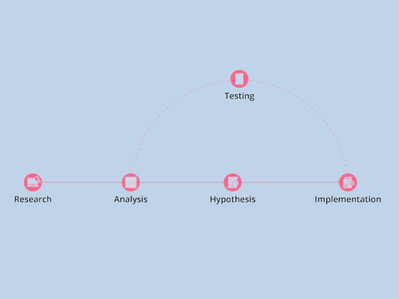
It seems web users might be more easily influenced than we think. A fascinating study by Professor Thorsten Joachims and his team at Cornell University shed light on how people interact with search engine results pages (SERPs). Their research revealed a significant tendency for users to click on the very first listing far more often than its actual relevance would suggest – highlighting the powerful influence of default options.

Initial findings, consistent with previous studies, showed that a whopping 42% of users clicked the top search result, while only 8% opted for the second one. This isn’t entirely surprising, as we know top positions generally attract the most attention.

However, the truly insightful part of the study involved a clever manipulation. The researchers secretly used a script to swap the order of the top two search results before they were displayed to users. So, the listing that was originally second now appeared first, and the original top result was moved to the second position.

Even with this swap, the results were striking. Users still clicked the new top entry 34% of the time, while the new second entry received 12% of the clicks.

The Magnetic Effect of the Top Spot

This experiment helps us understand why the top result gets so much attention. There are two main possibilities:

  1. Search engines are incredibly accurate at determining relevance and almost always place the best result first.
  2. Users click the top result simply because it’s at the top. This could be due to laziness (we naturally start from the top) or because users assume the search engine has correctly identified the best option.

The study’s findings indicate that the truth lies in a combination of both factors.

If users were always clicking the best link, then swapping the top two should have also swapped the click percentages. But this didn’t happen; the top spot still commanded the most clicks.

Conversely, if users blindly trusted the search engine and clicked the first link solely because it was first, then swapping the order shouldn’t have changed the percentages at all. This also wasn’t the case. The click-through rate of the top link decreased from 42% to 34%. This means that 8% of users shifted their clicks: 4% clicked the second result (which was originally first), and another 4% explored other options further down the page.

To further understand the accuracy of the search engine’s rankings, the researchers had human evaluators judge the relevance of the websites. Since there’s no definitive way to objectively determine the “best” website for a given query, they averaged the ratings of five individuals – likely the most reliable method for assessing information relevance.

The evaluation revealed that the original top result was judged the most relevant only 36% of the time, while the second result was deemed most relevant 24% of the time. Interestingly, the two top results were considered equally relevant 40% of the time. This shows that while the search engine was often correct, it was wrong about one-fourth of the time. (When the top two are equally relevant, the placement doesn’t really matter, so these instances were counted as “correct.”)

Considering how often the search engine’s top pick wasn’t actually the most relevant, users clicked it far too often. And when the top two were switched, too few users adjusted their behavior. The clear conclusion is that there’s a significant bias towards clicking the top link, although the quality of the link does still play a role.

For search engine marketers, the implications are clear: achieving that top spot is incredibly valuable. However, it’s equally crucial to have compelling “microcontent” – like effective page titles and summaries – that increases the likelihood of users perceiving your site as relevant. Unfortunately, controlling these snippets can be challenging on major search engines like Google, which often displays unhelpful and unclear descriptions. You have more control over this for internal search engines on your own website or intranet, assuming you can encourage content creators to write good summaries.

Defaults Extend Beyond Search

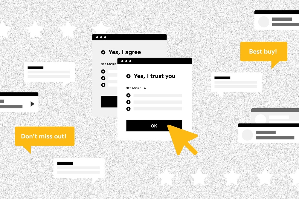
The power of defaults isn’t limited to search results. Users frequently rely on pre-selected options in various aspects of user interface design. For instance, they rarely delve into complex customization features, making it essential to optimize the default user experience, as this is what most people will stick with.

In forms and applications, pre-filling fields with the most common value can significantly improve usability. For example, on a conference registration form, if someone registers for the New York event, the country field could default to “United States.” If they register for the London event, it could default to “United Kingdom.” While users from other countries will need to change this, they would have had to specify their country anyway if the field was left blank. By using the most frequent value as the default, we save many users a small amount of effort.

Defaults offer two key usability benefits:

  • By presenting a representative value, they act as just-in-time instructions, helping users understand how to complete a field.
  • By showing a frequent value, they provide insight into the commonly expected response, as opposed to less typical ones. This knowledge can even be used for sales purposes – for example, by pre-selecting a one-year subscription option over a monthly one. However, consistently defaulting to the most expensive option can erode trust, so it’s important not to overdo it.

By guiding and informing users, well-chosen default values help reduce errors. Therefore, it’s crucial to select defaults that are genuinely helpful, rather than simply choosing the first item alphabetically or whatever happened to be at the top of an initial list.

Reference:

Thorsten Joachims, Laura Granka, Bing Pan, Helene Hembrooke, and Geri Gay, “Accurately Interpreting Clickthrough Data as Implicit Feedback,” Proceedings of the Conference on Research and Development in Information Retrieval (SIGIR), 2005. (Note: The link leads to a PDF file, which is an academic paper.)

This article has been edited from Nielsen Norman Group with the title The Power of Defaults by author Jakob Nielsen.

Measuring what matters: A deep dive into UI/UX metrics and KPIs

Introduction

Improving digital user interfaces (UI) and user experiences (UX) hinges on understanding and leveraging data about user behavior. In today’s competitive digital landscape, where a product’s success is often tied to its look-and-feel, a continuous and iterative UX design process is essential. This article explores the critical role of UI/UX metrics and Key Performance Indicators (KPIs) in this process, providing a detailed overview of how to measure design effectiveness and drive improvements.

A Deep Dive into UI/UX Metrics and KPIs
Introduction

Why measure UI and UX design?

Measuring UI and UX design is not merely a technical exercise; it’s a strategic imperative. The article emphasizes several key reasons why software developers and design teams should prioritize this:

  • Data-Driven Decisions: UX design KPIs provide objective data that supports informed design choices, leading to improved product performance and a stronger bottom line.
  • Alignment of Goals: Effective use of UX data helps align customer needs with business objectives, fostering overall project success.
  • Enhanced Communication: UX data promotes shared understanding and consensus among product team members, clients, and vendors.
  • Deeper User Insights: Analyzing user behavior data reveals valuable information about the target audience, including preferences, pain points, and interaction patterns.
  • Bridging the Gap: A thorough understanding of end-users enables product development teams to bridge the gap between designer intentions and user realities, resulting in more competitive UX and interfaces.
  • Minimizing Errors: Data-driven UX design reduces the risk of errors that result from subjective assumptions about user behavior.
  • Cost Efficiency: Data investigation helps avoid wasting resources on ineffective or detrimental design choices.
  • ROI Improvement: Informed product development decisions based on UX data can lead to a tangible improvement in Return on Investment (ROI) through increased conversion rates, higher sales, better customer retention, and reduced support costs.
  • Driving Innovation: Customer analytics data can uncover new trends and support innovative design ideas, moving beyond reliance on best practices.
  • Validation of Success: Positive trends in UX design metrics (e.g., customer satisfaction, engagement, churn) validate the effectiveness of the team’s work.
A Deep Dive into UI/UX Metrics and KPIs
Why measure UI and UX design?

Understanding UI/UX KPIs

A UX KPI is a quantifiable measure of a specific aspect of a user’s experience. For example, tracking the average time users spend daily in an app can help evaluate user engagement and satisfaction.

The article clarifies that there isn’t a single, universally accepted classification of UX and UI metrics. However, when aiming to understand user needs and behavior, teams often utilize two primary categories:

  • Behavioral UX Metrics: These metrics focus on what users do within a digital product.
  • Attitudinal UX KPIs: These metrics focus on how users feel about the product.

Behavioral UX metrics: Measuring user actions

Behavioral UX metrics provide insights into how users interact with a digital product throughout their customer journey. These metrics are typically gathered through usability testing and analytics tools.

The article highlights that usability is a foundational aspect of UX design, stating that “the UX/UI designer and app developers must ensure at least that the users can do what they want to do with the product.” The four dimensions of usability testing are:

  • Functionality
  • Flexibility
  • Learning ability
  • medium.com
  • Aesthetic user interface design

Common tools for monitoring behavioral UX metrics include Google Analytics, Hotjar, Mixpanel, Heap, Localytics, Kissmetrics, Crashlytics, Firebase, and Crazy Egg.

The article provides three examples of behavioral UX KPIs:

  • Task Success: This metric measures the percentage of users who successfully complete a defined task (e.g., completing a profile).
  • Task Time: This metric measures the time it takes users to complete a task. Average Task Time is often calculated.
  • Problems & Frustrations: This metric tracks the number of problems users encounter or the percentage of users who experience a specific issue. “Think aloud” protocols during usability testing are helpful for gathering this data.

Behavioral KPIs are often compared over time or against competitor benchmarks to assess progress and identify areas for improvement.

A Deep Dive into UI/UX Metrics and KPIs
Behavioral UX metrics: Measuring user actions

Attitudinal UX KPIs: Measuring user feelings

Attitudinal UX KPIs reveal users’ perceptions and feelings about a product and brand. This data is often gathered through customer feedback and surveys.

The article emphasizes three important attitudinal UX KPIs:

  • Net Promoter Score (NPS): Measures customer loyalty by asking users how likely they are to recommend the product. Users are categorized as “promoters,” “passives,” or “detractors,” and the NPS is calculated as the percentage of promoters minus the percentage of detractors.
  • System Usability Scale (SUS): A standardized questionnaire that assesses the perceived usability of a product. Users rate their agreement with statements about the product’s ease of use.
  • Customer Satisfaction (CSAT): Measures user satisfaction with a specific experience or the product overall. Surveys with rating scales are used to collect this data.

The article stresses the importance of combining behavioral and attitudinal metrics with financial and sales/marketing data for a comprehensive understanding of UX effectiveness.

A Deep Dive into UI/UX Metrics and KPIs
Attitudinal UX KPIs: Measuring user feelings

Measuring ROI in UI and UX design

To evaluate the return on investment (ROI) of UI and UX design efforts, the article suggests focusing on the following metrics:

  • Conversion Rate: The percentage of users who complete a desired action (e.g., registration, purchase). This is considered a crucial KPI for UX designers, as optimization can directly impact sales.
  • Drop-off Rate: The percentage of users who abandon a process before completing the desired action. Analyzing drop-off rates in different segments of a user journey helps identify areas where users are leaving.
  • Single Usability Metric (SUM): A standardized metric that combines task completion rates, task time, user satisfaction, and errors to provide an overall measure of usability.

The article also mentions “low-level metrics” such as page views, engaged page views, and latency.

A Deep Dive into UI/UX Metrics and KPIs
Measuring ROI in UI and UX design

Google HEART metrics

The article introduces Google’s HEART framework as a way to combine essential KPIs and gain a deeper understanding of design effectiveness:

  • Happiness: Measures user enjoyment.
  • Engagement: Measures user involvement.
  • Adoption: Measures the acquisition of new users.
  • Retention: Measures the ability to retain existing users.
  • Task Success: Measures the effectiveness, efficiency, and error rate of user tasks.
A Deep Dive into UI/UX Metrics and KPIs
Google HEART metrics

Onix’s tips for evaluating user experience design

Drawing on their experience, Onix provides the following recommendations for evaluating UX design:

  1. Keep the “Big Picture” in Mind: Analyze the product from a business perspective, considering its business model, monetization methods, and strategy. Conduct competitor analysis to identify opportunities. Ensure Google Analytics is properly configured.
  2. Prioritize Key Metrics: Focus on a few key UX KPIs that deliver the most value to customers and the business (e.g., conversion rate, drop-off rate, returning users rate). Gather as much relevant data as possible for each metric.
  3. Discover Correlations and Build Hypotheses: Go beyond surface-level numbers to understand the “why” behind user behavior. Use Google Analytics to track relevant behavioral metrics (e.g., device usage, time on page, clicks) and identify correlations. Form hypotheses about potential improvements.
  4. Test Hypotheses and Evaluate Improvements: Use A/B testing or compare before-and-after metrics to validate hypotheses and assess the impact of design changes.

The article includes a case study demonstrating how data-driven design improvements can lead to significant positive outcomes (e.g., increased donations on a content subscription platform).

A Deep Dive into UI/UX Metrics and KPIs
Onix’s tips for evaluating user experience design

Conclusion

The article concludes by emphasizing that UI and UX design is an iterative process of continuous improvement. Product development teams must plan for and implement ongoing measurement of design effectiveness.

The use of UX KPIs enables teams to enhance user convenience, product popularity, and market success. The article advises choosing KPIs that align with business goals, involving users in the process, and gathering feedback throughout design phases.

While conversion rate is highlighted as a crucial KPI, the article cautions against relying solely on low-level metrics or marketing/financial data without considering user feedback. It recommends using a combination of data sources, including surveys, user interviews, user journey research, and feedback from customer support and sales teams.

FAQ (From the Article):

The article also provides a brief FAQ section defining UI and UX design, explaining the importance of measuring design quality, and describing UX KPIs.

What are UI design and UX design?

  • UI (User Interface) refers to the point of interaction and communication between a human and a computer. In the context of web and mobile development, UI design involves arranging a product’s graphical layout and content to create a cohesive and visually appealing experience, adhering to established design principles.
  • UX (User Experience) denotes a human-centered approach to developing and improving digital products. UX design focuses on identifying and solving user problems, ensuring that the interaction with the product is efficient, easy, relevant, and enjoyable for a wide range of users.
  • UI design complements UX design by addressing the digital product’s visual elements, presentation, and interactive features. Both UI and UX are integral and work in tandem to achieve product success.

Why is it necessary to measure design quality and performance?

The development of most successful products is data-driven, meaning it relies on quantitative data to understand the target audience. Similarly, UI and UX must be measured to enable teams to make informed improvements.
Specifically, by measuring user experience, teams can:

  • Determine if one design version is superior to another or to a competitor’s product.
  • Gain insights into how users are actually interacting with the product.
  • Identify the specific problems users are trying to solve.
  • And more.

What are UX KPIs?

  • UX KPIs (Key Performance Indicators) are metrics that product development teams collect and analyze to quantitatively assess the success of their design efforts.
  • These KPIs transform data about user behavior and UI interactions into understandable information, enabling teams to draw conclusions and make informed decisions. When tracked over time, they indicate the progress made towards achieving specific design objectives.
  • Examples of prominent UX design KPIs include the Net Promoter Score, bounce rate, and returning users rate.

When is the optimal time to measure design performance?

Software developers should address design metrics and KPIs at least in the following situations:

  • When preparing for product improvements, such as before a design sprint, after identifying a problem, or following a UX audit that has highlighted usability issues and critical areas needing improvement. In these cases, it’s advisable to gather UX data from the previous 1-2 months.
  • After implementing any design changes, to evaluate whether those changes have effectively achieved the intended goals.

This article has been edited from Onix with the title “Main UI/UX Design Metrics and KPIs to Measure” by author Mila Slesar.

Visit Viartisan to read the latest and most in-depth articles on UI, UX, Branding, Develop, and Illustration!

Beyond the laws: Why mastering common usability patterns gives you a real UX advantage

You’ve probably seen the visually appealing charts outlining the “Laws of UX” – principles like Hick’s Law, Fitts’s Law, and the Law of Prägnanz (as beautifully presented by lawsofux.com). While understanding these foundational concepts can provide a theoretical framework for good design, there’s a more direct and often more effective path to creating exceptional user experiences: mastering common usability patterns.

Think of it this way: knowing the scientific principles of aerodynamics is helpful for an aircraft engineer, but understanding how to design effective wings, control surfaces, and landing gear – time-tested patterns – is what actually gets the plane off the ground.

Why prioritize usability patterns?

Instead of getting bogged down in the definitions and nuances of numerous UX laws, focusing on established usability patterns offers several significant advantages:

  • Instant Familiarity for Users: Users have encountered and learned these patterns across countless websites and applications. Implementing them means less cognitive load and a more intuitive experience. They already know how a standard navigation menu works, where to find the search bar, or the typical flow of an e-commerce checkout.
  • Battle-Tested Effectiveness: These patterns aren’t just theoretical; they’ve been refined and proven effective through countless iterations and user interactions. They represent solutions that consistently work well for common user tasks.
  • Practical Design Superpowers: Mastering these patterns equips you with a practical toolkit for tackling a wide range of design challenges. Instead of starting from a blank slate, you can leverage established solutions for navigation, forms, data display, and more.
  • Inherent UX Compliance: Usability patterns are, by their very nature, aligned with core UX principles. A well-designed navigation pattern, for example, inherently addresses findability, clarity, and efficiency – key aspects of good UX.

The proof is in the pattern (not just the law)

Consider the example you raised: signup and login pages. While you could try to apply individual UX laws in a vacuum, a seasoned designer will almost instinctively draw upon established patterns:

  • Clear and concise form fields with appropriate labels.
  • A prominent call to action button.
  • Options for password recovery.
  • Social login integrations.
  • Visual hierarchy that guides the user through the process.

These aren’t just random design choices; they are established usability patterns that have proven to be effective and user-friendly for signup and login flows.

Don’t ignore the laws, understand their manifestation

This isn’t to say that UX laws are irrelevant. They often underpin why certain usability patterns are effective. For example, Fitts’s Law explains why larger, closer targets are easier to interact with – a principle that informs the design of prominent call-to-action buttons in many usability patterns.

The takeaway

While a theoretical understanding of UX laws can be beneficial, your time and effort will be significantly amplified by focusing on learning and effectively implementing common usability patterns. These patterns provide a practical, user-tested, and efficient route to creating excellent user experiences. So, while appreciating the “Laws of UX” is a good starting point, truly mastering the patterns is where you’ll gain a serious design advantage.

Visit Viartisan to read the latest and most in-depth articles on UI, UX, Branding, Develop, and Illustration!

This article has been edited from LinkedIN by author Moamen Mawed.

Dark patterns in UX: Why designers must prioritize ethical responsibility

Abstract

Dark Patterns are deceptive design strategies used in user interfaces to manipulate users into actions they might not otherwise take—such as subscribing to unwanted services or making unintended purchases. The term was first coined in 2010 as e-commerce platforms rapidly expanded and designers, often under pressure to meet business targets, began using these manipulative tactics.

This article is split into two key parts. The first offers a detailed look at what Dark Patterns are, their origins, and the various forms they take—supported by real-world examples. The second briefly explores the wider implications of such practices and potential solutions.

In essence, this article argues that Dark Patterns violate ethical design standards. Designers must take responsibility for their impact and shift toward more honest, transparent user experiences.

Introduction

Great UX design is built around the user—ensuring that interactions are seamless, helpful, and respectful. But what happens when that power is misused? In pursuit of growth, some businesses deliberately employ manipulative design to push users toward decisions that serve corporate interests rather than the users’ own. These are known as Dark Patterns.

What Are Dark Patterns?

A Dark Pattern is a deceptive interface design that exploits human behavior to drive user actions that are not always in their best interest. Coined by cognitive scientist and UX designer Harry Brignull in 2010, the term refers to intentionally misleading designs like hidden subscriptions or unclear opt-ins.

Unlike bad design—which might stem from poor planning or lack of skill—Dark Patterns are deliberately constructed. They rely on a deep understanding of human psychology, not to help, but to exploit.

The Evolution of Dark Patterns

Dark Patterns have been around in various forms, long before the digital age. Credit card offers that advertise “0% interest” while hiding the long-term terms in fine print are an offline example.

Online, early examples included spammy pop-up ads and misleading banners. But today, these patterns have become more subtle and integrated. For instance, LinkedIn once sent unsolicited emails to users’ contacts—posing as if they came from the user. This tactic led to a class-action lawsuit in 2014, costing the company $13 million.

Dark patterns
The Evolution of Dark Patterns

Common Types of Dark Patterns

Brignull’s website darkpatterns.org outlines a taxonomy of deceptive UI behaviors. Here are some of the most prevalent:

1. Bait and Switch

This involves presenting a desirable option but delivering an entirely different outcome. A famous example: users clicking the ‘X’ on a Windows 10 upgrade prompt expecting it to close, only for the upgrade to begin.

2. Disguised Ads

Ads are embedded in a way that mimics normal content, tricking users into clicking. Font websites like Dafont.com often feature misleading “Download” buttons that lead to unrelated software.

3. Forced Continuity

Users sign up for a free trial with their credit card, and once it ends, they are automatically charged—often without a clear opt-out. Coursera is one example where the free version of a course is difficult to find, nudging users toward paid subscriptions.

4. Friend Spam

This pattern involves misusing a user’s contact list under the guise of connecting them with friends, only to send spam messages on their behalf. LinkedIn’s infamous contact-harvesting practice is a prime case.

5. Hidden Costs

These appear at the final stages of a checkout process. For instance, Curology promotes a $19.95 monthly treatment, but extra fees like shipping are revealed much later in the funnel.

6. Misdirection

This design tactic draws attention to one element while hiding critical information elsewhere. For example, Skype’s 2016 software update preselected options to change users’ homepage and search engine settings.

7. Price Comparison Prevention

Sites like LinkedIn often hide or obscure the price of their premium offerings, making it difficult to compare plans or make informed choices.

8. Privacy Zuckering

Named after Facebook CEO Mark Zuckerberg, this refers to interfaces that nudge users into oversharing personal data. Zapier was noted for offering two sets of Terms—one in plain language and another filled with dense legal jargon.

9. Roach Motel

It’s easy to sign up but incredibly hard to opt out. Times Jobs India, for instance, makes account deletion nearly impossible, continuing to send emails years after signup.

10. Trick Questions

These are intentionally confusing prompts designed to get users to opt into something unknowingly. Sky’s checkout page in 2015 included an opt-out sentence so poorly phrased that many users mistakenly agreed to receive marketing emails.

Addressing the Issue

Fixing Dark Patterns requires more than user complaints—it calls for a shift in design culture. Some industry voices, like Bunker (2013), have proposed ethical guidelines centered on privacy, honesty, and respect.

Author Nir Eyal, in his book Hooked (2014), introduced the Hook Model to build engaging, habit-forming products. He acknowledges the potential for misuse and introduces a “Manipulation Matrix” to help designers evaluate their intentions ethically.

Ultimately, responsibility falls on the designer. Each interface is a touchpoint with real-world impact. The question is not only “Can we do this?” but “Should we?”

Conclusion

As our digital ecosystems grow more complex, the use of Dark Patterns must be scrutinized. Designers are more than just creators—they are decision-makers with the power to influence behavior at scale.

Short-term gains from deceptive tactics may boost metrics temporarily, but they damage trust, brand integrity, and user wellbeing in the long run. As Steve Fisher once said at the Generate NY Conference:

“Find a way to help the vulnerable around you. If you have privilege, use it for good.”

Ethical design is no longer optional—it’s essential.

Want to deepen your knowledge of UI, UX, Branding, Develop, and Illustration? Read more helpful articles at Viartisan.

Sources:
This article draws from research and examples originally presented on darkpatterns.org, Fast Company, Medium, and works by Harry Brignull, Nir Eyal, and other UX practitioners.

5 powerful ways to conduct UX research without user interviews

Introduction

Great UX is built on solid research, but that doesn’t always mean you need to conduct time-consuming user interviews. In fact, you can uncover valuable user behavior, identify pain points, and discover opportunities for improvement by leveraging data-driven insights. This approach allows you to make informed design decisions based on what users actually do, rather than relying solely on assumptions or what they say they do.

Why Skip the Interviews (Sometimes)?

While user interviews are incredibly valuable, they’re not the only tool in the UX researcher’s toolkit. Sometimes, you need quicker, more scalable methods to gather insights. Data-driven UX research can provide a broad overview of user behavior, revealing patterns that might not surface in individual interviews.

5 Powerful UX Research Methods Without Interviews

Here are 5 effective ways to conduct UX research and gather crucial user insights without scheduling a single interview:

Analytics & Heatmaps

  • Tools like Google Analytics, Hotjar, and Clarity provide a wealth of information about how users interact with your product.  
  • You can see where users click the most, identify drop-off points in a flow, and pinpoint areas where they struggle with navigation.

A/B Testing & Experimentation

  • A/B testing allows you to test different versions of UI elements (buttons, layouts, calls to action) to see which performs best.  
  • This method lets real user behavior guide your design choices, ensuring you’re optimizing for effectiveness.

Session Recordings

  • Tools that offer session recordings allow you to watch real users interact with your product.  
  • This can help you identify pain points, areas of confusion, and navigation issues in real-time.

User Feedback & Support Data

  • Don’t underestimate the value of your existing user feedback and support data.
  • Analyzing user complaints, FAQs, and support tickets can reveal major frustrations and feature requests.  

Competitor Analysis:

  • Studying your top competitors’ UX patterns and user reviews can provide valuable insights.  
  • You can learn what works well, what doesn’t, and what users expect from similar products.  

The Power of Data-Driven UX Research

Data-driven UX research is a powerful approach that empowers you to make informed design decisions, even without conducting traditional user interviews. By leveraging these methods, you can create user-centered experiences that are both effective and efficient.  

Conclusion

While user interviews remain a valuable UX research method, remember that you have a range of other powerful tools at your disposal. By incorporating analytics, A/B testing, session recordings, user feedback analysis, and competitor analysis into your research process, you can gain a comprehensive understanding of your users and create exceptional user experiences.

Interested in UI, UX, Branding, Develop, or Illustration? Discover Viartisan‘s diverse library of articles now!

This article has been edited from LinkedIN by author Sarfraz Jasim Uddin.

UI vs UX: Stunning looks vs seamless experience – Which reigns supreme?

You’ve likely encountered the age-old debate: UI (User Interface) versus UX (User Experience). Many, especially those new to the design field, often confuse the two or underestimate the importance of one over the other.

I’ve found a simple metaphor that consistently clarifies the core difference:

UI is like the skin, face, hair, and clothes of a person. It’s what users see and directly interact with. A visually appealing interface with harmonious colors, legible fonts, and a clear layout undoubtedly creates a positive first impression.

UX, on the other hand, is akin to the brain, spine, nervous system, and heartbeat. It’s the deep-seated foundation that dictates how the system functions, how its parts connect, and whether users can achieve their goals easily and efficiently.

The painful truth is: You can survive a bad haircut. But you certainly can’t survive a broken nervous system.

What does this mean in the context of product design?

The next time your team kicks off a meeting by discussing:

  • Fonts
  • Color palettes
  • Button placements
  • Shadow effects

Gently remind them of the more fundamental questions:

  • Is the flow logical? Can users easily navigate through the steps to achieve their objectives?
  • Is the structure working? Can users find what they need quickly and effortlessly?
  • Is the system healthy? Is it stable, reliable, and responsive to user needs?

The reality is:

  • Great UI gets compliments. People will admire the beauty and aesthetics of the product.
  • Great UX gets results. Users will use the product more frequently, accomplish their tasks efficiently, and recommend it to others.

You need both. A successful product requires a harmonious blend of an attractive interface and a smooth, effective user experience. Never sacrifice UX for the sake of a visually appealing UI. Remember, a healthy “brain” is far more crucial than beautiful but useless “skin.”

(P.S. Want a simple visual I use to explain this? Ask in the comments.)


This article has been edited from LinkedIN by author Pavle Lucic.

Elevating user experiences: A deep dive into UX audits

In the dynamic world of UI/UX design, a UX audit is an indispensable process. It’s more than a simple check-up; it’s a strategic deep dive aimed at optimizing the user’s journey, crafting experiences that are smoother, faster, and more enjoyable. As a UX/UI designer, I firmly believe that a holistic UX audit demands a multi-faceted approach, encompassing several key perspectives.

Key Perspectives for a UX Audit

  1. User-Centered Focus: The cornerstone of any effective UX audit is a user-centric approach. Is the experience intuitive and frustration-free? Does it align with user expectations and needs? A user-centered approach places the user at the heart of the design process, ensuring their satisfaction and ease of use.  
  2. Business-Focused Alignment: Design should never exist in a vacuum. It must be strategically aligned with business objectives. Does the design effectively support conversions and the achievement of business goals? A UX audit should meticulously assess how the design contributes to the bottom line and facilitates business success.  
  3. Data-Driven Decisions: In the realm of UX, data is king. Analytics and user feedback provide invaluable insights that drive informed decision-making. Are you leveraging these resources to guide design changes? A data-driven approach ensures that improvements are grounded in evidence, leading to more effective and impactful outcomes.  
  4. Accessibility First Mindset: Inclusivity is not just a buzzword; it’s a fundamental principle of ethical design. Can everyone, regardless of their abilities, navigate and interact with your product seamlessly? An accessibility-first perspective ensures that the design adheres to accessibility standards, opening it up to the widest possible audience.  
  5. Performance-Oriented Optimization: In today’s fast-paced digital landscape, speed and responsiveness are paramount. Is your site fast, responsive, and free of errors? A performance-oriented approach focuses on optimizing the technical aspects of the design, guaranteeing a seamless and efficient user experience.  

The Comprehensive UX Audit Checklist

To translate these perspectives into actionable insights, a UX audit should involve a detailed examination of the following key areas:

Usability & Navigation

  • Is the navigation clear and easy to use?  
  • Are menus and CTAs intuitive and well-placed?  
  • Are key actions (sign-up, checkout, etc.) easy to complete?  
  • Is there a logical content hierarchy?  
  • Are interactive elements (buttons, links) easy to identify?  

Accessibility

  • Does the site meet WCAG contrast and readability standards?  
  • Is the website keyboard navigable?  
  • Are form fields and labels accessible (with placeholders and error messages)?  
  • Is alternative text provided for images?  
  • Are animations and effects not overwhelming or distracting?  

Visual Design & Aesthetics

  • Is the branding consistent across all pages?  
  • Are fonts readable (size, contrast, spacing)?  
  • Are buttons and CTAs easily distinguishable?  
  • Are elements aligned properly for a clean layout?  
  • Are images and media optimized for performance?  

Performance & Speed

  • Does the website load within 3 seconds?  
  • Are images and videos optimized for fast loading?  
  • Is lazy loading implemented where necessary?  
  • Are unnecessary scripts or plugins removed?  
  • Is caching enabled?  

Mobile Responsiveness

  • Does the site work seamlessly on all screen sizes?  
  • Are touch targets (buttons, links) large enough?  
  • Is the font size appropriate for mobile readability?  
  • Are mobile forms easy to fill?  
  • Are unnecessary pop-ups avoided? 

Forms & Input Fields

  • Are form fields labeled clearly?  
  • Are error messages helpful and easy to understand?  
  • Is auto-fill and input validation enabled?  
  • Are required fields minimal and necessary?  

Conversion Optimization

  • Are CTAs clear and compelling?  
  • Is there a seamless checkout or sign-up process?  
  • Are trust signals (testimonials, reviews, security badges) visible?  
  • Is there a clear value proposition?  

User Feedback & Support

  • Are feedback mechanisms (surveys, ratings) available?  
  • Is live chat or a support system easily accessible?  
  • Are FAQs or self-help sections provided?  
  • Is there a way for users to report issues?  

SEO & Findability

  • Are meta tags, titles, and descriptions optimized?  
  • Is the URL structure clean and descriptive?  
  • Are alt texts used for images?  
  • Is structured data implemented for better search visibility?  

The Core of Exceptional UX

Exceptional user experience transcends mere aesthetics; it’s about creating functional, usable, and intuitive digital environments where users feel valued and empowered. By embracing a comprehensive and meticulous approach to UX audits, we can pave the way for designs that not only meet user expectations but also drive business success.

This article has been edited from LinkedIN with the title How to Approach a UX Audit: A Clear Perspective by author Jithin Johny.

A step-by-step guide to user research: Unleashing the power of user-centric design

In the realm of product development, user research is the cornerstone of creating solutions that truly resonate with your target audience. It’s a process that involves gathering insights, understanding user needs, and identifying pain points to craft products that not only meet expectations but exceed them.

The importance of user research

User research is not just a mere formality; it’s a strategic investment that can save you from costly mistakes and ensure your product’s success. By understanding your users’ motivations, behaviors, and preferences, you can:

  • Avoid False Assumptions: Relying on assumptions about your users can lead to products that miss the mark. User research helps you validate or challenge these assumptions, ensuring your product aligns with real-world needs.
  • Create User-Centric Solutions: By empathizing with your users, you can design products that address their specific challenges and provide meaningful value.
  • Gain Competitive Advantage: Understanding your users’ pain points gives you an edge over competitors. You can develop solutions that address those pain points more effectively, positioning your product as the preferred choice.
A step-by-step guide to user research
HUGE misktake when do user research

The user research process

Conducting user research is a systematic process that involves several key steps:

  1. Define Your Research Objectives: Clearly outline what you want to achieve through your research. This will help you focus your efforts and choose appropriate methods.
  2. Select Research Methods: There are various research methods available, each with its strengths and limitations. Choose methods that align with your research objectives and budget.
  3. Find and Recruit Participants: Identify your target audience and recruit participants who represent that group. Ensure you have a sufficient sample size to draw meaningful conclusions.
  4. Conduct the Research: Execute your chosen research methods, gathering data and insights from your participants.
  5. Analyze the Data: Analyze the collected data to identify patterns, trends, and key findings.
  6. Create User Personas: Based on your research findings, create user personas that represent your ideal users. These personas will guide your product development process.
A step-by-step guide to user research
A practical landscape from Nielsen Norman Group

Popular research methods

Several research methods can be used to gather valuable insights about your users:

  • Interviews: One-on-one conversations with users allow you to explore their thoughts, feelings, and experiences in depth.
  • Surveys: Surveys are a quick and efficient way to collect quantitative data from a large number of participants.
  • Focus Groups: Focus groups bring together a group of users to discuss a specific topic, generating rich insights through interaction.
  • Competitive Analysis: Analyzing your competitors’ products and strategies can help you identify gaps in the market and understand user expectations.
  • Field Studies: Observing users in their natural environment provides valuable context and insights into their behavior.
A step-by-step guide to user research
Some popular methods to research

Tips for effective user research

To ensure your user research yields meaningful results, consider the following tips:

  • Prepare Questions: Craft clear and concise questions that elicit relevant information from participants.
  • Keep Surveys Brief: Avoid lengthy surveys that may discourage participants from completing them.
  • Use Experienced Moderators: For focus groups, hire experienced moderators who can guide discussions and keep participants engaged.
  • Be Objective: Avoid interpreting data based on your own biases. Let the data speak for itself.
  • Act on Insights: Use the insights gained from your research to inform your product development decisions.

Conclusion

User research is an essential component of successful product development. By understanding your users’ needs and pain points, you can create products that truly resonate with them. Embrace user research as a continuous process, regularly gathering insights to ensure your products remain relevant and aligned with evolving user expectations.

References

This article has been edited from Design_Strategy with title How to conduct user research: A step-by-step guide by author Kavcic, R.

Your gateway to UI/ UX design internships: Competitions to watch

Embarking on a UI UX design career can be challenging, but intern competitions offer a unique opportunity to gain experience and recognition. These competitions, hosted by leading companies, provide a platform to showcase your skills and potentially land a coveted UI UX design internship.

Why participate in UI/ UX design internships competitions?

UI UX design intern competitions offer a unique platform for aspiring designers to showcase their skills and gain valuable experience. These competitions can significantly boost your career by providing real-world challenges and industry recognition.

Real-world experience

  • UI UX design intern competitions often present challenges that mirror the complexities of actual design projects. This allows participants to move beyond theoretical concepts and apply their skills in practical, problem-solving scenarios.
  • Participants are frequently tasked with designing solutions for specific user needs or business problems, simulating the demands of a professional UI UX design role.
  • The experience gained from these competitions is invaluable for building a robust portfolio. Demonstrating the ability to tackle real-world design challenges showcases a candidate’s practical skills and problem-solving abilities to potential employers.

Industry recognition

  • Winning or placing highly in a reputable UI UX design intern competition can significantly elevate a candidate’s professional profile. It serves as tangible proof of their design talent and dedication to the field.
  • Industry recognition from such competitions can make a resume stand out to potential employers, particularly in the competitive field of UI UX design.
  • It signifies that the participant’s work has been evaluated and validated by industry professionals, adding credibility to their skills and experience.

Networking opportunities

  • UI UX design intern competitions provide a unique platform for participants to connect with industry professionals, mentors, and fellow designers. These connections can be instrumental in career development.
  • Participants have the opportunity to interact with experienced designers who may serve as mentors, providing valuable guidance and insights.
  • Networking with fellow designers can lead to collaborations, shared learning experiences, and future career opportunities.

Skill enhancement

  • The competitive nature of UI UX design intern competitions encourages participants to push their creative boundaries and refine their design skills.
  • Participants are often required to work under pressure and adhere to strict deadlines, developing essential time management and project management skills.
  • Competitions often require participants to stay abreast of the latest industry trends and technologies, promoting continuous learning and skill development.
The benefit of UI/UX design intern competitions

Notable UI UX design internships competitions

Ready to put your UI UX design skills to the test? Explore these prominent competitions that offer aspiring designers a chance to shine and gain valuable experience.

Google UX Design Internship Challenge

  • Google, a tech giant renowned for its user-centric products, frequently organizes design challenges as part of its internship selection process. These challenges are designed to identify promising UX design talent.
  • These challenges often simulate real-world design scenarios, requiring participants to tackle complex user problems and develop innovative solutions. This approach allows Google to assess the practical skills and problem-solving abilities of potential interns.
  • Participants have the opportunity to showcase their design thinking, user research skills, and ability to create intuitive and effective user experiences.
  • Link: Google Careers

Adobe Design Achievement Awards

  • While not exclusively aimed at interns, the Adobe Design Achievement Awards is a highly prestigious competition that recognizes outstanding student design work across various creative disciplines, including UI UX design.
  • Winning or receiving recognition in this competition can significantly enhance a designer’s portfolio, demonstrating their exceptional talent and creativity to potential employers.
  • The awards provide a platform for emerging designers to gain exposure and recognition within the design community.

Microsoft Design Internship Program

  • Microsoft’s design internship program is known for its rigorous selection process, often incorporating design challenges to evaluate candidates’ design thinking and problem-solving skills.
  • These challenges are designed to assess a candidate’s ability to approach design problems strategically, considering user needs and technical constraints.
  • Participants are evaluated on their ability to create innovative and user-friendly design solutions, demonstrating their potential to contribute to Microsoft’s design teams.

Facebook (Meta) Design Internship

  • Meta, formerly Facebook, is another major technology company that offers highly competitive design internships.
  • They are known to give design challenges that test the user-focused design methodology of the applicant. This means that the Meta design team is looking for people who can really put themselves in the shoes of the user.
  • They look for people who are skilled in user research and who can create products that are easy and intuitive to use.
Some UI/UX design internship competitions you can try to improve your career

Tips for success in UI UX design internships competitions

Selecting the appropriate UI UX design training method is vital for maximizing learning outcomes. Consider your team’s unique needs, budget constraints, and learning preferences to make an informed decision.

Understand the challenge

  • Thorough Analysis: Go beyond a cursory glance at the competition guidelines. Dedicate time to a deep analysis of the problem statement, requirements, and judging criteria.
  • Clarify Ambiguities: If any aspect of the challenge is unclear, seek clarification from the organizers. Don’t make assumptions that could lead to misinterpretations.
  • Contextual Awareness: Research the company or organization hosting the competition. Understanding their brand, values, and target audience can help you tailor your design solutions.

Focus on user-centered design

  • Empathy and Research: Demonstrate a strong understanding of user needs through thorough user research. Show that you can put yourself in the users shoes.
  • Usability Testing: If the competition allows, conduct usability testing to validate your design decisions. Document your findings and demonstrate how they informed your design process.
  • Accessibility: Consider accessibility guidelines to ensure your designs are inclusive and usable by a wide range of users.

Showcase your creativity

  • Innovative Solutions: Don’t be afraid to push boundaries and explore unconventional design solutions. Present ideas that are both creative and functional.
  • Visual Storytelling: Use visual elements to communicate your design concepts effectively. Create compelling presentations or prototypes that capture the attention of the judges.
  • Iterative Design: Demonstrate your ability to iterate and refine your designs based on feedback. Show that you can adapt and improve your work.

Build a strong portfolio

  • Curated Selection: Choose your best design projects to showcase in your portfolio. Focus on quality over quantity.
  • Case Studies: Present your design process through detailed case studies. Explain your research methods, design decisions, and the impact of your solutions.
  • Visual Appeal: Ensure your portfolio is visually appealing and easy to navigate. Pay attention to layout, typography, and imagery.

Network and connect

  • Active Engagement: Participate in online forums, social media groups, and networking events related to the competition.
  • Meaningful Interactions: Don’t just collect contacts; build genuine relationships with other participants and industry professionals.
  • Follow-Up: After the competition, follow up with the connections you made. Express your gratitude and maintain contact.
Tips for success in UI/ UX design internships competitions

UI UX design intern competitions are an excellent way to launch your career in the field. By participating in these competitions, you can gain valuable experience, showcase your skills, and network with industry professionals. If you are looking for UI/UX design services to help your company create the best product possible, please visit Viartisan on our homepage.

Transform Your Team with Expert UI UX Design Training

In today’s competitive digital landscape, exceptional UI UX design is crucial for business success. Viartisan offers comprehensive UI UX design training programs tailored to elevate your team’s skills. Equip your employees with the knowledge and expertise to create user-centric digital experiences that drive engagement and satisfaction.

Why Invest in UI UX Design Training?

In today’s digital age, user experience is paramount. Investing in UI UX design training ensures your team can create products that resonate with users, driving satisfaction and loyalty.

Enhance Product Quality

  • Well-trained UI UX designers possess the skills to create intuitive and user-friendly interfaces. They understand the principles of user-centered design, ensuring that products are easy to navigate and meet user needs.
  • By focusing on user experience, design teams can minimize usability issues and create products that are both functional and enjoyable to use. This leads to higher user satisfaction, as users are more likely to appreciate and engage with well-designed products.
  • Satisfied users are more likely to become loyal customers, leading to increased customer retention and positive word-of-mouth referrals.

Boost Team Productivity

  • UI UX design training streamlines workflows by establishing clear design processes and methodologies. This improves collaboration between designers, developers, and stakeholders, reducing miscommunication and rework.
  • By equipping team members with standardized design principles and tools, training enables them to work more efficiently and effectively. This leads to faster project completion times and reduced development costs.
  • Training also helps team members to be able to better communicate with each other.

Stay Ahead of the Competition

  • The UI UX design field is dynamic and constantly evolving, with new trends and technologies emerging regularly. UI UX design training ensures that your team stays up-to-date with the latest industry practices and tools.
  • By investing in ongoing training, your business can maintain a competitive edge in the digital marketplace. Your products will stay modern, and relevant.
  • This allows the company to adapt to the changing landscape of the market.

Improve Customer Retention

  • UI UX design training emphasizes the importance of understanding user needs and preferences. By conducting user research and incorporating user feedback, design teams can create products that resonate with their target audience.
  • When customers have positive experiences with your products, they are more likely to remain loyal to your brand. By focusing on user-centered design, you can improve customer retention rates and build long-term relationships.
  • By understanding the customer, and focusing on the user, you retain more users. Happy customers, are repeat customers.
The benefit of UI UX design training

Popular UI UX Design Training Options

To ensure your team is equipped with the latest UI UX design skills, it’s crucial to explore the various training options available. Each method offers unique benefits, catering to different learning styles and organizational needs.

Online Courses

  • Flexibility and Affordability: Online courses offer unparalleled flexibility, allowing learners to study at their own pace and from anywhere in the world. They are often more cost-effective than traditional classroom-based training.
  • Wide Range of Options: There’s a vast selection of online UI UX design courses catering to various skill levels, from beginners to advanced learners.
  • Crucial Selection: It’s essential to choose reputable platforms and courses with high-quality content and experienced instructors. Look for courses with strong reviews and recognized certifications.
  • Example platforms: Coursera, Udemy, Interaction Design Foundation.

In-House Training

  • Customization: In-house training can be tailored to meet the specific needs of a company and its projects. This allows for a focus on the skills most relevant to the organization.
  • Team-Specific Focus: In-house training can address the unique challenges and workflows of a particular team, improving collaboration and efficiency.
  • Expert Trainers Required: This option requires a company to have in-house UI UX design experts who can act as trainers.

Professional Training Centers

  • Structured Learning Environment: Professional training centers provide a structured learning environment with direct interaction between instructors and students.
  • Hands-On Experience: These centers often offer hands-on workshops and projects, allowing students to apply their knowledge in a practical setting.
  • Higher Cost: Training at professional centers tends to be more expensive than online courses.

Workshops and Industry Events

  • Latest Trends and Networking: Workshops and industry events offer opportunities to stay up-to-date with the latest UI UX design trends and network with professionals in the field.
  • Inspiration and Motivation: These events can provide inspiration and motivation for teams, encouraging them to explore new ideas and approaches.
  • Supplementary Learning: These are best used to supplement other forms of training, as they may not provide a comprehensive education.
Some popular options of UI/ UX design training

Tips for Choosing the Right Training Method

Selecting the appropriate UI UX design training method is vital for maximizing learning outcomes. Consider your team’s unique needs, budget constraints, and learning preferences to make an informed decision.

Clearly Define Training Objectives

  • Skill Identification: What specific UI UX design skills does your team need to acquire or improve? Is it user research, prototyping, interaction design, or visual design?
  • Goal Setting: What are the overarching goals of the training? Is it to improve product usability, streamline design processes, or stay competitive in the market?
  • By clearly defining the objectives, you can narrow down the training options and select a method that aligns with your specific needs.

Assess the Team’s Current Skill Level

  • Knowledge and Skill Inventory: What is the current level of UI UX design knowledge and skills within your team? Do they have any prior experience or are they beginners?
  • Proficiency Evaluation: How proficient are individual team members in relevant areas? This assessment helps identify skill gaps and tailor the training accordingly.
  • Assessing the current skill level, will help to make sure that the training will be helpful.

Consider Budget and Time Constraints

  • Budget Allocation: How much can your organization allocate for UI UX design training? Online courses are generally more budget-friendly, while in-person workshops or specialized training centers may be more expensive.
  • Time Availability: How much time can your team dedicate to training? Online courses offer flexibility, while in-house training may require dedicated time slots.
  • Time and money are very important factors, when choosing a training method.

Research Training Providers Thoroughly

  • Reputation and Experience: Investigate the reputation and experience of potential training providers. Look for established institutions, reputable online platforms, or experienced instructors.
  • Curriculum and Methodology: Evaluate the course content, teaching methods, and practical exercises. Ensure they align with your team’s learning style and objectives.
  • Student Reviews and Testimonials: Read reviews and testimonials from past participants to gauge the effectiveness and quality of the training.
Who should enroll UI UX design course?

Investing in UI UX Design training is a wise decision to enhance your business’s competitiveness. Choose the most suitable training method for your needs and circumstances to build a professional UI UX Design team, creating excellent products and services. If you require UI/UX design services or other marketing solutions for your business or project, please contact Viartisan on our homepage.